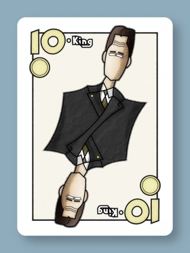
This is just about done, though John suggested adding a pocket with a handkerchief and some buttons, which sounds great to me.
Mostly, I focused on coloring and texturing.
The shadows and shading were all done by hand using extra vector art in Illustrator, something I’ve never done before. I usually try to use gradient meshes or drop shadows or Illustrator’s 3d tools for that sort of thing. But now that I’ve tried this, I love it — as a bit of a control freak, I like having absolute control over the shapes of the highlights and shadows.
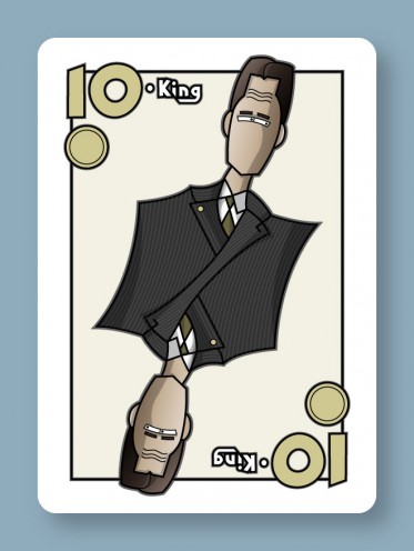
Once I had the coloring done, the image looked like this:
Kinda cartoony, kinda flat. I think, for this sort of look to work, you have to make it look a little distressed… more like an old poster printed on idiosyncratic equipment and less like cheap vector clipart.
This is actually a look I’ve been trying to get on my stuff for years, and I think this is the closest I’ve ever come to it. If you’re curious, what I did was this:
- Import my Illustrator art into Photoshop.
- Duplicate the one layer you’ve got.
- Apply a gaussian blur to the duplicate (I did 6 pixels here I think.)
- Apply a normal diffuse filter to the duplicate 10 or so times in a row.
- Set the blending mode of the duplicate to 100% overlay.
- Add a new layer.
- Make some black & white clouds on the new layer.
- Add a few difference clouds to that. I did like 6 iterations.
- Emboss.
- Set the blending mode of the clouds layer to 100% soft light.
So that gave me some wrinkles and the impression of imperfect printing. I’ll probably futz with it a little more and add some scratches too.

