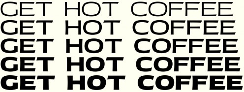
I had this critiqued by some experts in the industry a few years ago, and they suggested that it might work well as the widest variation of a whole family of fonts. I’ve never tried that before, but I’ve decided to give it a shot.
What I’m hoping to end up with is a 15 font family: you’d be able to pick any combination of one of five weights and 3 widths. Above, you can see what the 5 different weights might look like for the widest available width.
Luckily, I don’t have to make all 15 sets of letters from scratch; the way it seems to work is, you just define the extremes, and let your font-editing software blend between them. In the end, I’ll need to draw each character 4 times: narrow/light, narrow/extra-bold, wide/light and wide/extra-bold. What you see above is the two wide extremes blending together.
So it’s arguably 4 times as much work, but you get 15 times as much product, a more versatile product that hopefully will appeal to people with big, complex typesetting jobs.
But the ratio of work-to-product isn’t really what I find appealing about this. What I like about it right now is that working at these extremes is pretty unforgiving. The thinner the strokes, the easier it’s going to be to tell when they’re inconsistent. And with the extra bold characters, it’s been a bit of a challenge to cram everything in without having things look too crowded or muddy. And, I’m sure that the narrow versions of these will have their own unique problems to deal with.
It’s like you’re exaggerating the problems already present in the design. If I can figure these issues on the edges of my family, I’m sure the middle will be much better for it.
