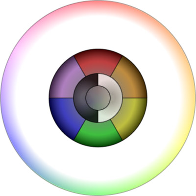
So I wanted to design something a little different for the character & costume creation in Tinselfly, something that lets you easily drill down to the color you want and go.
At first, you’ll be presented with a simple menu of things to choose from.

You can click on one of the primary colors, or one of the three shades of grey in the center.
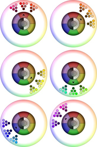
If you click on a primary color, you’ll get some different variations of that color, so the color picker would look like one of the six variations below:

The new colors shown are further categorized by hue, and within each triangle of similarly-hued colors, you can pick a lightness and saturation that you like.
Similarly, if you click on one of the greys, you’ll get some variations that let you refine your color.

And that’s the basic idea.
I think this interface does a reasonable job of looking uncomplicated, even though there are still a couple hundred things to choose from. However, I don’t think it’s obvious how you’re supposed to interact with this thing. Some labels, bevels or general instructional text is probably needed.
My usability two cents: I wanna click somewhere in the white space between the two circles.
Huh. I can kind of see that. Much too loud a border, huh?…
Maybe by default collapse the outer ring and then expand on selection. Could then make the expansion / collapse logic optional so you can reuse a simple mode.
I like that idea; if you just saw the color wheel on its own, it would certainly be more obvious what you were supposed to do.
Also, I need some always-in-the-same-place indication of what color is selected, though that might be handled in this combined texture/color/pattern fabric sample that’s also going to be part of this particular screen.