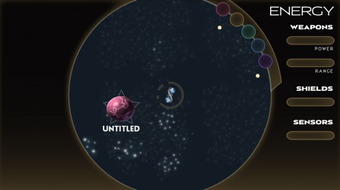
…and it was starting to feel kind of disjointed.
So I thought I’d try to unify things a bit.
I recently finished playing Stacking, and one of the stated goals was to take the inventory, verbs, and characters you find in point & click adventure games and make all those things one unified thing that was easy to manage. Conceptually, I love that sentiment, even if I thought its implementation within the game was problematic.
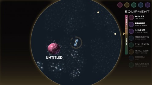
So the new mockup has a combined equipment/power/weapons display, consisting of a single list that the player can re-order at will. The basic idea is that every item is capable of providing this thematically related suite of passive buffs, combat effects when you press fire, and non-combat effects related to firing. The higher up something is, the more it does for you.
Say you have a tractor beam. If it’s at the bottom of your list, it does absolutely nothing. If you move it to the bottom of the Ready bucket, then you get a passive effect: power-ups and resources on screen drift towards your ship instead of sitting around waiting for you to pick them up. If you move the tractor beam higher in the Ready bucket, power-ups drift towards you quicker.
If you move the tractor beam to the Armed bucket, it’s now one of couple things that fires when you press your fire button. Any resources in the line of fire of the beam are instantly collected, and any enemy ships have to stay a fixed distance from you for a while.
If, say, you also had a mining laser armed, you could shoot an asteroid and make it explode into a shower of resource tokens, and since you’ve also got the tractor beam equipped, the resources would gravitate towards your ship and be easier to collect. Hopefully, you could combine items in interesting ways like that.
You’d be encouraged to re-order your list for different situations, and I think it could be pretty fun.
* * *
The UI font is my football font family I’ve been working on; I figured this is a good way to find out if it’s working as a family, and see what needs to be fixed.
I also need experience working with type families; it can be kind of tricky it seems.

