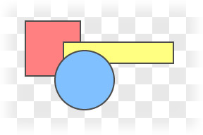
A lot of the time you can just draw a bunch of shapes, each one on top of the last, and be ok.
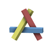
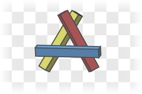
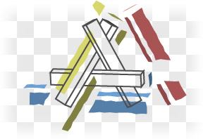
Everything’s nice and layered here. But say I wanted to make something with odd overlapping, like this:
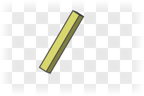
I could start with the yellow stick
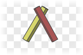
Add the red stick on top of that
Add the blue stick…
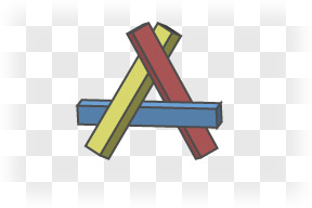
…and this is where things get a bit janky. The blue stick should go under the yellow stick, but over the red stick. There’s no order I can drop these things onto my drawing and get it to work.
The thing is, within Illustrator, I should stop thinking of these as sticks. I’m not working in three dimensions anymore; I’m working in two. I need to flatten everything out in my head, and see everything as flat shapes on a piece of paper.
If one three dimensional object overlaps another, that doesn’t always mean I get to make two 2-dimensional objects in Illustrator that overlap. Sometimes, it means that the top object breaks the bottom object.
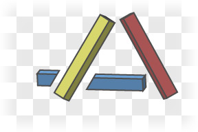
What I could do here is draw the blue stick as a couple of separate pieces. When they’re aligned right, you won’t be able to tell that’s what I’ve done.
But there are still overlapping objects here. It’s not a big issue with this simple a drawing, but for more complicated drawings, having too many overlapping objects can be kind of a pain. Selecting things becomes a bit counter-intuitive; I could click on a spot well inside the red stick and get the yellow stick instead because it’s right there under my cursor… just hidden. I do this all the time, and it’s immensely frustrating.
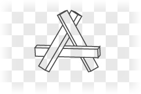
If I’m comfortable with my outlines — and I’d better be, before I move from paper to Illustrator — it might be best to just draw my outlines first
and add in colored, broken shapes everywhere, with nothing overlapping at all.
When I think of ‘layers’ in Illustrator, I think of my object. Like the layers of someone’s costume, layers of fabric.
But a good drawing has a different concept of layers. The drawing itself has layers that are completely unrelated to the layers the viewer might see in the thing being drawn. There are color layers and outline layers and shading layers, things like that.
I think I actually used something like this approach in my Girl Wonder thing, and didn’t quite realize just how good an idea that was until now.
<3
What beautiful, elegant illustrations you made for this post. It explains everything perfectly.