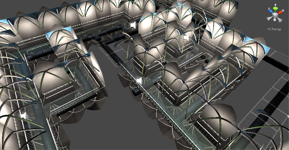
I’m glad I decided to try it because, this gave me a quick overview of what sorts of problems you can expect while making such an environment.
First off,
indoor levels look weird in a level editor
Repeat image from yesterday: this is my level as it appears in Unity’s editor. It’s… dizzying. You’re kind of outside the world, seeing inside things you shouldn’t be seeing inside, and I got rather confused trying to select things and lay them out properly.
i haven’t the foggiest idea how to light this thing
You can’t just slap a directional key light and a fill light on the scene and call it a day. This should have been obvious, but I didn’t think of that before deciding to do an indoor environment.
Well, I suppose I could have had fixed key and fill lights. I’m not much for naturalism, after all, and I would never accept realistic, flat indoor lighting as acceptable. I’m always going to want my lighting to be kind of contrasty and theatrical.
But my mechanics involved turning lights on and off, so I went with multiple point lights. In fact, every single tile has a light attached to it.
I’m sure that’s the absolute worst way to do this.
I considered just baking soft light into my textures, but sort of forgot about that idea as the gamejam wore on. Probably should have done that. My final build was really, really slow, and I’m sure a big part of that was my lighting.
you can’t see your destination
The goal of the game is to get to this one particular area on the upper right of the level. Which is totally not communicated to the player at all.
In an outdoor level, I’d have some big building or monument or whatever that looks interesting and worth going to. In the indoor level here, I wasn’t sure how to express where you were supposed to go, when you were making progress, or even where you were within the context of the level, since all the corridors look alike.
I thought maybe having collectible items here and there, just out of reach, would be the way to go — something just behind one of my transparent force fields, or at the other end of a chasm you can’t jump over — things that say, hey! you can’t go here now, but you’ll be able to eventually, and you will have made some progress through the game by doing so. I even had the locations for these things planned out, but never got around to modeling them and putting them in the game.
I think this approach has merit, but since I didn’t implement it I can’t say for certain what the challenges here would be or how effective it would have been.
tiles are nifty
This was my first foray into 3d tiles, and I like how modular everything is, how I could notice a bit where a puzzle was unsolvable and quickly rearrange my tiles so things were ok.
Trouble is, I made my tiles in this really inefficient way, fully completing and polishing a straight corridor tile before moving on to completing and polishing a T intersection, and finally completing and polishing an L-shaped corner. It certainly would have gone much faster if I had a more assembly line style workflow, like making all the walls at once, then all the railings at once, etc. I could go into a lot of technical detail about beveling and uv mapping, but suffice it to say that there’s a lot of efficiency to be gained by limiting how often you switch tasks.
My one-time-at-a-time approach was motivated largely by a desire to see a completed hallway made of straight corridor tiles as quickly as possible; it was motivated by being insecure and wanting to prove to myself that the quality of the tile set I would eventually produce would be acceptable. Which is silly. Finishing all the tiles was inevitable. I should have done it in the most efficient way possible.
