Every few years, I try to model Star Trek’s Enterprise, or something vaguely Enterprise-like, to practice my modeling skills. Here’s my latest attempt:
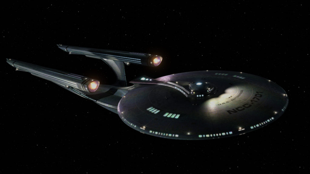
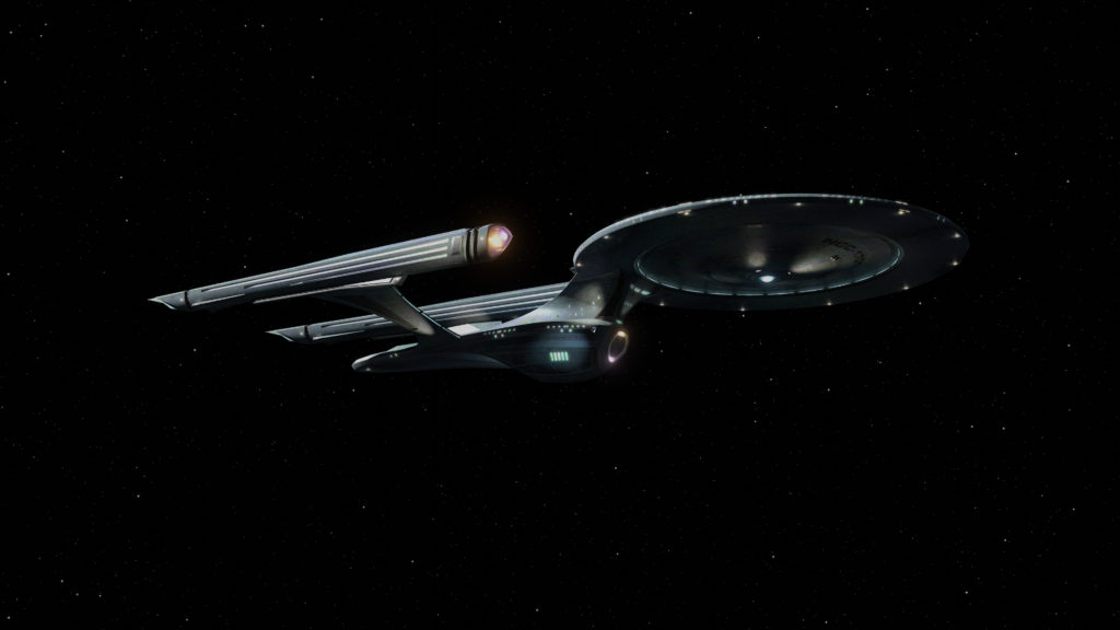
This is, of course not any existing Enterprise, making this an exercise in design as well as modeling. My goals were:
- To be recognizable as an Enterprise that could have been, in an alternate timeline or something.
- To have a silhouette distinctly different from any existing design.
- To look good from a variety of angles.
- To feel futuristic, whimsical, fast, and beautiful, with details that suggest that the different parts serve interesting, specific purposes.
- To make the various parts–the saucer, nacelles, engineering section, etc.–have clearly defined shapes and edges–
- –while simultaneously adding up to an overall form that feels fluid and unified.
- To have big windows looking into bigger interior spaces, giving the viewer a sense of scale and a sense that it’s not just a surface; that there’s depth and activity inside, like a dollhouse.
- To look as realistic as possible.
My goals were not necessarily to:
- Make something that fit in with any particular Star Trek show or movie aesthetic.
- Make a ‘better’ Enterprise-F (I entered this Star Trek Online design-the-Enterprise-F contest long ago, felt weird about getting a runner up prize, the winning design is gonna end up making an appearance in a real Star Trek show now, and I’m happy for the designer… but that’s just not an era or aesthetic or scale I’d ever be interested in and I can say that now, long story).
- Do this in the most efficient or effective way possible.
I can’t say I hit all my goals. Most notably, this can hardly be said to be a bold new take on the Enterprise; it’s really just a variation of the TOS and TOS movie designs. And the whole dollhouse thing probably would have required a different design built around that idea; something based not so much on having a nice silhouette as having nice, layered silhouettes, plural, so you’d see a silhouette that’s just, well, the exterior silhouette, but upon closer inspection you’d see that there are large glassy areas on the exterior that let you see a different interior shape inside–not just inside rooms; you could see the smooth, solid surface of a second interior silhouette whose shape complements the exterior silhouette in an interesting way.
(It’s a little hard to describe what I’m thinking of here. I may just have to try it out and post my results.)
And I wouldn’t exactly call this photo real. I don’t necessarily think it needs much more surface detail–it’s supposed to be pretty smooth–but the textures could use a lot of cleanup. They’re kind of muddy.
But enough complaining; on to the good parts now! I do think my attempts to make something more fluid than those old Enterprises worked, if only in an incrementally-different sort of way. I’ve never liked the ‘neck’ connecting the saucer and engineering section on any Enterprise, and I’m pretty happy with what I came up with for this design.
While I think the model without any texturing has interesting curvy edges and creases and joints that separate and complement the different forms, it took a surprising amount of work to make sure that those curves didn’t get lost on a textured, lit render. So I put a lot of effort into highlighting those, with strategically placed windows, vents, lights and such.
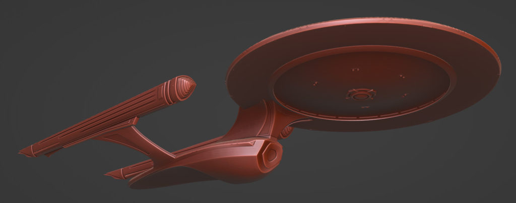
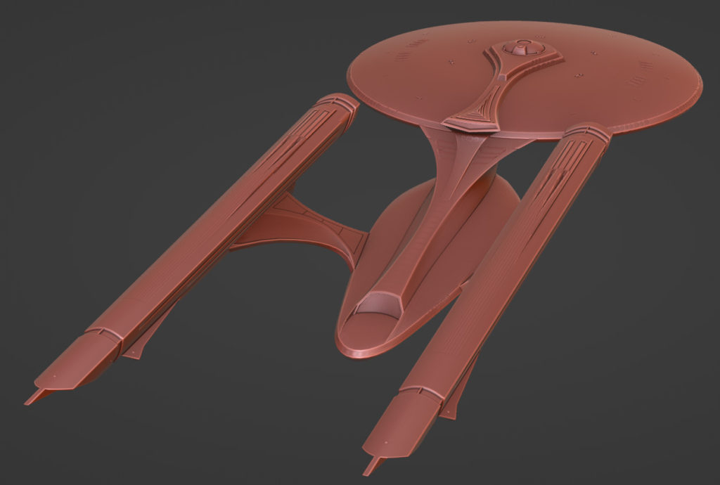
So that’s the whole reason the linear lights on the bottom of the saucer are there, why the windows are a bit less rounded and more densely arranged than their TOS counterparts, and why there are vents on the neck and nacelle struts.
I’m also quite pleased with the colors. I’m using a lot of secondary colors–purples, oranges and greens–instead of the reds and blues you get on your typical Enterprise. I think that that, plus the softness of the lights, makes it feel warmer and more whimsical somehow.

* * *
Of course, the purpose of this endeavor was not to make a pretty-looking spaceship, but to learn. And I’d like to apply what I learned to Tinselfly specifically, to the spaceship designs in the game. Even more specifically, I’d like to shore up this particular design, a ship that’s meant to be really striking and invite you to wonder, what goes on in there?
Here’s what I’ve got so far:
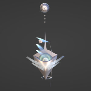
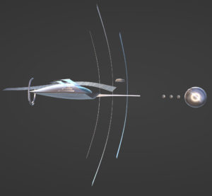
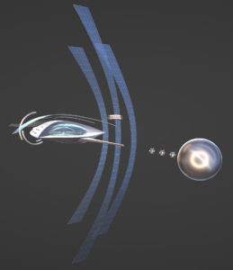
I generally like the direction this is headed, but it could use more… everything I like about my Enterprise above and everything I wanted to do, but didn’t. More interesting convex surfaces. More transparent layers. More softly glowing details that look functional and that could cast light the ship in interesting ways. More edge articulation. More of a feeling of forward motion.
And when it comes time to do texturing and lighting, I want pretty much the same color palette and look for the materials.
I’m looking forward to posting my progress here.
But before I do all that, I think I need to sort out the in-universe functional requirements of the ship, which is something I rarely (read: never) do. Because, it might help with realism (if that word can even be applied to anything in this universe)…
…and who knows, if there’s a Tinselfly sequel, it would probably be set here.