Brian Crick

VHS

So it was around 2000 or so, and Marie and I were living in our second apartment, and our VCR was either dead or dying. And I remember thinking to myself, this is it. This is our last VCR.

It was kind of an odd thought. Not sad or exciting; just odd. I’m not sure I could say I’d bought my last anything before that. But it made sense. Our next VCR wouldn’t be a VCR; it would be a DVD player.

Technologies come and go. Historically I’ve kind of blasé about it. But lately I’ve been thinking about this stuff a lot.

* * *

I’ve been without a pen tablet for about a year now. You’d think I would have rushed out and bought a new one as soon as my latest one failed, but for some reason I didn’t. All the Scopa cards I’ve been posting, the Girl Wonder submission, those were all done with a mouse.

Maybe the pen tablet will be replaced with a tablet computer, maybe not. Drawing directly on screen would be awesome, but I can’t say I’ve really warmed up to tablets yet.

* * *

I haven’t updated my Adobe products in four years. Photoshop,Illustrator, Flash — I’m several versions out of date now.

I may never buy another Photoshop or Illustrator.

Ever.

This thought kind of scares me. I’ve been using Photoshop since around 1992. I’ve invested a lot of energy into learning to use these programs as efficiently as possible, and would probably take a pretty big productivity hit if I switched products. I can open things I haven’t touched in a decade and start working on them without missing a beat.

But I don’t do freelancing anymore, and Adobe’s flagship products are expensive. There’s also a lot I don’t like about these products, not that I’ve tried anything else lately.

* * *

This wouldn’t be that much of an issue, except that from what I’ve read, my versions of Adobe’s products won’t run on the newest version of Windows. When my current laptop dies — and from the looks of things, that’s going to be pretty soon — I’m going to have a bit of a problem.

My strategy right now is to continue working on my own illustration program, and just keep my development tools up to date, which is relatively inexpensive.

We’ll see how sick I get of development after a while I guess. 🙂

Parallel Processing

Got outlines for a couple new Scopa cards.

These two characters are going dramatically faster than my previous ones. I’m changing my process a little, and that’s helped.

Here’s what’s different about the process, compared to when I started this project:

  • The outlines are monochrome. While my final product will have multi-colored outlines, not having to decide upon and change colors while drawing allows me to just draw line after line, really quickly. The whole process will end up being draw lines -> color inside the lines -> change line colors based on chosen fill colors. It seems kind of counter-intuitive, to change the colors of your outlines as the last step in your process, but I’m certain that doing that after I’ve decided on the fills will result in less indecisiveness and repetitive tweaking of the outline colors.
  • There are no fills yet. Again, this lets me just draw lines in rapid succession, and later I’ll draw lots of fills in rapid succession.
  • I’m doing two characters at once. If I’m already in outline-tracing or color-filling mode, I can quickly jump into doing the same task on another character, quicker than I could switch to a different task on the same character. You hit kind of a no-mind groove when sticking with a single tool in Illustrator.

So there you have it. All it basically comes down to is batching my work, and doing similar tasks all at once.

Myssing Links

Yesterday, for no particular reason, I started playing Myst again. My one video game of choice lately (La Mulana) causes my computer to randomly shut down without warning, I had a hankering for a video game to play, and I wanted to reacquaint myself with adventure game tropes (and to that end, I’ve also started Syberia II).

So since I was thinking about Myst, I went looking to see what one of the developers, Robyn Miller was up to.

And I was reminded that he has a web site named Tinselman.

* * *

My stupidly-long-in-development game project Tinselfly is the combination of two different things I was working on a couple years ago.

The name Tinselfly and the game mechanics come from a fairy-tale-themed follow-up I was doing to a game I made for a contest put on every year by Jennifer Ann’s Group. There was a damsel in not-so-much distress, and flying insects that emitted razor-wire-like strings from their bodies, like spiders emit spiderwebs. Hence the name Tinselfly; an earlier potential title was Damselfly.

The other project was Basil Street Bridge, an outer-space adventure starring a girl named Robin, who may have been consciously named after Robyn Miller.

Mash these two projects together, and you get an outer-space adventure named Tinselfly with a lead named Robin.

* * *

Am I getting into creepy copycatting territory here? Probably not.

Is this just a massive coincidence? Probably not that, either.

When an idea ‘just pops’ into my head, I like to trace it to its source. To the extent that I’m going to put a lot of effort into tracking this stuff down, I’m more likely than others to look at my work and find it depressingly derivative.

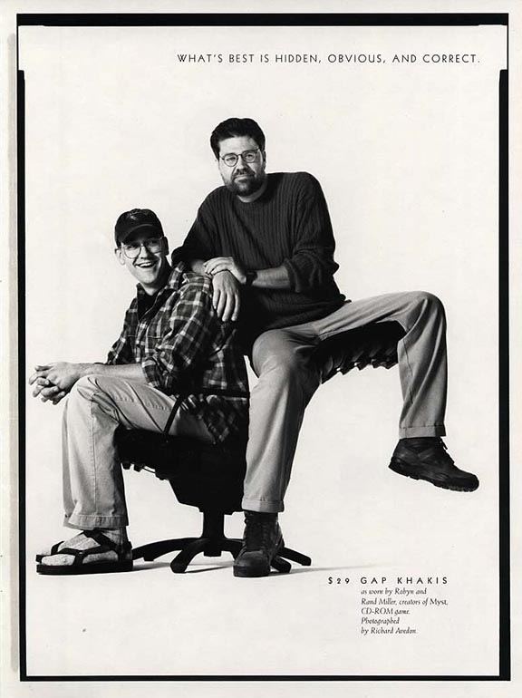
When I first played Myst, I really wanted to be the next Robyn Miller when I grew up. Which would make my brother Rand Miller, the other lead developer of Myst. I thought, in my own naive highschooler way, we might be the next Millers and make the next Myst or something. You know, and do a Gap ad.

The Robin character in Tinselfly is sort of an exaggerated version of myself. Her homeworld is based on my home town.

So in its own way, there’s this weird convoluted logic behind why Robin is named Robin, since I’ll conflate Robin and Robyn and myself.

* * *

I’ll probably stick with the name Robin and the title Tinselfly, but it’s something to think about I guess.

Test Driven Storytelling

At work-work, we’ve started experimenting with something called Test Driven Development.   It’s where you start a new program by writing some tests for it. Since your program proper hasn’t been written yet, your tests will fail.

After failing, you then write your program, and run your tests again. And hopefully some or all or the tests will pass. And you keep working on your program until all your tests pass.

It sounds a little backwards, and I wasn’t really sold on the whole idea at first, but it’s growing on me.

* * *

So I was gonna enter this co-op board game contest.

And then I didn’t.

I could write up a whole postmortem, but mostly what it comes down to is, I chose not to devote a lot of time to this project.  I’m still going to work on the game design. It’s deeply flawed, but I think there’s potential here. In many ways, failing this first test has been a good way to start.

* * *

Video games are filled with tests. Boss battles especially are very test-like. After grinding for hours and hours, you’ll suddenly find yourself in a situation where you have to use all the new equipment you’ve gained and defeat a screen-filling monster in an intensely concentrated test of your skills as a player.

For Tinselfly, I want tests, but more character driven. You can’t progress if you don’t get the characters you’re playing. Their assorted emotional baggage, their strengths, what things make them totally freak out for no rational reason. The story won’t continue if it thinks you’ve missed some of it.

* * *

It’s getting harder and harder to avoid working on actual playable levels for Tinselfly. I’ve done lots of setup, written lots of outlines; the visuals so far are nice… but a decade into this, I still haven’t figured out the details of where to begin, with this whole character-and-story-through-game-mechanics thing.

But it occurs to me that the answer lies in Test Driven Development. In an odd sort of way, a great many conventional stories are test driven.

You start with a hero. The hero is presented with a test in one of the first scenes of the story, and they fail the test. The exact way the hero fails should tell you a lot about them as a person. And then the hero gains new skills, has various emotional epiphanies, improves as a person, and finally passes the test they were originally confronted with. Roll credits.

Lots and lots of action movies follow this sort of template.

So without knowing the details of my first level, I can write the test for it, and just make it up as I go along, which is nice because I hate planning this sort of stuff.  And then I can build the rest of the level around that test, making sure the player has ways to gain the items and area unlocks they need to complete the test, and I can keep iterating until the test is actually completable.

Orders of Magnitude

New Tinselfly build up.

Been doing a lot of math lately. While I consider Tinselfly to be fantasy, it has sci-fi elements like spaceships and living on other planets and whatnot.

I would never call this hard sci-fi. I don’t even like hard sci fi. However, I don’t want people who are particular about scientific accuracy to check out of my story because I didn’t do my homework… and I also think it’s reasonable to say I have a responsibility to avoid spreading misinformation about science or astronomy or whatever, even though this is a work of fiction.

So while I’m still going to have artificial gravity here and there, and invisible force fields keeping the air in fantastic low-orbit cities, I’ve nixed faster-than-light travel, have constrained my setting to a single solar system, and am trying to make sure the sizes of planets and distances and travel times involved are reasonable.

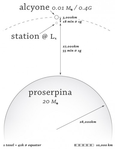
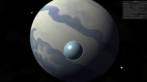
So we’ve got this small but reasonably-sized gas giant Proserpina here, and a moon orbiting it, and a station between the two.

Say you were living on the station but commuting the moon — I now know that it would take 18 minutes to get there, at a 1-gee burn accelerating halfway there and decelerating halfway back, because I know the the mass of Proserpina and a reasonable spot where that station would have to be.

Of course, if you were doing the commute in game, I wouldn’t make you sit on a shuttle for 18 real-world minutes; time is always compressed in games. But the important part is, I know that the commute is reasonable, and that this is something people might actually do, assuming that space travel over short hops like that is cheap enough in this universe. My own commute to an office a couple miles away takes longer than that.

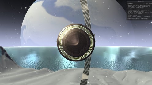
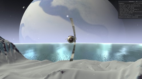
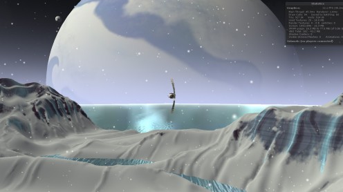
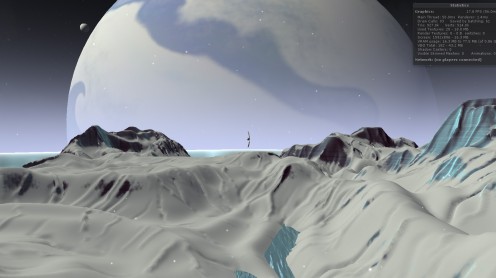
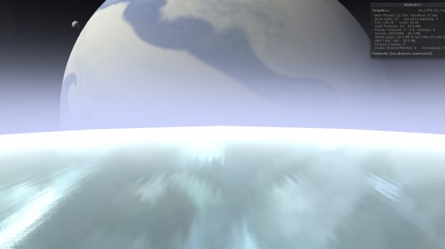
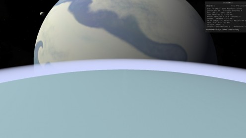
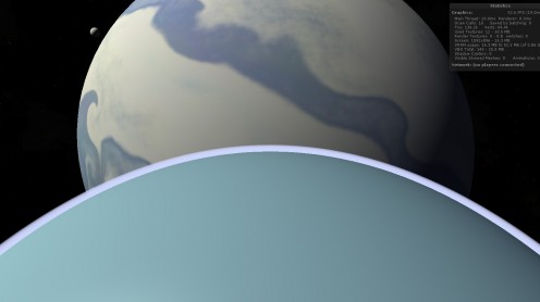
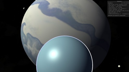
Part of this endeavor also revolves around making sure the size of things you see on screen makes sense. So above, you’re a couple hundred meters off the surface of that little moon, looking back at Proserpina, and that’s really how big a smallish gas giant would look through a typically wide camera lens.

I want to make sure the player understands these scales, or at least, understands that the scales involved in astronomy are so big that they’re beyond comprehension. A big theme of the story is how the characters feel very small, very insignificant.

If you run my latest build, you can zoom out (with the right mouse button or mouse wheel) all the way to outer space, with smooth transitions during every step of the process.

It’s not quite done yet, but I think most of this is more than sufficient, given the challenges involved. The numbers here are so big that my game engine can’t adequately deal with them at face value — I can’t just add a 56,000 km wide sphere to my scene and expect it to render properly in the background .

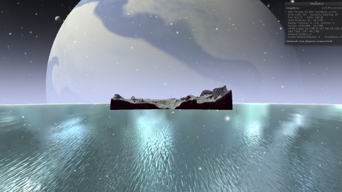
So what you’re seeing here is a composite image, where the landscape and the spaceship and some of the water is being filmed with one camera, and miniature versions of the stars and Proserpina and its moons are being filmed with another camera.

There’s a little bit of code sort of linking the cameras together. When the main camera turns, the miniatures camera turns the same amount. The scale is something like 100,000:1, so if the main camera moves back 1 meter, the miniatures camera moves back a hundredth of a millimeter so things stay lined up right.

If you look closely, you can see a seam in the image above, where you’re seeing two different versions of the water. Maybe I can fix that, maybe not; I won’t be terribly sad if that stays.

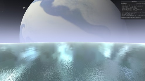
The hardest part was the atmosphere — it had to look right both from the ground and orbit. The way everything gets super bright as you’re exiting is totally accidental, but I kinda like it.

Mostly, I’m really happy with the effect. But it doesn’t interact with the light at all right now, so it glows a bit too much.

Also, my planet needs much more texture — that should be easy to fix.

I actually think a straight zoom like this is a terrible way to communicate scale, but I’m glad I’ve implemented this in a generalized sort of way where I can do whatever I want with the camera and have things show up properly.


Adequately Gorgeous

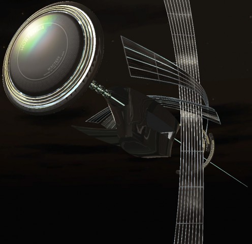
I’ve been obsessing over one particular spaceship model for Tinselfly lately. Mostly, I’m trying to prove to myself that I can make this product look as good as I want it to be.

You can view this in 3d here. (It’s updated from yesterday’s model, if you happened to see that.)

This is rather uneven, sort of by design. That main body is pretty funky looking, because I’ve been ignoring it.

I slip into a bit of a weird workflow, when I really don’t have any faith in my skills. Sure, a decade ago I made this design, ostensibly for this project, and it still looks pretty nice… but since I made that, I decided to make the switch from pre-rendered scenes to realtime 3d, and  I have a long way to go before I can say I’m good at making models for realtime 3d projects.

So I’m shooting for adequate here.

Trouble is, my standards for ‘adequate’ are pretty high. And what I’ll do, when I’m not sure I can make something that meets my standards, is just focus on one small piece of my model or illustration or whatever, and see if I can get it looking ok. Here, I’ve been concentrating on the big disc in front and those shiny lattice-like sails curving around everything. And I hereby declare those things adequate. I’m pretty sure now that I can give everything else — the main body of the ship, the rings in back — a similar level of detail and visual interest.

I sort of wonder, if I’d gone into this confident that I’d eventually get something I liked, if I might have picked a more efficient workflow. I wouldn’t say I’ve done a lot of second-guessing my decisions, but jumping into a challenge expecting to fail probably isn’t a great mindset to have.  That’s how I went into another recent illustration project, and I’m pretty sure that killed my efficiency.

Generally I tend to be pretty optimistic, and that’s been waning a bit, much to my surprise. I think it’s time to reclaim some of that. Being stupidly optimistic can be helpful sometimes.

Larger Than Life

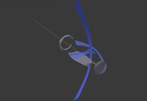
I’ve been working on my Hortensia model (a spaceship for Tinselfly), just roughing out the basic shapes for it. Here’s what it looks like from the front right now:

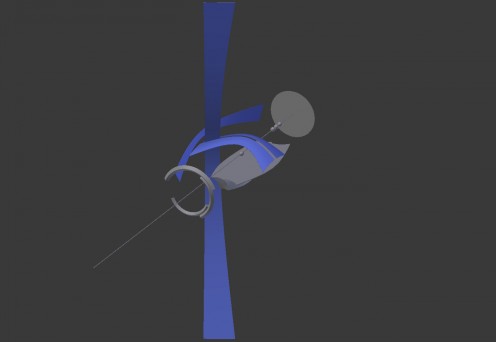
And from the back:

My main goals were to have it look absurdly fragile and have a sort of nautical feel, what with these sail-like structures and all, and I think this is finally getting there.

It’s a bit Tron-ish, but I’m ok with that; whatever I make, it’s going to be something-ish, and Tron-ish feels like a better fit for this story than Star Trek-ish, Star Wars-ish, or a realistic NASA-ish.

Besides nailing down the silhouette, I’ve also been trying to decide how big this thing is, and I’ve finally settled on that, too.

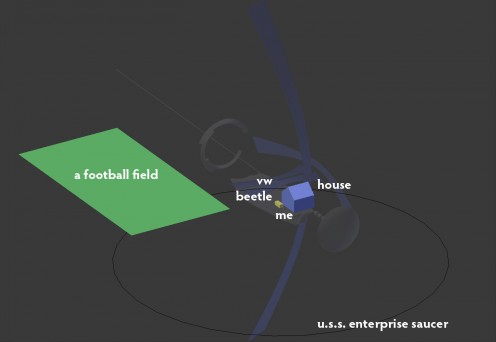
To give you a sense of the scale I picked, here’s an overlay of random things in comparison:

(The ‘me’ bit seems to have been completely obliterated by compression artifacts… you can click on the image to see a larger version.)

By any absolute measure, this is not a big ship. The distance from the front disc to the back of the rings is less than 100 meters. The main body isn’t so much bigger than the Mayflower.

I like that smallness. I like the idea that you could have the whole thing in frame, and see a character on deck or behind a window, and maybe even know which character you were looking at.

* * *

My lead character Robin is supposed to be in awe of the beauty and power of this thing. I could just scale it up; I could make it look big and massive and have it dwarf everything around it; I could make it comparable in size to popular fictional spaceships… but that sort of feels like a cheat. No matter what this ship looks like, Robin has to react to it in a way that expresses her feelings about it. And if I’m not communicating that in some sort of memorable, gameplay-driven way it’s sort of a lost cause anyway.

Here are some random ideas for doing that:

  • Robin occasionally glances back at the ship if it’s in view. (On its own, this isn’t really based on game mechanics, but imagine a scene where you’re talking to someone and keep glancing back at the ship and you fail to hear important information they’re trying to convey; the solution would be to talk to the character in a different location where the ship isn’t in view and distracting Robin.)
  • Robin can run a little faster towards the ship and a little slower when running away from it. (This could also be used to solve a puzzle of some sort.)
  • While near the ship, the camera rises really high, showing Robin dwarfed by the ship. Robin looks up constantly. From this point of view, Robin cannot interact with anything near her, that she needs to interact with; you need to literally get Robin back down to earth to continue.

That’s just a few ideas I thought of while writing this post. Hopefully you can have all sorts of little things that the player experiences, without words, without cutscenes, that tell you about this and other playable characters that don’t have anything to do with giving the player loads of verbal exposition.

Why I Liked Battleship More Than Star Trek

(Spoilers on both movies ahead.)

The other night, I saw the new Battleship movie. And, surprisingly enough, I kept comparing it to the latest Star Trek movie.

Star Trek was critically acclaimed. Battleship was universally panned. But they have lots of similarities:

  • We start with a protagonist who’s a bit of a screwball.
  • Said protagonist demonstrates his screwballness in a scene involving him in a bar trying to impress a girl he just met, and instead getting into trouble.
  • Protagonist gets a chewing out by someone in the military, is told that they have lots of wasted potential, and is urged to join the military.
  • Protagonist joins the military.
  • Protagonist develops a rival within the military, a person somewhat more by-the-book than himself.
  • Bad aliens attack. Good guys don’t fare so well.
  • Protagonist demonstrates his ability to command a ship in a pivotal scene involving his rival.
  • Good guys defeat aliens.

Now, admittedly, there’s a lot more to Star Trek than this possibly pedestrian screwball-does-good character arc, which has been done many times before. And the constraints that movie had to deal with, what with rebooting the franchise and all must have been crushing for anyone involved, But to the extent that I rather like pedestrian character arcs, and am going to focus on that aspect of any movie that has one, I kinda liked Battleship better than Star Trek.

exposition

Let’s start with the screwball. Star Trek’s Kirk gets in a bar fight while hitting on a girl who’d just as soon be left alone. There are nice moments, but it’s not that memorable a scene.

In contrast, Battleship’s Hopper is introduced in one of the funniest scenes in a movie I’ve seen in a while. Here, he girl wants something: a chicken burrito. The bar’s not serving food anymore, so our protagonist, in a desperate attempt to be helpful, runs to the nearest quickie mart to get a burrito. The mart is closed, so he breaks in, warms up a burrito, leaves some money on the counter, makes a huge mess of the place, gets chased by cops and gets tased just after delivering said burrito, falling unconscious at the feet of the girl he’s trying to impress.

It’s absurd, it’s funny, it’s memorable, and it’s strangely endearing. I’d go so far as to say it’s the best introduction of a screwball character I’ve seen.

the set-up

The next few scenes have one of those things where an unfortunate chain of events forces our unprepared, screwball hero into a situation where he suddenly has to prove his worth as a leader.

The captain of Kirk’s ship has to go do some super-dangerous stuff, leaves Kirk’s rival in command, and much to everybody’s surprise, makes Kirk the new second in command.

In contrast, in Battleship, the entire command staff of Hopper’s ship is killed, leaving Hopper as the senior ranking officer. Structurally, I like this set-up a little better. Hopper is completely blindsided by this. He goes from zero to captain in a single scene. We’re shown Hopper’s lack of fitness as a leader because he’s a really bad captain at first. He doesn’t have the trust of his crew at all, but he’s still captain and has to figure out what to do.

Kirk, as second in command, has to prove he’s better than his rival before he can take command and actually make command decisions. We don’t necessarily get a great sense of how exactly Kirk’s loose-cannon-ness might make him a bad captain and why nobody trusts him.

baggage

Both Hopper and Kirk have relatives in the military who die in combat early in the film, and Hopper and Kirk want to live up to these shining examples of military officers.

Kirk’s baggage is his father, who died saving a just-being-born Kirk. It’s noble and all, but you can’t really say Kirk and his father had an interesting relationship.

Hopper’s baggage is his brother, who he lived with well into adulthood, and who he works with in the Navy. We see them talking; we see Hopper’s brother trying to take care of him; we see the brother’s disappointment when things go badly. That relationship is the core of the first few scenes of the movie.

pay off

So finally we have our scene where our hero rises to the occasion and becomes the leader he needs to be, for the world to be saved.

Kirk does it by tearing down his rival. By proving that his rival, the current captain, is emotionally unfit for command.

A rival whose entire home planet just got swallowed by a black hole.

I find that pay off more than a little anticlimactic. If your home planet just got erased form existence, you might be a bad captain for a while, too.

In Battleship, Hopper proves his fitness by temporarily letting his rival run the ship, because his rival has come up with a brilliant plan for defeating the aliens. Hopper proves his fitness by acknowledging that command isn’t about doing everything yourself; it’s about  understanding the strengths of your crew and managing them well.

On an emotional level, I actually found this surprisingly satisfying. That arc really worked for me.

set piece

On a completely non-character-driven level, I liked the action scenes in Battleship more than Star Trek too. Being based on a board game, everything’s a bit more, shall we say, rules heavy. And I think any good set piece should have rules. Some people might groan at Hopper’s rival’s plan to chart the course of the aliens on a giant grid with letters on one axis and numbers on the other, but I rather liked that. It was better than watching starships flying at each other with guns blazing. There’s no structure to that.

And I rather like silly, overly abstract structures overlaid on my movies, whether you’re talking about set pieces or character development.

Extra! Extra!

Been working on a randomly-generated-extras system for Tinselfly.

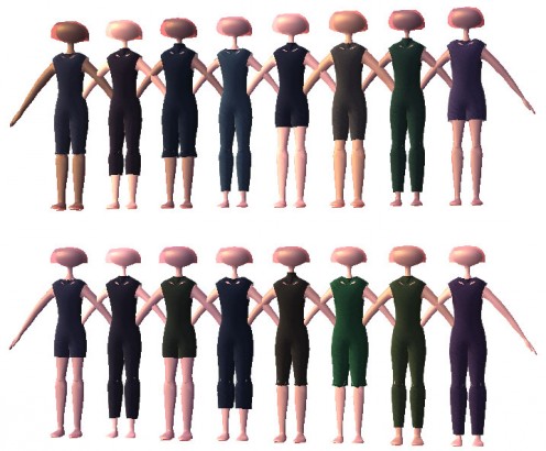
It doesn’t look like much yet, but I’m pretty excited. The idea is that if I have background characters in any given scene, they’re all going to be dressed in a similar fashion or they’ll be easily divisible into two or three classes of extras who are all dressed similarly. So for example, one ‘class’ might be people in navy uniforms. The uniforms will all look mostly the same, but there might be a little variation in the details: most people will have their shirts tucked in, but some will have their shirts untucked. Some people might be in short sleeves, and some in long. And of course, there would be variation in the people themselves: skin color, weight, height, hair style.

So here I’ve got a simple sample class that defines a character with some variation in weight and skin tone, and a plain garment with variable thickness, color, collar size and leg length.

Eventually, I want more detail and more variation or course; in one particular scene, I even need people in nice white dress uniforms with randomly placed blood stains that vary from shiny and red to matte and brown.

It’s going to take a while to get there. Besides procedurally generating character meshes, I need procedural textures with patterns, trims, lapels, and details like pockets or randomly generated fruit salad on people’s chests, if I want to get really detailed about it. All of which I’m pretty sure I can do, and it’s tempting to dive into all that, but my first priority is to make sure my procedurally generated characters can be animated.

In addition to extras, I’m going to be using the same system to define the look of my leads. And I’d like an animated, working, playable character as soon as I can get one so I can start on gameplay and level design stuff while keeping all this character generation stuff at a trickle.

Because I’m probably going to be making improvements to the character generation throughout the entire project.

Sensor Sweep

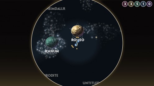
Got a new Operetta build up.

I’ve also been working on a musical theme for the game.

music

I’m trying some weird chords and progressions here that I can’t even quite describe, and I like how that’s lending a sense of exoticism without just sounding like I don’t know what harmony is supposed to sound like.

However, the instrumentation is giving is this journey-though-the-desert feel, which isn’t quite what I want… I want something more adventure-on-the-high-seas.

Well, actually what I want is a similar sound to My Name is Lincoln from The Island, better known (to me) as part of the trailer music for Elizabeth: The Golden Age. I want something that sounds both like sci fi and a period drama, if that’s possible.

gameplay

I’ve added a bit where things are only visible to the player if they’re close to the player, or if this new spinny radar thing of yours has recently swept over it.

This was a little difficult to pull off — it involves some custom shaders and pixel-by-pixel bitmap drawing, but I like the effect.

Right now, anything could be invisible if you’re too far away; that’s just for testing. Eventually, only objects marked as cloaked or hard to see will ever be invisible, and everything else will be visible at all times.

There’s a little bit of weirdness in the planet labels; apparently, Unity doesn’t let you use custom shaders with those. Like, at all. I was worried about that at first, but that shouldn’t be too much of an issue, since planets should never be cloaked.

Also, I’m not sure how I feel about the communication to the player about where the sensor is sweeping. Right now, there’s just a slight bit of darkness in the places you can’t see, and I like how unintrusive that looks… but it might be a little too unintrusive. I dunno.

Anyway, next I’ll be working on your item list, which will mean putting lots more work into my home-grown GUI system.

Copyright © 2017 Brian Crick.