Brian Crick

Sanity Check, Part 2

Since her vacation is nearly over, I guess it’s time to evaluate my progress keeping things together while Marie is away. This will, by necessity, be fiercely dry.

To recap: in the past, I’ve noticed a tendency to become slightly unstable when the following triggers are present (I’m not sure which are important):

  1. Marie is away…
  2. …and unreachable via phone, IM, etc.
  3. I’ve started working in a new environment…
  4. …with new people.
  5. It’s early fall.

Said instability has, in the past, manifested itself in the following ways:

  1. General confusion.
  2. Vague feelings of being unable to keep friendships alive.
  3. Inventing memories about hurting a friend, and then being distracted or incapacitated by guilt over said memories.

So. As for the current situation, triggers (1), (3), and (5) are present. It just so happens that my company moved offices recently, and I have just now started coming in to work at the new place.

However, only result (b) has actually happened. And maybe a little bit of (a), but only very little. I am presently regarding the insecure feelings I have with massive amounts of suspicion, and am confident that my concerns lack any real factual support.

As for (c), said friends I’ve worried about have historically had consistent physical characteristics; I have therefore identified a couple potential candidates for the person I’d be obsessing over now. Thankfully though, this has not actually happened, and my perception of my relationships with said candidates has appeared perfectly normal in the last few days, as far as I can tell.

To sum up, this has largely been a non-event. I credit:

  • Being aware, for the first time, that problems were likely to arise;
  • Frequent contact with Marie;
  • Frequent breaks to stop and think about past experiences with Marie (this is not something I naturally do);
  • Going into this while genuinely happy with my social life and life in general (unlike previous episodes);
  • The distinct possibility that nothing bad was likely to happen anyway, despite my stressing out about it.

So, that’s a very long-winded way of saying: yay, nothing happened. πŸ™‚

Looking forward to seeing Marie again tomorrow.
Keys and Locks

It’s a little late, but I have a new Tinselfly build up.

(As much as I like being able to embed the player directly in blog posts, I realized it would make the home page on my site here load horribly slowly after a while, so I’m gonna just link to them from now on.)

So anyway, there’s a more structured map now. Whee! Though, sadly, it’s somewhat difficult to talk about at this point, since the structure doesn’t really mean anything yet.

The basic idea is that the map is divided into these different areas. Which are different colors right now just for debugging.

You start in the red area. Somewhere in the red area, you’ll find a yellow key (not in this build, but later on). The key could be a plain old key that opens a door, or it could be a new equippable item that lets you cross rivers, or a map that helps you through a maze… it’s a very metaphorical sort of key, and the point is, the yellow key will let you into the yellow area. So somewhere on the boundaries of the red area, there will be a metaphorical locked door, an obstacle of some sort, that once unlocked lets you into to the yellow area.

Somewhere in either the red area or the yellow area, there will be a green key. And somewhere on the perimeter of the combined red and yellow areas, there will be a locked door leading to the green area.

And it goes on like that.

So right now you can’t see the keys or locks, but you can see the boundaries of the areas.

And that’s the basic idea behind the map generation I’ve been working on here. Which I’m sure will be much more exciting once, say, you can’t just move through the area walls. πŸ˜‰

Zombie Game Trailer, Part 2

Here’s some more babbling about that Dead Island Trailer; I realized last night I missed a few things. (And, same warning as before: it’s very gory, and, I forgot to mention last time, possibly quite unsettling in other ways, especially if you have kids.)

Inevitable Doom: Zombieland

I find myself comparing the music in the trailer to Estasi Dell Anima, the big climactic battle cue from Zombieland. Maybe just because they’re both about zombies, but they’re also sort of communicating similar emotions in similar ways. And hey, if you’re going to score something about the inevitable destruction of the good guys, chances are good that you’re doing it for a zombie-themed something or other.

So… inevitability. First off, both pieces are very repetitive. They’re not about a changing, dynamic scene so much as a single moment, stretched out to the length of a song. They also have very simple beats: the relentless quarter notes in Dead Island; the whole notes in Zombieland that give way to some 3/4 violin wailing. Nothing says endless like a waltz. Worked so well for Gladiator. πŸ™‚

From what I can recall, this sort of incessant, repetitive drum-beating is pretty common to slow-motion scenes of death and destruction.

(Incidentally, it occurs to me that Zombieland, structurally, is very similar to what I’d like to do with Tinselfly. Simple coming-of age story wrapped in an end-of-the-world scenario. I may have to watch that again.)

Shortcuts: Star Trek

It’s not like I was invested in the characters in the Dead Island trailer. It’s not like we get to know them real well. They’re an archetypal happy family who thought they were going on vacation. There’s a rugged dad, a panicking mom, an innocent little girl. By the time the trailer was over I was a bit misty, but if I was engaged, it was only because the characters were easily recognizable archetypes. Would this have worked if the kid were a scruffy teenage boy? With a same-sex couple? An axe-wielding mom? I don’t know.

Reminds me a bit of the opening of the latest Star Trek, where we spend a few minutes with a couple we really know nothing about. We’ll never see them again, but the scene is touching anyway because there are certain backdoors into our collective psyches that just work, despite our best attempts to be cynical about them: family; protecting a child; someone giving birth.

I have mixed feelings about this, but despite my aversion to gender-specific stereotypes and whatnot, I mostly don’t have a problem with using archetypes, at least not in something this short. Again, from that interview:

On the subject of the Daughter character specifically, we were aware that there was an impact about that choice for sure, but I think that choice fitted the narrative we wanted to tell and was appropriate in that sense.

As the audience you feel that fear much more strongly through the eyes of a child. Some people will see that as being ‘manipulative’ which is fair enough. It draws you in, makes you care. That’s quite a hard thing to do in 2 minutes and as some commentators have pointed out all effective fiction is ultimately manipulative in that sense.

I totally agree that all fiction in manipulative. It’s your job as a writer to produce specific reactions in your audience at specific times. That’s manipulation. And the shorter your work is, the more dirty tricks you’re going to have to use.

I guess the line I’d draw is that I’m ok with archetypes as long as you’re communicating the nature of said archetype using their clothes and body language and grooming — stuff independent of their gender, age or color. So you could have had a clean-shaven, panicking dad in a festive Hawaiian shirt, and an axe-wielding mom with scruffy hair, visible muscle definition and a sports jersey, and you’d still get your easily identifiable family that you can connect to.

Everything I Needed to Know I Learned from a 3 Minute Zombie Game Trailer

Guess I’m a bit late to the party, but I just saw the much-talked-about Dead Island Trailer. (Warning: it’s very gory.)

Despite some slightly janky motion capture, I think this is the most beautiful game trailer I’ve ever seen. Not that I’ve seen a lot of video game trailers, but hey, I found it more moving than most movie trailers anyway. And I find myself obsessing over this. Maybe it’s just that I’ve had a lot going through my head lately and my thoughts decided to all coalesce here. Who knows. So here are some random thoughts.

Music

More than anything, I’m obsessing over the music. It’s really elegant and effective. So I thought I’d try to reproduce it as best I could.

Here’s my version of the first phrase. It’s not quite there, but I think it’s a solid effort.

Despite — or perhaps because of — the simplicity of the original piece, this was really hard to pull off. Here’s what I learned:

  • Pay attention to velocity. If you play all the notes at the same velocity, or loudness, the piece sounds like crap. There’s no sense of forward movement, no rhythm. Just a bunch of monotonous quarter notes. There’s no percussion or anything keeping the beat, so it’s up to the melody itself to tell you where each measure starts. So apparently, you want the first note (of four) to be loudest, and your third note to be the second loudest. So the beginnings of your measures are well defined, and the beginnings of each half-measure are pretty evident too. But it’s got to be pretty subtle… seems like one of those things where if you do it right, everything sounds even, even though it’s really not. Sadly, I don’t have the coordination to do this in realtime, any more than I can use the pressure sensitivity of my pen tablet effectively, so I had to manually alter the velocity of each of my notes after playing them, one by one. Gotta practice doing this for real.
  • Use your mod wheel. The mod wheel is this dial on a keyboard that does… stuff. It’s different for different instruments. Sometimes it gives things more vibrato; sometimes it makes things warble in this really strange way. For the violin I used here, it softens the sound of the instrument — both in terms of volume and the sharpness of the sound. I’ve never really used the mod wheel before, but here it was essential to get the violin to swell and taper off like it does in the original piece.
  • Tremolo is fun and easy. The violin does this barely audible tremolo in the beginning. At first I wasn’t sure I could do it since I don’t have a ‘tremolo violin’ instrument, but it was easy enough to get that effect by, well, doing tremolo — by rapidly vibrating my finger on the note being played.
  • Filters can do more than make echoes. So there’s this piano in my music software. And yeah, it sounds like a real piano, and I could play the song on that… but it sounded totally wrong. Too bright, too happy. The original piece’s piano has this sort of muffled sound. I started with a reverb filter, which is the only filter I’d used before, mostly to make things sound like they’re being played in big stone halls. It helped, but wasn’t quite enough. So I added an equalizer filter too, to chop out high frequencies. That dramatically changed the sound of the instrument, and I got much closer to the sound I wanted with that.
  • Key matters. My inclination when analyzing a new song is to transpose it to C — to change the pitches of everything so you’re just using the white notes of the piano. I did that here, and something felt off, so on a whim I put everything back in the right key. And then it sounded a lot better. I really don’t understand why yet.
  • Simple, common chord progressions are fine. This starts with a I-V-I-V-VI progression, which as I understand it is fairly common. (Also recently noticed that How to Train Your Dragon uses a very common pattern.) I should study some of the more commonly used progressions out there; I have a list in one of my books already.

Gimmicks

The bulk of the trailer is filmed backwards. It works extraordinarily well, and there’s a great sense of closure to the way it ends (begins?)… to the father reaching for the daughter, but since it’s backwards, he’s getting ever farther from her.

There’s a scene in Tinselfly I’d wanted to go backwards, but it’s not a particularly emotional scene; it’s more expository. There is a particularly emotional scene I was planning on doing forwards, but now I’m wondering what it would be like backwards.

You could rightly call that gimmicky, blatantly aping this or Braid or whatever, but as far as I’m concerned, if the story is better communicated by doing this part backwards, then I’ll do it backwards. It’s only a gimmick if you’re using some avant garde approach because you think it’s cool and not because you think it will work.

Game Trailers

There’s this interview about the making of this trailer, and I found this quote particularly interesting:

To an extent a full CG trailer is always a different experience to actually playing the game. It isn’t trying to pretend to be game play, like a lot of CG trailers do, at all. It’s more trying to tell a story in the same world but in a different medium that describes an event that is illustrative of the type of interactive experience you might have when playing. All we have tried to do is tell that story as effectively as possible.

I have to admit there’s a certain logic to this. And the results are kind of refreshing. I never get much of a sense of gameplay from trailers anyway, so why not use this medium to do what it’s best suited for?

Though on the other hand, you could apply this logic to demos and argue that they should ‘tell a story in the same world’, but in a highly abbreviated fashion compared to the game story proper. I think that might be interesting.

Damage

Here’s another thing related to Tinselfly. On its own, I don’t mind gore, but here, it weirds me out a little because the characters are a little cartoony. It’s like… dismembering Wile E Coyote. Sure, you can flatten him and have bombs explode near him, but it’s all cartoony violence to go with the cartoony character who will react like a rubber toy, not like something that’s made of skin and muscle and brain matter.

I don’t intend for Tinselfly to have particularly violent gameplay (not in the story mode proper anyway, but that’s a long discussion). However, there will be violence here and there, and I have every intention of making said violence come off as brutal and visceral as I can make it. Now, that’s different from gore, but the issues are similar. She’s not finished yet, and I’m not saying this will happen, but could I, say, have my Robin character model be crushed to death on camera? I think I’ve asked that before, but I still don’t know the answer to that.

Basic

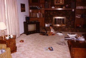
Found this picture while cleaning the other day.

So here’s the start of my amazing career as a computer programmer. You can see most of a latch-hook duck that I was working on in the foreground; that’s not so much different than making pixel art, when you think about it.

This picture is kind of freaking me out. Sure, everything is so horribly dated, with an awful 70s couch in one corner and a barely visible open-reel player in the other. And I don’t see old pictures of myself often; I didn’t think we had any at all around here.

But mostly, I’m thinking about the Basic programming book that came with the computer I’m sitting in front of. It’s sitting on top of the grey box behind me; you can see the blue spine with white and black stripes on top. Presumably, I had been reading this book around the time this picture was taken. Given the position of the television and non-avocado carpet, I actually suspect I had gone through it or had already finished it a year or three before the picture was taken. I’m not a good judge of age; I was 6 or 7 when I started and I’m not sure how old I am in the picture.

I can’t believe I read that book. No, really. I don’t mean, I think it’s incredible that I read it. I mean, I’m doubting that I did. It’s almost 150 pages long. It’s written for people completely unfamiliar with programming, but it’s not exactly written for kids. While illustrated, it’s got fewer pictures than the programming book I’m reading now.

But I did learn Basic around this time, John has no memory of teaching it to me, my parents didn’t know how to program this particular computer, and I can’t find any evidence out there of a different, more beginner-y type book that would have come with the computer. Though I do remember typing in programs verbatim from computer magazines, which itself was a good way to learn.

So most of my knowledge must have come from that book.

In many ways, that’s kind of an anachronism. I’m having trouble imagining what the modern equivalent of that would be. Computers don’t come with programming books anymore, much less languages to program in. I suppose a motivated kindergartner could do HTML & Javascript, but they’d have to go looking for instructional material. That’s really different than stumbling across a book that was bundled with the computer you’ve got, a machine that wasn’t really bought so anybody in the house could learn programming.

Though I guess I can’t really complain that modern kindergartners don’t have access to spontaneous, unexpected avenues to learn new things. That’s what web surfing is for. πŸ™‚

Reticulating Splines

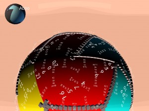
Well, this is very Hollywood OS.

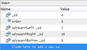
I’ve been working on map generation for Tinselfly, and have been having some trouble with that. And last night, I wasn’t just having trouble with my code; I was having trouble figuring out how to even begin debugging my code.

The world here is made of a bunch of triangles, and I wasn’t sure I was creating them all properly. So after an hour or two of slogging through my debugger and inspecting properties for my objects, I thought I’d just add some debugging information directly to the game world. So all the text you’re seeing, that’s information about what order my triangles were created in, what their unique IDs are, and which other triangles they’re adjacent to.

As you move around, the text moves too. Because the text is, after all, part of the game right now.

It looks like overkill, but it’s been immensely helpful.

* * *

1993. SimCity 2000 has just come out. I’m sitting in a computer lab, working on a 3d vector-graphic tank game in Turbo Pascal, a little like BattleZone.

Sure, it’s just primitive vector graphics, but it takes an insane amount of preparation to get a 16mhz computer to do this, in a programming language designed for learning, not for efficiency. Before you can draw a single graphic, you need to create a bunch of tables that the program can look at, so instead of solving complex, but common math problems every frame, it can just look up the solutions in a table.

Creating these tables takes the program a couple minutes. To make the wait a little more tolerable, I add in some messages about what the program is doing and how far it’s gotten. Some of the messages are useful. Some of them are not; they’re just silly, nerdy technobabble. Like the ‘reticulating splines…’ message in SimCity.

A not-so-nerdy friend of mine walks in and sees my program running. While he’s not as into programming as I am, he immediately picks up on the fact that this technobabble isn’t what it seems to be. He accuses me of trying to make my stuff look more involved than it really is, and walks out.

It isn’t a playful jab. He’s sincerely disappointed.

I’m mortified. Because he’s right. Sure, there really is some complicated math going on here, and getting this to work was no small feat. I want people to know that. Even the simple act of drawing a single line on the screen requires custom code that I’m proud of having implemented on my own.

But my status messages should have communicated exactly what I needed to know; no more, no less. I strip the messages out. They weren’t in my program for more than fifteen minutes.

But for years after this, I’ll be very nervous when talking to non-technical people about programming tasks. I’ll be very careful to choose words and phrases that are clear rather than impressive.

* * *

The moment I saw that globe with those numbers floating around it, I started to worry that this was more about making me feel proud about doing something complex, and less about solving a problem.

However, my problem with Tinselfly right now is all about spatial relationsips. It makes sense for my debugging information to be presented in a graphical way, rather than the text-only debugging screens I’m used to.

I kind of like silly, overproduced computer interfaces in movies. I sometimes think those computers might be fun to use.

Though in reality, overproduced interfaces just get in the way a lot of the time. You’ve got to have exactly as much interface as you need. And sometimes, just sometimes, what you need is a bunch of transparent numbers swirling around a colorful sphere. Which is kind of cool.

Anger Mismanagement

Time for some just-before-bed rambling, though I think the danger of posting something I’ll regret is minimal.

Been feeling kind of cranky for the last day or so. (I won’t get into the why; that’s a separate issue that I should deal with, since my tendency is not to deal with such things at all.)

But anyway, what I wanted to talk about was my propensity to try to capitalize on that sort of thing.

Like many people, I’m more productive — far more productive, and creative, and willing to stay up late working on things — when upset. Wired recently did a piece on how this may have worked wonders for Apple. And I’d definitely say my output the last day and a half has been pretty great.

I don’t like that this happens. Thankfully, I’ve stopped going out of my way to willfully upset myself for the sake of increased creativity… but I’m wondering if capitalizing on being angry when it organically happens is just as bad. It makes me value being upset. It might serve as a disincentive to, say, repair the situation that’s causing this.

See, I knew this was going to happen. I knew yesterday morning that, at some point yesterday afternoon, something was likely to happen that would make me cranky.

So while I’m confident that I’m not, by my own actions, getting myself into a heightened emotional state anymore, I may still, by inaction, be willfully allowing this to happen, and continue.

Maybe.

Just something to think about for a while.

Absolute Position

I finished my mini map! With, like, 40 minutes to spare. πŸ™‚

What’s New

(The Short Version)

First, the map is divided into different colored areas. They don’t really mean anything right now, but they’ll become important later.

Next, there’s a globe in the upper left corner. There’s a little arrow showing you where you are, and the colored area you’re currently in is highlighted.

User Interface Design Rambling

It was surprisingly not-straightforward to make that globe.

But the basic idea — and the reason it was so complicated — is that I’m very picky about how to communicate position to the user. I want the user to think of the world in terms of a small number of discrete, countable areas. It’s all about chunking. You’ll notice that as you move around within an area, The globe doesn’t really move much, but if you enter a new area, the globe will swivel to give to the best view of whatever area you’ve entered. I want the user to remember the colors of the areas, and the shapes of the areas, and if eventually the areas have names, I want the user to remember those, too.

So they can divide the world into manageable parts, and hopefully, that will help them navigate.

There’s a slight complication because the world is round here. Say I was using a map of the real world here, and my areas are continents instead of colored blobs. You start in North America, and the globe shows you North America, with Canada at the top and Central America at the bottom.

So you move around, and go visit the other continents, and when you come back to North America, suddenly Canada isn’t on top. It’s on the side. You never rotated the camera or anything, but it’s just the way navigating on a sphere works.

At first, I added some code to re-orient the globe to that North was always up, so that when you went to any given area, it was rotated the same way as it was the last time you were there. And that was nice and all, and it really helped reinforce the shape of the area and your memory of the area, but it was hard to tell what exactly would happen when, say, you pressed to up key. The arrow wouldn’t necessarily move up.

So instead of having a canonical rotation for each area, I’m just orienting the globe based on the orientation of the camera. And yeah, that can change over time, but I think that with the unique area colors and shapes it will still help with navigation the way I want it to.

Next Up

By Saturday night next week, I’d like to have my map generation more complete, with obstacles on the boundaries between areas.

Fun with Windows

I’ve recently started reading two new blogs: indie game news, and official Windows 8 design stuff.

It updates rather infrequently, but in many ways, I find the Windows 8 blog more interesting than the games one. More to the point, I find UI design & programming more interesting than game design & programming.

I suppose this says a lot about me, even though it’s already been said: I’d rather work on apps than games. Not that I find game design unworthy of my time in an absolute sense; it’s just a sort of consolation prize in some respects.

Still, I’ve managed to get Tinselfly back at a reasonable trickle, and have even been working on my board game a bit.

With the way work-work has been going, I’m clearly not going to have something ready to submit to this year’s Independent Games Festival. (I’m not at all stressy about that, but that’s another post.)

However, I’ve recently discovered Windows Gadgets, those little things like clocks and news feeds that sit on your desktop.

I don’t generally use my desktop. I get grumpy if there are more than a couple files on it at any given time (which, for the record, there are now).

Also, I don’t generally use the two monitors I’ve got. When I do, it’s great, but generally, I just use the nice big external one. So I put a few gadgets on my usually-empty laptop monitor in the hopes that they’ll help with my productivity somewhat.

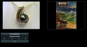
The first thing I did was add a couple of image slide shows. The Pictures folder on my computer consists mostly of random things I’ve grabbed off the web; anything I find interesting, I save locally. But I hardly ever open my Pictures folder to look at this stuff. So now a couple random selections of mine are always visible, and it’s interesting to look at the combinations of things that come up and think about how they might fit together. Good for brainstorming design ideas.

The second thing I added was a simple countdown tool. I was posting countdowns to the Festival on this blog here, and while that was cool and motivating as long as I was looking at my own blog, I kinda forgot about it easily. So I’ve got something right on my own desktop now.

Furthermore, I’ve decided to use it in a more granular way than I was using the Festival countdown; here you can see I’ve given myself five days to get random-map generation working for Tinselfly. I like deadlines. I’m much more productive with a deadline.

I’ll probably also add more countdowns — you can do that — for more long term goals like a playable adventure mode and a release candidate date too.

So.

With any luck, I’ll be posting a new Tinselfly build sometime in the next five days. πŸ™‚

Sanity Check

Sometime in the next month or two, Marie will be taking a trip to London. I’ve been a little stressy about this. I tend to become easily confused when Marie isn’t around. She sort of grounds me in the present; when she’s away, I have a tendency to forget that the last 15 years of my Marie-filled life ever happened.

I have been known to invent memories about having let down my friends in horrible, horrible ways while Marie is out. I have been known to be mostly unable to function because I’m feeling so horrible about these horrible things I didn’t actually do.

But this is all pretty laughable compared to the problems of my mother in law, who’s sitting in my living room right now. She’s a paranoid schizophrenic, who’s not on any medication.

Evil medical students are trying to perform experiments on her. Andrew Lloyd Webber stole all her ideas. Random people are trying to beat her up in her sleep.

It must be awful to live in the world she lives in. I wish I could show her around my world, which is really quite a happy place the vast majority of the time, but I can’t do that.

I suppose it’s good, every now and then, to be reminded that sanity is not a given for all of us, and to be grateful for how sane I am most all of the time.

And I can now stop being all whiny about what will happen to me while Marie is away.

Copyright © 2017 Brian Crick.