Brian Crick

Learning to Walk

Still horribly busy with work-work.

But while I’m waiting for a giant database restore and a giant software install to finish, I thought I’d babble about this, my first foray into absurdly long work weeks.

Now, I know, for some of you, this is nothing remarkable; my impression is that I’m lucky to have been working as a programmer as long as I have and not have had to put in hours like this yet. But this is new to me, so have some rambling thoughts on the subject.

I’m finding it useful to compare this to running. It’s nice and concrete and physical.

Just as I can decide to sprint instead of walk, I’ve trained myself to sort of mentally sprint on command. I will think more clearly, solve problems more quickly, type faster; I will be less likely to lose track of what I’m doing.

It’s a rush.

And just like sprinting, this is not sustainable and will kill my pace in the long run. I will even forget to breathe sometimes. If I start off my day like this, I’ll be a zombie by the afternoon.

So I have to be careful, not just about how many hours I’m working, but how I’m working when I’m sitting at the computer. Which means slowing down a bit.

Until recently, I didn’t really know how to slow down. It’s like I’m sprinting, and when I get tired I just fall over and take a nap. Walking was a skill I didn’t have. Until recently, I didn’t know how to code while tired. When I needed a break, I did something that was different from coding like doodling or playing on the piano.

But I’ve recently learned that — gasp — there’s such a thing as taking a break to write different code. The same way there’s such a thing as moving when not sprinting. To approach the whole act of coding in a different, more deliberate sort of way.

This programming book I’ve been reading has been immensely helpful. Without going into too much technical detail, it’s a sort of cookbook filled with common recipes you can use over and over again, so that programming becomes not so much about brain-hurting problem solving and more about calmly looking for an appropriate looking recipe card. Figuring out which recipe I should be using for any given problem and then following the directions there is something I can do while kind of fried. And I’ll feel refreshed afterwards.

I need to learn more ways to code that require less thinking.
Rose Colored Apples

Played Apples to Apples, among other games, with some friends last night. I hadn’t played said party game in quite some time and had been missing it. In addition to being great fun, it got me thinking about the way we perceive each other.

If you haven’t played the game, it goes like this: there are two kinds of cards, nouns and adjectives. Each player has a hand of noun cards. The players take turns being the Judge. The Judge flips over an adjective card at random and shows it to the other players. The other players then pick noun cards from their hand that they think the Judge will think is described by the adjective. The Judge shuffles all the submitted noun cards, lays them out on the table, and picks the one they think is best. Whoever played the winning noun card gets a point, and keeps the adjective card in front of them as a way of keeping score.

This is all totally subjective. If I were the Judge and flipped over the adjective scary, people could throw out Ben Stiller or they could throw out Going to the Dentist, and neither of these answers is intrinsically more right than the other. It’s all about my subjective opinion. Given those two options, I’d choose Ben Stiller as the scarier of the two and whoever threw that card out would get the word scary placed in their score pile.

We like to joke that the adjectives in your score pile are somehow descriptive of you as a person. I had radiant, fuzzy and playful in front of me by game’s end. Those seemed to fit me, just as the player next to me seemed to think that the words like hostile in front of him somehow were appropriate to him.

Now, you can chalk all this up to seeing patterns where there are none; people are good at that. But I actually suspect there’s more to it than that. This is a game about knowing other people. And for each of us, ‘knowing’ can mean something different. As for me, when I’m getting to know someone, I find myself focusing on things they sort of find innocently beautiful, or fun, or tasty. I’m less likely to care — and, more importantly, know — what a friend of mine finds scary, or violent, or sexy, or thought provoking. So I’m going to be better at collecting certain kinds of adjectives than others. I don’t know or particularly care what my friends’ political opinions are, so i’m going to have a hard time throwing out the right card for an adjective like corrupt. And this, this not caring about certain adjectives, does without question define me as person.

Sometimes, I’ve been listening to friends describe people I didn’t know, and their choices of what details to include baffled me. This person is good at games. This other person is very passionate. This person is attractive. I would never describe a person using those terms; I simply don’t care, or notice things like that. But other people do, and that’s part of what makes them different as people than me.

So to the extent that other people will focus on different things than me when trying to define themselves and others, I suspect that they will, in fact, tend to collect noticeably different kinds of adjective cards than I will.

And, that’s kind of fascinating, and I suppose that’s another reason to love Apples to Apples, which is already one of my favorite games.

Puzzle Pieces

Work is amazingly busy right now, but I wanted to take a break to talk about collages.

So I had this freelance client who wanted a brochure done, full of artwork he’s selling. And on the cover of the brochure, he wanted a collage of 12 of his favorite images.

And I thought to myself, yikes, this is going to be tough.

I had to fit all these differently sized images together in such a way that:

  • There is no whitespace between the images.
  • The images do not overlap.
  • The images should retain their original proportions as closely as possible, with a minimum of cropping.
  • The silhouette of the whole composition has to be a smooth rectangle with set proportions that the client wanted, so that a sidebar with informational text would fit nicely beside the collage.

I really didn’t know how to begin. I figured it would be like putting a Tangram together, finding that one, perfect combination of puzzle pieces that would yield a perfect square in the end.

I rather dislike those kinds of puzzles. You’re just guessing. If your guess is wrong, you haven’t made much progress; you just have to guess again and rearrange your pieces.

I started by just randomly sticking images together, and rearranging them, and resizing everything, and got very frustrated.

I started to wonder if if solution existed at all. I mean, really, what are the odds, given a random set of rectangles, that you’d be able to find an arrangement of them that would fit my constraints? They’re totally random. If I gave you a random set of pieces from multiple, different-sized Tangram sets, what are the odds that you’d be able to arrange them all into a square? Pretty slim.

But really, it wasn’t that hard once I figured out that this problem wasn’t nearly as complex as I thought it was.

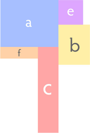
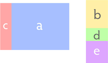
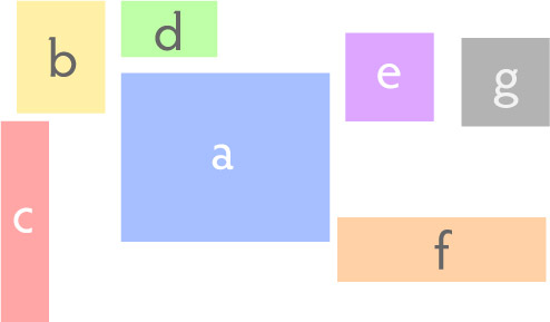
Given any number of arbitrarily sized and proportioned images, you can proportionally scale them and put them all touching in a row so that their heights are all the same, like a & c below. Or you can put them in a column with all their widths the same, like b, d & e. And the result is another smooth rectangle.

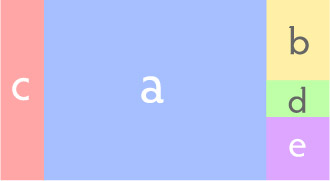
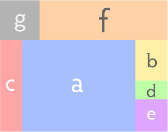
Similarly, you can take any number of image columns or rows, and you can scale them and put them side by side or in vertical stacks and get another rectangular arrangement of images.

And you just keep doing this until you run out of images.

If you don’t like what you’ve got, it’s easy enough to start over. And the images don’t overlap, they retain their original proportions, and you end up with a smooth rectangular collage, and you’re guaranteed to be able to do this with any set of images.

So much for randomness.

That’s What it’s All About

(…and you spin yourself around…)

I was working on the content for my Tinselfly project page the other day, and I was having trouble expressing my goals for it. Largely because, with work-work and all the drudgery you have to do to get any kind of project like this off the ground and have it look professional, I’d actually forgotten what exactly those goals were.

So while I’m taking a short recharge break in the middle of my work day—yes, it’s 4:00 and that feels kinda of middle-ish, the way things have been going — I thought I’d try to write this up as best I could. Because sometimes just restating this stuff can give me new insight into it.

* * *

It’s all about school.

Consuming a story isn’t so much different than sitting in class. Character exposition is where you learn about characters. A story has to communicate a plot in clear, efficient terms, the way a history professor might talk about real events. If this is science fiction or fantasy, you have to be taught the rules of the story’s universe so that you can apply that knowledge to exploring the moral, ethical, and societal implications of fantastic ideas.

Novels use the same medium as textbooks, and movies aren’t structured so much differently than documentaries.

Of course, I’m talking about just one kind of class here: I’m talking about lectures. Where you read a textbook, and listen to a professor talk, and maybe there’s some group discussion, but frequently there isn’t. It’s very passive. Just like a movie or a novel, where it’s a very one way sort of thing.

In addition to lectures, most of us have attended labs. They’re also educational; they also have a set curriculum where everyone who attends each lab is supposed to come away having learned the same things. But they’re more hands-on than lecture classes, and many people enjoy this style of teaching more than lectures, and will respond better to it. Some students will internalize more from these types of classes.

If movies and written stories are like lectures, then I think games can be like labs. I don’t think games can be just as good at telling stories than a movie or a novel. I think they can be better, because it’s a better way of learning and internalizing the important parts of a story—at least for some people. They can still have linear, author-controlled narratives, and I believe some players will find these hands-on stories more engaging and moving and meaningful than the storytelling styles they were previously used to.

Of course, some people will still always find the average movie more emotionally satisfying than the average game, just as some people today prefer novels to film.

So there you have it.

I don’t know if I’m the person who’s going to succeed at pulling off this approach to storytelling.

But I’m sure going to try.

Totally Backburnered Stuff Update

Since work has been really busy, I’ve been doing very little in my free time besides keep Tinselfly alive. But here’s the state of some of my other stuff, which I’m posting largely so I don’t forget about them all:

Electric Tea

I finally figured out some more details for turn-by-turn game mechanics and how they tie in with the overall mystery. Still having trouble getting the non-violent bootlegging theme to work; I’l still thinking of everything in terms of gang warfare.

Also got this book which is an actual diary of someone doing bootlegging last century. Hopefully that will give me some ideas.

Celestial Stick People
Made some test boxes for a different project a while ago, and they turned out ok. Not amazing, but adequate. I think the plan right now it to do the boxes and books by hand and have the cards professionally printed, once I have the time and budget to get that moving again.

Super Lilly
Not much movement here. Marie and I have talked about it a bit, but I still need to figure out how to quickly do art for it.

The Itty Bitty Galaxy
Not much movement here either. I need to get the Android development tools set up on my new computer.

Other
Despite the whole being swamped thing, I’ve been following the art & design message board on this board game community, and jumping on any opportunity to make art for other people’s pet projects. Got one bite so far.

I miss freelancing, but kind of despised working with web sites, so I wonder if I can do some freelance illustration. Not for the money; just because I miss working with people. And I’d like some good portfolio pieces out there, with the goal of eventually doing art for a professionally published game some time in my life.

Annoyance

Yesterday, I unsubscribed from the only game design blog I’ve been reading for a while. Mostly because I thought the author was coming off as a bit smug and condescending and it was making me cranky.

I feel kind of bad about this.

Sure, I disagreed with most of what the author had to say, but I frequently enjoy and learn a lot, reading things I disagree withโ€”as long as I think the author isn’t being pushy about their opinions. We all think this industry can be better. We all have different strategies for doing that. But to me, it’s all about exploring possibilities. As soon as someone says anything about how games should be made, or worse, played, I’m gonna tune them out completely.

But there were some good thoughts in this blog, and like I said, I feel kinda bad for bailing. Like I should just put up with the annoyance and bear it for the sake of being exposed to ideas different than my own. Like it makes me a more narrow-minded person for doing this. I know this author doesn’t mean to come off as a jerk. I’ve seen him actively seek out advice for how to sound less jerky.

Then again, who means to come off as a condescending douche? Who wakes up in the morning and decides to write like that? There are lots of bloggers out there, and I don’t see too much nobility in being patient with those who haven’t figured out how to sound approachable yet. I haven’t actually tried very hard to look for warm, friendly game design blogs, but I’m sure they exist. It’s not a blog per se, but Extra Credits is quite good.

I’d love to see more things like that.

Here Comes the Sun

It’s crunch time. I’m going to be spending much of today doing work-work, but before I dive into that, I wanted to babble a bit about lighting. Yes, I’m still keeping Tinselfly moving; that’s kind of essential during crunch time.

[fergcorp_cdt]

In the past few days, I’ve added some mostly cosmetic things. They all revolve around lighting and going beyond the obvious solutions for setting this up.

The Sun

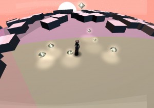
The sun won’t ever move. I want it to stay in a fixed position to help you navigate. I could, then, just have set up a directional light for the sun and walked away, but I would never have been happy with that. While the purpose of said directional light is to simulate the sun, the purpose of lighting in general is to sculpt your scene. The sunlight isn’t going to do that if it’s in line with the camera or directly behind it.

So there’s some logic in here to try to keep the sunlight close to where it would naturally be, but at a reasonable angle to your point of view so you get nice highlights and shadows here and there. I’m not quite done, but generally speaking I’m liking the results so far.

The Stars

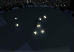
You’re on the night side of the planet, and can see a brilliant starfield. You start walking towards the day side. What happens?

My instinct was to have the stars fade out while the sky faded in, and while this was easy to implement, it just didn’t feel right. Stars don’t fade. They appear to twinkle, one by one, out of existence. So I wrote a special shader that would allow that to happen.

The Sky

Daylight is a funny thing. When you’re standing outside, you’re not just lit by the sun; you’re also lit, in large part, by the sky itself.

I thought I’d simulate this by adding some logic to have my sunlight appear higher than it naturally would be, but that’s not really working, and it’s screwing up the no-head-on-lights thing mentioned earlier.

So I think what I’ll do is have a blueish ambient light whose intensity varies based on your position instead.

Silly Photoshop Tricks: Backlit Clouds

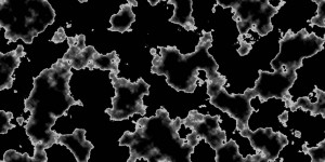
I was trying to make a nebula texture for Tinselfly, and discovered a neat trick for doing that in Photoshop.

I used to do this sort of stuff all the time, making textures with nothing but builtin filters and effects and whatnot. I’m a little rusty now, but I thought this was worth sharing.

Step 1: Start with some difference clouds. Those are always great for making textures.

(Random tip: if you make your image width a power of 2 like 256, 512, 1024 or 2048, the texture you end up with will be tileable.)

Step 2: Make a new layer and just slap a black & white vertical gradient on it.

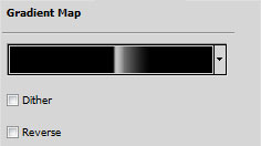
Step 3: On top the regular gradient layer, make a Gradient Map adjustment layer. My gradient map looks like this:

You want something that slowly ramps up from black to white, and then abruptly goes to black again. That abrupt change is going to define the edge of our cloud.

The effect it has on the layers underneath is like this:

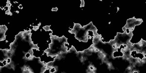
Step 4: Now, here’s where it gets fun. Go back to your regular gradient layer you made in Step 2. Slowly lower the opacity to 0 and watch what happens.

What you’re doing is changing how straight your clouds are going to be. If the gradient is too opaque, you just end up with a boring wavy line. If the gradient is too transparent, you end up with these funny blobs with no real structure. But somewhere in the middle, you’ll find something that looks kinda like the top of a large cloud, with light shining through it.

And once you’ve got that, you can add more effects to bring it to life.

I’m not done with this yet; it looks strangely flat still. But I think it’s an interesting start. And it took less time to do that than writing this post. ๐Ÿ˜‰

Hole in the World

I wasn’t planning on posting a Tinselfly update today, but I thought this was too nifty not to share.

(click to enlarge.)

There’s a bug right now where one—just one—face of my 20-sided world is displaying incorrectly. I thought this looked kinda eerie and beautiful.

I may have to make a level in my story mode of the game that looks like this. ๐Ÿ™‚

Anyway, I also added a randomly generated starfield, moonlight, and blue sky when you’re on the day side of the planet.

Progress

I’ve slowly been updating my web site, adding pages for my projects and web sites and whatnot, and it got me thinking about progress.

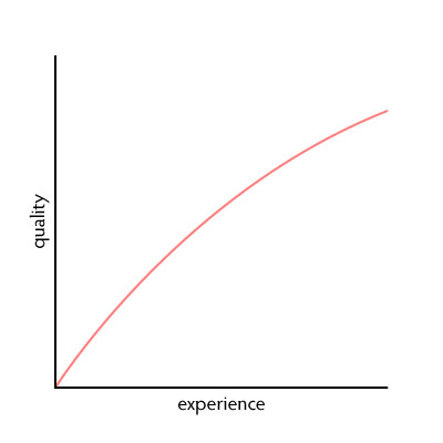
Take web sites, for example. It would be tempting to think that, given more experience, I’ll consistently produce better and better work.

It certainly doesn’t feel like this, though. While I love my most recent design, The Peacock’s Paintbrush is still one of my favorites — and one of my first; it was made around ten years ago.

It’s tempting to feel like I haven’t made much progress at all. Which, sometimes I do. I worry that I’m not improving as a designer or a programmer or whatever here.

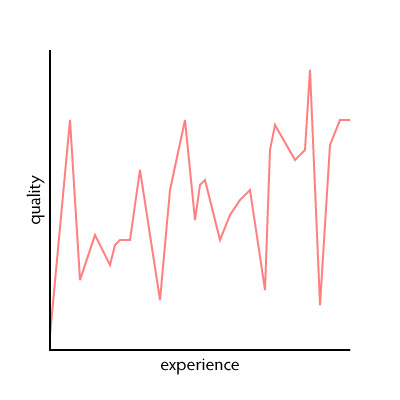
My output is really more like this:

Kinda random.

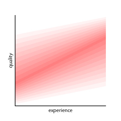
But really, it’s not as random as it looks. Experience does not make my work consistently better. It increases the probability that my work will be better.

The quality of my work will tend towards the darker red areas here. Without question, my work experience has made my average better.

However, under the right circumstances, I am still perfectly capable of producing crap. If I don’t get along personally with my client; if I hate the work itself, the work will suffer.

Ten years ago, under the right circumstances, I was perfectly capable of creating amazing things. The Peacock’s Paintbrush was a fascinating challenge. I was excited about getting portfolio pieces out there, and I had just the right amount of creative freedom.

The true measure of my progress is, I suppose, to look at the jobs that I neither love nor hate. The ones I just do because they have to be done. They’ll tend towards that nice dark red stripe, and I’ll forget about them the moment they’re over… but that’s the sort of stuff I should think about, when I’m thinking about what I can reasonably expect to accomplish next.

Copyright © 2017 Brian Crick.