Brian Crick

Postmortem: Mini Maker Faire 2014

Last Saturday, I had Tinselfly on display at the Cleveland Mini Maker Faire. This was a pretty new kind of experience for me, so I thought it was worth a postmortem.

on display

Seeing complete strangers play my barely-functional game — allowing complete strangers to play it — was rather odd. I was really, really stressed out about this in the days leading up to the faire. Would they be disappointed that there was very little gameplay? Would they ask pointed questions I’d be uncomfortable answering?

As it turns out, everything was very informal and the audience was mostly small children, so I had nothing to worry about. They liked the pretty visuals, and a few seemed to find the core gameplay engaging enough to stick with it until called away by their parents.

What adults played the game were very friendly. I’d forgotten that I’m more comfortable in this kind of environment that I am talking to people I’ve met before. It’s kind of fun to try to figure out what someone I don’t know at all will want to talk about: will they want to hear about the mechanics? The tools I used? The story? Every person will respond to different things, and I’d like to think that I can figure out what approach to take after just a couple sentences of conversation.

approachability

The morning before I left for the faire, I added in gamepad support. I figured that would be more inviting than a mouse & keyboard.

That seems to have been a good idea. Few people needed to be prompted to walk up to my laptop and pick up the gamepad.

To make things more inviting, next time I’d like to make a demo mode for the game, like old arcade games had. Some automated thing that shows basic gameplay, attracts people’s attention, and shows them how to play. If it could kick in when the game has been idle for a while, that would be perfect, so I don’t have to be there to reset the game every time someone leaves.

My game controls and mechanics are a bit odd, being about swordfighting and all, so visual instructions would be really helpful here.

noise level

Before I went to the faire, I also changed the music so it would loop over this two minute music clip instead of the 30 second one that was there while I’m figuring out my music playing system. That took a while, and wasn’t such a good use of my time.

I like this piece, and lends atmosphere, but you couldn’t hear it at all with the noise of the other games and people chatting, especially on my laptop speakers.

Next time, I could bring some external speakers, or just not worry about it too much.

breakability

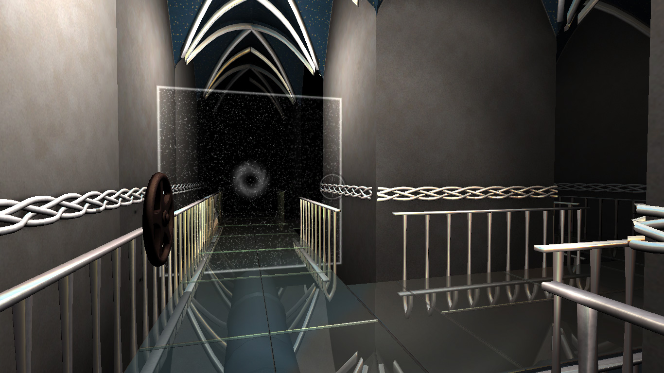
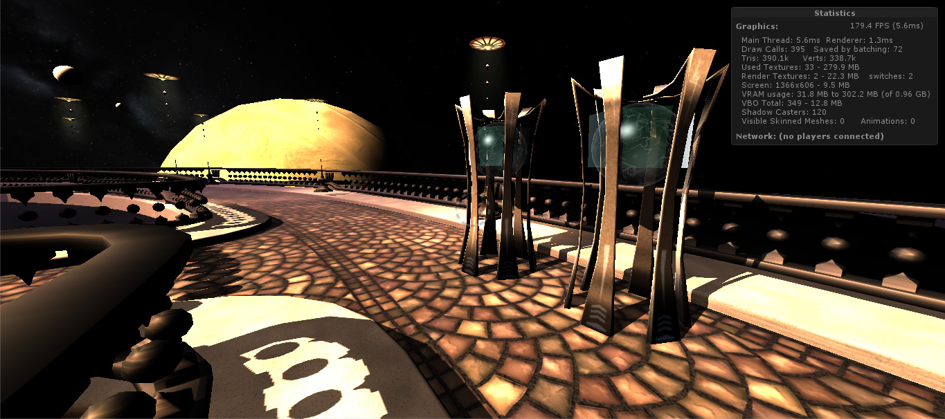
One thing I didn’t do just before the faire was fix my colliders. See, there are a few places where you can just walk through railings and fall off the edge of the world, necessitating a game reset. And people found those places. Many, many people.

I fixed all those last night, but really should have done it sooner.

to sum up

Overall, it seemed like people liked where I was headed. Many people complimented me on the graphics — especially the starry background — and one person’s eyes lit up when I started talking about how there would eventually be this story about this woman trying to get into the Navy.

I got some really good feedback about my mechanics, which I’ll be thinking about a lot in the next few weeks.

Plus, I had a really good time at the faire. It was great to hang out with the other game developers and see how people reacted to this. I’m looking forward to demoing this again at the Science Center in June.
Mechanics, Mechanics, Mechanics

At last week’s game developer meetup, I got to talking about Tinselfly, and once again had to say that I just had an environment right now; there was no gameplay.

So I set myself the goal of having some gameplay by the next meetup, which is in two and a half weeks.

So far, there are these alien robot things, which are supposed to look, like, otherworldly and menacing and stuff. And I’d like you to be able to swing your sword at them, and I’d like them to fight back.

Robot-27-February-2014

I can probably get the basic swordfighting mechanic ported over from my sandbox game tonight or this weekend. And then I just want to keep revising it and iterating over it, the same way I’d obsess over a model. Thing is, I’ve hardly ever done this before. And when I’ve done it, it’s been within the context of a game jam, so I’ve spent no more than a day trying to fix mechanics once dropped into a project.

Two weeks just working on mechanics is unheard of for me.

Hopefully, if I can get myself to give this the same attention to tiny detail that I give my models, I’ll have gameplay that’s on its way to being as fun as my environment is pretty. 😉

* * *

I am, of course, trying new things to keep Tinselfly on track. But it’s also more than that. At game dev meetups, I am frequently motivated by seeing other people’s stuff; or even just knowing that other people are making progress. I want to return the favor, and make sure I’m not inadvertently making people lose faith in this whole going indie thing. I don’t want people to look at my stuff and think oh, there’s no gameplay here; you’re either a graphics person or a programmer or a game designer.

I’m frequently hesitant to break out my laptop at meetups, but It’s not so much about showing off what I can do. It’s about showing myself what I can do, and showing other people what they can do, too.


Immediate Deresolution

I’d like to talk about modeling a bit. I’m saying that up front because it’s gonna take me a minute to get to that part. 🙂

* * *

For a brief period in high school, I regularly had three dance classes in one day. At the time, and up until just now, I focused on the time I was putting into it: an estimated 14 hours a week. It was a pretty decent chunk of time.

But looking back on it, the number isn’t the only thing that’s important. The other important thing was that I had three separate and distinct dance-related activities.

Every morning I had a class on technique. Every afternoon was spent rehearsing pieces for an upcoming show. And frequently, between classes, I’d run off to the studio to work on choreographing and practicing a solo piece.

And in each of these three activities, my mindset was different. Sometimes I was focused on being creative; sometimes I was not. Sometimes I was trying to stay in sync with my classmates; sometimes it was just me, learning to keep an eye on myself in the dance studio mirrors; sometimes I wasn’t looking at anything at all, trying to develop a good sense of balance and positional awareness. There was a specific time for each little thing I needed to learn, to get better at what I did. And while I wouldn’t say I ever got to be a great dancer, having those things separated out, was, in hindsight, a great thing to have happen.

* * *

In an attempt to improve my skills and efficiency in, well, pretty much every creative thing I do, I am going to try integrating small-scale game-making exercises into my regular project rotation. It’s kind of like a different classroom environment. I’ve always been a fan of having multiple projects at once so they can kind of creatively feed on each other, but I don’t think I’ve specifically drawn a line before and said, these things are for production; these things are for learning. I want to make sure I spend time in both mindsets, and really commit to one or the other when I’m working so I can learn more about whatever I’m working on.

* * *

My first assignment is an arcade-style thing meant to teach me about level design. My second, which I’m working on at the same time, is a spaceship flight sim where the emphasis will be on modeling and making responsive, natural-feeling player controls. I’m afraid I don’t have much to say about the former right now, but in regards to the latter, I learned a little bit more about how to make low-polygon meshes this week.

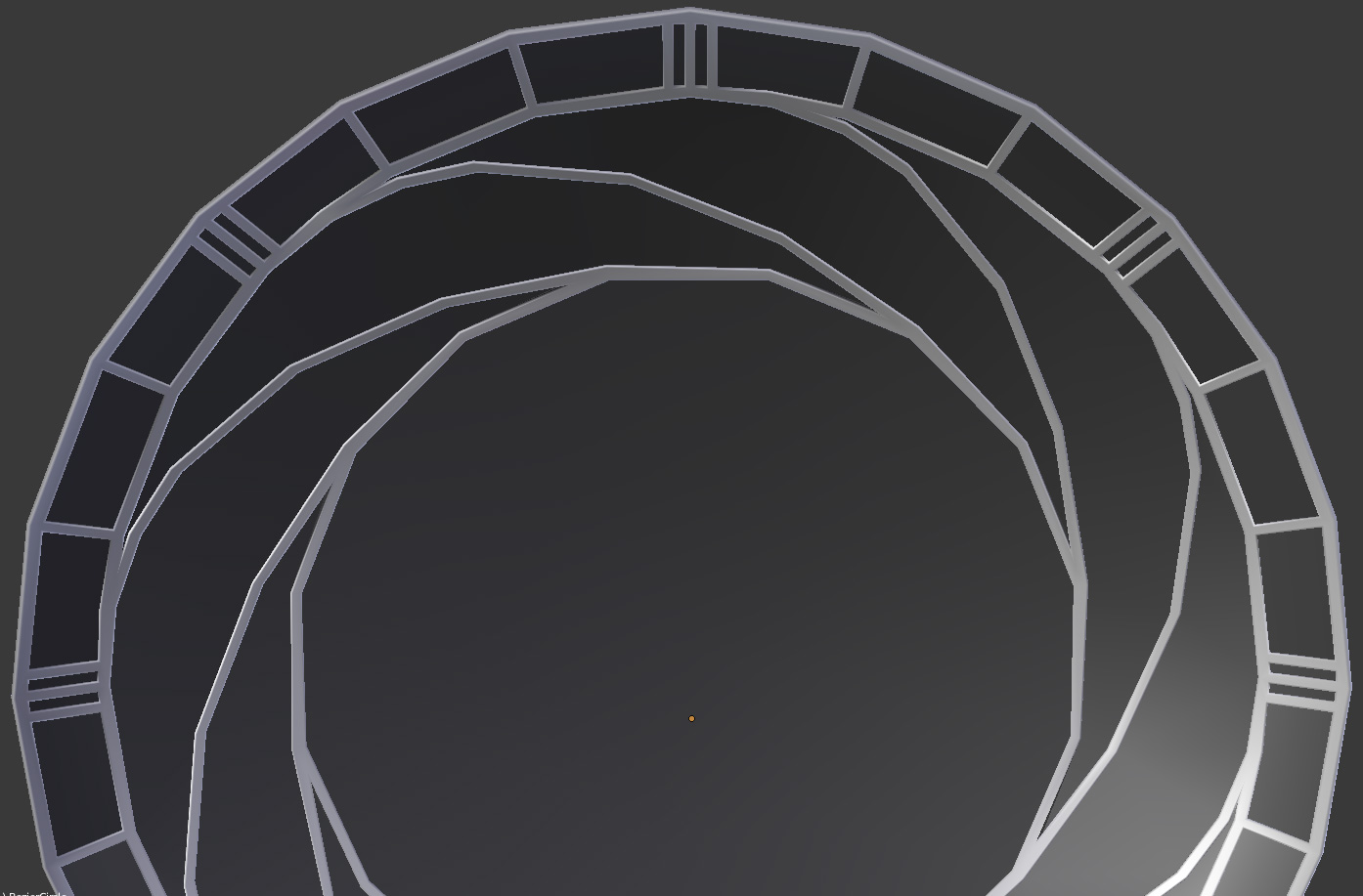
My first job is to model a spaceship cockpit. Right now, it looks vaguely Star Wars-y: there’s a big, round window with a decorative grill.

Cockpit

And here’s what I’ve learned the hard way: making a low-polygon mesh is not about making a high-polygon mesh and then simplifying it. You have to think in terms of the simplified version before you even start modeling.

I’ll explain that by way of a simplified example. Suppose you want to model this:

deresolution1

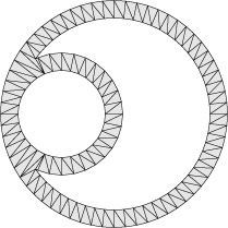
If you want to use this shape in a video game, you have to turn it into something a video game understands: a mesh made of triangles. Like so:

deresolution4

While each triangle has perfectly flat sides, the appearance of curves can be simulated by using very small triangles. When you use enough small triangles, you get the appearance of smooth curves.

deresolution5

Unfortunately, more triangles frequently means slower games. It’s not the only thing that can affect the performance of a game, but it is something you need to worry about. And I always start off by making meshes with too many triangles.

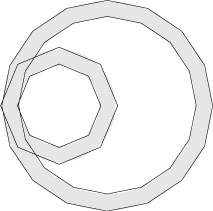
The obvious solution here is to take the high-resolution mesh and systematically remove detail from it. Here, I’m using a subset of the points used in the detailed mesh.

deresolution6

Check out the area where the small circle meets the big circle — there’s a sort of Y intersection there. And in this mesh, the widths of the strokes all around that Y feel totally wrong. And the inner circle is a little thinner than the outer one.

What’s happening here is that I’m reducing the number of triangles in the mesh without any real awareness of or respect for when the mesh actually represents. I’m treating this as a series of outlines, like so:

deresolution2

The relationships between each of those shapes is getting totally lost. What’s really happening here, of course, is that I have two outlined circles that need to feel circular in the final product.

deresolution3


I need to not reduce the triangle count the intersection of the two circle outlines. I need to reduce the triangles in the individual parts of my mesh —

deresolution7

— and then combine the derezzed versions.

deresolution8

Now, that Y intersection where the small circle meets the big one looks much better.

I’ve also made a change to how the simplification of the circles happened here.

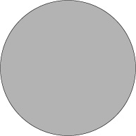
If I have this circle:

deresolution9


And this overly-detailed mesh:

deresolution10


And then systematically remove points on my mesh, I get this–

deresolution11

–I get a shape inscribed within my original, a shape which is much too small to be an accurate interpretation of the original.

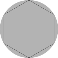
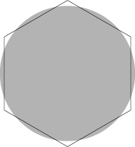
The new mesh should have around the same area as the old one. Like this:

deresolution12


Note that the vertices of the hexagon here aren’t on the circle. My simplified mesh doesn’t actually contain any of the points on the old mesh.

* * *

Of course, it probably wouldn’t be that useful to model individual parts of something and then use your modeling program’s boolean tools to combine them. Rather, the thing I’ve learned here is that I should start thinking in terms of a simplified mesh earlier, and model that–rather than modeling something that’s too detailed, and then programatically simplifying the detailed version (whether it’s an actual simplification utility in your app, or just thinking too programmatically).

Global Game Jam Post #4: This is the Jam that Never Ends

Gonna wrap up my Global Game Jam 2014 writeups by talking about how I’m going to approach my next game jam, which will probably happen this summer. Usually I don’t decide on an approach until the jam is about to start or shortly after the theme is announced, but in this case, it’s relevant that I’m deciding early.

I have tried to approach each of the four game jams I’ve been to with a different mindset. As someone who tends to do game jams solo, I have many roles to fill on my own — programmer, designer, modeler, composer. What I’ll usually do is really push myself and take a lot of risks with one role, and work just in my comfort zone in the other roles. So for example, in this last game jam, I made way more complex models than I usually do, but designed the project in such a way that I’d only have to do programming tasks that I was absolutely comfortable with.

The goal here is to focus on one skill and try to learn as much as I can about it during the jam. It’s basically calculated risk-taking in a controlled environment.

But for my next game jam, I will drastically reduce the amount of risk-taking I will make, everywhere. I will make the highest-quality, most complete product I can, only using skills I’m completely comfortable with. That might sound silly; one might assume that creating a quality product is always the goal at a game jam. But it’s never been my goal before. And the implications of setting that as my goal, now, are kind of huge. It means the game jam is a test, not so much of a learning experience in and of itself.

The learning must happen in the months leading up to the jam: I am going to try to force myself to keep working on all of my skills, on a consistent schedule.

If I want my game to have good music, I need to start improving my composition skills now.

If I want my game to have good graphics, I need to have good, efficient modeling and texturing practices down cold.

If I want my game to have a fun mechanic, I need to get comfortable experimenting with new mechanics in self-contained test environments.

And wherever my skills are when the next jam starts, I’m going to play it safe and do things I am reasonably certain I can do.

I don’t know how I’m going to feel about all this once the next game jam starts. I may very well find it all less exciting than previous jams, less intense, less fun, because of the reduced risk-taking during the jam proper. But I’m willing to try this approach.

Because I think that potentially squandering one game jam by playing it safe is a risk worth taking.

Global Game Jam 2014 Post #3: Trying for Once to Talk About Music

I don’t think I’ve ever gone into specific detail about music in a postmortem, except to say things like ‘I liked this’ or ‘this was hopelessly derivative’… I generally talk about my feelings, but not the music. So I suppose it’s time to start talking about specifics.

I’m not real sure how to talk about this. I can’t even read sheet music, and my musical vocabulary is somewhat limited.

But here’s what I’ve got:

A moody, haunted ship type thing that’s more ambience than music.

A somewhat happier, out-to-sea theme.

(Sadly, the 30 second clips above are not, like, samples of larger works. 30 seconds is all I’ve got.)

Anyway.

You were suppose to be on a spaceship. Can you tell?

Screenshot

Ok, not really. But it was supposed to be a spaceship. With, like consoles and windows into space and blinky lights. So I wanted something that sounded like a haunted ship.

When you were in an unlit area, the first theme would play; when you were in a lit area, it would fade to the other theme. I’ll just talk about the two separately.

the moody ambient thing

Generally, I like it, but I can’t really take credit for how it sounds. I’m using a software package called Garritan Instant Orchestra that includes pre-made instrument combos you can use, and while most are symphonic textures with names like ‘Splatty Ostinatos’ or ‘Sweeping Melodies’, some are more ambient…

…like the combo called ‘Ghost Ship’. I just opened it up and started pressing random keys. That worked well enough, but I certainly could have used it in a more interesting way.

Logically, the next step is for me to take manual control of what Instant Orchestra and my random-keys approach were doing for me automatically. If I want, Instant Orchestra allows me to play individually the instruments each pre-made combo is made of.

Ghost Ship is actually made of four unique instruments. At first glance, most seem to be drum kits, which means that they’re not playable, melodic instruments so much as collections of sound effects, each effect being tied to a different key on your piano. One key on a standard drum kit might be a big floor drum, while another key would be a cymbal crash.

So I should look at each kit, one by one, and listen to the effects, one by one, and try to think of interesting things you could do if you were controlling each kit independently, making the exact sounds you wanted, exactly when you wanted them. I should really get to know these kits, and the other kits Instant Orchestra has to offer.

the more melodic thing

When I think ‘nautical’, I think of music whose volume or pitch (or probably both) rises and falls in a gentle, rocking sort of way. I really don’t know if that would qualify as a musical cliche, but even if it does, I suppose it’s a cliche I really like.

I tried to do that with the arpeggios, trying to go for something like bubbling water there. Sadly, the arpeggios are a little hard to hear. Probably could have emphasized those more and the melody less.

As for the melody, it occurs to me just now that I probably want an instrument with a slow attack and release — meaning that when you press a key on your piano, the volume would start off really soft; as you hold the key down it gets louder, and when you release the key, the note doesn’t stop instantly, but fades out slowly.

Again, this is something I can manually control, though I tend not to.

Luckily, I think I’m kinda close to this already, but I don’t think I was consciously thinking about that whole gentle rocking thing when picking an appropriate sounding instrument.

The melody is a little slow and plodding; lots of whole notes. That goes with the whole slow rocking thing I guess, but I feel like there should be something more dynamic, too. And again, maybe emphasizing the arpeggios over the melody could help with that. I could also play arpeggios for a while, and then have it grow into a full-fledged theme with a more complex rhythm played on the same instrument.

Side note: In general, I think I try too hard to fill up all the space in my music. In visual design terms, there’s no whitespace; there are fine details, but when viewed from a distance, everything looks like the same boring grey.

If I’m having trouble making clips more than 30 seconds long, perhaps it is because I am so focused on the fine details, without a larger-scale framework in which to place them.

Global Game Jam 2014 Post #2: The Great Indoors

I decided before the game jam theme was even announced that I wanted to do a maze-like indoor environment. Like, spaceship corridors or something. Because I’d never done that before.

I’m glad I decided to try it because, this gave me a quick overview of what sorts of problems you can expect while making such an environment.

First off,

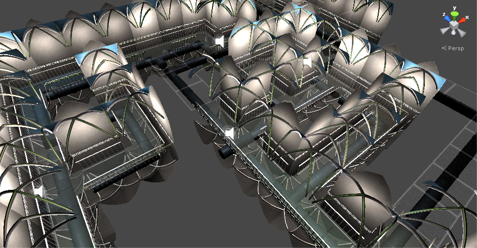
indoor levels look weird in a level editor

Interior-Editor

Repeat image from yesterday: this is my level as it appears in Unity’s editor. It’s… dizzying. You’re kind of outside the world, seeing inside things you shouldn’t be seeing inside, and I got rather confused trying to select things and lay them out properly.

i haven’t the foggiest idea how to light this thing

You can’t just slap a directional key light and a fill light on the scene and call it a day. This should have been obvious, but I didn’t think of that before deciding to do an indoor environment.

Well, I suppose I could have had fixed key and fill lights. I’m not much for naturalism, after all, and I would never accept realistic, flat indoor lighting as acceptable. I’m always going to want my lighting to be kind of contrasty and theatrical.

But my mechanics involved turning lights on and off, so I went with multiple point lights. In fact, every single tile has a light attached to it.

I’m sure that’s the absolute worst way to do this.

I considered just baking soft light into my textures, but sort of forgot about that idea as the gamejam wore on.  Probably should have done that. My final build was really, really slow, and I’m sure a big part of that was my lighting.

you can’t see your destination

The goal of the game is to get to this one particular area on the upper right of the level. Which is totally not communicated to the player at all.

In an outdoor level, I’d have some big building or monument or whatever that looks interesting and worth going to. In the indoor level here, I wasn’t sure how to express where you were supposed to go, when you were making progress, or even where you were within the context of the level, since all the corridors look alike.

I thought maybe having collectible items here and there, just out of reach, would be the way to go — something just behind one of my transparent force fields, or at the other end of a chasm you can’t jump over — things that say, hey! you can’t go here now, but you’ll be able to eventually, and you will have made some progress through the game by doing so. I even had the locations for these things planned out, but never got around to modeling them and putting them in the game.

I think this approach has merit, but since I didn’t implement it I can’t say for certain what the challenges here would be or how effective it would have been.

tiles are nifty

This was my first foray into 3d tiles, and I like how modular everything is, how I could notice a bit where a puzzle was unsolvable and quickly rearrange my tiles so things were ok.

Trouble is, I made my tiles in this really inefficient way, fully completing and polishing a straight corridor tile before moving on to completing and polishing a T intersection, and finally completing and polishing an L-shaped corner. It certainly would have gone much faster if I had a more assembly line style workflow, like making all the walls at once, then all the railings at once, etc. I could go into a lot of technical detail about beveling and uv mapping, but suffice it to say that there’s a lot of efficiency to be gained by limiting how often you switch tasks.

My one-time-at-a-time approach was motivated largely by a desire to see a completed hallway made of straight corridor tiles as quickly as possible; it was motivated by being insecure and wanting to prove to myself that the quality of the tile set I would eventually produce would be acceptable. Which is silly. Finishing all the tiles was inevitable. I should have done it in the most efficient way possible.


Global Game Jam 2014 Post #1: Planning on Failure

My Global Game Jam 2014 entry is up, and I thought I’d spend a few posts talking about it.

First, I want to talk about failure. One great thing about game jams is, they’re a safe environment in which to fail, and I haven’t really been taking advantage of that. I’ve always been cautious, limiting the scope of my projects in past game jams.

But for this game jam, I rather deliberately set out to make a project that I was certain was outside of my abilities to finish. The question was not whether or not I would fail. The question was how I would fail, which is valuable knowledge to have.

And this the most important thing I’ve learned: at every game jam, and in other projects, you will have a feature you just can’t complete. Because you don’t have time, or the skills to do it, whatever. And… I handle this situation very poorly.

example #1: the embarrassment factor

I always try to compose music pieces with multiple layers that are dynamically mixed together at runtime based on the game state, but for this to work, the music has to play long enough that the player can listen to the music and get used to it before it changes on them, so they can realize something changed.

I tend to make only get around to making a minute or so of music for game jams, and while that’s unquestionably short, that’s not all of my problem.

The problem here is that I always try to hide my short, incomplete music cues because I don’t want to make it that obvious how little music there really is. Allowing my short cues to loop endlessly is the obvious solution here. People do it all the time.

example #2: the coolness factor

In an attempt to make my game tie in with the theme for the jam, I made these ghost things, these swirling vortices, and they were very pretty, well-realized vortices.

They made the game pretty much unplayable. As soon as you touched one, you died, and they were everywhere.

See all this level? You can’t get to a fraction of it most of the time.

Interior-Editor


I tried to solve this really quick after the jam by reducing the number of ghosts, but they still just sat there, blocking your path, and weren’t very fun.

A quick solution during the jam would have been to remove the ghosts entirely, but I didn’t want to do that because they were the only thing tying the game to the theme.

why the embarrassment factor and the coolness factor are actually the same thing

These are both symptomatic of the same root problem: when I have a feature that doesn’t work as expected, and a deadline is approaching, I start to make decisions based on whether I want people to see the work I did, rather than making decisions based on the feature’s effect on the game as a whole. And it enters this weird limbo state where I’m unable to fix it properly, unwilling to cut it, and uncomfortable with bringing it to the foreground and looking at it long enough to think of a decent stopgap solution.

I suppose there’s a certain amount of pride at work here. I want to fix these things without allowing myself to experience them in their broken state.

So that’s something I need to watch out for. In my next post, I’ll babble about some more mundane workflow type things.


Global Game Jam Goals

So there’s another game jam this weekend, and I thought I’d write up some goals.

And as I was writing, I thought to myself, it’s not about goals as in a desired destination as in having having successfully created a project with specific features at the end of the weekend. The goal is to learn. The end product is irrelevant. If I make something cool and fun, great, but the goal is always to learn.

Right now, there are some very specific things I need to learn to do better, and I’m more interested in constraints than goals right now.

So here are a handful constraints for myself:

I will work in an existing genre.

FPS, RTS, platformer, whatever seems most appropriate; I just don’t want to do my usual approach of finding an idea that fits the theme and then trying to invent the perfect mechanic that fits the idea. Instead, I want to concentrate on figuring out how to to add the right tweaks to the tropes of a well known genre to create something that feels fresh. I want, to some extent, to have experience fighting against my chosen mechanics.

I will not make procedural levels.

This is the most important one. Every one of my previous game jam entries has included procedural levels, and while it’s always an interesting challenge to write the code that writes those levels, I really, really need some experience doing more traditional level design and thinking about the overall structure of a game. I want to spend less time writing procedural level-building code and more time visually evaluating and editing levels in Unity’s level editor, learning about what makes a good level.

If there is music, it will be very minimal.

Instead, I’d like to concentrate on creating a sense of place and mood via sound effects. I could certainly use more practice with music composition, but I need even more practice with sound design.

Meeting my ideals may be beyond the scope of this project.

I’ve decided to change Operetta (or Spindle Sun, if you remember that) from 2D to 3D. Mostly because, if there aren’t, like, human characters involved, I’m much more comfortable making 3D models than 2D illustrations. And many of the troubles I’ve had getting this project off the ground have been related to the 2D graphics and interface.

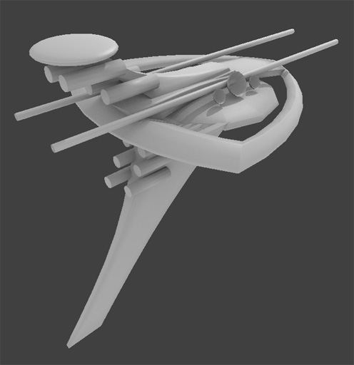
So I started making a model for the spaceship you’ll be flying around. I really don’t like it.

Ship-14-January-2014

Every time I try to design a spaceship, it seems it ends up looking like a Star Trek wannabe or a collection of random shapes.

And I think a big part of that is how small my toolbox is here. Tools are just development environments or new hardware. Tools can also be ideas.

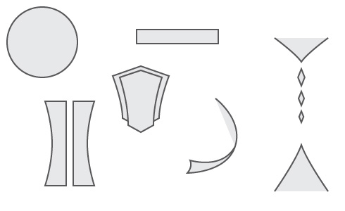
When designing things, I have a toolbox of shapes: saucers, cylinders, Art Deco fans.

toolbox

I’m comfortable with these shapes. I can get them to fit together in harmonious ways. And when I do, I get Star Trek or my usual Art Deco sort of aesthetic, which, honestly, I’m tired of.

But if I don’t use the tools I’m comfortable with, I get a mess, and that’s to be expected, I suppose. Getting comfortable with new shapes, learning how to use them in designs, will take time.

Having new tools is not enough. You need experience using them.

* * *

I’d like to make fun, exciting video games that don’t rely on combat to provide tension.

Combat in games is a known quantity. I have various tools with which to build a combat based game: levels designs and goals based on clearing areas of enemies. Randomly scattered ammo and health kits to keep the player moving. Life and magic bars that keep the player informed of their status.

Some of these tools will work for non-combat situations. Some will not. In any case, I need some new tools here.

* * *

Right now, all this is a bit paralyzing. The tools I’m most comfortable with to build Tinselfly are tools I’m unwilling to use. Even so, it can be much easier to use tools I don’t like than it is to force myself to abandon them and try new things.

With that in mind, I’d like to revisit Gemslinger, my gem-collection as arcade-shooter thing and see if I can get a minimal, workable product that’s fun and not based so much on killing monsters. I’d like to use this as an opportunity to expand my toolbox. Doing so here, with a small project, will hopefully make it easy to explore ideas that I can then apply to larger projects like Tinselfly.

My first few attempts to do this will undoubtedly fail. And by fail, I mean I may end up with something fun and polished… but which is more combat-based than I would like. And that’s ok. I need to fail before I can get better — I can’t just refuse to make anything with combat mechanics on the hopes that I’ll replace my entire toolset, all at once. I need to explore new ideas a little bit at a time so it’s not overwhelming and paralyzing, and that means a couple new, interesting ideas in products with mostly old, blow-up-monsters type ideas.

And maybe, just maybe, whatever I do after Tinselfly and Gemslinger and Operetta will have a higher proportion of new things made with my new tools, and a little less blowing up monsters.

And eventually I’ll get where I want to be. Eventually.

In Period

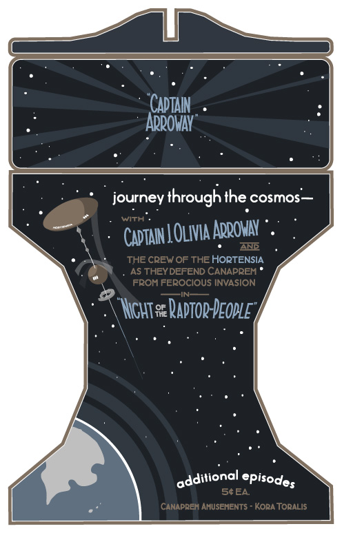
Been working on this texture for an old-fashioned stereoscope. It’s the first object you’ll see in Tinselfly.

Like everything else lately, this has been going slower than I’d like. And part of the problem is defining the problem I’m trying to solve.

The obvious problem is this:

Make something that looks like it was made in the 1920s.

Before I get into what’s wrong with that statement, let me talk a little about where I’m coming from here: Bioshock and Bioshock Infinite. They’re beautiful games with fun, period settings. But all the posters and signs you see in those games look maddeningly inauthentic to someone like me who’s studied the history of graphic design. In short, almost all the type you see should be hand-lettered; hand lettering takes a lot of work, but it’s something I have the skills to do, so I’d like to do it to make my stuff feel more authentic.

So back to making 1920s-style designs: That statement could mean a lot of things. The real question is, who’s looking? And when I asked myself that, I realized I was really asking myself to solve a different problem:

Make something that looks modern, to someone living in the 1920s.

And making something that authentic is way beyond the scope of this project. Like I said, hand lettering is hard. It’s adequate to say:

Make something that looks to a modern audience like it came from the 1920s.

This is not about being authentic for its own sake: this is about communicating something to a modern audience.

But this is, again, a loaded statement — what modern people am I talking about? Without really thinking about it, I realize I’ve taken the problem to mean:

Make something that a modern expert on 1920s illustration would identify as coming from the 1920s.

When it really should be:

Make something that a casual, modern observer would identify as coming from the 1920s.

This is close. Really, really close. Phrasing the problem this way frees me up to take a lot of shortcuts:

A casual observer may not notice how I’ve added procedural jiggling to my letters rather than doing real hand lettering.

A casual observer will not care too much if I use more ink colors than a real 1920s print might have contained. (And using more colors, in this case, actually makes my job easier).

A casual observer may not find the cel-shaded spaceship above too jarring (drawing that by hand would have taken lots more time).

In short, a casual observer will be much more forgiving of the errors I’m making than I will be. There’s a lot that’s inauthentic about the image above. And that’s ok.

If I want to keep things moving, that has to be ok.

So the problem, finally, is this:

Make something that a casual, modern observer would identify as coming from the 1920s and that does not annoy me too much with its anachronisms.

And here’s what it all comes down to: I am not my target audience. I don’t need to spend hours and hours making truly authentic illustrations here. I just need my stuff to pass a quick sniff test.

Despite my complaints, you could argue that the posters in Bioshock already pass said sniff test, and you’d be right. So what I’m going for here is not perfect authenticity — it’s just a slightly more strict sniff test.

And that’s a little more surmountable than the problem I was trying to solve last week.

Copyright © 2017 Brian Crick.