Brian Crick

I Have Some Catching Up To Do.

Just made a tweak to my layout here that should make my web site a little more readable (read: a little less unreadable) on phones: the right-hand blog navigation doohickey should drop out on small screens.

Since migrating to a CMS, I have, admittedly, been rather lazy about making sure this site scales well, is accessible, etc. For what it’s worth, I apologize for that. I can do better.

* * *

I used to complain rather frequently — and inarticulately — about how I didn’t like the approach HTML had to accessibility. It all felt very static, like a printed out web page with some explanatory notes written on it. And, I thought to myself, we can do better than this. Blind or sighted, you’re probably viewing web pages on a computer. Adding more explanatory data to your forms and images and site headers is good and all, but computers can do more. They can adapt to things. A browser could make intelligent decisions about what to present to the user based on screen size, ability to see images, whatever. HTML authoring tools could make cleaner markup and enforce basic accessibility guidelines, for those authors who can’t be prevailed upon to care. (Many will disagree, but I firmly believe that victory can only be had here if the people who just don’t care about accessibility are unknowingly making accessible markup anyway, because we’re encouraging the adoption of visual layout tools that do this for them. I think trying to make those people care is a waste of energy.)

Thankfully, this sort of adaptive presentation of web pages seems to be pretty common now. It would seem I checked out of web design right as this sort of logic was getting standardized — right as smart phones became popular.

I have a lot of learning to do.

* * *

Today’s update isn’t much, but it’s a start. This web site doesn’t use what you’d call an adaptive design, and it will take a long, long time — or, perhaps, a clean start, a nuke-the-site-from-orbit type overhaul — for me to get it where it needs to be.

But, for what it’s worth, I’d very much like to put in the effort towards getting this where it needs to be. It’s a bit overdue.

Little, Big, Solar System

The trouble with the solar system is, it’s big.

Really big.

Lighting-28-September-2013-496-440

So I was working on getting Tinselfly to understand the concept of interplanetary travel. I want it to be smooth and seamless; I want the player to really feel the distances involved here. I want the player to feel small. This is sort of an extension of some stuff I was doing last year.

In short: you can’t just model this stuff and have it work. You have to use some camera tricks. So I came up with a plan. It was a clever, workable plan inspired by the effects in The Lord of the Rings, and I was halfway through it when I realized the other half might not be worth doing.

Here are the parts I finished:

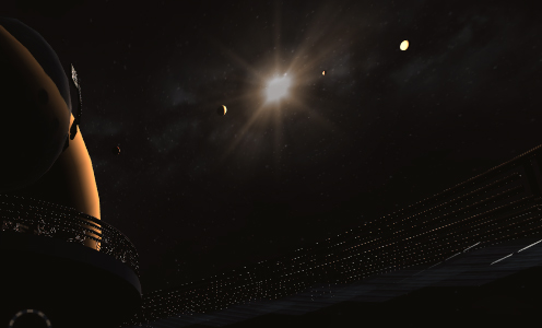
  • You are orbiting a small moon, the big screen-filling, sun-blotting sphere in the images above. Its size is realistic.
  • The moon is orbiting a gas giant, which in turn has other moons, all of which are realistically sized.
  • You can see four small planets orbiting the sun in the top image; their positions are realistic.

But here’s a problem that I’m choosing to leave in:

  • The sizes of the four small planets you can see near the sun are not remotely realistic.

You’re viewing the bodies in this solar system as if the planets are reasonably sized, but the planets (including yours) are all 1000 times closer to the sun than they should be.

The four little planets above? Are shown 1000 times bigger than they would be in real life. It was part of my plan, to store everything using a compressed scale in my scene, and kind of inflate it all when the game was actually running. And I stopped just short of implementing that inflation part.

Lighting-Closeup-28-September-2013

Looking at this detail image here, you can see that each planet has a different phase, like the real Moon does. The planet on the left is reddish and a crescent. The planets in the middle are half moons. The one on the right is almost full. You can tell these are spheres, being lit by the sun, with different sizes and colors.

In short, you can tell they’re planets. Which, realistically, you could not do. Realistically, they should look kinda like particularly bright, untwinkling stars.

Looking up at the night sky never, ever, made me feel small and insignificant, because reality does a terrible job of communicating to the viewer what they’re actually looking at. And I don’t see it as my job to have space be big. It’s my job to communicate that space is big.

Rather by accident, looking up at these planets in-game makes me feel small in a way that reality does not, because it’s all on a scale I can start to comprehend — and I start to comprehend just how far I am from really being able to grasp how big that scale is. So I think I’ll leave this mistake, this unfinished camera trick, in.

For the same reason, I have made the plane of the solar system here line up exactly with the plane of the galaxy, with lines up exactly with the plane of the planetary system you’re in. Again, not entirely realistic, but seeing everything lined up like that — and seeing it all move unrealistically fast — cements this idea that you’re part of this system of spheres spinning around other, larger spheres, spinning around ever larger objects.

And watching all this makes me feel really, really, tiny. Which is what I’m going for here.

One Eighty

So I’ve been toying with the idea of including combat sequences in Tinselfly, a project that was once defined in my head as being absolutely bereft of violence. And I’ll get to that heel turn in a moment, but first I wanted to talk about cameras.

If there’s going to be action, I want it to be first-person action, and if it’s going to be first-person, there was this one niggling problem I wanted to solve, that pops up in every first-person game I’ve played: tunnel vision.

Humans have a nearly 180 degree field of vision horizontally. In contrast, a video game with a wide camera might give you 100 or 110 degrees, if I’m remembering things correctly.

I’d like to give you a wider field of vision than your typical game. If there’s a threat coming at you from the side, I want there to be a good chance that you’ll see it onscreen.

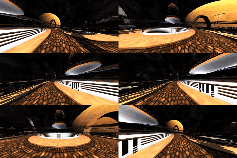
I’m shooting for 150 degrees here. So here’s a swiveling camera with a 150 degree field of view, and you can see why games generally don’t go this high.
Camera-Flat-17-September-2013

There’s this really awkward pinching effect when you make standard video game cameras wide angle. Things on  the edges look really distorted, and everything in the center looks farther away than it ought. This is what I’m trying to avoid.

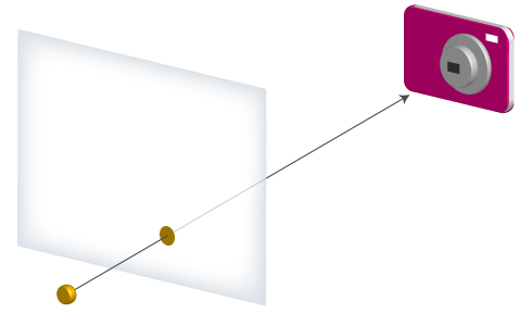
The animation above uses what’s called a planar projection. A projection is the process of taking your 3d game world and figuring out how to translate that to a 2d medium, your screen.
Plane-Projection

In this illustration, you’ve got a camera, a point in the 3d game world, and a 2d rectangle sitting a fixed distance from the camera, onto which the point is drawn. You draw a line from the point to the camera lens, and wherever that points intersects the rectangle, that’s where it will be on screen.

But this is just one kind of projection. You know how there are different map projections? Like the one where Greenland is way bigger than it should be, and the one that looks kinda like a banana peel? They all express the same thing, but try to reduce distortion in different ways. You can totally do the same thing with video games, though I’ve rarely, if ever, seen it done.

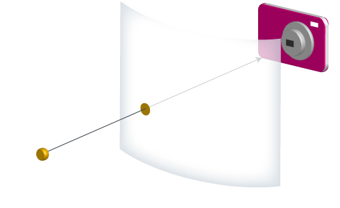
My first idea was to go with a cylindrical projection.
Cylinder-Projection

This time, the camera is in the center of a cylinder. You figure out where your point-lens line intersects the cylinder, and then unwrap part of the cylinder so it’s flat like your computer screen.

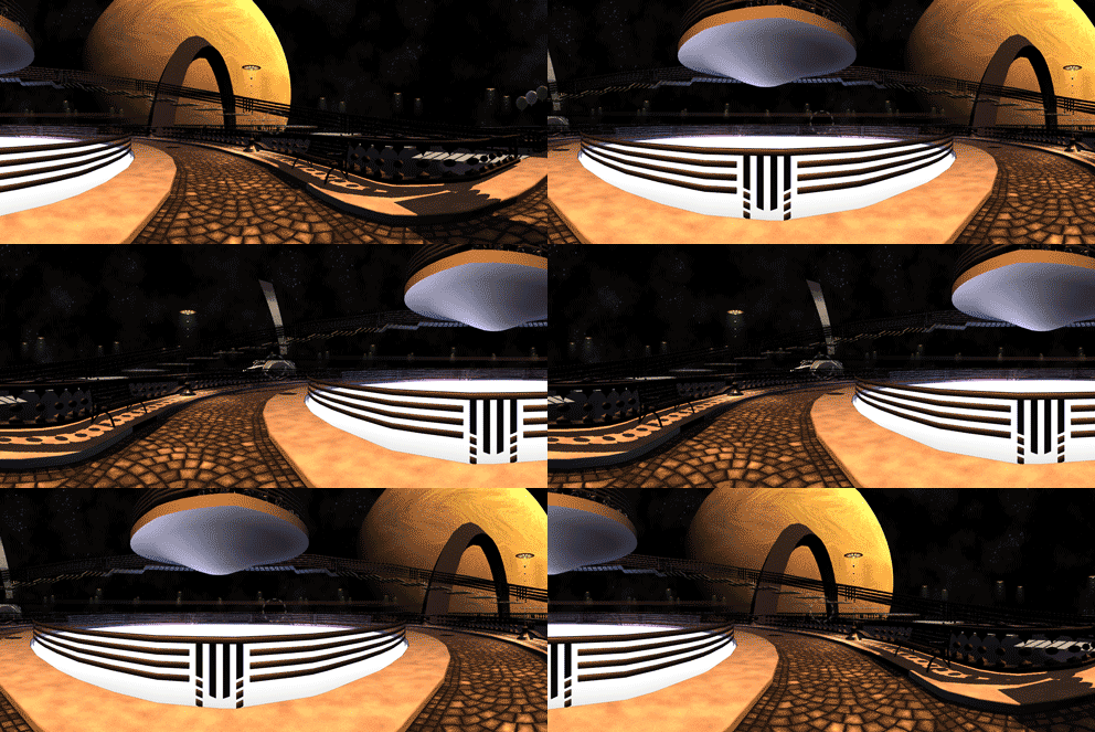
So that looks like this. Same camera position, same 150 degree horizontal field of view, same 180 degree swivel:
Camera-Cylindrical-17-September-2013

This removes the edge distortion. Completely. So completely, in fact, that it doesn’t even look like you’re turning anymore. It looks like there’s this flat image scrolling sideways across your flat screen. Which, basically, is what’s happening. You’re just unwrapping and flattening a different part of your cylinder.

This isn’t quite what I want either — a little bit of distortion can be an important visual cue that you’re turning around in a 3d world, and I want to preserve that.

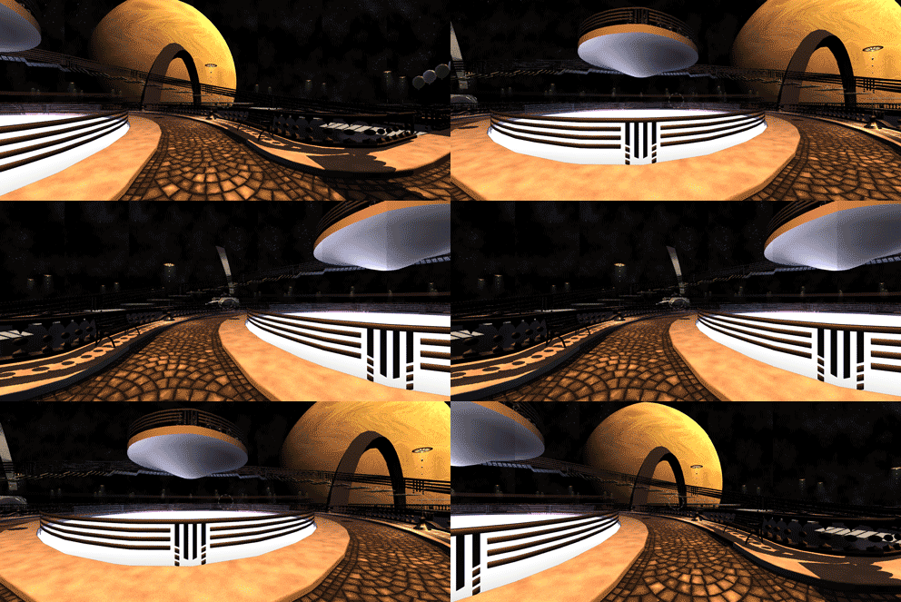
So I went for a hybrid solution — something between a planar projection and a cylindrical one. There’s still a cylinder, but the camera isn’t in the center of it. It’s sort of like a flattened cylinder.

And that looks like this:
Camera-Hybrid-17-September-2013

I’m really, really happy with this. I think I’ve struck a good balance here between reducing distortion and preserving the visual cues you get when you’re turning around.

That having been said, there are a couple possible issues here:

  • This might cause some people to get motion sickness. Personally, I just don’t ever get motion sick, so I really don’t know.
  • It’s a burden on the computer, to produce this effect. I’ve got seven cameras in my scene, all writing to a different part of the screen. That doesn’t make the frame rate a seventh of what it used to be — it’s more like, I dunno, two thirds — but it’s still noticeable.
  • Also, since your field of view is wider, there’s more stuff to draw, further reducing the framerate.

I should probably just allow the user to set the field of view/ cylinderiness if they so wish.

* * *

So about that whole violence thing.

I’m not completely against violence in games. I’m ok with it if the violence is leveled against stylized spaceships or inanimate objects. And with the right approach, I’m willing to include violence in a more naturalistic setting:

  • Your targets must not be living things, or sentient things like thinking humanoid robots.
  • Winning a fight against a target must not have any intrinsic value, like showers of coins or experience points. The player must never be encouraged to pick a fight with a random bad guy because they’re behind on character advancement.
  • Winning a fight against a target must not destroy the target. (It may, however, temporarily disable the target.) The player must never be encouraged to see eradication of all targets as the long-term solution to the threats the targets represent.
  • To defeat a target permanently, the player must solve puzzles or do other non-violent things that cause the targets to do productive things instead of harmful things, or move them to a safe place.
  • Each target must present a specific threat to your community, or the game world. Being a mortal threat to the player is not enough. Said threat must express itself in terms of real mechanics, like targets blocking a path, disabling a piece of equipment belonging to the good guys, or enabling the use of equipment belonging to the bad guys.
  • Targets may never respawn unless it is made clear that respawning would naturally happen in a believable way in this universe.

Shooters are fun. Jumping on funny monsters and watching them fall off the screen in Super Mario Brothers is fun. Swinging your sword in Zelda is fun.

Point and click adventures are many things, but I’m not sure fun is one of them, generally speaking. And Tinselfly has mostly been defined as a high tech point and click adventure. I’ve been worrying about the fun factor.

I’ve been asking myself, can I have fun, action-based — dare I say it, violence-based — gameplay in Tinselfly that follows these rules above? And I think I found my solution within the TV show Supernatural.

* * *

Supernatural has this character Dean who’s a badass, shotgun-toting, Impala-driving, bacon cheeseburger devouring action hero who goes around ridding the world of nasty ghosts, among other things.

Here’s the deal:

Dean looks badass.
He carries guns.
He shoots ghosts.
He eventually defeats the ghosts, sending them to the afterlife where they belong.

And… Shooting the ghosts can never defeat them.

Now, Dean is not above outright murdering evil people if he thinks it’s for the greater good. But I just want to focus on the ghosts. Dean looks like a violent action hero, but the manner in which ghosts are defeated in his universe is (arguably) non-violent. To defeat a ghost, you have to find the bones of the dead person the ghost came from, and burn the bones. This usually involves lots of research trying to figure out who the ghost is, where they’re buried, who might have stolen the bones if the bones aren’t where they’re supposed to be, etc.

Research.

But, ya know, badass research.

The shotgun Dean carries around is loaded with salt. In this universe, throwing salt at a ghost causes it to disappear temporarily and stop bugging you — but the ghost will come back after being salted. A shotgun just delivers salt in an amusingly badass way.

And it works. I’m seven seasons into this show and just now realized that Dean is a shotgun-toting, ghost-destroying badass who doesn’t dispatch a single ghost with his shotgun. The shotgun is an affectation.

* * *

So I can give Robin a sword. She can temporarily disable mechanical baddies by destroying their shields, as described here. She can solve puzzles trying to figure out what’s controlling the baddies, and re-purpose them or send them to safe places where they will do no harm. Her mental state can affect her fighting, so this can mesh with the character-driven puzzles I want to include as well. And her fighting can affect her mental state, which could lead to more interesting character development.

Robin can look and feel like a sword-swinging badass, without ever running anyone through. And I think this can work, and I’m comfortable with this approach.

Gotta go design and model a mechanical baddie now.
Fully Realized

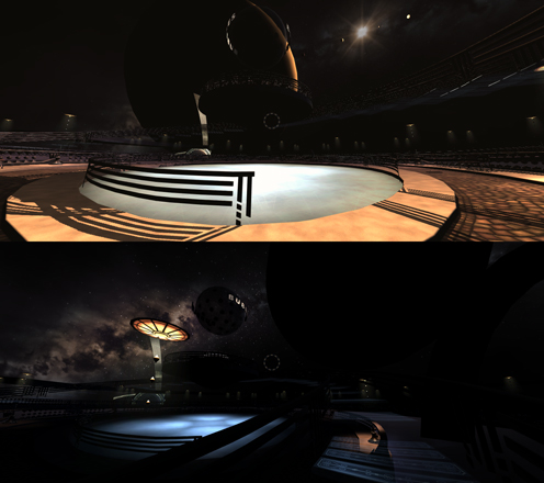
Continuing to work on that Tinselfly scene. In fact, I’ve done little else in my free time lately.

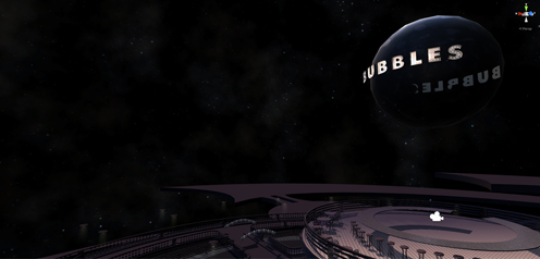
Right before bed on Sunday, I was working on this light-up sign. And for just a fraction of a second, I thought it was real, spinning silently above me on that late summer night as the crickets chirped and leaves rustled around me.

The weekend was ending. Shops were closing and the city was strangely quiet. It was time to go home.

It was kind of unsettling.

* * *

Given how long all this has been in development, you’d think that I’d be overjoyed to be able to see this stuff on screen at long last; to be able to walk through these sets that previously existed only in my head. Like how you might want to see a well-realized version of your favorite book, with all the sets and costumes and everything just the way you imagined them.

And… that’s completely not how I’ve been reacting to it. Which is kinda surprising me.

I guess you could say that getting this stuff out of my head makes it more malleable; an idea is hard to react to. Once something’s up there on screen, I’m more willing to change its purpose, appearance, or cut it and related objects entirely. Initially, my city here was supposed to be half a kilometer in diameter; now, it’s down to half that, reducing the area over which the player can travel to a quarter of what it originally was supposed to be. And the scope of the project in general has gotten significantly smaller.

Now that I can see this, I am so much more willing to produce work that I find merely adequate and make cuts to all areas of the project.

It’s kind of liberating.

For the most part, this place does not feel any more real to me than it did before I started modeling it. It is, however, significantly easier to work with. And that’s what’s important right now. Feeling real can happen later.

Soggy Popcorn Texturing

Been a while since I made a development-as-cooking post. I think it’s time for another one.

I tend to think of cooking in terms of problem solving, and the problems I’m solving are always the same: spend less time cooking; make the management of meals and ingredients easier. I dislike cooking, and that’s why I’m trying to do it better.

I’ll pick one problem and just keep at it until it’s been solved to my satisfaction. The latest problem is microwave popcorn. The full-size bags are too much for me, and the single-serving bags always end up both burnt and barely popped. A 10 pack of popcorn bags takes up a lot of space in the pantry, for very little food. There’s also lots of waste, with the box and the plastic-wrapping around each bag and the bags themselves.

The solution is homemade popcorn. A small jar of kernels can produce way, way more popcorn than a large box of popcorn bags. There’s less waste. I can portion things the way I want.

But despite trying a different recipes, the popcorn I’ve been making has been pretty unappetizing. It comes out oddly stale. The salt doesn’t stick. The butter feels greasy.

I still haven’t made popcorn to my satisfaction. But there are still new things I can try here. In the long term, I’m confident I’ll solve this problem; I’m confident that eventually, this will actually feel more convenient than popping a bag into a microwave and pressing a button, because of the vastly reduced frequency with which I’ll be buying boxes of microwave popcorn, and because of the vastly improved likelihood that I will have raw ingredients on hand any time I want them.

And here’s the point of all this: I still eat the popcorn. Greasy, burnt, bland, chewy popcorn. I eat it all. Because whether it’s a snack or a dinner gone horribly wrong, it’s food you prepared, and you’re gonna sit and you’re gonna eat it. I’ve made some really bad food here and there, but it’s hard to think of calling dinner a loss and pitching it (though sadly, I have done this a couple times). You gotta eat.

Which brings me to video game authoring.

* * *

A seeming difference between completely digital artwork and dinner is, I have no qualms about pitching reams and reams of art and starting over. You don’t have to eat everything you make.

Unless, maybe, you do.

Street-1-August-2013

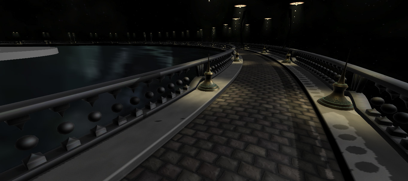
I’ve been working on this walkway for Tinselfly for six days, using drawing technique in my modeling program that I didn’t know existed before Saturday.

For six days’ work, I think this is looking pretty good. The only problem is, I spent way too much time on the cobblestone, and I’m still not really happy with it.

I made something, and threw it out. Then I made something a completely different way, and threw it out. Then I made this.

But I certainly would have learned more — and worked more efficiently — by just putting an ugly texture into my scene and moving on — sort of like eating the bad popcorn. The things I learned making this look better, I would have learned just as well while making something new for the scene. And then I could have come back and fixed this quickly.

The only disadvantage to moving on is that you’ve got this ugly thing in your scene for a while. I don’t like having ugly things in my scene. Even though this is of course a work in progress. I feel compelled to drop everything and immediately work on whatever looks the worst.

So here’s something new I’d like to try doing: at the end of the day, ugly or not, whatever I’ve worked on is going into my scene, and the next day I’ll start working on something else.

And it may be there for a while. And it will annoy me. And that’s something I need to get over.


Postmortem: The Butterfly and the Beanstalk, Part 2

Now for the fun part! Tearing my stuff to pieces is nifty.

I have a new, much more playable build now, and I’ll be talking about the changes I made with that.

what went wrong

class bloat

The code for my original version of the game contains a single Pipe class that stores the general shape of the pipe, handles the rendering of the pipe, and controls the placement of trees. The class got very big and complicated, and halfway through the jam it became a bit of a pain to find the specific bits of code I needed when I needed to make edits.

For the revision, I’ve separated this out into three classes: one for rendering, one for controlling trees, and one for the general structure and coordinate transforms. Basically a model/view/controller approach, which makes it much easier to edit.

regression issues

I made the butterfly mid-Sunday, just a couple hours before the deadline. Before that, the player was represented as a plain ball, a stock Unity object.

When I replaced the ball with my butterfly model, all the behaviors attached to the ball object had to be re-done for the butterfly object. The bounding box got bigger, which made the game much harder. And I didn’t copy over the music thing right (it was attached to the player) and the music didn’t loop anymore.

What I should have done is make a really simple, properly sized placeholder in Blender while working on other parts of the game, and then edit that Blender model when I decided it was time to flesh that out — that way, Unity would have automatically imported the changes to the mode without destroying the behaviors attached to it.

difficulty

The version I turned in for the jam is absurdly hard. I was never able to win it. For the new version, I spaced out the trees more, spread out the initial bumps, and made it so that your score only takes a hit once for each tree, even if you get stuck hitting the same tree over and over. Those simple changes made the game much more fun, and gives the player more of that calm, focused feeling I wanted for the theme.

the scoring thingummybob

The score meter was added an hour before the deadline, and it shows. Functionally, it does its job of giving the player win/lose conditions based on obstacle avoidance and not moving too much, but it’s not real clear when the meter is going to go up or down. And having it based on a whole number point system is just kinda weird.

the instructions screen

That was made fifteen minutes before the deadline. Obviously, it’s very spare and rushed.

feedback

Sometimes — just sometimes — when you hit a bump or move too much, you can see the pipe in front of you get all twisty, and it’s a really cool effect. But you don’t see that often, and in general, it’s not real clear what effect your actions are having on your environment.

My solution for the revision is to express this relationship though a visual intermediary: the storm clouds. When you hit something or turn too fast, a cloud appears, and you immediately know something is up. The cloud hovers near you for a while, causing visible havoc right in front of you. And you can see the cloud draining away, so you know when the havoc is going to end.

This also replaces the scoring meter. It’s still numeric, but it’s expressed in a way that feels like part of your environment.

It’s now unquestionably harder to see your score, i.e. the number of clouds in the scene, but overall I think this is a step in the right direction.

stalemate

You can easily reach a place where you’re not making progress towards winning, but the game isn’t ending, either.

Part of the issue there is that just tapping a key in the original version makes your score get one point closer to losing. To win, you’d have to be on 1 and then stay absolutely still and not hit anything while the score meter takes its time dropping to 0.

For the revision, I’ve made it so short taps don’t count against you, but if you hold down a key for any length of time, you get penalized. Things can still drag a bit, though. I think I might need something where the difficulty increases if you take too long.

to sum up

I’m still very happy with this, even the first, unwinnable build. I dare say it’s the first thing I’ve ever made — having been puttering around with video game programming since I could type — that I really like playing. And that says a lot.

I’d like to keep working on it, balancing things, making the cause and effect more clear, and really rewarding the player for being calm and measured in their movements. I think that’s a unique aspect of this project, that I can highlight more.

The Butterfly and the Beanstalk Postmortem: What Went Right

(This got a bit long, so I’m splitting it up into parts.)

This last weekend, I attended my third game jam. It’s a thing where you have a couple of days to make a complete video game, based on a theme that’s not known until the start of the jam.

This jam’s theme was The Butterfly Effect. I ended up with a racer type of thing, without the racing. You can play the version I completed for the jam here… though it’s nearly impossible to win. In my next post I’ll put up a new, more playable version and talk about what went wrong and what I was focusing on fixing post-jam.

what went right

the theme

I was really, really unenthusiastic about the theme when it was announced Friday night. So at first I decided to just do something pretty, where you were a pretty butterfly racing along this pretty, convoluted pipe with pretty, perfectly round trees in your way. Like this Unity contest winner. And… going with the theme of the butterfly effect, your small movements should affect the shape of the level globally… somehow.

Which is what I did for my other two jams. Nothing terribly original or exciting here.

But that — that not caring about the theme, or even my own mechanics — led me to what I think is an interesting mechanic that fit with the theme.

By the time Saturday was halfway over, I had sort of numbly forced myself to implement an unchanging pipe, and you could move along the pipe, and there were trees in the way. And I played several times through this empty, endless experience, each time imagining a different goal for the player, and different complications, and that helped me find an approach to the theme I could get excited about.

I kind of liked not starting with a concrete approach in mind. Instead, I started with a stock mechanic, the pipe racer thing, and that helped me think. And that’s the exact opposite of what I’ve done in my other jams.

the pipe

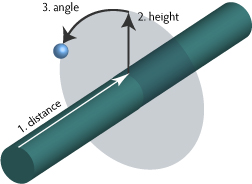
The game has only the vaguest concept of your position in three dimensional space, or even the fact that you’re traveling on the outside of a convoluted pipe.  As far as the game mechanics are concerned, you’re traveling in a straight line along a straight, two-dimensional track. What I’m doing is storing everything — the player location, the position of the trees, even the points that make up the surface of the pipe — in a simplified coordinate system with the following components:

coordinates

  1. Distance along the pipe.
  2. Height above the pipe.
  3. An angle representing your point’s orientation around the pipe.

I then wrote a single positioning function to translate this coordinate system to the world system, bending everything around an array of points I had that defined the curvature of the pipe in world space. Everything went through this function, so once that was nailed down, it became very easy to place things where they needed to be, relative to the pipe. To create the pipe, I call my function on different combinations of distance and angle, all with a fixed height (the radius of the pipe) and those are the vertices on the final pipe mesh. Every frame, the player’s distance goes up a fixed amount and the angle changes if keys are pressed, and then I call my positioning function to place the player model in the scene. As the player moves through the scene, trees are created with 0 height, a random angle and a random distance and positioned with my function. When trees spin, I change their angle slightly and call the function again.

Nothing here cares that the pipe is twisty. Nothing at all.

the music (sort of)

I’m not thrilled with the music. I spent all of half an hour composing it, and it has more than a little in common with this bit of Doctor Who (at the 1:55 mark ). I consider this a win, because I had the presence of mind to just throw some music up there, and move on. There were more important things to work on.

the graphics

My initial goal was just to make something pretty. I think it’s fair to say I got that. 🙂

I’m especially proud of this tree.

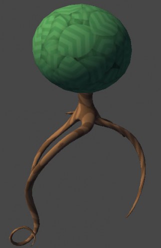
tree

More on how I made that in another post.

the revision

I’m considering the post-jam revision an essential part of this process, which is something I’ve never done before. Rather than simply think and blog about what went wrong, I decided to go ahead and try to make fixes for the most glaring problems, and that has helped me learn more about what I need to work on here.

So that’s it for now. Stay tuned for What Went Wrong, which may be even longer! 😉

What You See

On some basic level, most programming languages are kind of the same.

Until they’re not.

Sure, ifs are ifs and loops are loops no matter what the syntax, but development environments can vary greatly in terms of how they want you to work. And if you fight that, you can be making things way harder on yourself than you need to.

I’ve recently run into this with Unity.

I picked up Unity because I was tired of trying to make games in environments designed for writing apps. And I loved it. Unity has a really nice library that contains functions for editing meshes, writing shaders, and working with object relationships in three dimensions.

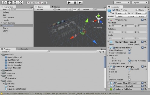
However, this is what Spindle Sun looked like, in Unity:

Editor-1-June-2013

It… didn’t look like anything at all. There are no spaceships, no planets, no game board to look at. Just an anonymous sprite sheet, which is an artifact of the way I was approaching everything: everything was made in code. When you started the game, it would randomly make some planets, and give them random names, and put you in the center of the map… but you couldn’t see any of that in the editor. And it was hard to imagine, looking at the editor, what was going on, what the gameplay might be like.

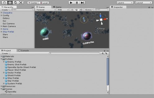
So I’ve decided to ditch the procedural maps thing and just make a level in Unity’s very nice level editor, and this is what editing looks like now:

Editor-3-July-2013

Here, you can see a couple planets. They have names in the Hierarchy list and in the Scene preview. There are stars, and you can see your spaceship’s starting position.

Spindle Sun is sort of a spin on 4x take-over-the-galaxy games, and you sort of expect those to be procedural. But I’m working out the gameplay as I go, and doing that with a procedural world has proven to be rather annoying. What I need to really get the gameplay right is a concrete map, so I can look at it and see what sorts of challenges the player will face and what obstacles I can put in their way and see how the player is going to progress through the map.

It’s about being able to work hands-on with the design of the game. Which, previously, I wasn’t really doing.

I’ve tried studying levels in other games like Metroid Prime, but I’ve never actually designed a level before, in a level editor. Most stuff I’ve done has been procedural, or I’ve made little maps you could walk around that weren’t really levels in the sense that there was a flow through the level. So all this is new to me.

Unity is much more than a code library, and I’m pretty sure Unity wants you to work in a visual sort of way. And I’m rather liking it so far.

Personal Archaeology

Some people have formative experiences. Among other things, I have a formative logo, which I’ve just seen for the first time in thirty years. Always an odd experience, seeing things like that.

* * *

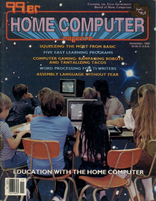
When I was little, we had this computer. And we got magazines written just for users of this computer.

robochase-cover

Every issue had code for simple games; if you typed the code verbatim into your own computer, you could play these games. I did this a few times.

This particular issue about ‘education with the home computer’ had a game called Robochase. I don’t remember the gameplay at all, but I do vaguely remember the instructions screen, which had a logo that looked like this:

robochase

This is me.

This is my life.

* * *

To make that title card, you didn’t use a graphics program or anything. You did it in code.

robochase-code

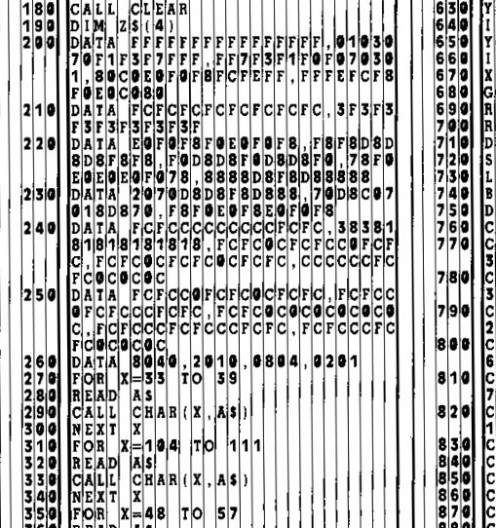
See all those DATA statements with incomprehensible gobbledygook after them? Those are custom letters. A font, if you will. E0F0F8F0E0F0F8 is an R. F8F8D8D8D8F8F8 is an O. But it’s not a whole font. It’s just the letters you need to spell out ‘robochase’.

And one of the first things I did with a computer that wasn’t typing in a canned game or playing an existing game, was try to fill out the rest of the letters in this sort of Tron-ish font.

I don’t remember how far I got, or how good my results were. But I remember that I tried. I found this endeavor far more enjoyable than playing kickball with my friends.

And being a programmer, and puttering around with game projects, and having an interest in making fonts, and typography, and graphic design in general, this is a big part of who I am.

* * *

I love being able to dig up stuff like this. The stuff that made us. Not that it’s a particularly straightforward process. It’s taken years for me to find a pdf of this magazine.

Part of the fun is the random other stuff you discover along the way. An ad for floppy disks. An article about how great computers will be at teaching mentally disadvantaged kids.

And once I see this stuff I’m made of, it all becomes a little more mundane, and it’s reminder that every mundane thing I do still makes me, for better or worse. I’m well out of my formative years, but I’m still being made by the things I surround myself with. So I’d better make sure I’m being made of the right things.

First Person Fencer

Took a bit of a detour over the last couple of days to try out an idea for a swordfighting game mechanic that’s been stuck in my head.

There’s a lot that’s janky about this, but it’s been nice to just dive in to a couple of random ideas and explore them.

First:

swordfighting

The idea here was to tackle a number of things I don’t like about first person shooters. I like how immersive the environments feel in first person games; I like 3d platforming, and I like the lack of item trays in your typical FPS. But… I don’t like the shooting so much.

The solution was swordfighting. You can’t see a sword in my prototype, but the idea is you can thrust or slice with your sword, wearing down an opponent’s shield. Every time you slice, you divide the shield into smaller fragments. You can thrust at a small, red-highlighted fragment to destroy it. Really small fragments simply disappear on their own.

So here are some things I had in mind:

hit or miss

In an FPS, if you shoot something, you either hit it or you miss it. True, there’s something kind of satisfying about lining up a perfect headshot (if you can stomach the subsequent gore), but I just don’t find the act of shooting that interesting. Your targets have X health points, each shot does X damage; do enough shots and the target is eliminated. It’s not something that’s expressed in a very visual sort of way.

So here, you eliminate a target when you’ve gotten rid of their shield. It’s pretty easy at first, but when the shield starts to wear down, it can be a little tricky to line up slices in such a way that they cut a maximum number of remaining shield fragments.

I find the act of doing this kind of fun and visually interesting.

abstraction

You don’t fight your opponent: you fight their shield. There wouldn’t be any blood, or dismemberment or anything; you’re not thinking about the damage your weapon might cause to someone’s flesh. As soon as the shield is gone, the opponent can conveniently vanish in a puff of pixels.

(I might have your opponents be all mechanical anyway, because I’m still squeamish about showing harm to living things.)

health bar

Your opponent has no health bar; the more shield they have left, the healthier they are.

variation

Let’s say a shield fragment turns red and can be thrusted away when it has an area of 1 unit. And shield fragments under 0.5 unit simply disappear as soon as they’re created. With that in mind, the following things happen:

An opponent with a shield 0.6 units in area can be eliminated with a single thrust.

A single slice will probably do it too. You can be messy: if you divide the shield into one 0.2 unit fragment and one 0.4 unit fragment, they’re still under 0.5, and both fragments will disappear after the slice.

Go up to 0.8, and you’ll have to be more careful about your single slice, say, dividing the shield into two equal 0.4 unit halves.

At 1.2, a perfectly-centered slice will result in two 0.6 unit fragments that don’t disappear outright, but which are small enough to be thrusted away.

And anything above that size will require multiple slices, which the player will (hopefully) have to put some thought into arranging if there are time constraints of some sort (like, you know, taking damage).

You could even have shield so big you you have to jump up to start your slice and continue it on your way down.

I like this sort of progression. The difficulty scales in a way that isn’t just about spending more time in the fight or taking more damage.

problems

All that having been said, there are a few problems that will probably prove difficult to solve.

animation

I do not relish the thought of modeling and animating a believable sword and jointed sword arm that responds to your movements.

cursor

The mouse is used both for movement and slicing: at present, your sword tip is always at the center of the screen. Besides looking very unnatural when you do actually have a visible sword and arm, it makes placing your slices feel very awkward. While slicing, I expect the camera to stay relatively still.

height

If your opponents are the same height as you, you’ll constantly be looking down at their shields. Again, awkward.

symmetry

I’m having trouble imagining giving the player their own shield that follows the same rules as the bad guys. The controls could be awkward or confusing, and you wouldn’t even be able to see most of your shield most of the time.

camera

Incidentally, I’m also experimenting with a sort of fisheye camera. Your horizontal field of vision is around 120 degrees, but it’s a cylindrical projection, which minimizes distortion on the edges. Of course, this adds some distortion to what would be straight lines in a regular projection.

Ideally, I’d want something that was sort of like you were standing inside a cylinder with the world projected onto it… and then took a couple steps forward. So when you turned, there would be a little bit of distortion, but not as much as a regular planar projection. But that would involve lots of matrix math I don’t understand.

Overall though, I think it feels fairly natural. I don’t like how limited your vision is in most first person games.

to sum up

I think this has potential. Who knows when/if I’ll develop this more; right now, I’m just glad to have the basic concept out of my head.

Copyright © 2017 Brian Crick.