Brian Crick

Blog

Tinselfly: The Text Adventure

For the last two weeks, I have been working on a new feature for Tinselfly.
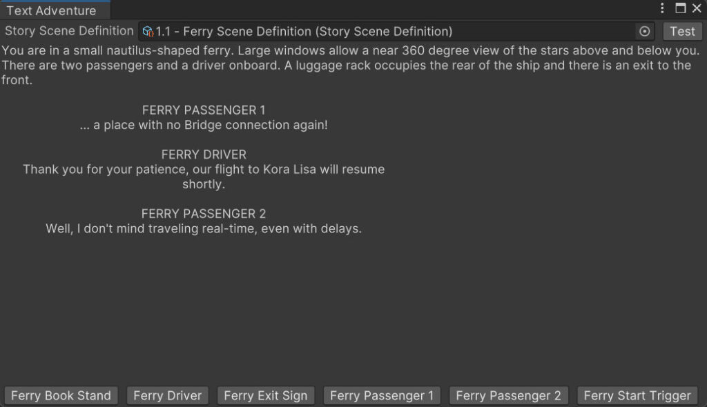
You’ll be able to play most of the game in this little window. You see text descriptions of the areas you’ve unlocked, see all dialogue as text on screen, and interact with the world by pressing buttons representing objects in the scene. There’s not a single graphic.

It’s basically a text adventure.

And I’m incredibly excited about this.

* * *

Ok, ok, this isn’t a feature really. It’s a development tool. What this allows me to do is not do anything at all whenever my partner Marie needs to write a new scene with new props, new environments and new characters. With a few button clicks, Marie will be able to create new things for the player to interact with, and new places for them to explore. She’ll be able to test dialogue trees and play through whole scenes containing multiple dialogues and puzzles, without ever running the game. She won’t have to wait on me to create art assets or scripts, which always takes a dreadfully long time. She can write text descriptions of yet-to-be made assets, which will help me, you know, make them.

As someone who’s already accustomed to writing both traditional text-only stories and text adventures in things like Twine, I’m hopeful that this will be a natural workflow for her.

* * *

For this to work, there has to be a clear separation between the content of Tinselfly and its presentation.

Right now, my Tinselfly scenes — like many Unity scenes — are this soup of things that do stuff… you click on an interactive object, it runs a little script that affects other objects, or variables, or plays animations, or whatever… it works but it’s very unorganized.

For example, imagine the simple act of opening a door in a spaceship hallway that leads to your cabin. Currently:

  • There is a 3d modeled and textured hallway the player may walk though.
  • There is a 3d modeled and textured cabin that the player cannot see yet.
  • There is an invisible physics barrier where the door is, preventing the player from passing through the door.
  • The player clicks on the door.
  • An animation plays, showing the door opening.
  • The physics barrier is removed, allowing the player to pass through.

There’s not that much here, but there’s an uncomfortable combination of visual updates (the door opening), physical scene updates (the physics barrier being removed), and conceptual updates (the player’s new ability to walk through the doorway).

Thing is… the most important part — the conceptual update — isn’t expressed in any direct way in the door script. The player can pass through the doorway by virtue of the invisible wall being removed, but the game has no awareness that a new area has been unlocked.

To make the text version of the game, I need formalized blocks of data for things like unlockable areas, interactive objects and characters that exist completely separately from their visual representation. These data blocks can even exist completely outside of game scenes. They’re just… data.

And then I also need a more limited concept of game scripts, that can’t operate on objects in game scenes at all; scripts that can only operate on the data.

(Many problems in application development can be solved by limiting what things can do, rather than expanding it.)

The flow then becomes:

  • The spaceship hallway area is currently unlocked.
  • The cabin area is currently locked.
  • The player interacts with the door.
  • The cabin area is marked as unlocked.

None of the steps above deal with visuals or physical walls at all. They’re just dealing with concepts. The presentation layer of the game then takes care of the visuals. It can detect when an area is unlocked, and play an appropriate animation, and disable the appropriate physics barrier.

Or, if the game is in text adventure mode, it can show a text description of the new area, with a new list of buttons representing the objects in that area that the player can interact with.

* * *

Now here’s the fun part: if every interaction in the game is expressed as simple instructions that operate on pure ideas, you don’t need to actually play the game to play the game.

I can now write some testing scripts that ‘play’ the game just by looking at all the data, and go through every conceivable combination of player interactions with the world, and tell me if the game can ever reach a state where a puzzle can’t be solved, the player gets stuck, or certain important events can happen out of their intended order. I’m sure this will be incredibly helpful moving forward, for both me and Marie, as we make sure the player experience is what it’s supposed to be.

* * *

Moving Tinselfly from a solo-dev project to a multi-person project has been… a complicated process. It’s not just a matter of delegating tasks; the project has to be structured in such a way that tasks can be compartmentalized meaningfully. And so far, they really haven’t been.

While Marie has been taking a break from the project during these updates, this has already helped me fixed other bugs. Which brings me to the moral of the story here: solo-dev or not, this sort of work makes the project more maintainable, and stable, and testable. I started this so that Marie could do her job more efficiently, and it’s making everything about the project better.
Infinity Mirrors

Like many writers’ first, overly ambitious, semi-autobiographical works, Tinselfly is a story about its own creation.

Setting: a sci-fi universe where spaceship travel is dying out, and wormholes are taking their place.

A young woman suddenly finds herself able to travel millions of miles in a single step, staring into a fresh new wormhole leading to a prestigious academy on another world. This whole idea of wormholes is still fairly new to her, but all she has to do is start walking. She has always dreamed of attending —

–and she never walks through.

* * *

I am currently job hunting. I love my current job, but we’re all grant funded, and we’re running out of grant, so here I am.

I’m a Unity developer, and there aren’t a ton of Unity developer positions where I live, so I’m looking for remote work for the first time in my life.

Call it what you will, but I’m not used to applying for jobs where nobody already working at the company can vouch for me. I’m having to work harder to describe my skills and work history to other people than I ever have before.

I’m having to work harder to remember my skills and work history than I ever have before.

* * *

Setting: a college dorm room in 1995.

I suddenly find myself in a position to send a job application to someone on the other side of the country, starting at a recruitment web page for a prestigious visual effects studio. This whole idea of using the Internet to communicate with people is still fairly new to me, but all I have to do is click a button —

— and I never do.

I never assembled a portfolio.

Despite being well known as someone who could do intricately detailed pencil and paper drawings, despite having won Best of Show in a state arts competition for digital art, despite receiving one of the highest visual and performing arts awards my high school had to offer, despite this being my dream job, I had done very little work towards getting it, because California is very far away from Oklahoma. I could never go.

More importantly, I had no portfolio. It never occurred to me to keep a record of what I’d made.

And suddenly, California was on my computer screen.

* * *

I’m not used to keeping records. I don’t save mementos. I don’t look at old photos of past adventures. They don’t in any way jog old, happy memories; I have few if any memories to jog.

The photographic evidence may suggest certain things, but that’s not a memory.

In a very broad sense I know who I am and what I can do. But ask me what I’ve done and I won’t know the answer for a few minutes, if ever.

* * *

I had my first technical interview today. And, of course, they asked about my recent accomplishments and challenges. And, of course, I had trouble remembering.

I’m used to having other people remembering my accomplishments for me. On a day-to-day basis, I don’t need to remember. I just need to retain the skills and knowledge I gain from surmounting each challenge.

* * *

A portfolio is, almost by definition, for other people. But what if I didn’t make one for other people? What if I made it for me? With a robust portfolio, I could know what I’ve done as well as what I can do. And prospective employers would know that, too.

It wouldn’t have to be just visual, either. I’ve solved a lot of complex technical challenges for Tinselfly. I can’t remember, as I am writing this, what many of those challenges were–

–but the evidence suggests that I solved them.

I could review my portfolio between each interview, as if cramming for a test. And maybe–just maybe–I could hold that knowledge just long enough to more effectively communicate my own worth as an employee.

* * *

Click! I applied for a job.
Click! I applied for another job.
Click! Look! I did it again!

Such is the nature of looking for remote work in 2023.

The clicking is too easy, all this clicking is useless if I can’t describe what I think my value is to others.

So now I am, for the first time in my life, assembling a portfolio, both for myself and potential employers. As of this writing it’s still fairly incomplete, but it’s getting there.

And, if only for my own benefit, I’d like to make more posts here about the technical side of Tinselfly.

Finding a job isn’t going to be easy, but I’m feeling better and better about the job hunt every day.

Travel, Without Moving

One of the more technically complex sequences in Tinselfly involves your 175 meter long, 285 meter tall spaceship flying into a spaceport where the player can board it, and leave immediately with the player on it, with no loading screens or interruption to player control.

This was challenging to implement because the ship can’t move.

As far as the Unity game engine I’m using is concerned, the ship — where you’ll spend much of your time in game — is a static scene, meaning that there’s pre-calculated lighting and visibility and pathfinding information encoded into the scene that makes the game run faster and better… and if the elements of the scene were to move, that information would become invalid. Lights wouldn’t illuminate the areas they’re supposed to, NPCs wouldn’t be able to move around, and the various calculations that determine what the player can see would stop providing accurate results.

To solve this problem, I’m using multiple cameras: one for the spaceport, and one for the ship. The spaceport camera is attached to the player’s head; no surprises there. But as the player moves through the spaceport, and as the ship ‘moves’ through the scene, the ship camera moves to the position you’d see the ship from, given the spaceport camera location and ship location.

(Sometimes, it seems like half of the codebase for Tinselfly in converting things from one coordinate system to another, but that’s another topic.)

Just syncing up the cameras isn’t enough to sell the illusion, though. The ship needs to appear to pick up light from inside the spaceport: it should be affected by fog, be bathed in some purple bounce light from the spaceport walls, and the glassy sails should appear to reflect the buildings and signs around you.

As far as Unity is concerned, none of the light is actually pre-calculated in the scene with the ship, so it all has to be faked. Enter custom shaders.

(Sometimes, is seems like the other half of Tinselfly’s codebase is custom shaders…)

A shader is a little program that tells Unity how to draw something on screen, what color it is, how bumpy the surface is, how it reacts to light. In this case, the hull of the ship has custom shaders that calculate the reflection angles you’d get if the ship were really where it appears to be, and add the aforementioned fog and reflections. Also, there’s a gigantic, invisible purple light outside of the ship, that turns on just when it’s in the spaceport.

Once the player boards the ship, they teleport from the spaceport scene to the ship scene, and the camera control reverses: the ship camera becomes attached to the player’s head, and the spaceport camera’s position becomes dictated by the ship camera and ship position.

Overall, I think the effect is fairly convincing. And it’s not something I’ve seen it a lot of games. I’d say I hope that rarity makes this sequence all the more memorable, but in the end, the goal here is to make it looks like there are no effects at all, and have the scene be memorable because of the narrative context in which you’re experiencing it.

Emptiness and Fullness; Ships, Spells and Stars

My day, expressed as today’s shopping list:

  • One phone charger to replace the one I left at my hotel on Saturday.
  • One external 2TB drive.
  • Services and parts from Micro Center, for a laptop drive upgrade.
  • One bottle of bubble bath.

* * *

As I type this, my laptop–my only development machine for my day job, Tinselfly and any number of other projects, is running a full backup. One of its drives has outlived its usefulness. I’m on vacation this week, but I’m not really going anywhere; I just have vacation days to burn and I’d planned to spend these days catching up on my game. But I cannot really do any work right now, and most likely not again for another day.

You might see this as terrible timing. I choose to see it as great. I, and my laptop, are overdue for a refresh.

* * *

A couple of weeks ago, I was feeling pretty overwhelmed with Tinselfly. So, I did what I always should do in these situations but haven’t done in years: I gave myself more work to do.

Tinselfly is a first-person 3D narrative adventure game. Think Life is Strange… but in a wacky, whimsical science fiction world… and with wacky, character-driven set pieces.

Gemslinger is a 2.5D mashup of the original Legend of Zelda and match 3 games set in a fantasy universe. You’re a magic user and casting spells means lining up gems just right.

Operetta is a 2.5D, bite-sized, 4x/top-down shooter mashup. You’ll colonize planets, research new technologies, and dodge beautifully arranged sprays of projectiles.

These projects are all quite different from each other, which is critically important: I can take a break from one project by working on another, using one set of skills while another set recharges. This has, as always, been immensely good for my productivity and mental health. And, in fact, Tinselfly itself is moving along faster because I am spending more time working on things that are not Tinselfly.

I’m not immensely good at taking breaks in any other way.

* * *

Last week, I went to GDEX, a nearby game developers’ conference. For the first time in years, I wasn’t showing Tinselfly or giving any talks; I was just there as an audience member. And it was exhilarating. I went in nervous that I’d never break into the games industry and left with concrete plans for doing just that. I tried to listen carefully to the advice of established professionals, and give the best advice and encouragement I could to those not as far along in their journey as I am. Most importantly, I tried to have fun.

In many ways, going as an audience member is more exhausting than going as an exhibitor. I found myself skipping talks I really wanted to go to, just so I would have time to digest the last two. To sit and think, but also, to do and think nothing at all for a while.

* * *

My experience of the world is very much about now. All there is, is now. There is no past, no future; life is just an endless series of moments. I don’t think about the future of my career at all, nor do I think much about how long it’s taken to get where I currently am. There is only now.

* * *

Productive as they are, my sessions of rapidly, intensely cycling through my creative work but be balanced with periods of absolute nothingness. Taking a break to watching TV or playing a game isn’t mind-emptying enough; what I’m talking about is long periods of having not a single word in my inner monologue, not a single conscious thought running through my brain.

The bath after my daily aerobic workout or cooking a meal I’ve cooked a thousand times before usually suffices.

* * *

For the last several years, GDEX has partnered with Origins, a board game expo. Your GDEX pass gets you into the Origins exhibitor hall, and this was the first year I saw it. There must have been hundreds of games, most all of them lavishly produced, with full color illustrated boards and full color illustrated tokens or lovingly sculpted miniatures.

Most of the time, the artwork on the boards and other game components is so lavish, and so beautiful, that I can’t tell what’s going on. There are tokens on the boards, but they get lost in the swirling colors of the boards themselves. There are cards, but I find myself struggling to find the text printed on them.

I’m in awe of these games. And I don’t want any of them.

I buy an Art Deco inspired Star Trek poster from one artist and leave.

* * *

On the last day of GDEX, some friends and I decided to go to Otherworld, a strange, surreal sort of art exhibit/amusement park that feels like one of those games where you’re stranded on an alien world with lots of puzzles. There are dozens of rooms to explore, with odd plant life, Alice-in-Wonderland-like imagery, odd machines to interact with and cryptic messages to discover.

About an hour in, I got separated from my group. And I started to panic. Without other people around to tie me to the real world, Otherworld was all there was. This bizarre, inscrutable universe was all I knew, yet I didn’t know how I was supposed to engage with it.

I’ve experienced similar levels of disorientation and anxiety while at Disneyworld, in museums, or when I’m separated from my family for long periods of time. All there is, is now.

* * *

Just before leaving for Otherworld, I decide to grab a quick bite to eat. On the way, I run into one of the GDEX presenters, who is promoting a board game at Origins. Mentally, I feel like I don’t have space to even look at another board game. But I look at the board for his and it’s colorful and it’s vibrant and it’s… minimalist and comprehensible. I can read it. I can see the empty spaces where the tokens go.

I tell its designer how refreshing his design is.

And I can see a wave of joy and relief come over his body.

I suspect that he’s put a lot of work into this, and few people comment on it. His GDEX presentation was all about making good game tutorials, controlling the flow of information. Making sure that players feel neither bored nor overwhelmed.

My last thought leaving GDEX is about how, as soon as I get back home, I want to pre-order that board game. The one that was beautiful in its simplicity. The one I could understand when I looked at it.

The one with the empty board, waiting to be filled.

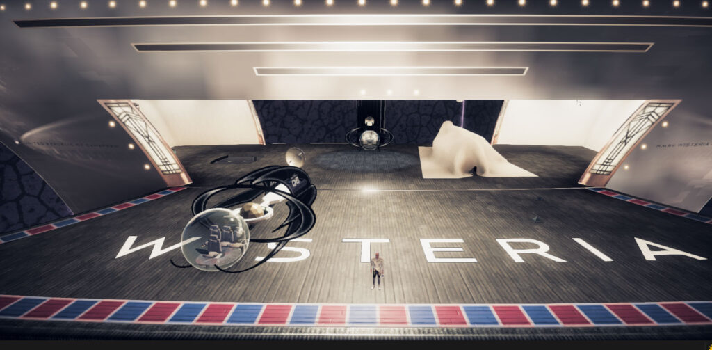
Wisteria Decks 6-7: The Also Very Big and Vaguely Defined Shuttle Bay

The Wisteria in Tinselfly, where they player will spend most of their time, is a research vessel. It ferries researchers to places where there’s demand for research, and, once there, acts as a centrally located research campus.

Decks 6-10 of the ship are entirely about research operations: labs, offices, housing for the researchers themselves… and a large shuttle bay, where researchers go, when they need to go somewhere else nearby to do their research.

Shuttle Bay

I suspect that crew who don’t normally work on the flight deck would occasionally stop by during rush hours to assist with loading, unloading, and directing researchers to their shuttles.

This environment is not at all complete yet. Visually, I haven’t given a lot of thought into how to make this look interesting or futuristic or unique to this universe, but It’s likely I’ll be able to add unique details on a prop-by-prop, structure-by-structure basis.

So: without going into any visual or aesthetic detail, here’s some random brainstorming for additions, structured from the point of view of a researcher.

* * *

Upon exiting the lift and walking on deck, I’d expect to be greeted by a schedule board and maybe a crewperson at an information booth, to answer questions. There would be some benches where I could sit and wait, and maybe even some snacks and magazines or something to look at while waiting.

There would need to be a changing room with lockers and spacesuits and showers, just in case that was needed upon getting to the planet surface.

And of course a bathroom off the waiting area.

There would be clearly labeled parking stands (I just learned that term) for the shuttles. There could be fuel pumps at each stand, and equipment to do exterior scans of the shuttles for maintenance purposes, and maybe a crane built into the deck ceiling. And dollies and palette jacks and such.

The shuttles themselves would be purpose-built, in a variety of shapes and sizes, as many shuttles would not just be transports, but might contain specialized sensor equipment of their own.

I guess I’d expect to see other shuttles too, ones that aren’t going to flown any time soon, in storage bays.

Somewhere, possibly on the opposite side of the bay as the waiting area (where civilians wouldn’t be expected to go), I’d expect to see a repair bay, with spare parts and tools and whatnot.

Finally, there should probably be some kind of control room with big windows overlooking the whole bay. That may be… tough to squeeze in, given the shape of this space.

* * *

Back to Star Trek. Conceptually, this is what I think of, when I think of Trek, but if I may say so, the Wisteria has the potential to be… a fascinatingly unique construction in spite of how much of a rabid Star Trek fan I am. All of what appeared in this post, and what will appear in the upcoming labs & offices posts makes a decent amount of sense to me, for what a Star Trek-y science vessel might feel like. And yet, I have never seen anything quite like this in a game, or on film. The trick is going to be to clearly express, visually and mechanically, what makes this ship — this place— fascinating to me.

    Wisteria Decks 4-5: The Very Very Very Big Radial Engine Thing

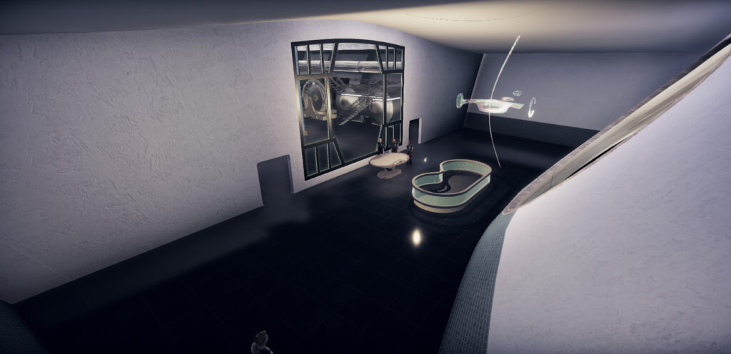
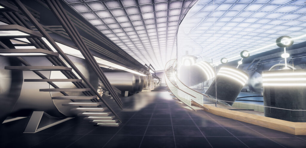
    Decks 4-5 of the Wisteria are the engineering bay and related rooms. As mentioned earlier, this ship came out way bigger than it was supposed to… and the engineering bay was always supposed to run almost the entire length of this part of the ship… so this came out a dizzying 80 meters long. Most of the length is this great big room with pistons in a tank and some fuel tanks and things on the side (Above).

    The rest is this completely placeholdery entrance area (below).

    what does this thing do, anyway?

    It’s an engine room. It’s kindofsortof based on the idea of an ion thruster, where you take ionized gas and spit it out the back of your ship: a rocket engine, but with a very thin stream of particles instead of a big blast.

    So already I’ve got a visual problem; the radial piston engine (in the blue tank on the right of the image above) isn’t a radial piston engine; it’s supposed to be more of a particle accelerator. But a slight redesign of the piston models could communicate this idea more effectively. And also be more visually interesting.

    The tank in which the pistons sit is supposed to be a cooling system. To make that clearer, I could:

    • Add ice crystals / condensation to the tank walls.
    • Put engineers in special garments to suggest that the room is pretty cold, too.
    • Put caution signs near the exposed parts of the beam.
    • Add a heat distortion effect near the exposed parts of the beam (I think my game engine already provides a way to do that, but I’ve never tried).

    On the sides you’ve got some fuel tanks and structures meant to resemble rotary converters.

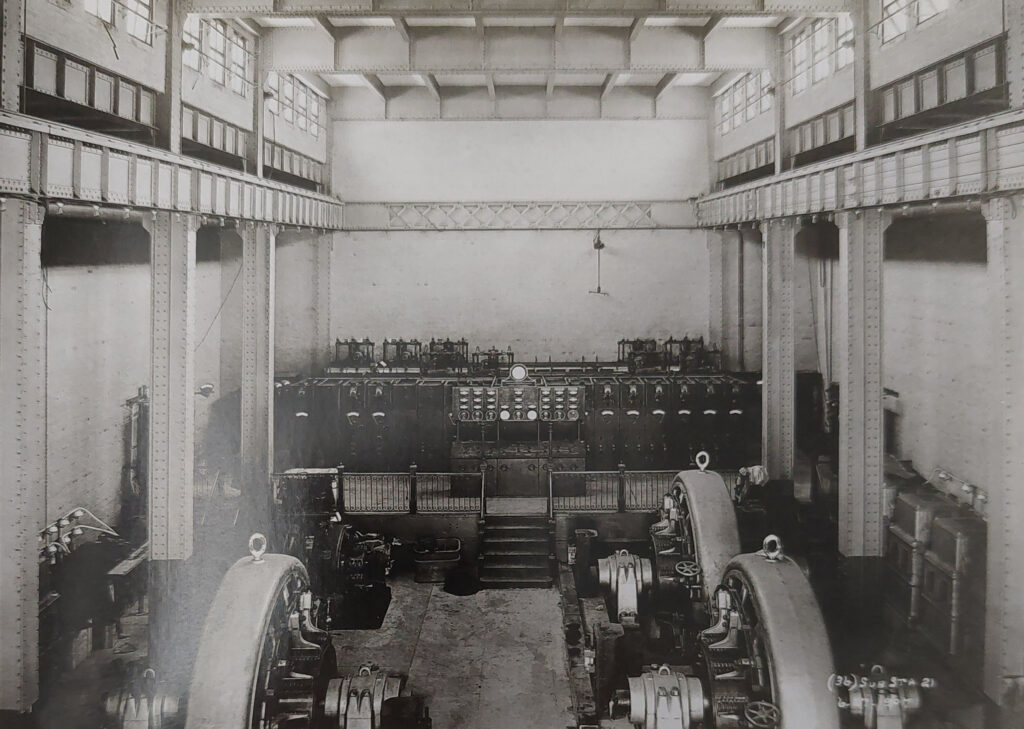
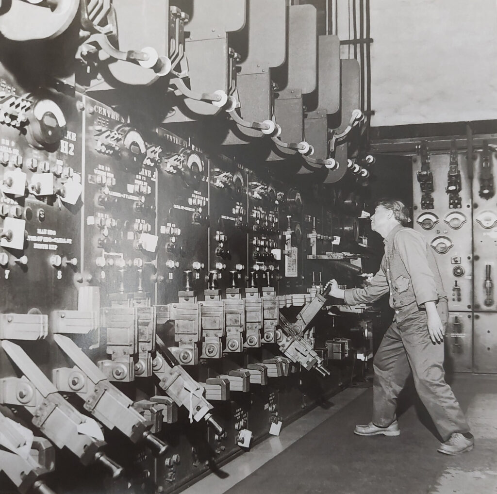
    Oh hey, that detail was taken from this book New York’s Forgotten Substations. Let’s look at that a bit more.

    In this image, there are some nifty columns running the length of the room. That could be a nice detail, the suggestion that, you know, something is holding that ceiling up.

    And here we’ve got some consoles lining the walls. I could do some colorful displays pretty quickly to add interest there.

    what do people do here?

    So I suspect engineers’ jobs might broadly fit into two categories? Maintaining the engine parts and monitoring the engine parts while it’s running.

    Maintenance

    There could be a workshop. You’d also need dollies or palette jacks or something that can move large objects into the workshop, and some suggestion that wall between the front and back areas has a large garage door or something through which you can wheel those objects.

    A broken part in the workshop, currently being worked on, would be great.

    There should also be spare parts.

    Monitoring

    I feel like there could be more monitors pretty much everywhere. More consoles on the floor and on the catwalks, readouts on the tank glass itself, readouts on various tanks and engine parts.

    I’d also like there to be some sort of centralized, high-level ship-wide systems monitor, where the player can see their progress repairing parts of the ship.

    Much of the work in the main room is already done, though it’s always felt rather empty and consequently unconvincing to me.

    is this enough?

    If I move the machinery on the edges of the room in just one meter, the space somehow looks much more… like they needed this amount of space for this engine, plus, it lets you walk behind the machinery. So yeah, I think the above edits will be enough.

    Entrance Area

    About that entrance area: I’m thinking add some walls on either side of the space (sort of dividing it into thirds). The center portion can be big and open, with a big holographic ship status display that the player can look at, to see their progress during the repairing-the-ship part of the game.

    Some ideas for the side rooms:

    • An office.
    • A break room.
    • A bathroom.
    • Lockers and maybe showers, if the characters in this space are shown to be wearing specialized protective garments or something while in the engine room.
    • A workshop with stores of small spare parts, for repairing damaged engine pieces.

    * * *

    Next up: the flight deck. The engineering bay was the last part of the Wisteria I’ve done substantial work for, so after this things get pretty sketchy.

    Wisteria Decks 2-3: Parks & Recreation

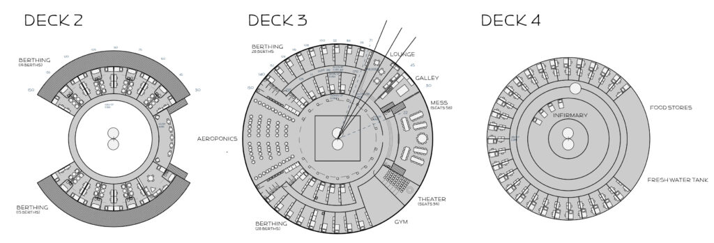
    Decks 2 and 3 of the Wisteria are the habitat module of the ship, containing bedrooms, recreation, food, the infirmary, and the aeroponics bay.

    This module is not really the best place to add details that express the function of this ship or anything, but maybe I can squeeze in some more worldbuildingy cultural stuff.

    In terms of game mechanics, the player would reasonably be able to recharge their energy in many of the spaces here. But while I feel like it makes some sense for these spaces to be clustered together in the habitat module as that-place-you-go-when-off-duty, from a level design standpoint it might be… less than ideal.

    I need to think about this a bit.

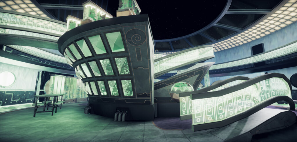
    Aeroponics

    Aeroponics might not be the right word, but this is supposed to be a place where food is grown and carbon dioxide turned into oxygen. I’m quite certain it’s not even close to large or dense enough to serve this purpose realistically but there’s uh some time-dilating tech inside the glass plant enclosures where a season inside the glass is a couple days outside.

    Something like that.

    But hey, it’s also pretty.

    It’s supposed to feel like weird formal garden and there are a few tables and benches on which to sit and relax, so I think of this as a sort of break area too. This space also exists to convey the idea that people in this universe have little concept of what real nature is.

    This area is one of the most complete sections of the ship, but it still needs details to communicate what the space is for:

    • The glass enclosures need fruit and vegetables that look, you know, tasty.
    • There needs to be clear storage for harvested fruit and vegetables, or an indication that harvesting is a thing that happens from time to time–like, an open enclosure with a crate of fruit next to it.
    • It should be more obvious where the freshwater tank is (it’s there, but it’s really not clear what you’re looking at).
    • There should be more benches. Right now there’s just one bench and one table to sit at. Not exactly a space that’s inviting people to sit and relax in it.
    • There should be evidence of recreational activities happening. Light reading on a bench; a card game on the table.

    (Note that I’m not talking about environmental storytelling here. Tinselfly will not feature any environmental storytelling. It just… it doesn’t work for me. It doesn’t excite me. I don’t want the player stopping to pore over every detail in these scenes, trying to piece together a story. It wouldn’t be right for the pacing I want. Ok, moving on.)

    Food

    Currently, the Wisteria has a single mess hall that seats 66.

    It’s… fine. One of the first spaces I made for this project. I even made it twice. You wouldn’t think this would be a great place to do world building, but there is a very specific detail I want this area to express.

    In the Tinselfly universe, if you go out to eat, you’re probably eating in something like a food hall. The idea being that people from a wide variety of worlds with a wide variety of dietary needs and preferences can always eat in a shared space with others. A big ship would have a food hall, though even my oversized Wisteria might not fit this definition of ‘big’.

    In any case, I’d like to squeeze this in, as it’s supposed to highlight that there are societal systems in place, maybe a little different that the real world, that exist because this is a multi-planetary civilization.

    Having said all that, I think it would be absurd to have multiple kitchens or food stations or anything like that on a ship of this size. Maybe I can have this idea inform the mess details on a much smaller scale.

    I think a ship like this would reasonably have a buffet for every meal, which already lets people pick and choose what they want to eat, and how much of it. But maybe there’s a way to sci-fi up that concept. There’s really not room for buffet tables, a bit of a design oversight. But I could do a dim sum like thing with food trays flying around that people would wave down. That way they wouldn’t take up valuable floor space, they’d add motion to the scene (again, any sense of busyness that I can add, without having to animate humans is a good thing), and there could even be a puzzle involving the flying food trays.

    Recreation

    There are a few different places people can go to relax or entertain themselves in the habitat module.

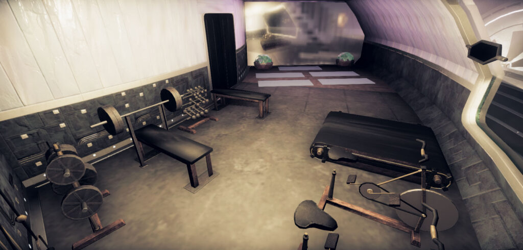
    The gym

    The treadmill needs a 3d video wall showing a space you’re running through. Maybe not so much on the ship, but there should be lots of details in environments that are all about helping you pretend you’re somewhere else; it’s a big theme here.

    Could also use some wall hangings–class schedules, reminders of upcoming competitions, races or other events.

    The Mess

    People might go there to play card games or just hang out.

    The mess could also double as an entertainment venue when food is not being served.

    The original plan was to have a set piece where something is happening while there’s a movie being projected through the space, but that might mess up the flying plates idea. Or hey, maybe they could work together in an absurd way.

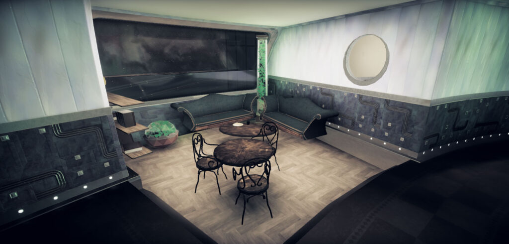
    Lounge

    The wiry bistro furniture in the lounge really needs to go; it’s just not the right feel for the space at all. But I don’t have any more utilitarian looking furniture yet.

    Needs some games and books on the shelf.

    Infirmary

    Right now, there isn’t one, but I want to make the gym smaller and put the infirmary there.

    What’s in here will probably be determined by how much the player will need to make use of it. Right now, there isn’t even a concept of a health bar in the game, despite there being sword fighting.

    So I’ll go ahead and adjust the gym walls to make space for it, and leave it empty for a while.

    * * *

    Next up: the absurdly oversized engineering bay. Which needs help.

    Wisteria Routines & Deck 1

    Dress

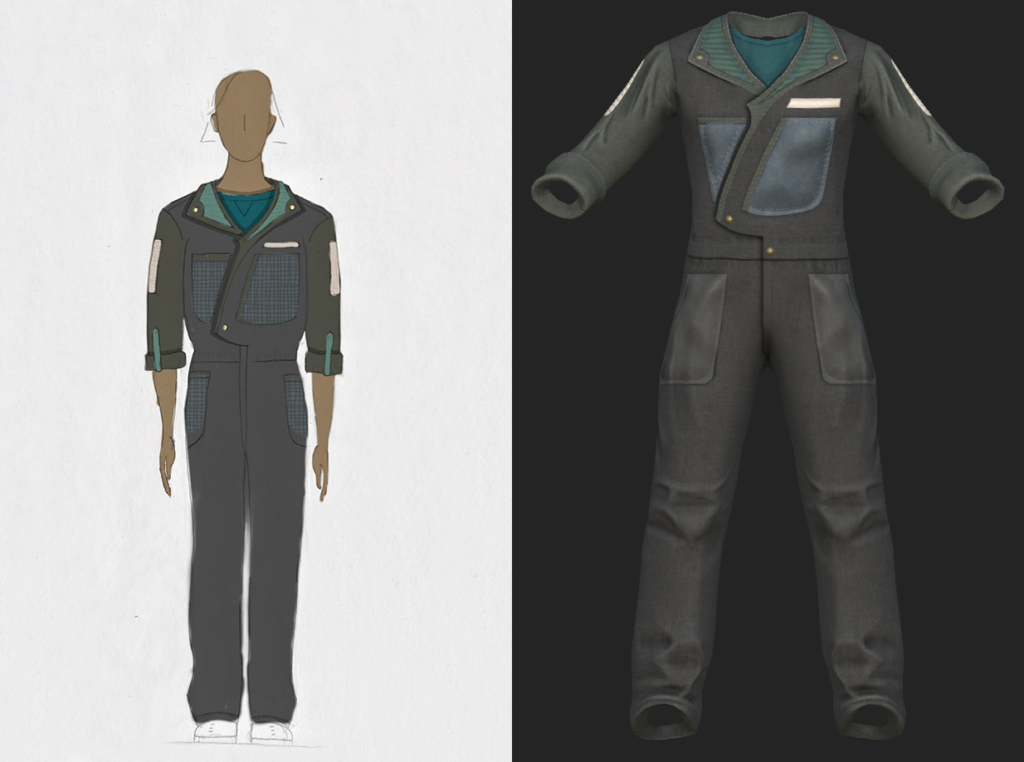
    Most crew, most of the time, should be wearing these coveralls while on duty. Not incredibly dirty coveralls, but not immaculate either.

    Officers and crew in more office-y jobs might wear uniforms, but nothing particularly showy or science fiction-y; just garments resembling regular period office attire. I have dress uniforms and coveralls I love, but I still need to come up with regular duty uniforms I don’t hate.

    As for the researchers, I’ll be putting them in office wear too, or the sort of thing you’d wear to go hiking, or whatever comfortable clothing is appropriate to the climate of the location being visited. Or, you know, environmental suits if the location demands them. Not sure about lab coats for people in the wet lab. The drapery could cause problems.

    (Confusingly, there are some wetsuits in the dry lab, but I’ll get to that later.)

    Survey Room

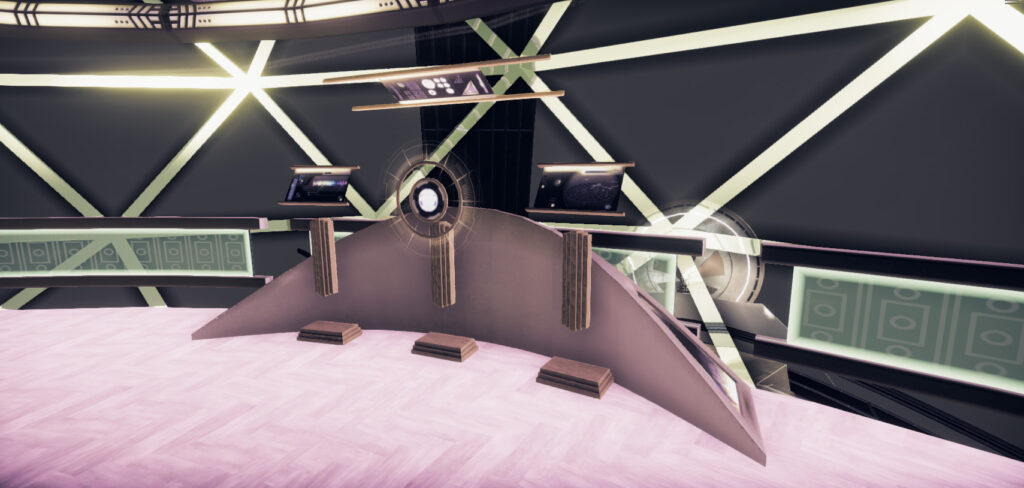
    So let’s start at the top of the Wisteria, where the bridge is. The bridge is… tiny.

    No giant viewscreen, no special captain’s chair… just some navigation, communications and helm consoles.

    It needs some chairs. I have a selection of chairs you might see in restaurants or a bar but I’m not sure if I have anything more work-like I can drop in here. I’ll have to check.

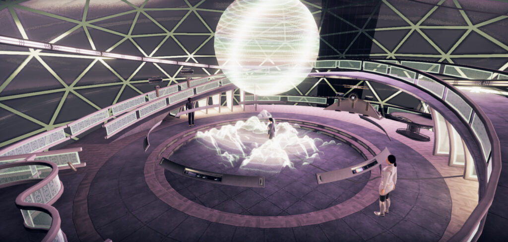
    The room the bridge is in is the survey room, which has much more going on. The entirety of deck one is basically this room.

    This is where the mapmaking happens. The plot doesn’t actually have the ship make it to a surveyable moon anymore, but if it did, I’d want to show that the mapmaking is a little active and physical: crew on the balcony would manually aim sensors pointing out of the windows, you’d watch map fragments get created near the sensor equipment, and the sensor people would literally pick up fragments and toss them, like frisbees, down below. The people on the bottom would catch the fragments, then move around and through the topographical map, putting pieces in place and smoothing them out with their hands as the map scrolls by.

    The chances of my being able to animate all this are basically zero anyway.

    But at the same time, there’s more than likely going to be an important, information-heavy scene in the survey room where everybody figures out what’s going on around them. And that scene needs to be as engaging as possible on a visual, and since this is a game, interactive, level. (For anyone out there familiar with the old Star Trek movies, think of the stellar cartography scene from Generations: a rather infodumpy bit made much more memorable by not putting it in a boring room with some maps in it, which as I understand it was the original plan.)

    Maybe there’s a simpler way I can show what’s going on here and still have this feel like a high tech hub of activity.

    • Crew operating scanners can use stock using-a-keyboard animation loops I already have. And never move from their consoles.
    • Meanwhile. floating sensors near the top of the space (or perhaps right outside the glass) can spin and take readings (complete with camera flashes and shutter click noises).
    • You could see one or more thin beams of light going from the sensors to the map on the floor, wiggling back and forth and creating new map data where the beams touch the map. Sort of 3d printerish.
    • Crew on the floor could walk around randomly while carrying tablets, pausing every now and then to look at a random point of the map in front of them, then look down at the tablet and do a stock using-a-tablet animation, which again, I already have.
    • Some crew on the floor could also be at the ring of consoles on the floor and do some stock keyboarding.

    So… this wouldn’t require any new character animations; I just need models for the floating sensors themselves (and maybe some on the floor, too) and some simple scripts to control it all.

    Also: this deck could probably use a bathroom.

    Daily routine

    Getting people to actually walk from room to room on the ship through a daily routine is just not gonna happen. They’ll have to stay in contained spaces, and teleport when the plot demands it. Besides, it would certainly annoy the player to have to have important characters moving around when you want to talk to them.

    But I’d love it if it felt like these people did move around when you weren’t looking.

    Very low priority, but here are some random ideas:

    • Have all the characters you need to interact with to advance the story stay in fixed positions, but have ancillary characters teleport when you’re not looking, so for example, every time you walk into the gym or lounge there’s a different set of characters there.
    • Show posted schedules.
    • Have background conversations about planned activities after people’s shifts.
    • A bulletin board outside of the mess with random postings (missing things, help wanted, movies in the mess hall, yoga schedule in the gym).

    * * *

    Next up: decks 2 and 3, where the quarters, mess, gym, lounge and aeroponics bay are. Oh, and a laundry room.

    Great Big Spaceship

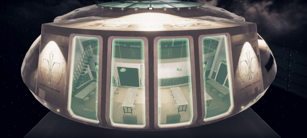
    The Wisteria, the spaceship where the player in Tinselfly will spend much of their time, is too big.

    It was supposed to be the size of the Normandy from Mass Effect: something with a total crew and passenger count of around 25, maybe 5 decks, tops. A small, unremarkable ship.

    Somehow, I messed something up with my size estimates or unity conversion or something and ended up with a design that was 260 meters long.

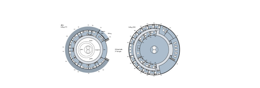
    Some old deck plans. It’s smaller than the starship Enterprise; that makes it modeling it a surmountable task, right?

    It was only after I’d completed a good bit of modeling that I realized that this what not at all what I wanted or, more to the point, could achieve. So I removed sixty percent of the interior volume and cut the length down to a mere 192 meters.

    New smaller-but-not-small-enough plans, to scale with above, reduced from 3 decks to 2 for this module.

    And it was only after doing even more modeling that I realized, it was still too big. But I’m kind of stuck with this ship now; I’m about halfway through modeling the interiors.

    So I need to fill these interiors, and figure out details for a couple other ships in the Tinselfly universe, too. But before I dive into modeling and adding random stuff, I thought it would be good to take a step back and figure out how ships operate in this universe. Like, in more detail than will likely be expressed in-game, even though it has always been the plan that you will see every deck, and literally every not-a-bedroom room on the Wisteria (and even then, you’ll see a representative sample of the bedrooms).

    I’m not especially fond of this kind of work, but ultimately, it will probably speed up the work of finishing these ships and make them more engaging environments at the same time. Besides giving myself specific goals for modeling and set dressing, this will certainly help with puzzle design, and effectively communicating what I want to communicate, about what it’s like on one of these ships.

    Because it might not be what players expect.

    This is space opera; this is melodrama; this is an optimistic science fiction universe with science ships running around… but this is not Star Trek. Much of what follows here and in subsequent posts will be based heavily on what I understand to be modern NOAA survey ship operations… and much of this will be me making this up as I go, trying to look directly at how my assumptions are still based heavily on Star Trek.

    Ship life in the Tinselfly universe is intended to be, in sharp contrast to the visuals, quite mundane and grounded in the real world. These are a ships with kind of mundane jobs to do, and that’s kind of important, thematically, to the story.

    There’s a lot of work to do here, and it will take some time–and multiple posts. So let’s get started with some background information.

    Mission

    The Wisteria’s typical duties include:

    • Making maps of both land and oceans, so that ground, air and water-based craft can navigate newly colonized worlds safely;
    • Measuring the health of atmospheres and oceans, to ensure that colonization and resource gathering efforts do not adversely impact the environmental health of these worlds;
    • Measuring alien life populations, which eventually informs how much fishing/hunting/etc., if any, is permitted each year on each world;
    • Providing space, support, transportation and equipment to civilian scientists who would like to perform their own research projects wherever the ship happens to be going.

    That last point is in many ways the most important. The crew of the Wisteria, generally speaking, does not do research. They don’t explore. They don’t solve alien mysteries. They don’t even really have goal-oriented missions like you’d hear described in the opening captain’s log on a Star Trek episode, kicking off the plot for the next hour. They go to places where a variety of people need to do research, for a variety of different reasons.

    The crew runs and maintains the ship, and while they collect routine survey information, their first priority is providing a service to the civilian scientists onboard.

    * * *

    Complement

    So far, the Wisteria has beds for 49 people. There could be more, depending on what details I add to the unfinished parts of the ship, but at 49 beds that probably means there would be around 24 crew and 25 researchers. Let’s say that’s like up to ten independent teams of researchers, ten different research projects going on? That sounds like a decent number I think.

    Considering the size of the interior spaces of the Wisteria, the crew compliment feels a bit sparse but there’s plenty of space in the as-yet-mostly-empty bottom section of the ship, enough to easily double the number of beds, and researchers, and crew. So we’re probably looking at more like 100 people total: 50 crew, and a score of research teams.

    More specifically, for the crew, here’s a possible breakdown:

    • 1 captain.
    • 1 XO.
    • 1 chief scientist.
    • 12 deck hands.
    • 12 engineers.
    • 6 survey team members.
    • 2 tech support people (the player character is one of them).
    • 6 cooks / cleaning staff.
    • 4 bridge watch people.
    • 1 botanist for the aeroponics bay.
    • 2 doctors/nurses.

    That sounds like a lot now. It changes the story a little. Even if every plot point is the same and we focus on the same core characters, a story about 24 people in trouble is a little different than a story about 100 people in trouble.

    Modeling all of those people is tedious, but not difficult; and while I’m worried about animating all of them, 100 people will probably use not too many more unique animations than 24 would have. Mostly, I’m worried about the game performance; animated people are very taxing on game engines.

    I’ll probably have to do quite a bit of optimization to make sure people you can’t see aren’t drawn or animated… which again… I would probably have needed to do anyway.

    * * *

    Next up: clothes, daily routines, and the bridge. Stay tuned!

    Divert All Power to Whimsy

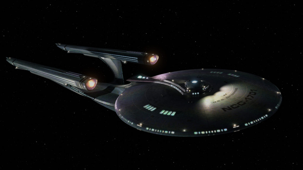
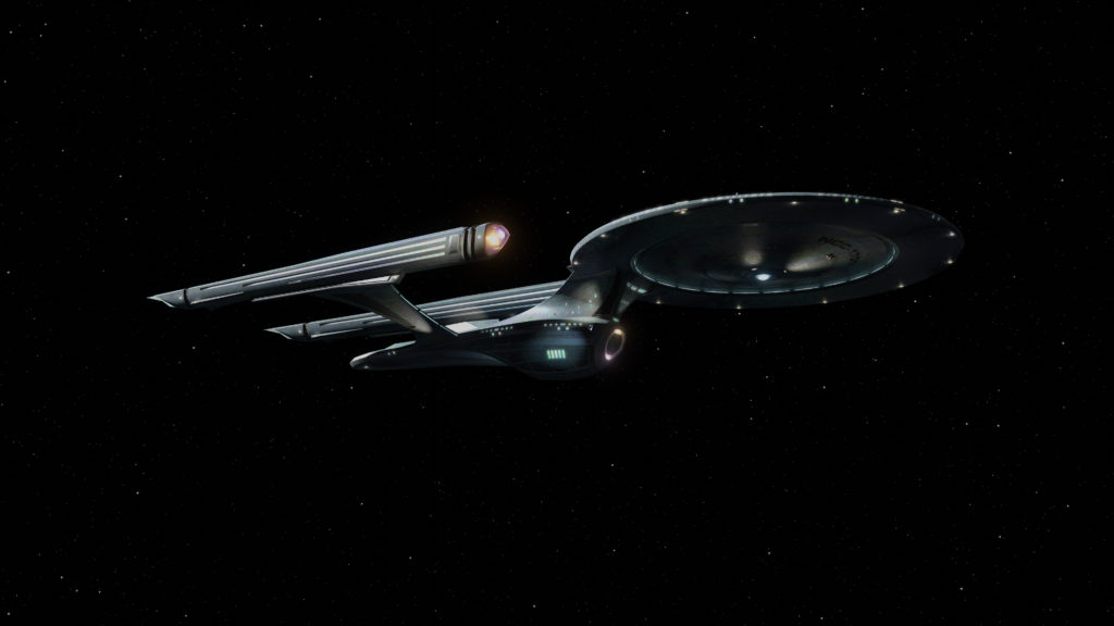
    Every few years, I try to model Star Trek’s Enterprise, or something vaguely Enterprise-like, to practice my modeling skills. Here’s my latest attempt:

    This is, of course not any existing Enterprise, making this an exercise in design as well as modeling. My goals were:

    • To be recognizable as an Enterprise that could have been, in an alternate timeline or something.
    • To have a silhouette distinctly different from any existing design.
    • To look good from a variety of angles.
    • To feel futuristic, whimsical, fast, and beautiful, with details that suggest that the different parts serve interesting, specific purposes.
    • To make the various parts–the saucer, nacelles, engineering section, etc.–have clearly defined shapes and edges–
    • –while simultaneously adding up to an overall form that feels fluid and unified.
    • To have big windows looking into bigger interior spaces, giving the viewer a sense of scale and a sense that it’s not just a surface; that there’s depth and activity inside, like a dollhouse.
    • To look as realistic as possible.

    My goals were not necessarily to:

    • Make something that fit in with any particular Star Trek show or movie aesthetic.
    • Make a ‘better’ Enterprise-F (I entered this Star Trek Online design-the-Enterprise-F contest long ago, felt weird about getting a runner up prize, the winning design is gonna end up making an appearance in a real Star Trek show now, and I’m happy for the designer… but that’s just not an era or aesthetic or scale I’d ever be interested in and I can say that now, long story).
    • Do this in the most efficient or effective way possible.

    I can’t say I hit all my goals. Most notably, this can hardly be said to be a bold new take on the Enterprise; it’s really just a variation of the TOS and TOS movie designs. And the whole dollhouse thing probably would have required a different design built around that idea; something based not so much on having a nice silhouette as having nice, layered silhouettes, plural, so you’d see a silhouette that’s just, well, the exterior silhouette, but upon closer inspection you’d see that there are large glassy areas on the exterior that let you see a different interior shape inside–not just inside rooms; you could see the smooth, solid surface of a second interior silhouette whose shape complements the exterior silhouette in an interesting way.

    (It’s a little hard to describe what I’m thinking of here. I may just have to try it out and post my results.)

    And I wouldn’t exactly call this photo real. I don’t necessarily think it needs much more surface detail–it’s supposed to be pretty smooth–but the textures could use a lot of cleanup. They’re kind of muddy.

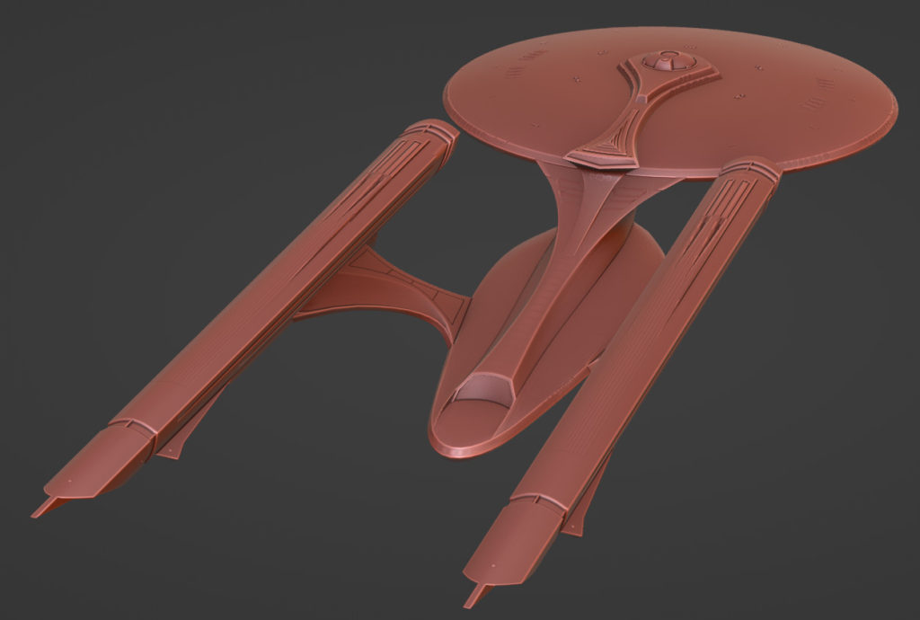
    But enough complaining; on to the good parts now! I do think my attempts to make something more fluid than those old Enterprises worked, if only in an incrementally-different sort of way. I’ve never liked the ‘neck’ connecting the saucer and engineering section on any Enterprise, and I’m pretty happy with what I came up with for this design.

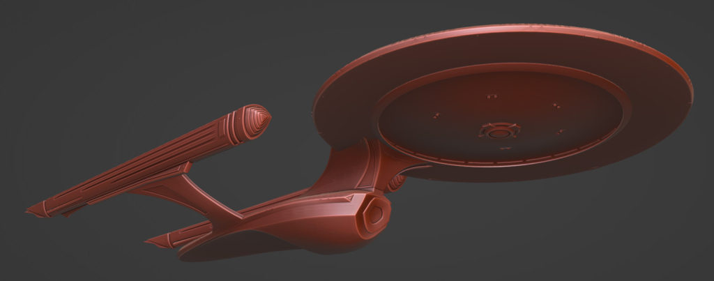
    While I think the model without any texturing has interesting curvy edges and creases and joints that separate and complement the different forms, it took a surprising amount of work to make sure that those curves didn’t get lost on a textured, lit render. So I put a lot of effort into highlighting those, with strategically placed windows, vents, lights and such.

    So that’s the whole reason the linear lights on the bottom of the saucer are there, why the windows are a bit less rounded and more densely arranged than their TOS counterparts, and why there are vents on the neck and nacelle struts.

    I’m also quite pleased with the colors. I’m using a lot of secondary colors–purples, oranges and greens–instead of the reds and blues you get on your typical Enterprise. I think that that, plus the softness of the lights, makes it feel warmer and more whimsical somehow.

    * * *

    Of course, the purpose of this endeavor was not to make a pretty-looking spaceship, but to learn. And I’d like to apply what I learned to Tinselfly specifically, to the spaceship designs in the game. Even more specifically, I’d like to shore up this particular design, a ship that’s meant to be really striking and invite you to wonder, what goes on in there?

    Here’s what I’ve got so far:

    I generally like the direction this is headed, but it could use more… everything I like about my Enterprise above and everything I wanted to do, but didn’t. More interesting convex surfaces. More transparent layers. More softly glowing details that look functional and that could cast light the ship in interesting ways. More edge articulation. More of a feeling of forward motion.

    And when it comes time to do texturing and lighting, I want pretty much the same color palette and look for the materials.

    I’m looking forward to posting my progress here.

    But before I do all that, I think I need to sort out the in-universe functional requirements of the ship, which is something I rarely (read: never) do. Because, it might help with realism (if that word can even be applied to anything in this universe)…

    …and who knows, if there’s a Tinselfly sequel, it would probably be set here.

    Copyright © 2017 Brian Crick.