Brian Crick

Blog

Mark II Shields

There’s a new Operetta build up. Clicking moves; spacebar fires; the only way to reset the level (say, if you actually destroy the bad guy) is to refresh the web page.

I’ve been working on re-doing the shields mechanic detailed in this old lj post, though since I can’t depend on there being a constant frame rate, I ditched the ‘zillion tiny shield arcs’ approach and actually did multiple segments with arbitrary, floating-point starts and ends.

And yes, it was a pain, but I think it’s working.

There’s also collision detection; I’ve been using the stuff I learned at a recent Unity talk. Yay!

I’ve gotten a renewed interest in working on this project, as I’ve got a story I think could work within the format I’m planning, and Marie’s on board too and hopefully can help with the writing.

All the City’s a Stage

Apparently, there’s this YA, vampirey series of books set in a prep school in my childhood home town of Tulsa — not the prep school I went to, mind you, but a big rival of ours; and much of the action in the books takes place in places I’ve been. I’m tempted to give it a shot. I vaguely remember getting a kick out of Dragons of the Cuyahoga because it’s set in my current home of Cleveland; it’s kind of a different way of engaging with ficton.

* * *

Saw The Avengers last night. Much of it was filmed in Cleveland, though Cleveland is standing in for New York City and, in one scene, some place in Germany. I was afraid that would be kind of distracting, but it wasn’t, really; most of the time, everything’s going by so fast you could really be anywhere.

There’s one part, though — no spoilers, just talking about locations here — where they’re outside in this square downtown, and all these dressy people are happily walking on red carpets going into this shopping center/skyscraper I know as Tower City… and when they switch to an interior shot, it’s not Tower City, it’s some gallery. (Marie and I were thinking it might be the Cleveland Museum of Art, but we can’t confirm that.)

I found that kind of fascinating, because I didn’t find it at all jarring. It just kind of made sense.

Also, there’s this exterior shot looking up at the skyscraper part of Tower City, and it just works so well because of the way that place is lit with ominous red lights even when they’re not filming movies there.

There was another shot of a random street with some scaffolding over a sidewalk, and some Lion King and other Broadway posters on the wall behind the scaffolding, and nothing said New York City to me like that little section of street. That could have been any street in Cleveland I guess; just make it look like it’s under construction and add a zillion musical ads and boom, it’s New York. That sold me on the location better than the aerial shots, better than the view of the Chrysler building outside of someone’s office. Probably because that’s a view of New York City I’ve actually seen myself. It’s interesting, the details you latch onto. I don’t really think of the skyscrapers when I think of Manhattan.

Marie has this one football friend who was in the background of a scene, playing a random scientist. I didn’t see her, but I found myself paying a lot of attention to the extras, thinking about those here in Cleveland who were lucky enough to be a part of this and see how this all gets put together and meet the stars of the movie.

It’s funny, the last movie we saw was The Cabin in the Woods, also written by Joss Whedon, also starring Chris Hemsworth… and that, plus the enthusiastic midnight showing audience, plus it being in Cleveland, plus Marie’s friend who I’ve given water to on the football field, all that kind of added up to this unique way of engaging with the movie, like you’re watching a school play put on by a bunch of people you know already in other contexts. And it’s comforting and familiar and you’re not just there to consume something made by some faceless studio; you’re there to be supportive and see how it turned out and it’s a strangely personal thing at that point.

I like that. I like a big dose of artificiality with my fiction, and I kind of like the idea of being aware of the craft of the movie while watching it, just so long as that awareness doesn’t break you out of the story being told.

In an odd sort of way, the occasional familiar Cleveland building made it easier to imagine that this was all happening right here; it made it more immediate — not less.

Failure: The Secret to Success

I think it’s safe to say it’s been years since I screwed up any one day as completely as I did this last Saturday. I’ll not itemize everything I did wrong here, but suffice it to say that it started with me trying to troubleshoot a relatively innocuous internal toilet leak, entering into a comically endless cycle of trying to make things better and actually making things worse, and ending with frighteningly massive plumbing bill.

(Now, said plumbing bill would eventually have come anyway, but it really couldn’t have come at a worse time.)

Mostly, I blame the general disorientation that comes with being sick.

* * *

I kind of value my lack of cognitive abilities while sick. It is a reminder to me that, even while healthy, my perceptions are not guaranteed to be accurate; my words are not guaranteed to convey my intent; my judgment is not guaranteed to be reliable.

I would do well to remember that focus is something you have to work for. Been a bit lazy about that lately (again, even while healthy).

* * *

To that end, I’ve gone ahead and slapped together a functional, but not particularly polished app to help me organize all the stuff I’m doing. (To recap: I’ve settled on a fixed rotation for my projects, so any time I sit down to work, I just do what’s at the top of my list, and after a fixed amount of time, I move it to the bottom of my list and work on the next thing. Not allowing myself to deviate from the rotation is important here.)

While it’s mostly pet projects, there are a few items of note in there that are more general.

  • Games. As I mentioned in a previous post, I need to schedule in downtime or I won’t take it.
  • Calls. This will sound like a really sterile way to approach it, but I’ve included calling relatives in my project rotation. Said relatives are themselves in a rotation, so I can make sure everyone gets a call on a regular basis. I want to keep in touch, I really do; but I literally forget that people exist if I don’t have frequent contact with them.
  • Rescheduling. While my whole fixed-project-rotation thing generally works, I’m slow to make changes to the rotation. So now, questioning the contents of the rotation is itself part of the rotation. Yay checks and balances!

So there ya go. It’s been working out well the last few days.

Postmortem : Celestial Stick People

As always happens with postmortems for projects with no set deadlines, it feels good to write that subject line. So on to the dissecting.

making it up as you go

It’s not like I sat down twelve years ago and said hey, I’m gonna try to draw and sell a full 78 card Tarot deck. So I can’t really evaluate this in terms of how well my final product matches my intent. However, I’ve definitely learned the importance of good planning, as there was no real planning for this product. There was an awful lot of backtracking here. Some things I should have done better:

  • If there’s any possibility that what I’m doing will make it into print, I should make sure my Illustrator files have print-quality raster effects. Changing the effects resolution after the artwork is mostly finalized is a huge pain.
  • Keep separate images in separate files. While it’s convenient to have everything in one place, Illustrator crashes frequently on my large, multipurpose files.
  • Keep files organized. Which is to say, I totally didn’t do that here… just finding the files I needed for any given task became rather difficult late in this process.

those jargon-free rules

Looking over my rulebook, everything feels reasonably straightforward. Unfortunately, I never really had a Tarot newbie try reading the rules and tell me if they made sense. Really should have done that.

In terms of layout, I’m not thrilled with the layout of the instructions, but given the constraints I was under (limited to three separate, unordered sheets of paper) I think it’s adequate. Not good, but adequate. Again, lots of backtracking here as I figured out what format I would need.

the ilustrations

I really can’t think of any changes I’d want to make to the illustrations, looking over them again. Maybe the backgrounds could be better, more textured. But my only real complaint is that, because I changed the contrast fairly late in the process, you can see some slight banding on the background.

(Okay, I can see slight banding. Most people probably won’t notice.)

Anyway, I do need to learn how to do color management better so I’m not changing contrast in Photoshop at the last minute.

web site

Because of some errors I made in my scripts, the web site for the product was effectively down for a few days shortly after launch. Whoops.

I made the site years ago, and barely changed it for the product launch. I briefly considered moving it to WordPress like my personal site, and in hindsight, I probably should have done that. I just don’t think it’s worth my time trying to maintain custom scripts for a web site; most of this stuff is pretty cookie cutter, and the nice thing about a third-party CMS is, a lot of people have tested it for you. It’s all standardized, and easy to get help on.

dead ends

So for a long while, I was considering getting this printed through a local professional printing press. The minimum order would have been like 100 or 200 decks, with an upfront cost of two or three grand.

While everyone I talked to at the printer was friendly and helpful, I’m really, really glad I didn’t go that route. Did you know that playing cards aren’t just colored pieces of card stock? They’re coated in plastic, and have this thin layer of graphite in the middle that gives them a lot of springiness.

I didn’t realize this until I’d shrugged off professional printing as an option and bought my own paper cutting machine and nice color printer with which to do everything myself. And I got some nice cardstock and printed out cards… and they didn’t feel like playing cards. At all. They didn’t slide against each other right, and they didn’t bend right. And while your typical Tarot cards and board game cards don’t feel nearly as nice as nice playing cards, you can still shuffle them and slide them against each other, which isn’t a guarantee at all with any random card stock.

I would have been terribly disappointed if I’d only realized this after dropped a few thousand dollars on printing a hundred of these things. So while I didn’t end up using my own equipment for this, having it and trying it out taught me a lot about printing.

So I’m happy I went with The Game Crafter, with their nonexistent upfront costs and suitable-for-games card printing. There’s no telling how cranky I would have gotten collating and packing all those boxes myself, and I’m glad I didn’t have to set up a storefront. Again, this is pretty cookie cutter web site stuff and I’d just as soon have someone else do it.

to sum up

I’m sorta surprised I got this out at all, considering how long it’s been in development. But overall, it was a good learning experience, and I’m super excited about printing an actual board game through The Game Crafter now. And making a card-reference tablet app in Unity or something.

And trying to get this in real stores. In many ways, this project is just beginning.


Celestial Stick People is Done!

For all you non-Facebook, non Google+ friends, Celestial Stick People is done! Like for real. You can even, like buy it and stuff if you really want.

Got the final prototype last night and rushed through getting photos and flipping switches on web sites as quick as I could, lest I bail. You’d think there would be less of an urge to rush, given that this project is over a decade old… but yeah, not so much.

Postmortem coming soon.

Postmortem : Girl Wonder

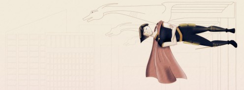
So here’s my submission to the Girl Wonder banner contest (click to enlarge):
And just to get the good stuff out there first, have a new revision:
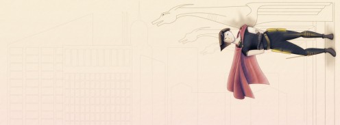
This was made after the contest deadline, but I was kinda fried on Sunday and thought I’d try to clean this up a bit, just to do it.

Rather than a what went right / what went wrong sort of thing, I thought I’d break this up into smaller chunks by subject. So here goes…

motivation

It’s amazing what an external deadline can do. I’ve wanted for quite some time to work on my people drawing skills, and this contest was a great excuse to do that. Also, Marie and I have been talking about doing a superhero comic together, and this was a good way to dive in and see if I was really capable of doing comic-appropriate art to my satisfaction. (I’m pleased to report that I’ve decided that the answer is yes, which I wasn’t certain of at all going in.)

You could say the timing could have been better — also had a big work deadline coming up — but ultimately, I think that having a single, isolated project to work on during such a deadline helped me focus during regular work.

anatomy

Overall, I think the character’s body came out pretty natural and realistic looking. Mostly I  credit careful planning — figuring out the character’s proportions in advance with a simple stick model that I then drew over.

But as you may recall, when last I posted about that, I had a decent looking sketch with a not-so-well-proportioned upper body.
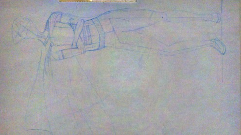
The next time I was able to work on this, I was away from home, and unable to transfer any changes to my sketch into the computer. So I just went straight into Photoshop and enlarged the arms and shoulders a bit, which nicely fixed the long torso problem.
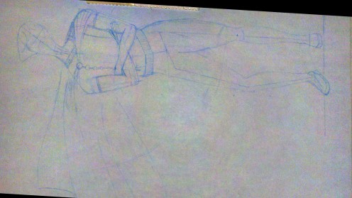
(Yes, I used Photoshop to try to make a figure’s proportion’s more realistic. 🙂 )

I mentioned I might do this, and while it was kind of cool and necessary to be able to do this while away from home, I’m thinking now that it’s not really a great solution. My first priority should be learning to detect problems before I’ve started drawing over them. If a problem does slip through, generally speaking, it would probably be best to adjust the sketch directly, so I get good at doing this right on paper.

layers, layers, layers

I made extensive use of Photoshop and Illustrator’s nondestructive filters and layers. I’m not sure I can explain in well here, but basically what that means is that things like colors, shading and special effects can all be handled independently.

So in the image below, you can see each of those things getting added, one by one, to a simple black & white outline.
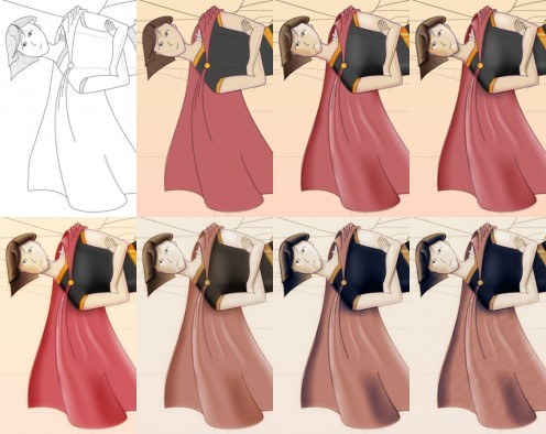
Despite its complexity, this worked out pretty well. I could quickly go back to any layer in my documents and make changes that would propagate forwards to the final product automatically. So, for instance, if I decided I didn’t like the color of the cape, I could change just my color layer and the shading and shadows would be preserved.

shading

So like 14 or so years ago I was trying to do coloring for an online comic (that sadly never got off the ground), and I was trying to do it in Photoshop, using its drawing tools. It didn’t turn out very well; everything was kind of muddy. There were highlights and there were shadows, but my shading didn’t really clue you in to the precise shapes of things at all. Sure, my skills weren’t very good, but that distinctive Photoshop brush muddiness is something I’ve seen even in professionally produced comics.

For this contest, I wanted to make sure my shading was crisp and detailed, so you got a sense of cheekbones and wrinkles in the cape, things that aren’t being expressed with linework.

Illustrator has this thing called gradient meshes, which I figured would work well here. The third image on the top row of the image above introduces some gradient meshes I used for shading, most notably on the cape. Again, I don’t want to go into too much technical detail, but while I got the crispness I wanted, all those meshes were a pain to work with.

Next time I do this, I guess I basically have to options: I can learn to work more efficiently with gradient meshes, or I can revisit my homemade paint program, which contains what’s supposed to be a simple system for doing this kind of work, but which needs some fine tuning before it’s really usable. Neither of those options sounds immensely attractive.

drapery

The cape makes no sense. It isn’t just unrealistic or poorly executed; the geometry of it is simply impossible.

I only realized this the morning after I turned in my submission.

I think my big hangup there was that I was trying too hard to figure out what this thing would like like, when I should have been thinking about how it behaved.

For my revision, I tried to think of the cape as a bunch of strings. Like a beaded curtain. I imagined that the curtain was anchored on the character’s back and shoulders, and I imagined individual strings draping over and hanging off of different points on the character. It was easy to figure out where each string would fall. And then, you can kind of mentally stitch these one-dimensional strings together and figure out how this two-dimensional piece of cloth is going to look in three dimensions.

I don’t know if that’s the best approach, but it was good to figure out some sort of manageable approach, if only after the contest deadline.

triage

The reason the background isn’t colored in is that I realized I wasn’t going to have time to do everything I wanted, and rather than have a whole image half complete, I thought I’d submit something with a good looking character and a sketched in environment. Getting the character right is what I needed the most work on.

Similarly, I totally punted on the costume; again, while I’d find it an interesting challenge to come up with something theatrical and tasteful, it just wasn’t a priority.

That’s not totally a bad thing. There’s something kind of appealing about the utilitarian jumpsuit look.

looking ahead

Marie and I have been talking for a while about this superhero comic thing, and I’m really excited about it now. There’s still a lot of workflow issues I need to sort out if I were to do that many illustrations, but this experience has convinced me that it’s at least possible.


Girl Wonder Sketches

Here’s what I got last night on the Girl Wonder thing. You’re looking at maybe 90 minutes’ work here. Don’t have a lot of time to work on this.

Since the desired image size is sorta widescreen, I thought I’d have my character standing sideways, on the side of a skyscraper, to fill the space better.

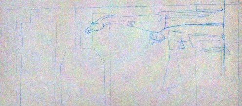
I had a sketch of that (not pictured) and it just wasn’t that interesting visually, so I thought I’d add in a gargoyle that the character could be leaning against. So I drew a quick thumbnail sketch of that.

In this composition, the character could be upright and still fit, but hey, I like the way this is balanced. So you’ve got a character with her arms folded, cape hanging down, standing on the side of a building, leaning up against the bottom of a ginormous gargoyle rain spout thingie, with a bunch of skyscrapers in the background.

So far, so good.

Then I started a new sketch just focusing on getting the proportions and body of the character right. Like I said before, I’m not terribly skilled at this.

I had my anatomy book open the whole time, and had to force myself to do this in stages: I started with an 8-head-high ruler with little tickmarks on it, used that to draw a simple skeleton (you can kind of see that around the hips and legs) and built the body around the skeleton. Pretty basic stuff as I understand it, but I’d never done that before.

Mostly, I think this turned out quite well; the stages really helped. However, I do have a couple of quibbles.

First, the torso feels too long. My torsos always feel too long. While I think I got the proportions of the skeleton right, I think I made the widest part of the hips/legs way too low. Gotta brush up on my anatomy there, especially male/female differences to watch out for.

Second, I was going for a little bit of contrapposto there (having all your weight on one leg, which results in the hip being all slanty), but I think I made the torso too twisty. There’s a little bit of butt sticking out there, which is the last thing I want. However, I think I’ll leave the basic shape as is, and when I scan in my sketch for real for tracing in Illustrator, I’ll just bend things a bit in Photoshop so the general upper body is more to my liking.

I haven’t given a whole lot of thought to the costume, besides the off-center cape and asymmetric collar detail. I figure I can (and should) design the costume separately from the actual act of figuring out how the body looks in my sketch.

It’s very, very tempting to just give the character a decorative pull-over short-sleeved shirt with a cape, leggings and short boots, and call it a day. There would be nothing particularly feminine or cheesecakey about it; it would be very safe.

But I expect superhero costumes to be a bit theatrical; I’d expect skirts and gloves and shiny accessories. Getting that sort of stuff to work, that’s half the challenge here. And like the formal wear I was talking about the other day, I think it’s important to get at the roots of these design decisions.

Take thigh high boots for example, common in girl superhero costumes. True, there’s a bit of fetishism going on there, and you can be dismissive of that… but they also emphasize the length of the legs, just as the long gloves commonly paired with these boots emphasize the arms. If you’re going to have a character kicking and punching bad guys all the time, you want to draw attention to their limbs. It makes sense. The trick, I think, is to place emphasis where you want it without having it be too obvious to the viewer that there are specific things you want to focus on here.

I’m not sure when I’ll be able to get to this next. I’ve got stuff happening tonight and tomorrow night, and friday night is, well, friday night. 🙂

Girl Wonder

The web site girl-wonder.org is having a contest to design a banner for their Facebook page. Deadline is this Friday.

I’m not real familiar with the site, my people drawing skills aren’t very good, I think it would be tough to beat the refreshingly tasteful banner they’ve already got, and it’s exceptionally unlikely I’ll be able to crank something out that I think is remotely acceptable in the next three days.

So I’m going to drop every other pet project I’ve got for a bit and give this a shot.

I can always use practice working absurdly quickly. I’d like to finally have a reason to open up my anatomy for artists book and practice drawing oddly shaped body parts like knees, which are plainly visible in your typical superhero costume. And I’d like so see if I can actually design a costume that meets my standards for tastefulness and still retains many of the lines you’d expect from this sort of thing.

It’s something I’ve wanted to try for a while anyway, just to see if I can do it.

I’ve already got a broad idea what I want to do… hopefully I’ll have a rough sketch up at the end of the night.

Celestial Stick People Photos!

Got my Celestial Stick People color test in the mail yesterday. Wheeee!

So here’s what you get:

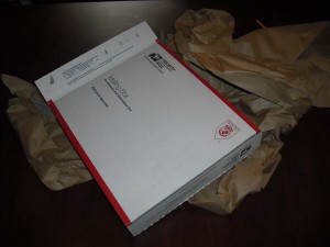
A Postal Service box. It’s big. And filled with lots and lots of paper.
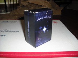
Wrapped up in all that paper, you get a tuckbox. (It’s not shrinkwrapped, which I kind of like. Shrinkwrap is icky.) The box feels very sturdy and crisply constructed.
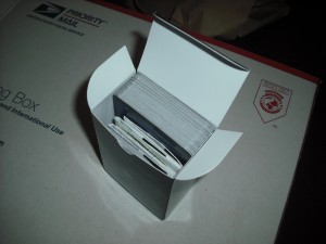
Sadly, I did my math wrong and this test box contains only 65 cards, not the 78 a real deck would have. So it looks a bit loose here. I just tried padding it out with regular playing cards, and everything still fits fine with 80something cards so I think we’re ok.
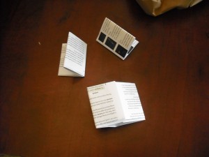
The instructions come as three separate, folded pieces of paper. I’m kinda bummed about that — you have to sort the pages by hand, so I’m glad they’re numbered — but I don’t think it’s a dealbreaker. If I could squish the card reference onto two sheets of paper and have the instructions by themselves on one sheet, that might make all this feel more logical, but I’m pretty sure that’s not really doable.
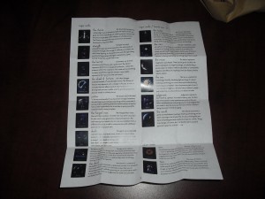
Unfolded, the rules are perfectly readable at least. The folds in the paper are nice and crisp; it’s not like you unfolded a crumpled up sheet here.
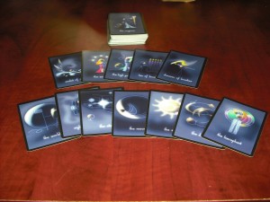
And here are the cards. The registration is ok, and a couple of the 5 sets of samples I got have nice looking colors. They don’t really have that new card smell. Not exactly important, but I was surprised.
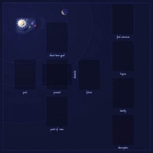
So back to the rules.

I’d already been considering a ‘deluxe’ edition to complement the regular version. It would come in a big cardboard box almost 11 inches on a side (with a custom label, but not custom printed on all sides) and a foldable 18×18 board, something like this:

I still have a long way to go on the design here, but the point is, you get a nice board, and the rules will be folded less and presumably stapled.

Not sure if there’s really a lot of value there, and I don’t have a lot of time to do anything but grunty, scriptable prep work, but it’s worth considering I guess.

…For What You Believe In

My Celestial Stick People color test should arrive today. For those just joining in, this is a Tarot deck I’ve been working on since November 2000, and I’m agonizingly close to getting it printed finally.

As part of getting all this wrapped up, I’ve been slowly adding captions to the images in my web site galleries, which includes images from the deck, trying to give just a couple sentences’ worth of history or inspiration for each piece if I can remember it.

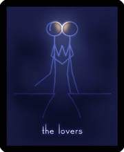
And then I got to the Lovers. It looks like this:

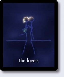
I bring this up because it used to look like this:

The Lovers is supposed to represent love overcoming obstacles. It’s about fighting for love. So very late in this whole process, I changed the characters from a boy and a girl to just two boys.

My color test is not making me nervous. The possibility that this project is simply going to disappear into the Internet upon completion does not make me nervous.

This card makes me nervous.

I’m usually not real vocal about my political or social views. I’m generally not one to post righteously indignat rants; I don’t re-post articles or images on Facebook with statistics or quotes or jokes about causes I care about. I would prefer to express my convictions through the actions I take and the work I do.

This slight rearranging of blue lines, this removal of one yellow blob and one green blob — this is me, taking a stand.

Within my own group of friends, the change to this card was met with nothing but support. However, if my more conservative relatives see this deck and this image — and it’s likely they will; they may even see this post — it could add a bit of tension to some relationships that could already stand to be a lot better, that I would very much like to be better.

Just thinking about this is making my pulse go up a bit.

But I’m not about to change my mind on this. I’m firmly of the opinion that this shouldn’t even be an issue; that, hopefully, most people won’t even notice or care that my two Lovers are presumably the same sex. It’s not a particularly loud statement I’ve got here, my two kissing stick figures, but my feeling is that whispers can have more of an effect on people than shouts.

Copyright © 2017 Brian Crick.