Brian Crick

Blog

Egoless Scheduling

It’s been a while since I babbled about managing myself, so have a random thought.

The concept of egolessness comes up a lot in martial arts. I never quite hit it during my brief dabbling in Judo, but I often lose my sense of self while programming or illustrating.

It can all sound a bit hand wavey I suppose, but to put it in more practical terms, I suppose losing a sense of self is simply a loss of desire (yeah, it’s very Buddhist). The desire to impress; to learn; to meet a promised due date or fulfill a specific expectation.

I do my best work when I stop caring about getting work done. If I’m too excited about the work, it’s easy to get overconfident or impatient to get more work done. (Which, sadly, happened at work-work today.) Which is not to say that I do my best work on projects I hate; hate is a form of caring, a form of emotional attachment, a burning desire not to do something.

So I’m wondering tonight if this concept of mastery and happiness through egolessness also applies to managing one’s responsibilities on a higher, more abstract level.

I’ve mentioned a few times before how I’m most productive when I rapidly cycle through pet projects. Part of the benefit of this is just to make sure I don’t lose track of any of my projects; I frequently waste depressing gobs of valuable time reacquainting myself with things I’ve backburnered. But also, I think this strategy is helpful in that it removes me — it removes desire — from the process of deciding what to work on. Since it’s a predetermined cycle, I always know what I will be working on next. I won’t procrastinate on things I’m afraid won’t go anywhere. I won’t implement quick, poorly conceived ideas because I’m excited about moving something forward.

Removing desire makes the work about the work — not about me.

So I should really start keeping an eye on how excited I am to be working — because if I’ve got too much motivation, it’s probably time to take a break.
Low Hanging Starfruit

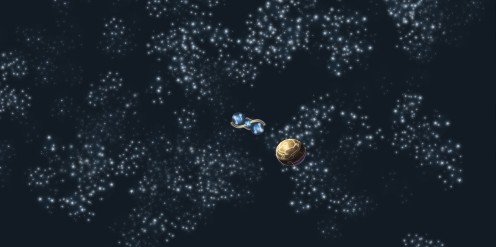
Now that work has settled down a bit, I’ve been tinkering with a very old pet project called The Itty Bitty Galaxy.

In sort of the same way I always break new modeling programs in by making the starship Enterprise, for the last decade I’ve broken in new programming languages with this project. I’ve done it in C++, Flash, Flex, Torque, Android, and now Unity.

Been concentrating on the starfield. Another thing I’ve done a zillion times before. I’m very particular about my starfields. Most of them — especially real ones — just look flat and boring to me. There’s no color, no sense of depth, no volumes to look at, and if I’m going to show of how big and vast my universe is, I want to try to do it in a volumetric sort of way, in a way where you have identifiable, three-dimensional volumes of space to look at, so you can say, hey, this here thing is big. It’s tough to wow people with how big and empty space is, though I’ve certainly seen it done (Homeworld comes to mind there).

And actually, this posts has been languishing as a draft for so long that I’m looking at this version of the starfield and thinking to myself, wow, this is not very deep. But I’ll have another update on this later I guess. 🙂

Little White Book, now with 10% more littleness

Spent much of today working on my Celestial Stick People book, trying to get it from a 30 page 5.5 x 8.5 doc into a 6 page 8.5 x 11 doc that The Game Crafter can support.

That was not pleasant. But it think it’s looking passable. Not great; not, perhaps, good, even; just passable.

https://www.oogby.com/wp-content/uploads/2011/11/game-crafter-book-12-november-2011.pdf

(If you don’t see it above, you can go here to download it.)

I’ve actually had to cut very little; just a sentence here and there, and my one-page introduction. Mostly, it’s just a much more compressed layout than my other design. I miss my wide margins and copious amounts of whitespace, but I’m actually fairly happy that I could do this at all without too many cuts.

I guess if it’s stapled together and stuck in to a card box, people will be more forgiving of really compressed text.

Gonna do more cleanup, bug Marie for the Diamonds card text when she’s back from Indiana, and get it off to The Game Crafter as soon as I can.

About a Sharp Dressed Man

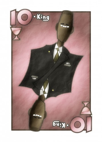
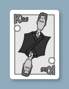
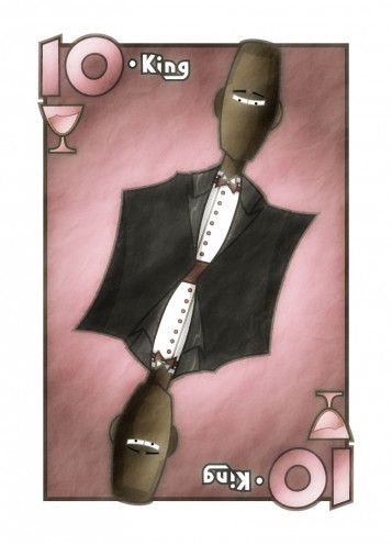
Finished my King of Cups.

I tried a white tux, but the large swatch of white just didn’t work… it felt empty. So I just made it black like the businessman.

I feel a little weird about how not-detailed the sides of the tux are, but in some ways I like it.

Don’t have too much else to say about this, except that copy/paste is definitely not the way to go here. While there’s a similar end result here to the businessman, the underlying shapes used to create that result ended up being very different. Would have been faster to simply start from scratch.

Abstraction

Have the beginning of a King of Cups.

As you can surely tell, I started with the King of Coins and made modifications from there. I still need to change the suit, to make it a white tuxedo instead of a black business suit.

I’m not sure if this copying-and-pasting approach is actually faster than starting from scratch. I’ve spent 45 minutes on this so far, which is already quite a bit longer than the 15-30 minutes per face card I was hoping for. Of course, I really have no idea what sorts of expectations to set here, so I’m not going to beat myself up too much about the time spent… this is, after all, a learning process.

I didn’t really sit down and design the cup icon; I just drew something straight in Illustrator really quickly. But I rather like what I ended up with. I think I’ll keep it, with only slight modifications probably.

* * *

While I’m waiting on answers to some questions I had for the client, I thought I’d post some ruminations on what I want to get out of this. And what I want is to do work for precisely the sort of games I don’t like playing.

I like games that are about building stories. Games with memorable characters and places, where after the game, you find yourself joking about the funny or surprising or hero-clobbering plot twists that came up during the game.

These sorts of games tend to have lush, naturalistic illustrations where every picture could be a still from a movie.

I have neither the skills nor the desire to produce this kind of stuff. I like making illustrations that are a little abstract. The sort of illustrations that would be well suited for more abstract games, where your characters aren’t characters so much as ideas represented by people.

My stuff tends to lean towards Art Deco, so this is no real surprise. If you’ve got, say, an Art Deco mural with a bunch of construction workers… those workers aren’t people. They’re the visual manifestation of the idea of hard labor, and the nobility thereof. They’re archetypes. If you’ve got an abstract strategy game where you can summon any number of identical snipers each turn, those snipers aren’t individuals. They’re sort of platonically ideal snipers, and I like it best, from a visual standpoint, when the character portraits for these more abstract games have more abstract art for these kinds of things.

I’d love to have done art for games like Pandemic… there are people, but not really interesting characters you can connect to. I would have loved to have seen some stylized, glorified doctors and engineers in that. That would have been pretty awesome.

Of course, when my board game project gets further along, I’ll want to do more naturalistic illustrations for that since it’s supposed to be story based. Should be an interesting challenge.

Scopa King, Final (No, Really.)

With the random stuff I work on, usually it feels like it goes on forever. But sometimes, there’s a fine line between done and not-done.

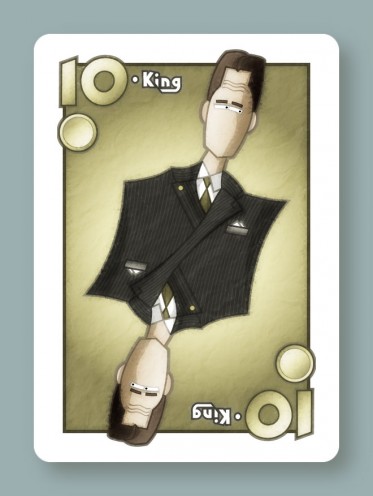
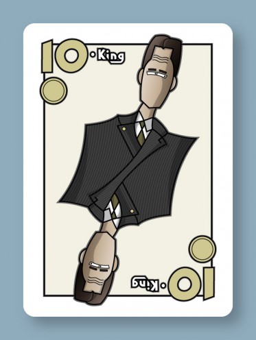
This here Scopa King is done. This is the look I wanted. Nothing more, nothing less.

The last thing I did was add that radial gradient behind the character, and that finished off the illustration for me. I could repeatedly hit undo/redo in Photoshop to toggle between states and go yeah, this current version is done. This version one step back in the undo history is not done. It’s a really fine line sometimes.

I guess it’s all about setting expectations that are both precise and reasonable, which I tried hard to do here. This took a little longer than I wanted, but it was never my intent to make my best illustration ever — just to do something with a reasonable level of quality, in a reasonable amount of time. And mostly, I think I got that.

Of course, the big question now is, how long will it take me to do the other cards? There are 11 more to do, plus some simpler, more abstract numeric cards that will largely be copy/paste jobs.

Getting to this point took around 3 or 4 hours, but I’m hoping for 15-30 minutes per new face card. Luckily, I’ve got things set up in Photoshop in such a way that I can just import my Illustrator art and all the weathering will happen completely automatically.

So hopefully, I’ll have an update on that later this week.

Scopa King, Nearly Final

Have a Scopa update.

This is just about done, though John suggested adding a pocket with a handkerchief and some buttons, which sounds great to me.

Mostly, I focused on coloring and texturing.

The shadows and shading were all done by hand using extra vector art in Illustrator, something I’ve never done before. I usually try to use gradient meshes or drop shadows or Illustrator’s 3d tools for that sort of thing. But now that I’ve tried this, I love it — as a bit of a control freak, I like having absolute control over the shapes of the highlights and shadows.

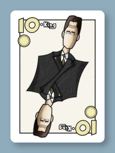
Once I had the coloring done, the image looked like this:

Kinda cartoony, kinda flat. I think, for this sort of look to work, you have to make it look a little distressed… more like an old poster printed on idiosyncratic equipment and less like cheap vector clipart.

This is actually a look I’ve been trying to get on my stuff for years, and I think this is the closest I’ve ever come to it. If you’re curious, what I did was this:

  • Import my Illustrator art into Photoshop.
  • Duplicate the one layer you’ve got.
  • Apply a gaussian blur to the duplicate (I did 6 pixels here I think.)
  • Apply a normal diffuse filter to the duplicate 10 or so times in a row.
  • Set the blending mode of the duplicate to 100% overlay.
  • Add a new layer.
  • Make some black & white clouds on the new layer.
  • Add a few difference clouds to that. I did like 6 iterations.
  • Emboss.
  • Set the blending mode of the clouds layer to 100% soft light.

So that gave me some wrinkles and the impression of imperfect printing. I’ll probably futz with it a little more and add some scratches too.

Scopa King, Rough Draft

I mentioned a while ago that I wanted to try doing some board game art illustration, and have made a little progress there.

I’ve actually had two leads, but one of them wanted pin-up style stuff. Ugh. They also wanted 1920s style sci-fi which would have been really really cool to work on, but… yeah. Couldn’t ever take that work.

The other bite was a custom set of Scopa cards. It’s basically like a poker deck, with some numbered cards and some face cards used in an abstract trick-taking game.

I’m not a big fan of abstract card games, but making stylized face cards sounded kinda fun. I decided to do a modern spin on the symmetric, double-sided people used on regular playing cards, so each suit would have people in different types of dress: business attire, formal, military uniforms… and I haven’t decided on the last suit yet.

If I’m going to be doing illustrations for other people, I need to figure out the most efficient way to do that. I can’t just lovingly tinker with something until I believe it’s done. So I’m trying to change things up here.

I thought I’d try a businessman first.

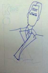
I started with a very simple pencil sketch and inking:

I just wanted to make sure the basic proportions of everything were right, and do the minimum amount of penciling and inking necessary to get this into the computer. That approach is new to me, but I suspect it will work better than my previous attempts to more fully flesh something out on paper and then import that. I always have to re-do all my fine details in Illustrator anyway.

Since my old scanner doesn’t work with my new computer, I just took a picture of my sketch with my phone, and that’s what you see above. Sure, there are going to be perspective issues if I don’t get the angle just right, but it’s much faster than using a scanner. And it’s easier to see my light pencil lines.

Having gotten the photo, I then started tracing in Illustrator. I’m very particular about vectorizing everything, so I would never use a tool to do that for me… chances are, it would create paths with too many points and be hard to edit later on.

After I had my basic shapes, I added some temporary shading. So while there’s no color yet and the shades are far from final, you get a general sense that the suit will be very dark, the skin very light, the shirt white, etc. Never done that before, but this is supposed to be another efficiency improvement.

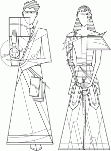
When I was working on these stylized fantasy characters a while ago, I was having trouble, because just looking at line art like this…

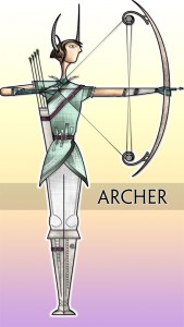
…it was difficult to tell how coloring would affect the line quality on a finished character like this…

…the problem being, the colors completely change how you look at the lines.

So here, I was all nervous because I was looking at a black & white drawing and thinking to myself, I won’t know if this is going to work until I do the coloring, but the outlines really have to be nailed down before I start coloring, or I’ll end up trashing all my coloring work and starting over if the outline of something needs to change.

And then it finally occurred to me that I could just fill things in with temporary shades of grey, and that’s enough to tell me how the final colors & shading might affect how you see the linework. And I can quickly adjust the linework based on my rough shading, if necessary.

I haven’t actually decided how I’m going to color this, whether it will be Illustrator gradients or Photoshop painting or my own paint program. I may just try them all and see what looks best or can be done the fastest or what the client likes most.

Next up, I need to add more detail like shading and seams and pinstripes, and de-emphasize the word ‘King’ in favor of a simple number (at the client’s request).

Pan Am, Part 2: In Which I Argue with Myself

First, a picture:

Aren’t those engines lovely? So… retro and stuff in a way I didn’t expect actual jet engines to have ever been retro.

Anyway, on to more Pan Am. I came up with a counterargument to the bit in my last post comparing this to Mad Men, and thought I’d share.

I’m generally of the opinion that it’s the job of fiction to exaggerate the crap out of the protagonists’ struggles. I’m not a huge fan of naturalism. That’s part of why I like science fiction; I like how you can take mundane personal issues and explore them through made-up technologies and discoveries.

So if the mundane issue you want to explore is sexism in the modern, mundane world, it makes perfect sense to explore that in the 1960s, so you can make things a whole lot harder for your female characters.

Now, personally, I don’t like that approach; I want to see (and write) characters who have basically the same mindset and values as modern people; I find the characters in period dramas kind of alien sometimes. (That’s mostly why I preferred the Keira Knightley Pride & Prejudice to the BBC one; in the former, I felt like these were modern people with modern values, and I could easily empathize with their frustrations with this whole formalized approach to courtship.)

But anyway, that’s just a personal preference, and I’ll still accept the 1960s setting of Mad Men as a valid approach to heightening your drama and presenting the world with positive role models.

Of course, this is all dependent on the extent to which the show actually highlights the struggles of the women and the extent to which they either succeed outright or grow as characters through their struggles. I’m not through the first season yet, and so far, I’m not sure I’d say the women’s stories are the focus of the show. But my understanding is that that may change later on, so I’ll try to keep myself open to that and see what I think if the show goes that way.

Friendly Skies

So I wanted to talk about Pan Am a bit.

Pilots

I really like television pilots that don’t quite know what they’re doing. I like how eager they are, how they’re all like omg omg look at all these cool ideas we have! and yeah, some of those ideas aren’t real solid, but it’s hard not to get caught up in how excited the show is at merely existing.

Pan Am doesn’t quite seem sure what it is yet, and I’m ok with that. Not knowing exactly where this is going to go is part of what makes it fun.

Mad Men

It’s sort of impossible to talk about this without mentioning Mad Men.

I’ll start by saying that calling these shows competitors is kind of insulting to both. For better or worse, Pan Am isn’t Mad Men on a Plane, nor is it trying to be.

What I think is worth talking about, however, was the two shows’ different approaches to feminism. I could write pages and pages about this, but I guess the basic idea is, if your goal as a show with a feminist agenda is to make the world a more egalitarian place by having people watch you, I think Pan Am has the more viable approach.

The show itself is easy to get into. I was pretty much sold on the show before the first commercial break. It’s fun, it’s zippy, it’s visually stunning. Whatever it’s saying, I suspect it’s at least going to communicate it to a wide audience. Yes, I’ve started watching Mad Men, but in the sort of way you’ll choke down a new food for a while so you’ll eventually develop a taste for it. Mad Men is many things, but I wouldn’t call it approachable.

Perhaps more importantly, Pan Am is trying to present some positive, strong female role models. Sure, they’re not terribly three-dimensional, but the show makes it fairly explicit that this is what it’s trying to do. There’s even a scene in the end where a little girl is staring in awe of the female leads… it’s beautifully un-subtle.

I don’t care if having women this independent and men this ok with it isn’t historically accurate. If glossing over history is what it takes to get some strong female characters out there, than I’m all for it. To the extent that television shows are consumed within the real world; to the extent that many people will connect to television characters and stories as strongly as real people and real situations, the world is a more egalitarian place because this egalitarian fantasy world was created within it.

I prefer that to littering the airwaves with a bunch of sexist male characters with sexist male dialogue. If we took the characters in Mad Men and plopped them in a show set in an ad agency in the modern world with a sexist sort of work culture, would we complain that the writers and writing were sexist? Does it matter what time period it’s set in?

To me, it feels like sitting around complaining about the problem rather than actively solving it.

Eye Candy

Not that Pan Am is all that high-minded. (Though I don’t think you have to come off as high-minded if you want to effectively advance your cause, whatever it is.) I’m in it mostly for the style, not the substance. Things as mundane as airplane cabins are beautifully lit; I love the over-saturated colors and over-designed costumes; the shots are stylishly composed and edited. Sure, the dialogue wasn’t amazing, the plotting not terribly solid and I wouldn’t call the pilot a self-contained, satisfying story, but I think I’ll keep watching the show on style alone.

Who knows, maybe it will get deeper as time goes on, but I’d be sad if it got less happy.

Copyright © 2017 Brian Crick.