Brian Crick

Blog

Nothing To See Here

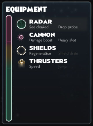
Equipment-12-June-2013So there’s this equipment pane in Spindle Sun. To recap: the equipment pane is supposed to replace the power management sliders, equipment selection popups, and health bars you get in many outer space games, expressing all the same concepts as a single, re-orderable list. Each item has a passive, always-on effect and the higher up something is in the list, the more pronounced the effect — like, you could increase your sensor range by moving your radar up. Also, the top two items do something special when you press your fire button; those are said to be armed. So you can arm different items for different situations.

I want to make sure the player knows what the passive and fire effects are, and my first inclination was to make something where you click on an item and get a popup with a description and a nice big picture of the item and whatnot. Lots of games do this. However, I’ve opted for a minimal solution that requires less programming and design. So in the screenshot above, there are short blurbs to remind you what an item does under each item’s name in the list. If the item is damaged; everything will be greyed out; if armed, everything will be bright; if it’s just sitting there providing passive bonuses, just the fire effect text will be greyed out.

The descriptions are meant to be easy to ignore. I’ll probably push them farther into the background at some point; as they are now, I find them too loud.

If I’m going to have a unique ‘voice’ when it comes to game design, I suppose this is part of it: I want you to be able to drill down into a selection of data or an interface not with your mouse, but with your eyes. It should look simple from far away, but if you just look closer, you’ll notice there’s more going on. I don’t want a controls hiding behind tabs or popups or UI modes. I just want good layouts.

This is not something I can say I’ve seen in games a lot — I’m kind of thinking of newspaper layouts here. And that’s something I’d like to see explored more. Yes, tooltips and popups and expandable lists are neat things, but, strangely enough, I don’t want to rely on those kinds of solutions too heavily.
Almost Human

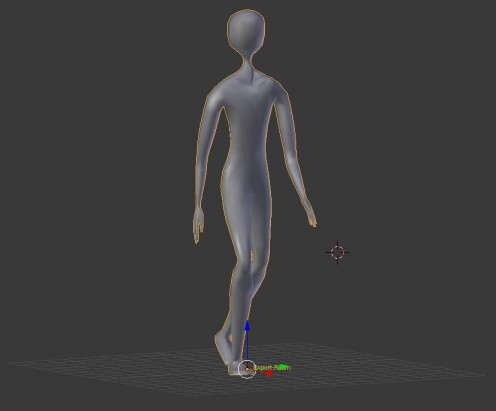
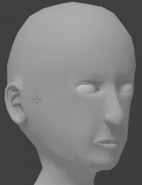
Been working a lot on my Sam model for Tinselfly lately. I think it’s starting to look pretty nice.

character-3-june-2013


Here are some disconnected thoughts about the whole thing:

  • If you told me a few months ago that that best way to do this would be to manually create and move every single point on the model (instead of using higher level tools of some sort) I totally wouldn’t have believed you. But that’s exactly what I’m doing here.
  • Right now, I’m just concentrating on making something that looks like human — not this human. Sam will be dark-skinned, with a wider, flatter nose than this and fuller lips.
  • Sam is probably dark-skinned because I have pretty in his character description. It wasn’t a conscious decision; I just think of dark skin when I think ‘pretty’. I don’t know what, if anything, that says about me.
  • I added some tear ducts. It may seem like a stupidly tiny detail, given that this character will be like two inches tall on screen, but that really helped me understand the shape of the eyes.
  • I am not using any specific reference. I am not tracing a photographed model or a hand-drawn character design. That would probably make things easier, but I am finding that using references of all ages, races and genders is helping me better understand facial structure in general.
  • I’m not sure what’s up with the shading on the chin, lower lip, and above the ear. As far as I can tell, everything’s pretty smooth there. Gotta look into that.
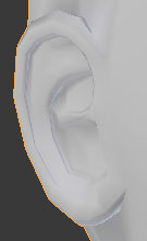
  • It’s nearly impossible to work on the ears without frequent renderings with shadows turned on.
    ear-3-june-2013 Without shadows, the ear is just a strange blob; so much of what we think of when we think of ears isn’t shape, but color.
  • My model (including the body) has something like 15,000 triangles right now. I don’t know if that’s acceptable or not.
  • I can’t wait to move on to Sam’s costume. 😛

Yay, I Get to Fill Out Forms!

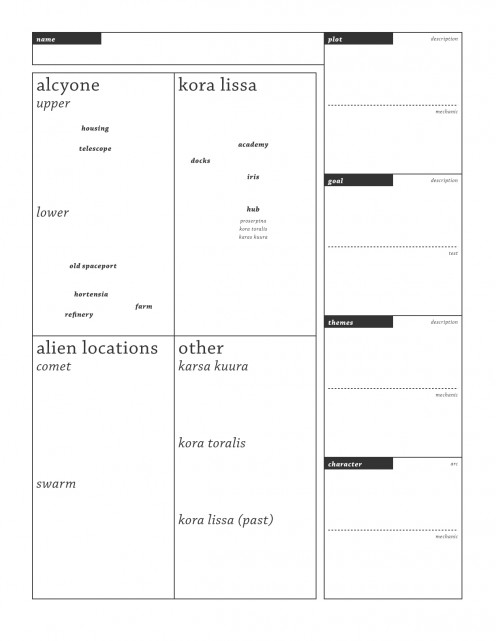
Over the weekend, I tried to do some level planning for Tinselfly, which mostly revolved around creating a form I can fill out for every scene in the game (I hesitate to use the word level, as locations will be re-used from scene to scene). Currently the form looks like this:

form-empty

The bulk of this form is a grid showing all the locations the player can ever visit in the game. The idea here is that, for each scene, I’ll write down what areas the player needs to go to, what areas they cannot go to, and any special redressing I need for my sets (like, I might say in this scene, Old Spaceport has been reduced to a pile of rubble).

Even though there’s no maps really, having this abstract list of places I can draw on has already helped me sort out my thoughts about where the characters need to go and how they relate to their environment.

I’ve decided the number of locations I’ll have will be exceptionally limited. I’m hoping that, by re-using these locations, I can save time modeling stuff, and I’ll have a more coherent narrative because you’ll see how these familiar locations change in response to the story.

The rest of the form is a bunch of questions I want to make sure I’m answering for each level. They all take pretty much the same form, pairs of things like ‘what do I want to express here?’ and ‘how am I expressing that through my game mechanics?’.

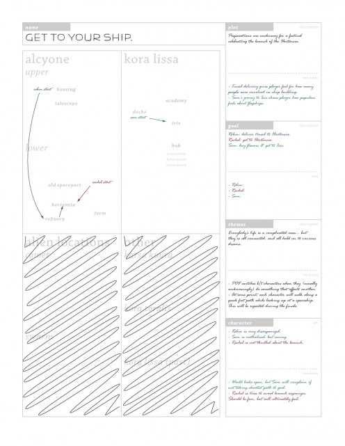
So here’s an example of a partially filled out form.

form-filled

That the form looks like something I’ve printed out and filled out by hand is important: I have to believe anything I write here is mutable, and that if I have a random idea I can just jot it down and worry about vetting it later. I have to believe these look like rough notes, and there’s a point at which I have to trick myself into seeing this form that way.

(Though I do like the idea that these are 8.5×11 and I could print them out for reference later on, if I wanted to.)

Anything having to do with a specific playable character is color coded. Robin is blue, Sam is green, Rachel is red. So I can quickly glance at my questions and see what I don’t have filled in, if one color is missing.

Unused locations are scribbled out, and I’ve got some vague arrows showing where the characters will be going on the locations that are used.

I’m sure I’ll be adding locations as I go, and that’s a good thing; hopefully, I’ll be able to just fill out these forms before doing too much modeling or coding, and then I’ll have this nice list of every location I need to model, and a vague sense of how the parts of each location should relate to each other.

And I’m sure I’ll be changing the layout of the form as I go; I might want more questions to answer, or just more space in which to answer them.

Self-Documenting Mesh

Over the last couple of weeks, I’ve been working on a character model for Tinselfly, and I’ve learned that it’s not enough to make a mesh that looks right. Just like classes in a computer program or layers in an Illustrator file, getting something to work is one thing; getting it to be sensible and maintainable is quite another.

So here are a few things I’ve learned lately.

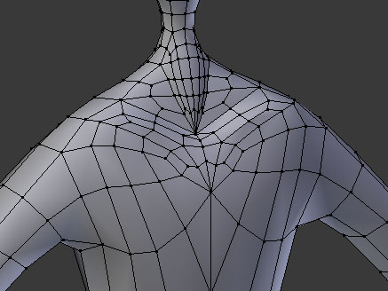
torso-old

The torso above is functional, the way a hastily constructed computer program is functional. It has the right shape. There’s a neck and body and arms and some definition to the collarbones.

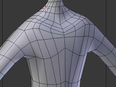
But from an organizational standpoint, it’s a complete mess. Compare that to this torso:

torso-new

Here, I’ve created a pretty strict grid. The overall shape is basically the same, but it’s easier to tell what’s going on. My mesh doesn’t just need to have a certain shape: it must also communicate to me, the modeler, what that shape is. Like well-named variables and functions, this mesh is self-documenting. I can look at these long, smooth curves on the grid and get a good sense of what those curves represent in three dimensions. I can’t really do that with the first torso; the lines, such as they are, are jumbled and jagged.

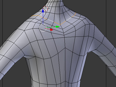
Working in this sort of way also makes editing easier. The modeling software I use has built-in tools to select whole lines or circuits on my grid, like the orange lines here:

torso-new-loop-select

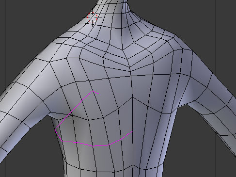
I can also add detail to my mesh fairly easy. If I decide my character’s sides aren’t smooth enough, I can quickly add a loop cut, shown in purple here:

torso-new-loop-cut

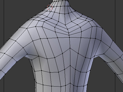
Loop cutting breaks every square along the loop in half, so I can refine a specific area. And once cut, my mesh is still a nice, neat grid which can be further refined with more loop cuts.

torso-new-loop-cut-after

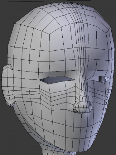
Just imposing a grid on the mesh isn’t enough, though. This face has a simple grid structure:

head-old

Trouble is, this grid isn’t structured that logically. I probably wouldn’t want to take a random cross-section of the face and move it, or scale it, or whatever.

head-old-loop-cut

If I want to add some detail to the eye sockets, I could add a loop cut, like I did with my torso. But this loop cut wouldn’t just affect the eyes: it would also add lots of unnecessary detail around the temples and back of the head.

So what I need to do here is change the way the grid works, just in one localized area. Like so:

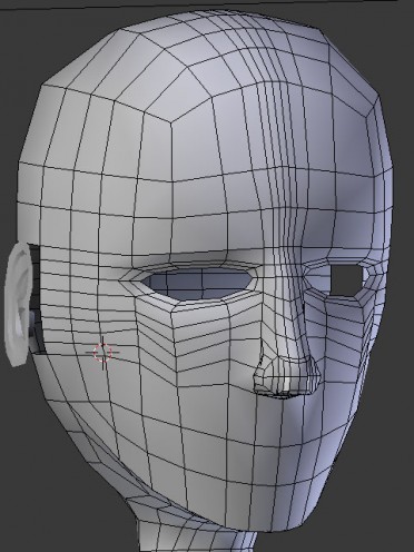
head-new

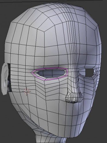
Here, the area around the eyes is its own closed polar grid, while the rest of the face retains the square grid it started with. And now, if I want to add detail to the eye sockets, I can add a circular, eye-shaped cut, like this:

head-new-loop-cut

That loop makes sense to me. It represents an area of the model that I think of as one unit. And again, just seeing the polar grid around the eyes helps me understand the geometry of the eyes, more than the previous approach did.

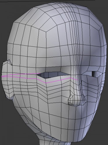
One thing I’m struggling with here is this idea of adding pockets of detail. Suppose, for instance, I wanted to smooth out the contour of the eyelid. Right now, I’d have to add a loop cut like this:

eye-loop-cut

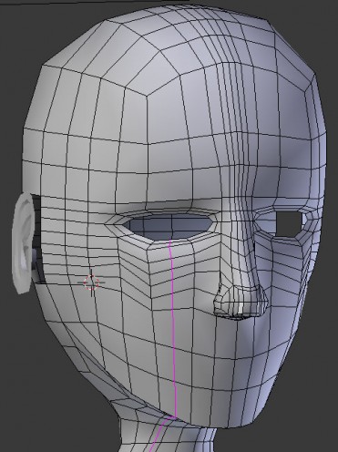
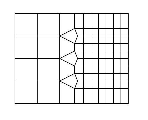
…Which will add extra smoothness around the eye, but will also add unnecessary geometry down the cheeks, and along the neck, and who knows where else. I’m trying to come up with simple, general-purpose strategies for adding detail, like this method of smoothly transitioning from a coarse grid to a finer one.

grid-resolution

That might work in some instances, though maybe not the eye specifically. I still have much to learn here.

Wider, Fatter, Stronger, Better


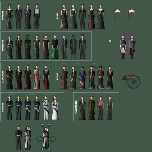
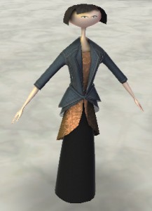
A stupidly long time ago, I posted these costume ideas for Tinselfly.

costumes

And somebody commented how it was funny how all those little people, boy or girl, young or old, kinda looked like me. The long, mouthless faces, the skinny bodies.

I am skinny.

Oh, sure, I’ve gained a slight belly in the last few years, and my mother pokes it whenever she sees me, but I probably still qualify as skinny to most people.

When I sit down to draw or model a a character, I think of myself as a baseline. If the character is described as thin, I’ll try to make them thinner than myself.

And then I wonder why they don’t look quite human.

I am a bad baseline. But just saying that doesn’t give me a tangible sense of what the baseline is. So let’s try to throw some numbers at this.

I’m 5’11” and barely reach 150 pounds most days. I know BMI is problematic, but that puts me right at ‘normal’ according to the CDC. And by ‘normal’ they mean ‘healthy’. Average for a an American is apparently like 50 pounds heavier than I am.

According to this handy figure drawing book I’ve got, an average male has a hip width/head height ratio between 1.5:1 and 2:1. I’m 1.4:1, below the bottom of that scale. Also, my shoulders are thinner than the book’s average, at around 1.5 heads to the book’s 2.

So I’m not just a bad baseline; I’m a really bad baseline, and I’d still be a really bad baseline if I gained lots of weight, because of the slightness of my frame. I guess I already kinda knew that, but the numbers help cement it. An ‘average’ adult male would have a wider frame than me, by several inches; and they would weigh significantly more. I’m not sure how weight translates to bulkier shapes when drawing, but it’s fair to say my characters should be a lot bulkier if I want them to look like average, ordinary people.


Sam is Pretty


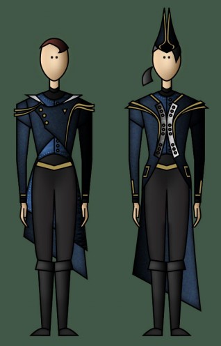
I’m kicking off my more-natural-looking Tinselfly characters thing by not doing my lead. I’ll do a supporting, but playable character named Sam. He’s in the Navy, and will be wearing a uniform like the character on the left here:

uniforms-4-april-2013

This should be well within my abilities to model. Sam will probably have a shaved head, so I don’t have to worry about modeling hair. His uniform is neatly tailored, so I don’t have to worry about drapery or wrinkles. He’s tall and thin, so my current NPC model isn’t too far off from his body.

And he’s pretty.

Why does that matter? Because, from a certain point of view, pretty = less complicated. Smooth. Symmetric. Crisply defined.

Fewer polygons.

* * *

Part of modeling a character is getting to know the character–and I’m already starting to do that, having done nothing more than take the head on my old model and start to make it more natural looking. Which is good, because Sam is mostly defined in terms of being a foil for the lead.

sam-4-april-3013

So here’s what I’ve got so far: when I say ‘Sam is pretty’ I don’t mean that pretty is a thing that Sam naturally is. I mean to say that Sam puts work into being pretty; it is something he values. This is part of his character, not part of his appearance.

Sam looks quite dashing in his uniform, and knows it. But it’s not vanity so much as an obsession with neatness, and an aversion to things that are unorganized.

This works out well, because I’d planned on having a level where Sam is exploring the jumbled fragments of a destroyed, floating city, and having Sam try desperately to put part of the city back together in his head could make for interesting gameplay.

* * *

I also like starting with Sam because said exploration level is fairly self contained; I can just dive into it without worrying about how it ties in with other things. It would be a good starter level, and I desperately need one of those.


Fleshing Out

There are many, many things stopping me from working on Tinselfly right now, but I think the biggest one is my whole approach to character design. To recap, here’s what my lead currently looks like:

0005z21s

Or, at least, that’s what she looked like before I gutted everything and tried to write a totally generic system where you could define a character’s body shape and color and multiple, layered clothing items at runtime.

The character generating thing has been going terribly slowly. So I’ve decided to ditch it and just… make characters in Blender. If a zillion-dollar game like Bioshock: Infinite can have copy/pasted extras, so can I.

I also want more naturalistic characters. I mentioned in an earlier post that the skinny, porcelain look was supposed to tie into the themes of the story and that, while I might decide I’m wrong, this seemed to be they way to go.

Well, I’ve decided I was wrong.

I specifically want to call out the fact that this character is a little heavy, a little ambivalent about her appearance, a little ordinary looking. I specifically want an ordinary looking hero; I think we could use more of those.

I also need the human characters to mesh with these house-sized alien characters, who are kinda like… if you took people and scaled them up and added more detail, the way you’d take a chunky ship or prop design from an old sci fi show and added more detail for the new, rebooted movie version.

I don’t have to ditch everything I’ve got — working with my existing model, I should be able to give the character realistic proportions, and real facial features, and the messy, unstyled hair I always imagined the character would have if I met her in real life. When I first made this model, I didn’t have the modeling skills to do that. Now I’m pretty sure I do.

And the big benefit of doing this reworking is, it should be easier for me to think of the character as a real person, if she looks like a real person; and it will be easier to think of the story beats and whatnot. I need to believe the character is real if I’m going to make progress here.

In Character

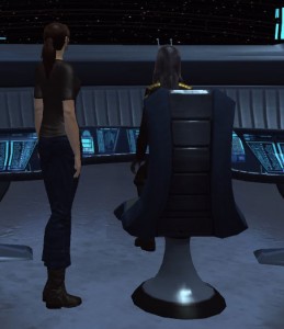
I noticed a little while ago that my MMO of choice, Star Trek Online, now offers your characters short-sleeved uniform shirts, like the ones worm by some of the medical staff in the first Star Trek show.

screenshot_2013-02-13-15-31-24

I was excited about this, because it means I can make my character look even more mundane — with a little customization, it’s not too far off from the plain black t-shirts I am wont to wear, every day I can.

I kind of like the feeling of being immersed in this universe, but I don’t want to feel like I’m playing a character. I want the character to be a projection of myself.

And while the character above neither looks that much like myself nor a 25th century spaceship captain, that image is less distracting to me than having me play a boxy male character wearing a futuristic jumpsuit.

* * *

As I prepare to run a one-shot RPG tonight, I’m thinking a bit about why RPGs scare me so much.

I think it comes down to being fuzzy about what is expected of me as a player. I never really looked at the role-playing part as a means to an end before, and thus don’t really know what the end is.

I usually think of it like, if the world doesn’t feel real to me during a role-playing game, I’m not playing the game right; I’m failing to do well at the game; and who wants to play a game they’re guaranteed to lose?

I put a lot of pressure on myself to enjoy the game the way I think the other players enjoy it.

But maybe it’s not about me. Sure, I may never find a tabletop role-playing session an immersive experience; I’m just too obsessed with visuals. But as a player, I might be able to heighten the immersion for other people playing, by being part of the world building that’s going on.

My goal, from that point of view, is not necessarily to think like my character, or to lose myself in my character, but simply to entertain. And that’s something I can kinda get behind.

Where am I?

Lots of half-written drafts sitting in WordPress right now, which is a pretty appropriate metaphor for life right now: disjointed; half-finished things are piling up; I’m trying to keep things moving but there’s lots of friction to overcome.

It’s easy to overcome. I just clear my head of all conscious thought, and accept the slog.

This always works.

And yet, I have trouble remembering to do it.

If I’m having trouble getting motivated, it’s usually not because I hate the slog — that’s just an excuse. It’s because some part of me thinks that whatever I’m about to work on is not worth working on.

Which is to say, some part of me believes that very little of what I’ve been working on lately, is worth working on.

* * *

As long as I’m feeling rambly and introspective, let’s talk about what I think has been my biggest problem lately: context. Some examples of this being an issue:

  • During board games, I’ll forget whose turn it is, or what we (in a cooperative game) were trying to accomplish.
  • During work meetings, I will be asked a question and will have trouble answering because, while I understood the question, I will have forgotten what we were talking about that led up to the question being asked.
  • Reading books, I frequently forget where the characters are and what they’re trying to do.

I like keeping my head empty as much of the time as possible. And while that keeps me calm and focused, it can also lead to issues like the ones above I guess.

As for meetings, my solution lately has been to keep notes during the meeting. I still get to stay in the moment, but if I’m asked a question, I can quickly peek at my notes to see what the context is.

* * *

It occurs to me that my favorite video games can easily be played in a contextless sort of way, and you’re not asked to remember a lot about what you’ve previously done. If I play a level of Alice or Amnesia, I don’t really care what the last level was. I just want to continue from where I left off. Conversely, playing something like Mass Effect or any MMO, I have to remember what skills my character currently has, what I have equipped, and maybe where I was traveling to… and I have trouble keeping track of this stuff and it gets frustrating.

* * *

If I had an RPG-like ‘stat’ for my ability to have fun, it would be like a 1. I turn everything into work. Which is not to say that I turn everything into something stressful; work can be calm too. But calm work is different than fun.

I mentioned earlier that I thought this One Game a Month thing might be good because I might actually relax and just make things I’d find fun to play, rather that trying to change the way people perceive this whole industry.

And I’m still hesitant to do this, because I’m thinking of these games as just benefiting me. And I’m not worth it, I think to myself. The work has to be for someone else to be worthwhile.

But really,that’s not a well-thought-out argument. Yes, the work would be for me, initially. It’s not like there would be anything stopping me from letting others enjoy the finished work after I’m done. The problem here is that I’m only looking at the most immediate, direct beneficiary of the work. It’s kind of short-sighted.


Makeup


Got one new Scopa card done last night, and revised another.

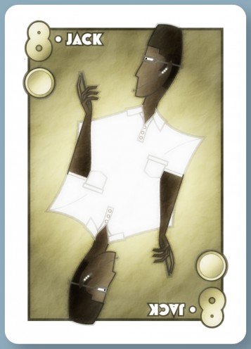
So here’s a new Jack (though maybe it should be Knight?) of Coins.

jack-coins-28-january-2013

Going with the business attire the other coins had, I thought I’d go with a polo shirt here. It’s awfully plain; no pinstripes or layers to add interest. I’m not sure if that’s a good or bad thing.

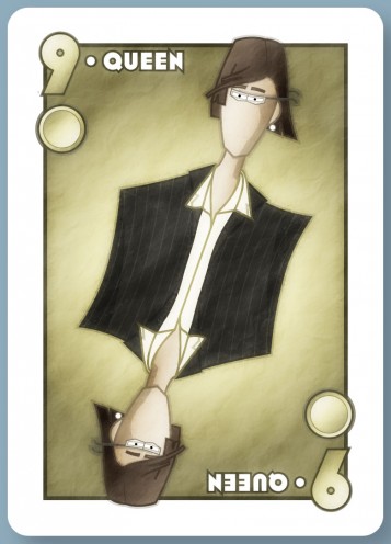
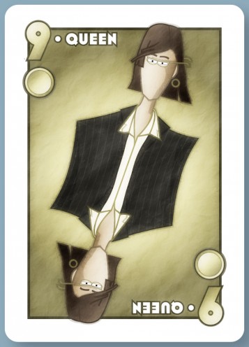
I sent this Queen of Coins to the client last month, and he commented that she looked a bit too androgynous.

queen-coins-27-december-2012

While I’d prefer not to have exaggerated sexual dimorphism in my stuff, I can kind of see where he’s coming from there.

I was reminded a bit of this children’s RPG that made a point of having dignified, non-sexualized female characters, and people complained that the characters weren’t recognizably female.

A tangent: when I was a kid, I thought girls’ nails naturally grew pointy, and boys’ nails came out square. And I met a girl with square nails, and got very confused.

Yes, there are of course physical differences between genders, but a great many of the things we think of as ‘feminine’, especially with regards to people’s faces, take conscious effort to produce: styled hair, makeup, shaped eyebrows, more saturated colors on glasses and clothing.

I’d love it if we lived in a world with less gender-specific grooming, but we don’t live in that world, so let’s be practical about it: a character who doesn’t follow at least some of these conventions is likely to cause confusion. I get that.

I don’t like it, but I get it.

I’d also love it if we lived in a world where most people didn’t care whether or not another person’s gender was obvious from their grooming, but again, we don’t live in that world.

So I went ahead and lengthened the hair, enlarged the earrings, made the eyebrows arched and the glasses brighter.

queen-coins-28-january-2013

But I didn’t add makeup.

Makeup is gross.

Copyright © 2017 Brian Crick.