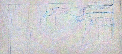
Since the desired image size is sorta widescreen, I thought I’d have my character standing sideways, on the side of a skyscraper, to fill the space better.
I had a sketch of that (not pictured) and it just wasn’t that interesting visually, so I thought I’d add in a gargoyle that the character could be leaning against. So I drew a quick thumbnail sketch of that.

In this composition, the character could be upright and still fit, but hey, I like the way this is balanced. So you’ve got a character with her arms folded, cape hanging down, standing on the side of a building, leaning up against the bottom of a ginormous gargoyle rain spout thingie, with a bunch of skyscrapers in the background.
So far, so good.
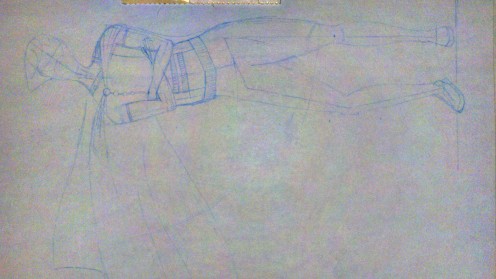
Then I started a new sketch just focusing on getting the proportions and body of the character right. Like I said before, I’m not terribly skilled at this.

I had my anatomy book open the whole time, and had to force myself to do this in stages: I started with an 8-head-high ruler with little tickmarks on it, used that to draw a simple skeleton (you can kind of see that around the hips and legs) and built the body around the skeleton. Pretty basic stuff as I understand it, but I’d never done that before.
Mostly, I think this turned out quite well; the stages really helped. However, I do have a couple of quibbles.
First, the torso feels too long. My torsos always feel too long. While I think I got the proportions of the skeleton right, I think I made the widest part of the hips/legs way too low. Gotta brush up on my anatomy there, especially male/female differences to watch out for.
Second, I was going for a little bit of contrapposto there (having all your weight on one leg, which results in the hip being all slanty), but I think I made the torso too twisty. There’s a little bit of butt sticking out there, which is the last thing I want. However, I think I’ll leave the basic shape as is, and when I scan in my sketch for real for tracing in Illustrator, I’ll just bend things a bit in Photoshop so the general upper body is more to my liking.
I haven’t given a whole lot of thought to the costume, besides the off-center cape and asymmetric collar detail. I figure I can (and should) design the costume separately from the actual act of figuring out how the body looks in my sketch.
It’s very, very tempting to just give the character a decorative pull-over short-sleeved shirt with a cape, leggings and short boots, and call it a day. There would be nothing particularly feminine or cheesecakey about it; it would be very safe.
But I expect superhero costumes to be a bit theatrical; I’d expect skirts and gloves and shiny accessories. Getting that sort of stuff to work, that’s half the challenge here. And like the formal wear I was talking about the other day, I think it’s important to get at the roots of these design decisions.
Take thigh high boots for example, common in girl superhero costumes. True, there’s a bit of fetishism going on there, and you can be dismissive of that… but they also emphasize the length of the legs, just as the long gloves commonly paired with these boots emphasize the arms. If you’re going to have a character kicking and punching bad guys all the time, you want to draw attention to their limbs. It makes sense. The trick, I think, is to place emphasis where you want it without having it be too obvious to the viewer that there are specific things you want to focus on here.
I’m not sure when I’ll be able to get to this next. I’ve got stuff happening tonight and tomorrow night, and friday night is, well, friday night. 🙂
