Brian Crick

Fleshing Out

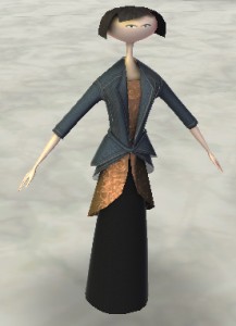
There are many, many things stopping me from working on Tinselfly right now, but I think the biggest one is my whole approach to character design. To recap, here’s what my lead currently looks like:

0005z21s

Or, at least, that’s what she looked like before I gutted everything and tried to write a totally generic system where you could define a character’s body shape and color and multiple, layered clothing items at runtime.

The character generating thing has been going terribly slowly. So I’ve decided to ditch it and just… make characters in Blender. If a zillion-dollar game like Bioshock: Infinite can have copy/pasted extras, so can I.

I also want more naturalistic characters. I mentioned in an earlier post that the skinny, porcelain look was supposed to tie into the themes of the story and that, while I might decide I’m wrong, this seemed to be they way to go.

Well, I’ve decided I was wrong.

I specifically want to call out the fact that this character is a little heavy, a little ambivalent about her appearance, a little ordinary looking. I specifically want an ordinary looking hero; I think we could use more of those.

I also need the human characters to mesh with these house-sized alien characters, who are kinda like… if you took people and scaled them up and added more detail, the way you’d take a chunky ship or prop design from an old sci fi show and added more detail for the new, rebooted movie version.

I don’t have to ditch everything I’ve got — working with my existing model, I should be able to give the character realistic proportions, and real facial features, and the messy, unstyled hair I always imagined the character would have if I met her in real life. When I first made this model, I didn’t have the modeling skills to do that. Now I’m pretty sure I do.

And the big benefit of doing this reworking is, it should be easier for me to think of the character as a real person, if she looks like a real person; and it will be easier to think of the story beats and whatnot. I need to believe the character is real if I’m going to make progress here.
Makeup


Got one new Scopa card done last night, and revised another.

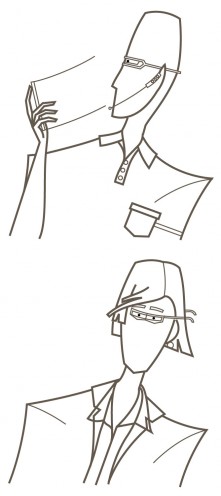
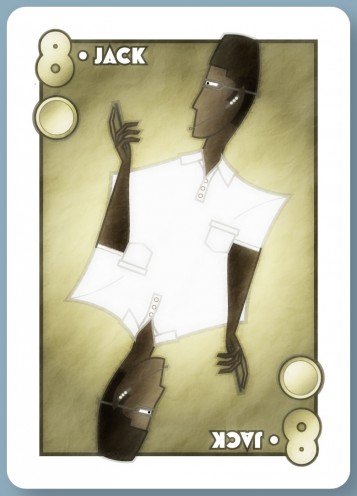
So here’s a new Jack (though maybe it should be Knight?) of Coins.

jack-coins-28-january-2013

Going with the business attire the other coins had, I thought I’d go with a polo shirt here. It’s awfully plain; no pinstripes or layers to add interest. I’m not sure if that’s a good or bad thing.

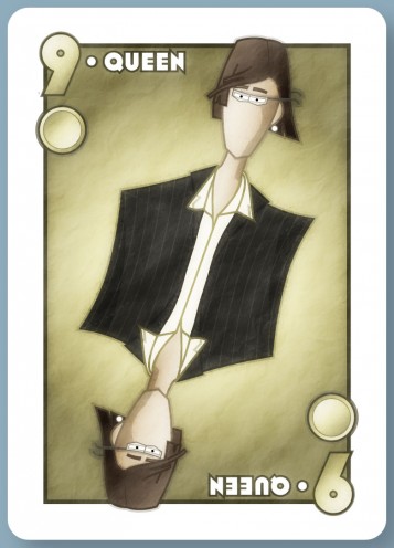
I sent this Queen of Coins to the client last month, and he commented that she looked a bit too androgynous.

queen-coins-27-december-2012

While I’d prefer not to have exaggerated sexual dimorphism in my stuff, I can kind of see where he’s coming from there.

I was reminded a bit of this children’s RPG that made a point of having dignified, non-sexualized female characters, and people complained that the characters weren’t recognizably female.

A tangent: when I was a kid, I thought girls’ nails naturally grew pointy, and boys’ nails came out square. And I met a girl with square nails, and got very confused.

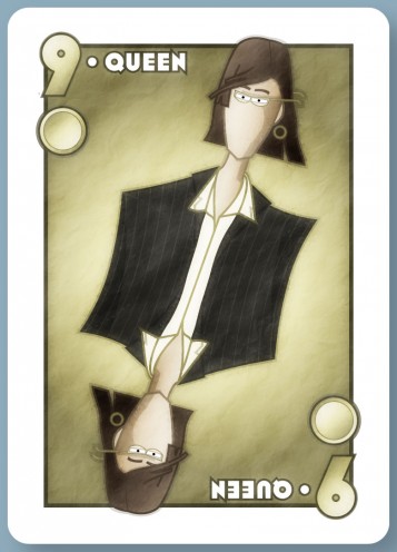
Yes, there are of course physical differences between genders, but a great many of the things we think of as ‘feminine’, especially with regards to people’s faces, take conscious effort to produce: styled hair, makeup, shaped eyebrows, more saturated colors on glasses and clothing.

I’d love it if we lived in a world with less gender-specific grooming, but we don’t live in that world, so let’s be practical about it: a character who doesn’t follow at least some of these conventions is likely to cause confusion. I get that.

I don’t like it, but I get it.

I’d also love it if we lived in a world where most people didn’t care whether or not another person’s gender was obvious from their grooming, but again, we don’t live in that world.

So I went ahead and lengthened the hair, enlarged the earrings, made the eyebrows arched and the glasses brighter.

queen-coins-28-january-2013

But I didn’t add makeup.

Makeup is gross.

Twelve Not So Angry People


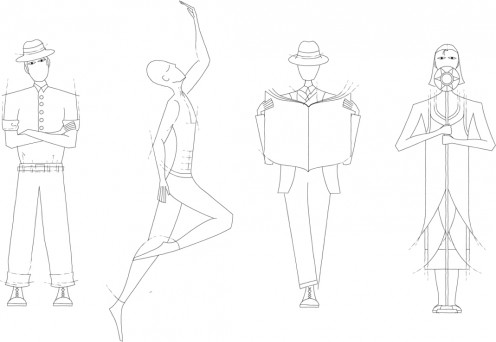
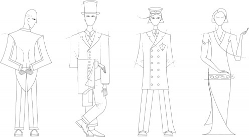
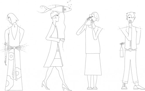
Finished up outlines for my speakeasy board game characters last night.

characters-21-december-2012-1 characters-21-december-2012-2 characters-21-december-2012-3


Working as fast as I possibly could, I’d say each outline took 15 minutes. Working at a more leisurely pace (as I did last night) I’d put each outline at around 25.

You’d think it would take less time than that.

But anyway, have some random notes:

one game a month

So there’s this One Game a Month challenge coming up. And it occurs to me that I’ve already got four things in the pipeline — two board games, two computer games. I was already hoping to get most of those things done sometime in 2013. So, I figure, this speakeasy thing and the three other things in development — Tinselfly, a cyberpunky boardgame (big, big breakthrough last night!) and Operetta can get lumped in there. Ok, well, who knows what decade Tinselfly is coming out… but let’s not give up hope. A lot could happen between now and the very last month of One Game a Month.

But more on that whole endeavor later.

heels

OMG high heels are awkward.

I’ve never drawn a person wearing those before, but much to my surprise, it seems that most women in my 1920s fashion books are wearing high heeled shoes. So I figured I had to have at least one character in heels.

I couldn’t draw the feet on that character on the bottom, walking her fish, without thinking about how strange the position of the feet were and how uncomfortable that looked.

I’m glad that I’ve decided that, in the Tinselfly universe, everyone wears flats.

back view

The character on the lower left is supposed to be facing away from you. I’m not sure that’s entirely clear, or how to make that more clear.

Maybe, when there’s color, I can have some shading indicating that that’s the small of her back you’re seeing, through a relatively tame dress with a low back (again, based on real period stuff I saw).

hard edges

Here and there, I tried to make things a little too geometric to give things this art deco look.

I think I could have done more of that, but I was kind of rushing to get these done.

Stupid Photoshop Tricks: Corrosion

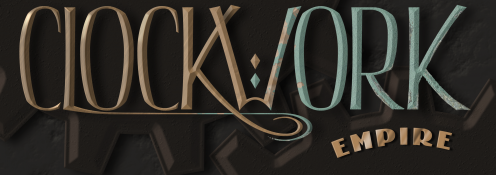
Recently, I made a logo for someone’s upcoming RPG.

logo-opaque-13-december

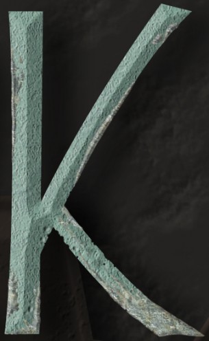
They wanted something kind of corroded looking; if you view the image full size, you can see how the letters look a bit icky and old.

8-even-more-pits

So I wanted to talk a little bit about how I did that. It’s mostly Photoshop tricks and very little hand-drawing.

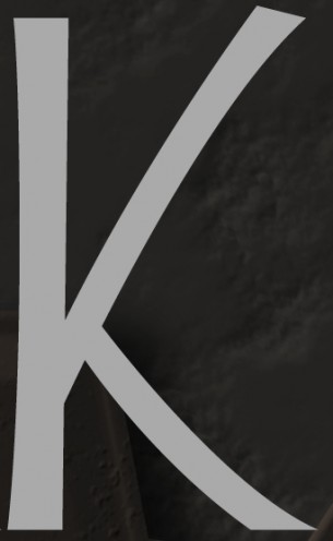
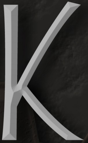
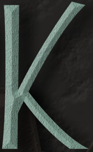
First, I started with some boring grey letters in their own layer.

1-outline

Then I added a stock bevel and drop shadow — just standard Photoshop effects. You can click on the fx bottom on the layers palette to add these.

2-basic-effects 

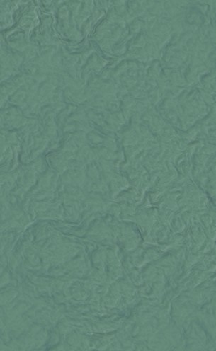
I made a generic sort of streaky rusty copper texture like this:

a-copper-texture

It may look complicated, but it’s mostly stock filters.

c-copper-steps

On the image above, you can see the results of a Filter->Render->Clouds on top. In the middle, I’ve done Filter->Stylize->Find Edges. And on the bottom, I’ve done a Filter->Stylize->Emboss. And with that, you’re most of the way there.

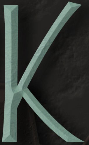
So I made this great big copper texture and pasted in into my document, and used a clipping mask to make it look like a texture on my beveled letter. You can do that by selecting the texture layer and going to the little arrow menu on the Layers palette and selecting Create Clipping Mask, and what that does is, it uses the opacity of the layer under the selected layer as the opacity of the selected layer itself. But the effects, like the bevel, are still visible.

3-pattern

So at this point there’s a nice color texture, but it needs to look kinda bumpy and worn.

Sadly, I forget how I made this one. 🙁

b-pit-texture

But it was also pasted into my document, and had Clipping Mask turned on, and I set the Blending Mode on the Layers palette to Hard Light. That makes it so that the colors of the layer underneath are preserved, but you’re sort of adding shading to it. So you can see below how the letter’s still blue-green, but the highlights and shadows in the pitted texture above are coming through.

4-basic-pits

There’s this sorta lumpy, pitted texture now, but the edges of the letter are still perfectly smooth — it doesn’t look quite right. So I took little bites out of the letter with the Eraser tool, just near the edges, to make it look more like this texture was a three-dimensional thing. This effect is most visible where all the strokes come together in the middle of the letter.

5-more-pits

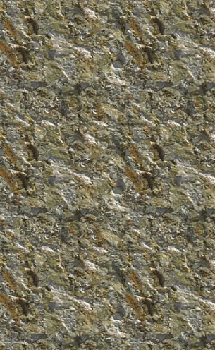
Next, I wanted to add some mineral deposits. Rather than make a custom pattern, I just used this yellowy, lumpy rock pattern that comes with Photoshop.

d-mineral

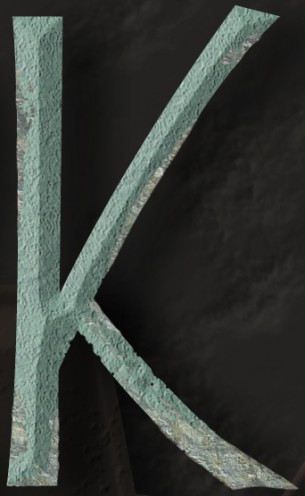
What I did was, I made a new, empty layer and added a Pattern Fill using that fx menu, and a Color Fill too, to tone down the yellowness a little. And then I just started drawing blobs over my letter.

Part of the goal here was also to hide the flat appearance of the bottom-right part of the K; sometimes, Photoshop’s automatic bevels look a little funny.

6-minerals

That ended up being a little hard to see,and not nearly nasty-looking enough, so I also added a bevel to the mineral layer itself. So it kinda looks like there’s this buildup on the letter.

7-minerals-emboss

And finally, I added some more pits, again near the intersection of all the strokes for the letter.

This is a little strange. What you’re seeing below is some beveled dots, but the dots themselves aren’t visible — you can do that by lowering the Fill on your layer in the Layers palette. And what you’ve got then, is the bevel effect applied to the layers underneath the dots.

8-even-more-pits

And there you have it… a lovingly crafted, nasty looking K. 🙂


VHS

So it was around 2000 or so, and Marie and I were living in our second apartment, and our VCR was either dead or dying. And I remember thinking to myself, this is it. This is our last VCR.

It was kind of an odd thought. Not sad or exciting; just odd. I’m not sure I could say I’d bought my last anything before that. But it made sense. Our next VCR wouldn’t be a VCR; it would be a DVD player.

Technologies come and go. Historically I’ve kind of blasé about it. But lately I’ve been thinking about this stuff a lot.

* * *

I’ve been without a pen tablet for about a year now. You’d think I would have rushed out and bought a new one as soon as my latest one failed, but for some reason I didn’t. All the Scopa cards I’ve been posting, the Girl Wonder submission, those were all done with a mouse.

Maybe the pen tablet will be replaced with a tablet computer, maybe not. Drawing directly on screen would be awesome, but I can’t say I’ve really warmed up to tablets yet.

* * *

I haven’t updated my Adobe products in four years. Photoshop,Illustrator, Flash — I’m several versions out of date now.

I may never buy another Photoshop or Illustrator.

Ever.

This thought kind of scares me. I’ve been using Photoshop since around 1992. I’ve invested a lot of energy into learning to use these programs as efficiently as possible, and would probably take a pretty big productivity hit if I switched products. I can open things I haven’t touched in a decade and start working on them without missing a beat.

But I don’t do freelancing anymore, and Adobe’s flagship products are expensive. There’s also a lot I don’t like about these products, not that I’ve tried anything else lately.

* * *

This wouldn’t be that much of an issue, except that from what I’ve read, my versions of Adobe’s products won’t run on the newest version of Windows. When my current laptop dies — and from the looks of things, that’s going to be pretty soon — I’m going to have a bit of a problem.

My strategy right now is to continue working on my own illustration program, and just keep my development tools up to date, which is relatively inexpensive.

We’ll see how sick I get of development after a while I guess. 🙂

Parallel Processing

Got outlines for a couple new Scopa cards.

These two characters are going dramatically faster than my previous ones. I’m changing my process a little, and that’s helped.

Here’s what’s different about the process, compared to when I started this project:

  • The outlines are monochrome. While my final product will have multi-colored outlines, not having to decide upon and change colors while drawing allows me to just draw line after line, really quickly. The whole process will end up being draw lines -> color inside the lines -> change line colors based on chosen fill colors. It seems kind of counter-intuitive, to change the colors of your outlines as the last step in your process, but I’m certain that doing that after I’ve decided on the fills will result in less indecisiveness and repetitive tweaking of the outline colors.
  • There are no fills yet. Again, this lets me just draw lines in rapid succession, and later I’ll draw lots of fills in rapid succession.
  • I’m doing two characters at once. If I’m already in outline-tracing or color-filling mode, I can quickly jump into doing the same task on another character, quicker than I could switch to a different task on the same character. You hit kind of a no-mind groove when sticking with a single tool in Illustrator.

So there you have it. All it basically comes down to is batching my work, and doing similar tasks all at once.

Adequately Gorgeous

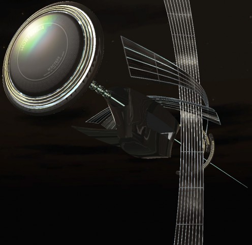
I’ve been obsessing over one particular spaceship model for Tinselfly lately. Mostly, I’m trying to prove to myself that I can make this product look as good as I want it to be.

You can view this in 3d here. (It’s updated from yesterday’s model, if you happened to see that.)

This is rather uneven, sort of by design. That main body is pretty funky looking, because I’ve been ignoring it.

I slip into a bit of a weird workflow, when I really don’t have any faith in my skills. Sure, a decade ago I made this design, ostensibly for this project, and it still looks pretty nice… but since I made that, I decided to make the switch from pre-rendered scenes to realtime 3d, and  I have a long way to go before I can say I’m good at making models for realtime 3d projects.

So I’m shooting for adequate here.

Trouble is, my standards for ‘adequate’ are pretty high. And what I’ll do, when I’m not sure I can make something that meets my standards, is just focus on one small piece of my model or illustration or whatever, and see if I can get it looking ok. Here, I’ve been concentrating on the big disc in front and those shiny lattice-like sails curving around everything. And I hereby declare those things adequate. I’m pretty sure now that I can give everything else — the main body of the ship, the rings in back — a similar level of detail and visual interest.

I sort of wonder, if I’d gone into this confident that I’d eventually get something I liked, if I might have picked a more efficient workflow. I wouldn’t say I’ve done a lot of second-guessing my decisions, but jumping into a challenge expecting to fail probably isn’t a great mindset to have.  That’s how I went into another recent illustration project, and I’m pretty sure that killed my efficiency.

Generally I tend to be pretty optimistic, and that’s been waning a bit, much to my surprise. I think it’s time to reclaim some of that. Being stupidly optimistic can be helpful sometimes.

Larger Than Life

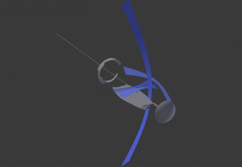
I’ve been working on my Hortensia model (a spaceship for Tinselfly), just roughing out the basic shapes for it. Here’s what it looks like from the front right now:

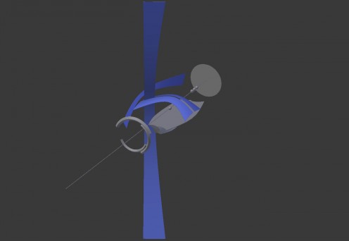
And from the back:

My main goals were to have it look absurdly fragile and have a sort of nautical feel, what with these sail-like structures and all, and I think this is finally getting there.

It’s a bit Tron-ish, but I’m ok with that; whatever I make, it’s going to be something-ish, and Tron-ish feels like a better fit for this story than Star Trek-ish, Star Wars-ish, or a realistic NASA-ish.

Besides nailing down the silhouette, I’ve also been trying to decide how big this thing is, and I’ve finally settled on that, too.

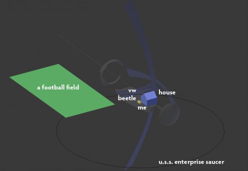
To give you a sense of the scale I picked, here’s an overlay of random things in comparison:

(The ‘me’ bit seems to have been completely obliterated by compression artifacts… you can click on the image to see a larger version.)

By any absolute measure, this is not a big ship. The distance from the front disc to the back of the rings is less than 100 meters. The main body isn’t so much bigger than the Mayflower.

I like that smallness. I like the idea that you could have the whole thing in frame, and see a character on deck or behind a window, and maybe even know which character you were looking at.

* * *

My lead character Robin is supposed to be in awe of the beauty and power of this thing. I could just scale it up; I could make it look big and massive and have it dwarf everything around it; I could make it comparable in size to popular fictional spaceships… but that sort of feels like a cheat. No matter what this ship looks like, Robin has to react to it in a way that expresses her feelings about it. And if I’m not communicating that in some sort of memorable, gameplay-driven way it’s sort of a lost cause anyway.

Here are some random ideas for doing that:

  • Robin occasionally glances back at the ship if it’s in view. (On its own, this isn’t really based on game mechanics, but imagine a scene where you’re talking to someone and keep glancing back at the ship and you fail to hear important information they’re trying to convey; the solution would be to talk to the character in a different location where the ship isn’t in view and distracting Robin.)
  • Robin can run a little faster towards the ship and a little slower when running away from it. (This could also be used to solve a puzzle of some sort.)
  • While near the ship, the camera rises really high, showing Robin dwarfed by the ship. Robin looks up constantly. From this point of view, Robin cannot interact with anything near her, that she needs to interact with; you need to literally get Robin back down to earth to continue.

That’s just a few ideas I thought of while writing this post. Hopefully you can have all sorts of little things that the player experiences, without words, without cutscenes, that tell you about this and other playable characters that don’t have anything to do with giving the player loads of verbal exposition.

Broken Illustration

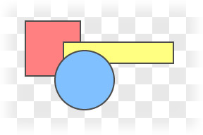
I think I figured out a big part of my problem with my Scopa workflow, and working in Illustrator in general: I think of things too much in terms of overlapping shapes.

A lot of the time you can just draw a bunch of shapes, each one on top of the last, and be ok.

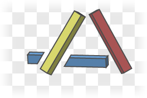
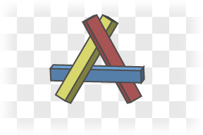
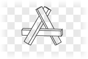
Everything’s nice and layered here. But say I wanted to make something with odd overlapping, like this:

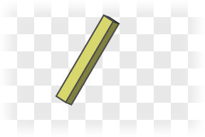
I could start with the yellow stick

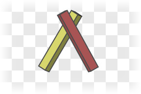
Add the red stick on top of that

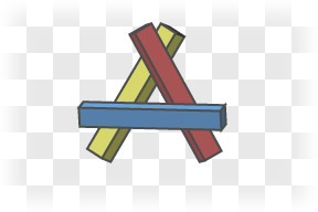
Add the blue stick…

…and this is where things get a bit janky. The blue stick should go under the yellow stick, but over the red stick. There’s no order I can drop these things onto my drawing and get it to work.

The thing is, within Illustrator, I should stop thinking of these as sticks. I’m not working in three dimensions anymore; I’m working in two. I need to flatten everything out in my head, and see everything as flat shapes on a piece of paper.

If one three dimensional object overlaps another, that doesn’t always mean I get to make two 2-dimensional objects in Illustrator that overlap. Sometimes, it means that the top object breaks the bottom object.

What I could do here is draw the blue stick as a couple of separate pieces. When they’re aligned right, you won’t be able to tell that’s what I’ve done.

But there are still overlapping objects here. It’s not a big issue with this simple a drawing, but for more complicated drawings, having too many overlapping objects can be kind of a pain. Selecting things becomes a bit counter-intuitive; I could click on a spot well inside the red stick and get the yellow stick instead because it’s right there under my cursor… just hidden. I do this all the time, and it’s immensely frustrating.
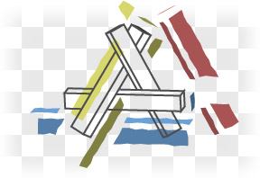
If I’m comfortable with my outlines — and I’d better be, before I move from paper to Illustrator — it might be best to just draw my outlines first

and add in colored, broken shapes everywhere, with nothing overlapping at all.

When I think of ‘layers’ in Illustrator, I think of my object. Like the layers of someone’s costume, layers of fabric.

But a good drawing has a different concept of layers. The drawing itself has layers that are completely unrelated to the layers the viewer might see in the thing being drawn. There are color layers and outline layers and shading layers, things like that.

I think I actually used something like this approach in my Girl Wonder thing, and didn’t quite realize just how good an idea that was until now.

Friction

The thing about my whole ‘throw things at the wall and see what sticks’ approach to improving my productivity is, you have to take time to see what’s sticking and what’s not. And I think I’ve just realized something here isn’t as sticky as I thought.

* * *

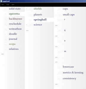
My pet project management thingie has, just within the last week or so, gotten into a mostly usable state. It still needs a lot of work, but I can reliably use it to manage my projects.

It’s basically just a tree. You can add things to the tree, change the order of things, move things up or down in the tree, and select whether individual nodes will open in a new pane or just expand like, you know, a regular tree control.

I was keeping all this information in a simple text file, but a couple months ago I decided it would be a good idea to ditch the text file and start using my still-buggy homemade software. I figured if I forced myself to use it, I would then be more motivated to fix the bugs.

I was wrong.

Instead of using my software and trying to fix it, I just abandoned project management entirely. And there was a massive hit to my productivity because of that.

It’s a little too easy to abandon my pet projects, even though I know that doing so is bad for my mental health. You can have all the motivation in the world, but sometimes it’s not about motivation. For something like this, sometimes you have to look at the other end of things and reduce the friction that’s stopping you from moving.

So I dropped everything and got this app usable, and that’s a big part of why I’m now getting everything back on track.

* * *

My Adobe Creative Suite software — Photoshop, Illustrator, Flash; that sort of stuff — is a couple versions and a few years out of date.

Adobe has moved to a subscription based service for their software, and I’m finding it hard to justify the cost, given that I don’t do any freelancing anymore. In fact, it’s entirely possible that I will never get a new version of Photoshop the same way I will never buy a new desktop computer. It just doesn’t seem to make sense anymore.

* * *

I’d like to get moving on that comic with Marie, and haven’t decided yet if I’m going to do it in Illustrator or my own custom paint program that I write a while ago, just for this sort of thing.

Illustrator is a known quantity, but it has trouble with files with lots of filters, which I use extensively. Getting a new computer won’t help; the problem is that, because it’s old software, it can’t take advantage of all the memory present in new machines.

On the other hand, my custom paint thing has some potential, but is also very buggy and needs to be updated quite a bit before I’d really say it’s usable.

I’d say I should just go ahead and declare that I’m going to use my own program and that will motivate me to clean it up… but I’m coming to the conclusion that that strategy is never going to work. Which is not to say I’ll never get the paint program usable. I think I just have to do it for its own sake.

I can’t think of it as a quick fix for the hole left by an outdated Creative Suite; it will never get done that way… I have to think of it as worth the investment instead.

Copyright © 2017 Brian Crick.