Brian Crick

Scopa King, Final (No, Really.)

With the random stuff I work on, usually it feels like it goes on forever. But sometimes, there’s a fine line between done and not-done.

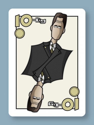
This here Scopa King is done. This is the look I wanted. Nothing more, nothing less.

The last thing I did was add that radial gradient behind the character, and that finished off the illustration for me. I could repeatedly hit undo/redo in Photoshop to toggle between states and go yeah, this current version is done. This version one step back in the undo history is not done. It’s a really fine line sometimes.

I guess it’s all about setting expectations that are both precise and reasonable, which I tried hard to do here. This took a little longer than I wanted, but it was never my intent to make my best illustration ever — just to do something with a reasonable level of quality, in a reasonable amount of time. And mostly, I think I got that.

Of course, the big question now is, how long will it take me to do the other cards? There are 11 more to do, plus some simpler, more abstract numeric cards that will largely be copy/paste jobs.

Getting to this point took around 3 or 4 hours, but I’m hoping for 15-30 minutes per new face card. Luckily, I’ve got things set up in Photoshop in such a way that I can just import my Illustrator art and all the weathering will happen completely automatically.

So hopefully, I’ll have an update on that later this week.

Scopa King, Nearly Final

Have a Scopa update.

This is just about done, though John suggested adding a pocket with a handkerchief and some buttons, which sounds great to me.

Mostly, I focused on coloring and texturing.

The shadows and shading were all done by hand using extra vector art in Illustrator, something I’ve never done before. I usually try to use gradient meshes or drop shadows or Illustrator’s 3d tools for that sort of thing. But now that I’ve tried this, I love it — as a bit of a control freak, I like having absolute control over the shapes of the highlights and shadows.

Once I had the coloring done, the image looked like this:

Kinda cartoony, kinda flat. I think, for this sort of look to work, you have to make it look a little distressed… more like an old poster printed on idiosyncratic equipment and less like cheap vector clipart.

This is actually a look I’ve been trying to get on my stuff for years, and I think this is the closest I’ve ever come to it. If you’re curious, what I did was this:

  • Import my Illustrator art into Photoshop.
  • Duplicate the one layer you’ve got.
  • Apply a gaussian blur to the duplicate (I did 6 pixels here I think.)
  • Apply a normal diffuse filter to the duplicate 10 or so times in a row.
  • Set the blending mode of the duplicate to 100% overlay.
  • Add a new layer.
  • Make some black & white clouds on the new layer.
  • Add a few difference clouds to that. I did like 6 iterations.
  • Emboss.
  • Set the blending mode of the clouds layer to 100% soft light.

So that gave me some wrinkles and the impression of imperfect printing. I’ll probably futz with it a little more and add some scratches too.

Scopa King, Rough Draft

I mentioned a while ago that I wanted to try doing some board game art illustration, and have made a little progress there.

I’ve actually had two leads, but one of them wanted pin-up style stuff. Ugh. They also wanted 1920s style sci-fi which would have been really really cool to work on, but… yeah. Couldn’t ever take that work.

The other bite was a custom set of Scopa cards. It’s basically like a poker deck, with some numbered cards and some face cards used in an abstract trick-taking game.

I’m not a big fan of abstract card games, but making stylized face cards sounded kinda fun. I decided to do a modern spin on the symmetric, double-sided people used on regular playing cards, so each suit would have people in different types of dress: business attire, formal, military uniforms… and I haven’t decided on the last suit yet.

If I’m going to be doing illustrations for other people, I need to figure out the most efficient way to do that. I can’t just lovingly tinker with something until I believe it’s done. So I’m trying to change things up here.

I thought I’d try a businessman first.

I started with a very simple pencil sketch and inking:
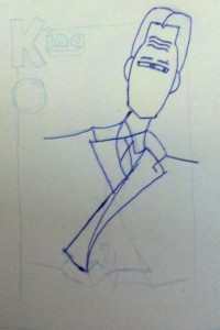
I just wanted to make sure the basic proportions of everything were right, and do the minimum amount of penciling and inking necessary to get this into the computer. That approach is new to me, but I suspect it will work better than my previous attempts to more fully flesh something out on paper and then import that. I always have to re-do all my fine details in Illustrator anyway.

Since my old scanner doesn’t work with my new computer, I just took a picture of my sketch with my phone, and that’s what you see above. Sure, there are going to be perspective issues if I don’t get the angle just right, but it’s much faster than using a scanner. And it’s easier to see my light pencil lines.

Having gotten the photo, I then started tracing in Illustrator. I’m very particular about vectorizing everything, so I would never use a tool to do that for me… chances are, it would create paths with too many points and be hard to edit later on.
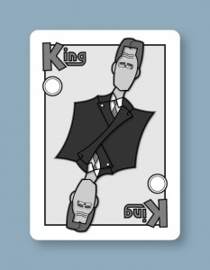
After I had my basic shapes, I added some temporary shading. So while there’s no color yet and the shades are far from final, you get a general sense that the suit will be very dark, the skin very light, the shirt white, etc. Never done that before, but this is supposed to be another efficiency improvement.

When I was working on these stylized fantasy characters a while ago, I was having trouble, because just looking at line art like this…
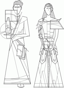
…it was difficult to tell how coloring would affect the line quality on a finished character like this…
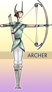
…the problem being, the colors completely change how you look at the lines.

So here, I was all nervous because I was looking at a black & white drawing and thinking to myself, I won’t know if this is going to work until I do the coloring, but the outlines really have to be nailed down before I start coloring, or I’ll end up trashing all my coloring work and starting over if the outline of something needs to change.

And then it finally occurred to me that I could just fill things in with temporary shades of grey, and that’s enough to tell me how the final colors & shading might affect how you see the linework. And I can quickly adjust the linework based on my rough shading, if necessary.

I haven’t actually decided how I’m going to color this, whether it will be Illustrator gradients or Photoshop painting or my own paint program. I may just try them all and see what looks best or can be done the fastest or what the client likes most.

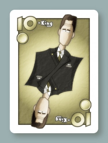
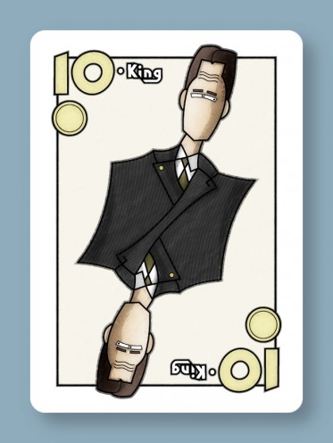
Next up, I need to add more detail like shading and seams and pinstripes, and de-emphasize the word ‘King’ in favor of a simple number (at the client’s request).
Puzzle Pieces

Work is amazingly busy right now, but I wanted to take a break to talk about collages.

So I had this freelance client who wanted a brochure done, full of artwork he’s selling. And on the cover of the brochure, he wanted a collage of 12 of his favorite images.

And I thought to myself, yikes, this is going to be tough.

I had to fit all these differently sized images together in such a way that:

  • There is no whitespace between the images.
  • The images do not overlap.
  • The images should retain their original proportions as closely as possible, with a minimum of cropping.
  • The silhouette of the whole composition has to be a smooth rectangle with set proportions that the client wanted, so that a sidebar with informational text would fit nicely beside the collage.

I really didn’t know how to begin. I figured it would be like putting a Tangram together, finding that one, perfect combination of puzzle pieces that would yield a perfect square in the end.

I rather dislike those kinds of puzzles. You’re just guessing. If your guess is wrong, you haven’t made much progress; you just have to guess again and rearrange your pieces.

I started by just randomly sticking images together, and rearranging them, and resizing everything, and got very frustrated.

I started to wonder if if solution existed at all. I mean, really, what are the odds, given a random set of rectangles, that you’d be able to find an arrangement of them that would fit my constraints? They’re totally random. If I gave you a random set of pieces from multiple, different-sized Tangram sets, what are the odds that you’d be able to arrange them all into a square? Pretty slim.

But really, it wasn’t that hard once I figured out that this problem wasn’t nearly as complex as I thought it was.

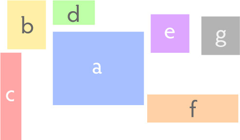
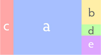
Given any number of arbitrarily sized and proportioned images, you can proportionally scale them and put them all touching in a row so that their heights are all the same, like a & c below. Or you can put them in a column with all their widths the same, like b, d & e. And the result is another smooth rectangle.

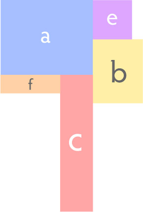
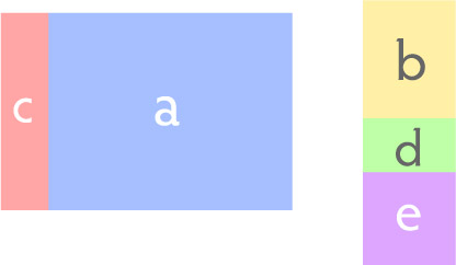
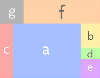
Similarly, you can take any number of image columns or rows, and you can scale them and put them side by side or in vertical stacks and get another rectangular arrangement of images.

And you just keep doing this until you run out of images.

If you don’t like what you’ve got, it’s easy enough to start over. And the images don’t overlap, they retain their original proportions, and you end up with a smooth rectangular collage, and you’re guaranteed to be able to do this with any set of images.

So much for randomness.

Totally Backburnered Stuff Update

Since work has been really busy, I’ve been doing very little in my free time besides keep Tinselfly alive. But here’s the state of some of my other stuff, which I’m posting largely so I don’t forget about them all:

Electric Tea

I finally figured out some more details for turn-by-turn game mechanics and how they tie in with the overall mystery. Still having trouble getting the non-violent bootlegging theme to work; I’l still thinking of everything in terms of gang warfare.

Also got this book which is an actual diary of someone doing bootlegging last century. Hopefully that will give me some ideas.

Celestial Stick People
Made some test boxes for a different project a while ago, and they turned out ok. Not amazing, but adequate. I think the plan right now it to do the boxes and books by hand and have the cards professionally printed, once I have the time and budget to get that moving again.

Super Lilly
Not much movement here. Marie and I have talked about it a bit, but I still need to figure out how to quickly do art for it.

The Itty Bitty Galaxy
Not much movement here either. I need to get the Android development tools set up on my new computer.

Other
Despite the whole being swamped thing, I’ve been following the art & design message board on this board game community, and jumping on any opportunity to make art for other people’s pet projects. Got one bite so far.

I miss freelancing, but kind of despised working with web sites, so I wonder if I can do some freelance illustration. Not for the money; just because I miss working with people. And I’d like some good portfolio pieces out there, with the goal of eventually doing art for a professionally published game some time in my life.

Silly Photoshop Tricks: Backlit Clouds

I was trying to make a nebula texture for Tinselfly, and discovered a neat trick for doing that in Photoshop.

I used to do this sort of stuff all the time, making textures with nothing but builtin filters and effects and whatnot. I’m a little rusty now, but I thought this was worth sharing.

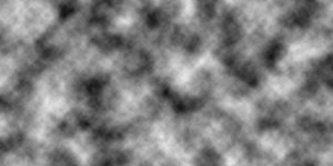
Step 1: Start with some difference clouds. Those are always great for making textures.

(Random tip: if you make your image width a power of 2 like 256, 512, 1024 or 2048, the texture you end up with will be tileable.)

Step 2: Make a new layer and just slap a black & white vertical gradient on it.

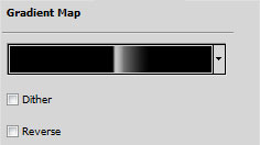
Step 3: On top the regular gradient layer, make a Gradient Map adjustment layer. My gradient map looks like this:

You want something that slowly ramps up from black to white, and then abruptly goes to black again. That abrupt change is going to define the edge of our cloud.

The effect it has on the layers underneath is like this:

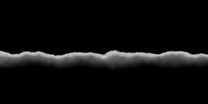
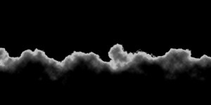
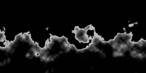
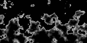
Step 4: Now, here’s where it gets fun. Go back to your regular gradient layer you made in Step 2. Slowly lower the opacity to 0 and watch what happens.

What you’re doing is changing how straight your clouds are going to be. If the gradient is too opaque, you just end up with a boring wavy line. If the gradient is too transparent, you end up with these funny blobs with no real structure. But somewhere in the middle, you’ll find something that looks kinda like the top of a large cloud, with light shining through it.

And once you’ve got that, you can add more effects to bring it to life.

I’m not done with this yet; it looks strangely flat still. But I think it’s an interesting start. And it took less time to do that than writing this post. 😉

Copyright © 2017 Brian Crick.