Brian Crick

Embrace the Fluff

I don’t talk about them much, but in addition to Tinselfly, I’m working on two other video game projects. Or, rather, I was working on two other video game projects. And then I stopped.

The other two projects — with working titles Operetta and Gemslinger — are, mechanically, more interesting to me than Tinselfly. I suspect they’re more commercially viable. And they’re much, much smaller in scope than Tinselfly; my chances of finishing them is, like, above zero.

And yet, I haven’t been working on them, in large part, because I find them insufficiently pretty. I just couldn’t get motivated.

So rather than try to force myself to work on these projects knowing that later on, I can polish the graphics, I spent the whole last week making Operetta prettier.

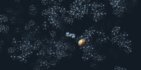
A year ago, this is what it looked like:

Screenshot-8-June-2013

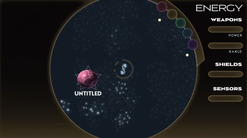
A week ago, it was like this:

Outer-Space-7-March-2015

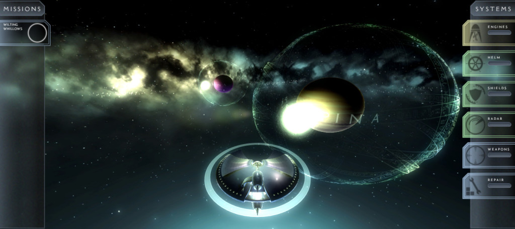
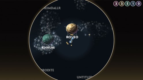
And this is my brand-new, just-this-week look for the project:

Outer-Space-18-May-2016

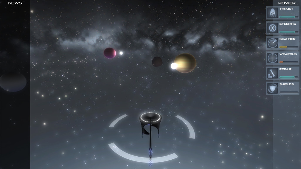
The new look is mostly based on the end credits of Jupiter Ascending.

Which brings me to another reason I haven’t been working on Operetta: it’s the Star Trek game I always wanted to play.

See, I don’t want to be that game developer. That developer who just makes the things they want to play. Who is resistant to new ideas and voices in game development. Who is uncritical of their own work, tastes and ambitions.

But I’ve come to the conclusion that it’s fine to embrace Star Trek fandom as a starting point — as long as I make sure I focus on what’s supposed to make this game and universe unique; as long as, when I’m done, I’m saying Star Trek and other Star Trek games were inspirations rather than templates. (Which shouldn’t be that hard; after all, there are a lot of things I don’t like about Star Trek.)

I should be asking myself questions like these:

  • Do I want something more Jupiter Ascending than Star Trek?
  • Does there have to be ship-to-ship combat?
  • Is your ship even part of a military-ish, Starfleet-ish organization?
    • (Do you and your crew wear uniforms?)
  • How do I make my ship management mechanics about story rather than tactics?
    • What kinds of stories do I want to tell, that Star Trek doesn’t tend to tell?
      • What types of characters does Star Trek tend to ignore?
  • How can I let players customize their ship and crew, so it’s their ship, instead of mine?
  • How can I give the player the impression that their ship is one of many, equally valuable ships, rather than some superpowered flagship-of-the-Federation?
  • How do I make the player feel like they’re co-operating with alien civilizations, rather than wiping them out, assimilating them, or doing favors for fixed rewards?

I certainly don’t know the answers to all these questions. And there are certainly more questions like these I should be asking. But if I keep asking, and answering, I think I’ll have a game worth working on — and playing.
What You See

On some basic level, most programming languages are kind of the same.

Until they’re not.

Sure, ifs are ifs and loops are loops no matter what the syntax, but development environments can vary greatly in terms of how they want you to work. And if you fight that, you can be making things way harder on yourself than you need to.

I’ve recently run into this with Unity.

I picked up Unity because I was tired of trying to make games in environments designed for writing apps. And I loved it. Unity has a really nice library that contains functions for editing meshes, writing shaders, and working with object relationships in three dimensions.

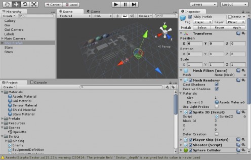
However, this is what Spindle Sun looked like, in Unity:

Editor-1-June-2013

It… didn’t look like anything at all. There are no spaceships, no planets, no game board to look at. Just an anonymous sprite sheet, which is an artifact of the way I was approaching everything: everything was made in code. When you started the game, it would randomly make some planets, and give them random names, and put you in the center of the map… but you couldn’t see any of that in the editor. And it was hard to imagine, looking at the editor, what was going on, what the gameplay might be like.

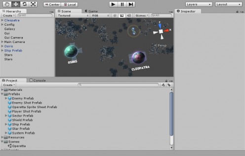
So I’ve decided to ditch the procedural maps thing and just make a level in Unity’s very nice level editor, and this is what editing looks like now:

Editor-3-July-2013

Here, you can see a couple planets. They have names in the Hierarchy list and in the Scene preview. There are stars, and you can see your spaceship’s starting position.

Spindle Sun is sort of a spin on 4x take-over-the-galaxy games, and you sort of expect those to be procedural. But I’m working out the gameplay as I go, and doing that with a procedural world has proven to be rather annoying. What I need to really get the gameplay right is a concrete map, so I can look at it and see what sorts of challenges the player will face and what obstacles I can put in their way and see how the player is going to progress through the map.

It’s about being able to work hands-on with the design of the game. Which, previously, I wasn’t really doing.

I’ve tried studying levels in other games like Metroid Prime, but I’ve never actually designed a level before, in a level editor. Most stuff I’ve done has been procedural, or I’ve made little maps you could walk around that weren’t really levels in the sense that there was a flow through the level. So all this is new to me.

Unity is much more than a code library, and I’m pretty sure Unity wants you to work in a visual sort of way. And I’m rather liking it so far.

Nothing To See Here

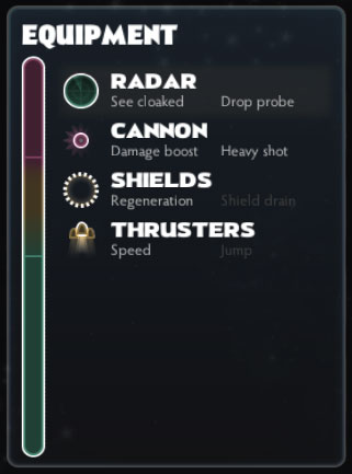
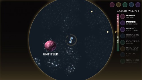
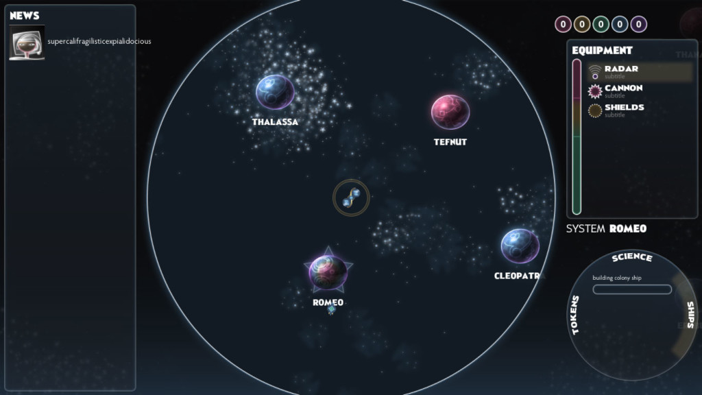
Equipment-12-June-2013So there’s this equipment pane in Spindle Sun. To recap: the equipment pane is supposed to replace the power management sliders, equipment selection popups, and health bars you get in many outer space games, expressing all the same concepts as a single, re-orderable list. Each item has a passive, always-on effect and the higher up something is in the list, the more pronounced the effect — like, you could increase your sensor range by moving your radar up. Also, the top two items do something special when you press your fire button; those are said to be armed. So you can arm different items for different situations.

I want to make sure the player knows what the passive and fire effects are, and my first inclination was to make something where you click on an item and get a popup with a description and a nice big picture of the item and whatnot. Lots of games do this. However, I’ve opted for a minimal solution that requires less programming and design. So in the screenshot above, there are short blurbs to remind you what an item does under each item’s name in the list. If the item is damaged; everything will be greyed out; if armed, everything will be bright; if it’s just sitting there providing passive bonuses, just the fire effect text will be greyed out.

The descriptions are meant to be easy to ignore. I’ll probably push them farther into the background at some point; as they are now, I find them too loud.

If I’m going to have a unique ‘voice’ when it comes to game design, I suppose this is part of it: I want you to be able to drill down into a selection of data or an interface not with your mouse, but with your eyes. It should look simple from far away, but if you just look closer, you’ll notice there’s more going on. I don’t want a controls hiding behind tabs or popups or UI modes. I just want good layouts.

This is not something I can say I’ve seen in games a lot — I’m kind of thinking of newspaper layouts here. And that’s something I’d like to see explored more. Yes, tooltips and popups and expandable lists are neat things, but, strangely enough, I don’t want to rely on those kinds of solutions too heavily.

Twelve

Hello 2013! I’m not much for resolutions, but I kindasorta decided to join this One Game a Month thing. It’s basically what it says on the tin: A bunch of developers are pledging to make one game, every month.

This may end up being a very bad idea, or it may be just what I need.

The rules are pretty loose, so I’m reading ‘make’ as ‘finish’, not ‘start and finish’ a game every month. With that in mind, I’ll be including my existing projects in this endeavor, and using this as motivation to get those finished and out there.

I’ve got four game projects currently in development:

  • Tinselfly, a character-driven action/adventure hybrid;
  • Operetta, a 4x / shooter hybrid;
  • Blind Tigers, a co-op board game; and
  • an untitled cyberpunk-themed board game.

In addition, I could tack on some things I started years ago but never completed:

  • Gemslinger, an arcadey Facebook game; and
  • Mika’s Tavern, a turn-based strategy game with no actual violence.

And that’s six projects right there.

* * *

What I’d like to do for the rest is just relax and make things I’d want to play, since I have so much trouble finding things I want to play. Nothing terribly innovative or demanding. Lunchbreak-sized games.

What games I do start for this will be small, 48-hour game jam sized things so they don’t take up too much of my time.

I’d like to make an attractive dungeon crawl. A simple RTS that’s so small in scope it doesn’t even require scrolling or a minimap. A completely derivative platformer with cutesy characters.

The only way I’m every going to work on stuff like this is within the context of a larger endeavor filled with projects I see as more worthwhile, and I think it might be good for me, to force myself to work on things that are known quantities.

* * *

Scheduling will be tricky here. I want to keep Tinselfly moving, so I’m probably going to be working on two things simultaneously all the time — Tinselfly plus another project. The existing board games and Operetta are bigger than your typical 48-hour gam jam stuff, so I want to get those out of the way first.

* * *

To kick this off, I’m starting with something to gamify the process of learning volume control and multiple-hand playing on a keyboard. I could really use something like this; my skills in these areas are terrible.

If I still had a pen tablet, I might have started with something to gamify the process of learning pressure and angle control, things I never really learned. Oh well.


Sensor Sweep

Got a new Operetta build up.

I’ve also been working on a musical theme for the game.

music

I’m trying some weird chords and progressions here that I can’t even quite describe, and I like how that’s lending a sense of exoticism without just sounding like I don’t know what harmony is supposed to sound like.

However, the instrumentation is giving is this journey-though-the-desert feel, which isn’t quite what I want… I want something more adventure-on-the-high-seas.

Well, actually what I want is a similar sound to My Name is Lincoln from The Island, better known (to me) as part of the trailer music for Elizabeth: The Golden Age. I want something that sounds both like sci fi and a period drama, if that’s possible.

gameplay

I’ve added a bit where things are only visible to the player if they’re close to the player, or if this new spinny radar thing of yours has recently swept over it.

This was a little difficult to pull off — it involves some custom shaders and pixel-by-pixel bitmap drawing, but I like the effect.

Right now, anything could be invisible if you’re too far away; that’s just for testing. Eventually, only objects marked as cloaked or hard to see will ever be invisible, and everything else will be visible at all times.

There’s a little bit of weirdness in the planet labels; apparently, Unity doesn’t let you use custom shaders with those. Like, at all. I was worried about that at first, but that shouldn’t be too much of an issue, since planets should never be cloaked.

Also, I’m not sure how I feel about the communication to the player about where the sensor is sweeping. Right now, there’s just a slight bit of darkness in the places you can’t see, and I like how unintrusive that looks… but it might be a little too unintrusive. I dunno.

Anyway, next I’ll be working on your item list, which will mean putting lots more work into my home-grown GUI system.

Fun with Mashups

I was working on this UI mockup for Operetta, and it was a little like Zeus, with all these tabs for looking at your empire and ship in different ways, which I prefer to the multiple-screen approach you get in many other empire building games. So there was a research tab, and a power management tab with all these sliders — you have to have power management in spaceship games, right? — and there would have been some sort of system inspecting tab too, so you could manage the production of the planet you were currently at…

…and it was starting to feel kind of disjointed.

So I thought I’d try to unify things a bit.

I recently finished playing Stacking, and one of the stated goals was to take the inventory, verbs, and characters you find in point & click adventure games and make all those things one unified thing that was easy to manage. Conceptually, I love that sentiment, even if I thought its implementation within the game was problematic.

So the new mockup has a combined equipment/power/weapons display, consisting of a single list that the player can re-order at will. The basic idea is that every item is capable of providing this thematically related suite of passive buffs, combat effects when you press fire, and non-combat effects related to firing. The higher up something is, the more it does for you.

Say you have a tractor beam. If it’s at the bottom of your list, it does absolutely nothing. If you move it to the bottom of the Ready bucket, then you get a passive effect: power-ups and resources on screen drift towards your ship instead of sitting around waiting for you to pick them up. If you move the tractor beam higher in the Ready bucket, power-ups drift towards you quicker.

If you move the tractor beam to the Armed bucket, it’s now one of couple things that fires when you press your fire button. Any resources in the line of fire of the beam are instantly collected, and any enemy ships have to stay a fixed distance from you for a while.

If, say, you also had a mining laser armed, you could shoot an asteroid and make it explode into a shower of resource tokens, and since you’ve also got the tractor beam equipped, the resources would gravitate towards your ship and be easier to collect. Hopefully, you could combine items in interesting ways like that.

You’d be encouraged to re-order your list for different situations, and I think it could be pretty fun.

* * *

The UI font is my football font family I’ve been working on; I figured this is a good way to find out if it’s working as a family, and see what needs to be fixed.

I also need experience working with type families; it can be kind of tricky it seems.

Low Hanging Starfruit

Now that work has settled down a bit, I’ve been tinkering with a very old pet project called The Itty Bitty Galaxy.

In sort of the same way I always break new modeling programs in by making the starship Enterprise, for the last decade I’ve broken in new programming languages with this project. I’ve done it in C++, Flash, Flex, Torque, Android, and now Unity.

Been concentrating on the starfield. Another thing I’ve done a zillion times before. I’m very particular about my starfields. Most of them — especially real ones — just look flat and boring to me. There’s no color, no sense of depth, no volumes to look at, and if I’m going to show of how big and vast my universe is, I want to try to do it in a volumetric sort of way, in a way where you have identifiable, three-dimensional volumes of space to look at, so you can say, hey, this here thing is big. It’s tough to wow people with how big and empty space is, though I’ve certainly seen it done (Homeworld comes to mind there).

And actually, this posts has been languishing as a draft for so long that I’m looking at this version of the starfield and thinking to myself, wow, this is not very deep. But I’ll have another update on this later I guess. 🙂

Totally Backburnered Stuff Update

Since work has been really busy, I’ve been doing very little in my free time besides keep Tinselfly alive. But here’s the state of some of my other stuff, which I’m posting largely so I don’t forget about them all:

Electric Tea

I finally figured out some more details for turn-by-turn game mechanics and how they tie in with the overall mystery. Still having trouble getting the non-violent bootlegging theme to work; I’l still thinking of everything in terms of gang warfare.

Also got this book which is an actual diary of someone doing bootlegging last century. Hopefully that will give me some ideas.

Celestial Stick People
Made some test boxes for a different project a while ago, and they turned out ok. Not amazing, but adequate. I think the plan right now it to do the boxes and books by hand and have the cards professionally printed, once I have the time and budget to get that moving again.

Super Lilly
Not much movement here. Marie and I have talked about it a bit, but I still need to figure out how to quickly do art for it.

The Itty Bitty Galaxy
Not much movement here either. I need to get the Android development tools set up on my new computer.

Other
Despite the whole being swamped thing, I’ve been following the art & design message board on this board game community, and jumping on any opportunity to make art for other people’s pet projects. Got one bite so far.

I miss freelancing, but kind of despised working with web sites, so I wonder if I can do some freelance illustration. Not for the money; just because I miss working with people. And I’d like some good portfolio pieces out there, with the goal of eventually doing art for a professionally published game some time in my life.

Whee Humbug!

Have a Scrooge for The Itty Bitty Galaxy.

I was going to give him a top hat and scarf and whatnot, but figured having him lying in bed would be more unique to the character. This was done really quickly, like in 20 minutes or so. Yay copying and pasting!

* * *

For this project as a whole, I basically see two options, not that I’m dying to dive back into coding right now.

  • I can rewrite what I’ve got in Unity.
  • I can continue writing in native Java code.

Despite my aversion to ever doing anything in native code again, I’m leaning towards option #2. First of all, it’s free. While the base Unity package is free, the Android libraries are not, and my track record with this sort of stuff is not good enough to justify dropping a few hundred dollars on a product I may never recoup the costs for.

Secondly, I should probably get comfortable with Java. It seems likely that I may need to know that for my current or future jobs.

* * *

I’ve started running regularly! I’ve never done this before, but I sort of hit a tipping point where this seemed worth doing.

  • I want to participate in next year’s Warrior Dash. Like pet projects, I’m much more likely to work on a skill if it’s in the service of some well-defined project. So since the Warrior Dash is like a dozen obstacle coursey activities spread out over three miles of trails, my goal is to be able to run three and a half miles uninterrupted.
  • My progress is measurable. Thanks to my phone and RunKeeper, I can see detailed statistics about every run I do and see if I’m improving. Without some objective way to see how I’m doing, I’d probably just get flustered and quit after a while.
  • I am confident that progress can be made here. I was doing an EA Sports Active routine for a while, and made noticeable progress doing the activities there, which I wasn’t sure would happen within 90-day program they have you do.
  • I am confident that this will improve, not take away from, my ability to write good code for work and keep pet projects moving. Again, my experience with EA Sports Active has shown me that exercise is essential to doing complex problem solving, which again, I did not expect.

So there you have it. Once the winter sets in again and the snow starts to fall, I’m not sure how this will work out. I can go back to indoor EA Sports stuff again of course, but I’m not sure about the running.

I’ll figure that out when it happens I guess.

Copyright © 2017 Brian Crick.