Brian Crick

Tinselfly update: Uncle Sam wants you

Well, I probably should have realized this earlier, but for a variety of reasons, the weekly project update thing just isn’t going to work. In fact, packaging them in my head as weekly updates makes me less likely to post here. So I’m switching to updates-as-they make sense.

So, have a Tinselfly update!

Signing-26-December-2015

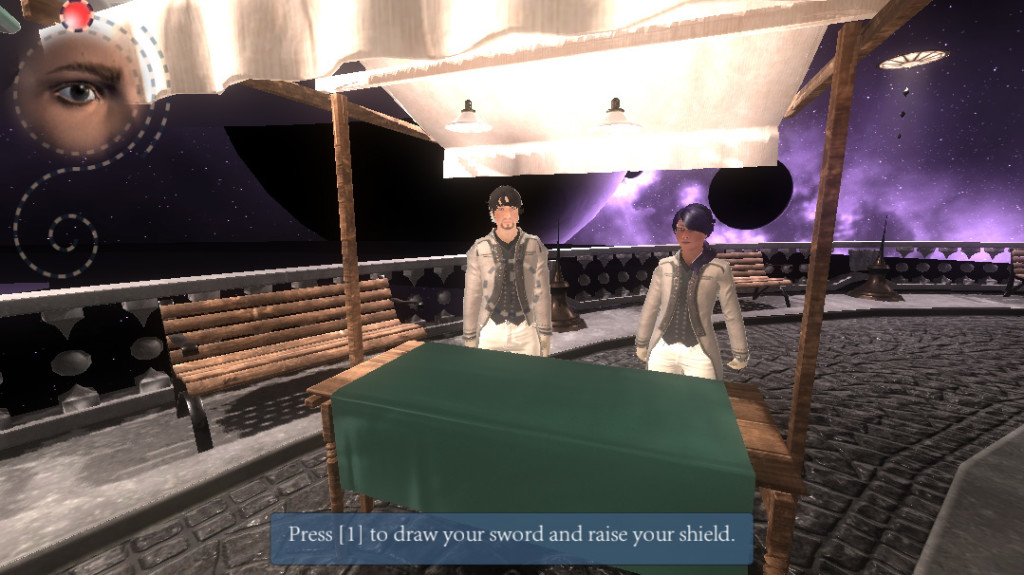
I have started working on one of the first scenes in the story,  which involves recruiters. Your character lives in a town whose main industry is shipbuilding, and they hold a signing festival upon the completion of large ships, on the deck and hull of the completed ship. It’s supposed to be an air-show-like thing where, in addition to vendor booths and aircraft demonstrations, people who worked on the completed ship sign their name on the hull in this sort of signing ceremony.

So your character during this scene will be a teenager, and there will be Navy and other non-military recruiters trying to grab your attention.

There are a number of technical and design problems I need to overcome here, but as my first real scene, most are not unique to this:

  • I need a dialogue system, if only a temporary one while I decide how I want dialogue to work.
  • I need to figure out how to get NPC facial animation, both expressions and lip synching. This LipSync Unity plug in looks promising.
  • I need some puzzles to require you to visit each booth and pick up swag or talk to people; puzzles that give the player some introductory information about about her character, the world she lives in, and her relationship to various entities in it.
  • There will be a Navy recruiting booth kinda like the real-life Air Force Performance Lab. It will feature a handful of interactive activities testing people’s fitness for the Navy. In addition to making those activities interactive for the player, I need to show a constant stream of NPCs interacting with the activities and moving through the booth.

Your character won’t ever join the Navy, but I’m the most worried about the Navy booth — and not because of the visitor NPC scripting or animation. I’m worried about getting the tone right. I don’t want to look like I’m commenting on historical or modern recruiting or military organizations; but I don’t want it to look like the game itself is all hey! look how cool this is! either. It has to be earnest and honest and feel real, and over-the-top on selling heroics only to the extent that a real booth like this might go nuts with creating this brand around individual heroism, to get visitors interested in their program.
Tinselfly Update: Puzzle time

I guess ‘week’ is kind of flexible here, seeing as it’s been 9 days since my last post. 😉

What I did last week

Made a bathroom light, based on several antique 1920s lights I found online–though it’s not a copy of any particular design.
Bathroom-Light-13-September-2015
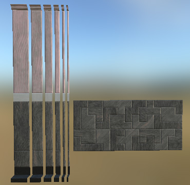
Made filler pieces for my walls, little wall slivers of varying widths that I can use to fill out walls whose lengths aren’t an even multiple of the panels I’ve got (which is most of them). Most filler pieces can use the same texture/material now, which hopefully will help with memory & performance a little tiny bit.
Wall-Filler-13-September-2015
This was supposed to be a big time saver too, but right now, getting the UVs right on filler meshes is kind of a pain. Gotta figure out how to streamline this.
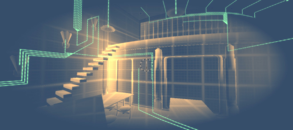
Also wired my entire mess, including bar and bathroom lights.
Engineering-Mode-13-September-2015

Goals for this week

I didn’t have to do to all the filler pieces I wanted, and didn’t make bathroom fixtures besides the light. I’m calling those a loss for now, as I want to move on to making my first real puzzle.

At the moment, I have no idea what form said puzzle will take, but it will probably have to involve areas that are already reasonably detailed:

  • Ship areas:
    • Mess
    • Bar
    • Cabin
    • Lounge
  • City areas:
    • Ice rink
    • Soda fountain
I’ve just written some notes about how time switching puzzles might work, so I I guess the first step is to read over those with my decent-looking areas in mind and see if any ideas come to mind. I’ve also got some notes about how I might approach wiring specifically as a storytelling tool.
Ideally, I’ll come up with a story fragment first, and make puzzles that harmonize with it, rather than starting with puzzles and finding the story in them. But right now, I’ll take whatever I can get.

Tinselfly update: Wires & Lights

Well, for a variety of reasons (which I won’t go into here), this summer has been nuts. But it’s getting back to normal, and in the interests of getting back into a routine with my pet projects, I’m gonna try posting regular, weekly updates here.

So here’s my first Tinselfly update!

What I did last week

I made some custom editors for wiring.

Engineering-Mode-4-September-2015

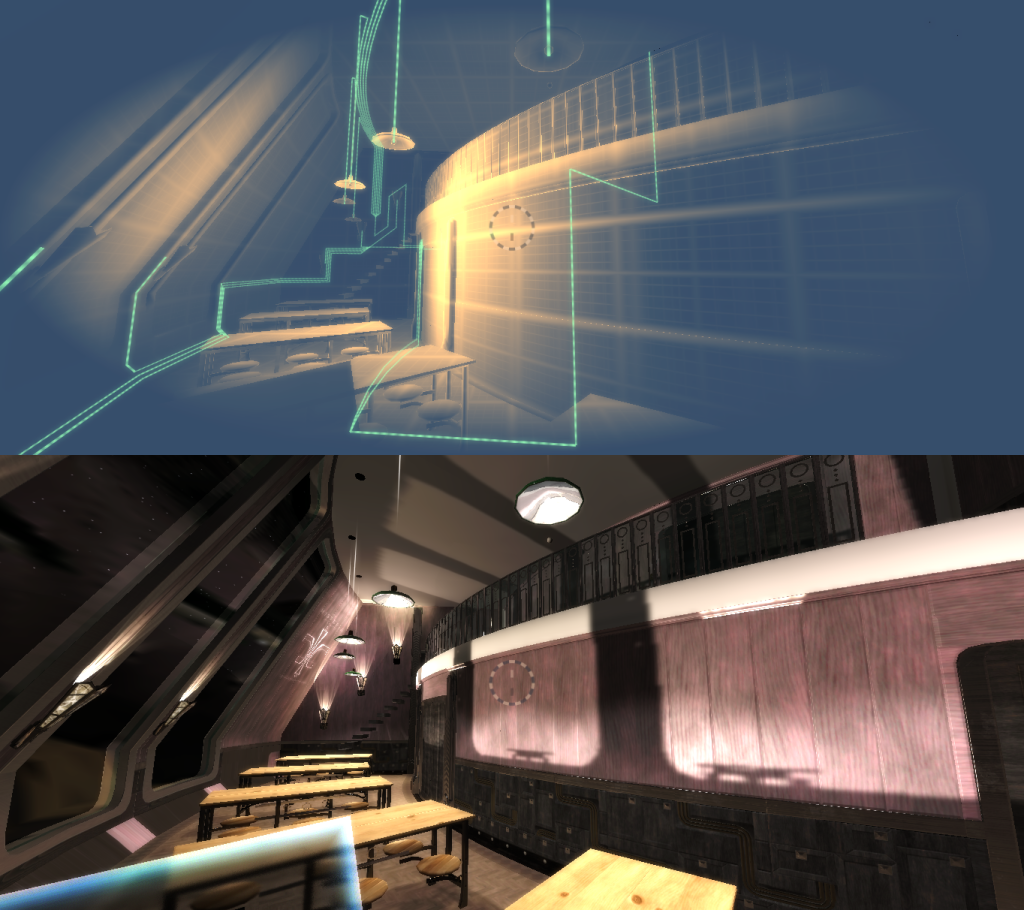
Since I haven’t mentioned this on the blog before: everything you see on your spaceship should be powered. And when you put your engineering glasses on, you should see wiring everywhere. If you’re going to be running around solving wiring puzzles, I want all the wiring to be functional and logical. So I’ve already got it so the game knows that, say, when you flick a light switch, the power line coming out of the switch loses power, and since it’s connected to some lights, each of those lights turns off.

To save myself time, many devices will be powered wirelessly; there won’t be power outlets. But every light, every automatic door, every large device, should be powered, with visible lines running to them, and lines running through things like lightswitches and motion sensors.

Adding all that wiring will be a lot of work, so to save myself time I’ve made a custom editor. I can drop these sort of wiring canvases into the scene and plot lines on the canvases reasonably quickly now.

Goals for this week

I could fuss over my editor more, but it’s functional now and I’d like to move on.

I’d like to get my mess completely wired, including the bathrooms, entrance and bar area. That, by itself, shouldn’t take very long. I’m most of the way there already.

The more time consuming part will be designing and modeling new light fixtures for the bathroom and bar. And I’m careful to use the word design here: lately, I’ve been feeling more like a curator, faithfully reproducing antiques I’m finding images of online . But while my ship has a 1920s sort of aesthetic, this isn’t the 1920s. This  isn’t our world at all, not even an alternate history. I need to get back to designing things with styles that recall the 1920s, while still being having their own identity.

I also need to design and model a toilet and other bathroom fixtures.

Lastly, I’d like to finish updating my mess with Substance Designer/Painter textures.

Solving for Pine Wood

A few days ago, I got a subscription to Substance Live. It’s a ‘rent-to-own’ kind of deal where, for around $20 a month, you get access to tools that let you make realistic looking textures for video games.

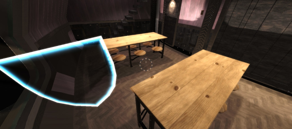
Before this, I was using texture nodes in Blender. To give you an idea of the level of quality I was able to achieve with those, here are some cafeteria tables with Blender textures that involved hours and hours of tweaking, over the course of several months:

Mess-13-March-2015

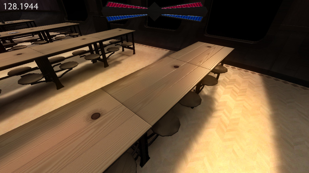
And this is what I’ve replaced them with, just playing around with Substance Painter over a couple of free evenings:

Mess-20-August-2015

I find the new wood table textures just… better. More realistic, more detailed… and they took very little effort to make and customize.

I probably should have gotten this a lot sooner. The cost is minimal, and the results are wonderful.

* * *

Procedural pine wood surfaces are a solved problem. I’m not the first person to want an unfinished wood cafeteria table in a video game.

And yet, when confronted with any problem — how do I make convincing procedural wood, how do I make this music sound more nautical, how do I make a wormhole you can walk through — my first question is, how do I solve this problem?

My first question should be, has someone else already solved this? And most of the time, the answer will be yes. Sometimes I’ll have to pay for someone else’s solution, but most of the time, it’s totally worth it.

These problems are solved.

* * *

Sometimes, I think of myself as a sort of lone pioneer, exploring new ground: the sort of game I want to make has never been made, to my knowledge, and certainly not by a single developer. However, the whole ‘lone wolf’ thing is entirely inaccurate. First of all, I get a huge amount of input from my wife and my brother, who are at times more opinionated about the nature of my wacky 1920s-but-not-really, sci-fi-but-not-really universe than I am.

And secondly, I’m not here to fashion bespoke solutions to every problem that comes my way. I am, increasingly, using other people’s tools and libraries to finish this project — which I see as giving me more independence, not less. I’m here to try to solve some very specific problems: how do I craft puzzles that teach you about characters rather than impersonal systems; how do I set up situations where I’ve loaded up simple player actions with piles of emotional context.

Realism in texturing is not one of these problems. I have nothing to add to the field of realistic texturing.

* * *

So I want to focus more on picking my battles, which in many ways means finding more tools that will help me. I’ve already got a third-party character modeling and animation system I like. I’ve now got a texturing system I like. I may, in the future, start looking for a way to auto-generate 1920s style, hand drawn and lettered posters and signs, rather than hand-drawing everything myself. I am capable of doing hand lettered signs. That doesn’t mean I should do it here.


And hopefully, this will all let me give my characters and story the attention they deserve. Those are the most important problems I need to solve here.

I am not Robin

Of my lead character in Tinselfly, I have often said, well, she’s basically me.

And while that is still true in many ways, it’s time to start thinking about how she’s not me. It’s said that you can only understand things in opposition to other, similar things; in this case, I will gain a better understanding of my character by asking myself how she and I are different.

And as long as I’ve been defining the character as me, it’s been too easy to blithely ignore any criticism that I might not treating the character with respect, saying, or thinking, of course I understand her experience; her experience is my experience!

And that’s just not true.

It’s time to remove that safety net.

* * *

I thought it would be useful to express this as a handy-dandy Venn diagram:

Robin…

is somewhat physically active

is not afraid to get self, clothes dirty

likes dressing up on occasion

occasionally drinks

thinks about career (later in story)

might enjoy a discussion about which comic book character would win in a fight

doesn’t mind being called nerdy or geeky

self-identifies as a woman

went to public school

Both of us…

are shy and quiet

don’t use profanity

like soda pop

like sci-fi stories

grew up in small town where many people (including one parent) worked in air/space-craft type industry

spent lots of time stuck in air/space-ports

remain somewhat childlike well into adulthood

like fixing, creating things

like exploring new places

I…

like creature comforts

don’t like touching my food, much less getting dirty

go out of my way to wear plain clothes

can’t stand alcohol

think fandom is frequently obsessive and silly

find this whole idea of binary gender identification kind of weird

wore uniforms to middle/high school

don’t really have career goals

* * *

Well, that was fun.

So what does this get me?

Anything in the blue Robin-only section is stuff I’ll have to be extra-careful about. They range from behaviors I simply don’t engage in, to mindsets I find outright alien.

So, moving forward, what I should probably do here is start thinking, not about how Robin’s individual behaviors are different than mine but about Robin’s overall mindset and how it’s informing those behaviors.

As I type this, the following example comes to mind:

behaviors root cause
likes dressing up on occasion

is not afraid to get self, clothes dirty

Robin sees that there are times when looking nice is important, and other times when it doesn’t matter even slightly. This is a sharp contrast to myself; I want to be clean, but casual all of the time if I can help it, even if nobody is looking or cares, and even if the situation demands more formal attire.

So… from my point of view, the first two behaviors listed here seem contradictory at first glance, despite my gut feeling that both belonged in the list. But I know many people who exhibit those behaviors, and thinking about it some more, it makes perfect sense — one you get to the single root cause of those behaviors.

Similarly:

behaviors root cause
thinks about career

self-identifies as a woman

doesn’t mind being called nerdy or geeky

Robin has stronger concepts of social, gender and sexual identity than I do. She consciously sees herself as a member of a variety of groups and will work (consciously or not) to preserve her feeling of membership of said groups, and will, if only in a small way, conflate herself with the group as a whole.

Et cetera, et cetera.

Well, I think this has been a useful exercise. Looking forward to doing more of it, but hopefully you get the idea. 🙂

Some thoughts on planning

This is a box.

cube-face

This is also a box.

cube-isometric

Which is to say, they’re both equally awkward representations of a simple cube. This is slightly less awkward:

cube-angled

But they all really represent the same thing.

* * *

So I’m working on this game called Tinselfly. It’s a big, big project, and I’m just one person. While I have a decently good sense of the overall shape of the project, nailing down specifics has been really, really difficult for me.

I’ve been trying for years to make one, unified project plan so I can wrap my head around this project.

At first, my project plan was going to be a written story, which I would then adapt to the medium of games.

Then I tried mind maps.

Then it was going to be a comic book.

cover

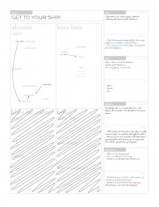
Then I started filling out these odd forms, one for every scene.

form-filled

Then I ditched planning entirely, letting my game environment be my plan.

Street-24-September-2013

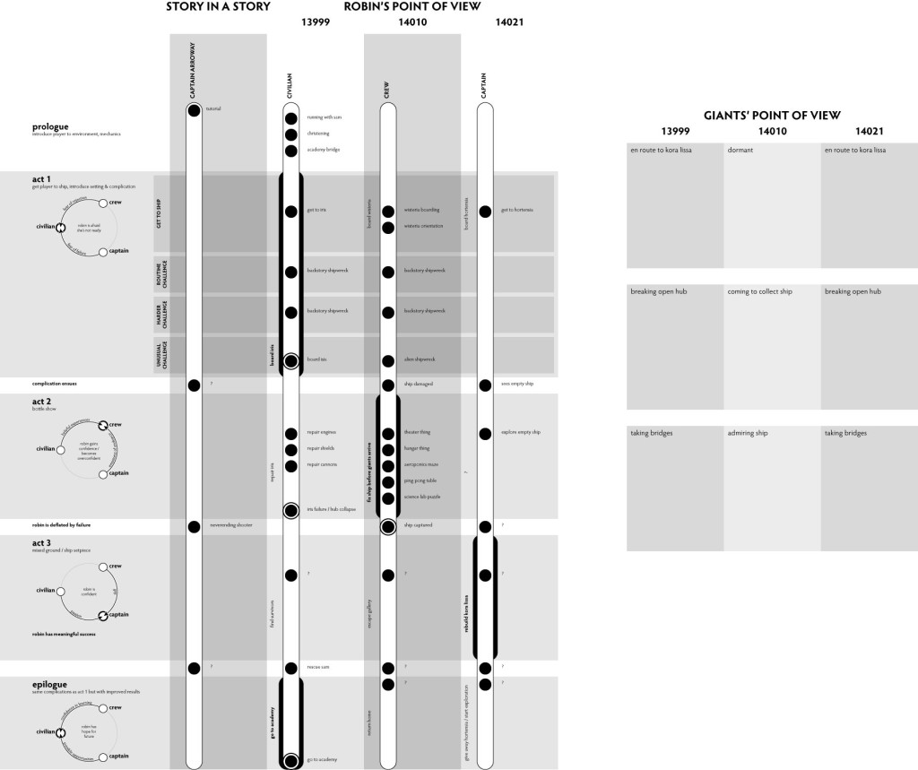
I stuck with that for a long time, with a no-formal-design-document approach to planning, but still couldn’t wrap my head around my own story. So I tried to express my story as a graphical timeline sort of thing.

Story-26-March-2014

That’s been really helpful. But still, I don’t feel like I have my one, authoritative story bible.

But…

…I don’t need one.

* * *

It’s all about multiple points of view.

This is a plan for a house:

house-top

And so is this:

house-front

And so is this:

house-side

Here’s an angled view, which makes things a lot clearer.

house-isometric

This view is great for getting a sense of the overall shape of the house, and the relationships between the parts. But it’s not very useful if I want to know the angle of the roof, or the exact dimensions of the sides. The top, side and front views are better for those kinds of precise measurements.

No one view of the house is going to give me everything I need to build the house, but together, then can give me a clear mental picture of the house.

I can’t reproduce that mental picture here, or anywhere.

* * *

I’ve been looking for one, giant, comprehensive project plan, and I’m never going to find one. But that doesn’t mean I’ll never have a clear mental picture of where I’m going. In many ways, I’ve already got what I need in terms of Tinselfly planning tools. I’ve got ways of broadly sketching out the themes of my story, and I’ve got ways of homing in on specifics.

And all these ideas exist in multiple documents.I need to use all my design documents, because they all represent different points of view, different ways of looking at my story. Some are very dry and technical, and some give me a broad sense of what’s going on. Some make me feel like I know what’s going on, while others, if I’m being totally honest with myself, are much more useful in terms of giving me my clear mental picture.

And all my planning documents are useful.

Empty Vessel

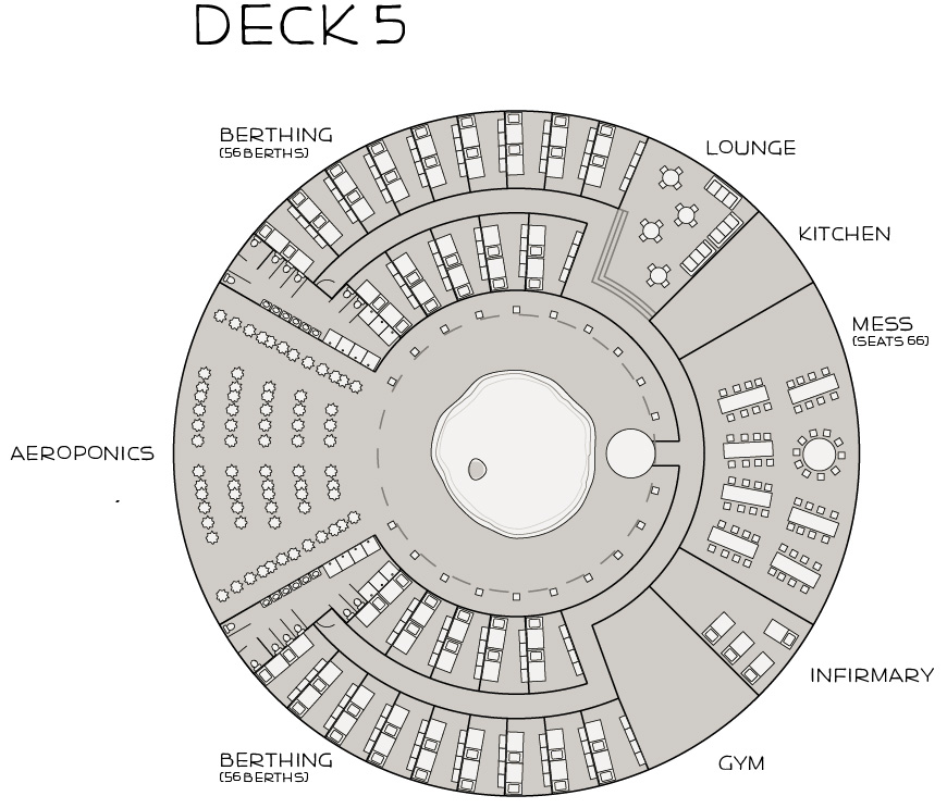
Been working on deck plans for the Wisteria, a spaceship in Tinselfly where you’ll spend like 1/3 of the game.

When I started these plans, I just went in trying to design a realistic ship. Not a level, not a game… a ship. Where people can live and work and relax.

Before, I had no idea what that 1/3 of game would look like. And now I kind of do. This is starting to feel like a real place to me, without any modeling or level design yet. I can imagine people running around this blueprinted spaceship, and it helps me think. It’s a playset in my head.

This is an empty space. Some people like coming up with game and ideas and building a container around them. That doesn’t work for me, and I have to constantly remind myself of that.

Me, I want an empty container that can be filled… and you have to have that empty container before you can fill it.

Wisteria-Deck-Plan-12-May-2014

* * *

What started all this was discovering the existence a government-run organization called NOAA that runs a fleet of research ships. And… it was a real epiphany sort of moment; Tinselfly is all about its heroine dreaming of (and getting into) this sort of Star Trekky touchy-feely navy, and it’s all supposed to be like patriotic and stuff, but the whole idea of a government-run fleet of ships that go out and do science and explore just seemed like pure fantasy. So now I’ve got something to base this space fleet on, some sort of precedent. And every aspect of this universe is starting to feel more real to me, and I have a strategy for filling in the details I don’t have yet. I can watch NOAA recruitment videos. I can look at deck plans for NOAA ships. I can read years worth of NOAA blogs.

So here are some revelations I’ve had, since starting my research of NOAA.

  • Research: NOAA ships have a handful of naval officers on them, but most people on the ship are civilians. From what I can tell the atmosphere is fairly casual. My take: I couldn’t write a realistic Navy story with strict chains of command if I tried. And I wouldn’t want to. Your character Robin in Tinselfly needs a lot of independence, but still be on a career path to being a Navy captain, her being a video game character and all. I feel more confident now about selling the idea of having the Wisteria be a sort of casual environment, but some some Navy officers and enlisted-type people onboard.
  • Research: NOAA ships exist to do science. There are modular, interchangeable labs. Half the population of the one ship I’ve studied in detail so far is scientists. There’s a ton of sensing equipment on board. My Take: Initially, the Wisteria was a cutting-edge warship, that never saw combat, that inexplicably existed in a propaganda-filled world that was almost entirely at peace. Again, I like that there is a precedent for a government-controlled fleet of not-for-warfare ships with not-so-regimented ship life.
  • Research: One the big things NOAA ships do is all about fish. They keep track of fish populations, guard against overfishing, and make sure the water in the ocean is good for fish. My take: Similarly, the Wisteria can protect tinselflies, which in this universe create materials used in the production of spaceships — which makes said eponymous alien bugs even more well integrated into the plot. (Like how silk is made from caterpillars.)
  • Research: NOAA ships also create maps of the ocean floor, which are available to the public. These maps help other sailors steer clear of shipwrecks and shallow areas where they might run aground. My take: In the beginning of the game, the Wisteria can be on a routine survey, find routine shipwrecks, and at some point find one that’s not so routine, which kicks off the plot. With the Wisteria as a survey vessel, it’s perfectly reasonable for them to be out there looking for wrecks.
  • Research: While NOAA locates wrecks, to my knowledge, they do not clear them. My take: Robin is an engineer. Since the derelicts wouldn’t be decaying tons of water, it seems reasonable that in an outer-space-based version of NOAA, you might send an engineer onboard derelicts, just to get them moving out of harm’s way, or to salvage yards, under their own power. I have have the player learn about the engineering mechanics by having Robin repair successively repairing ever more damaged ships before finally having to take care of her own.

* * *

Imagine that you own some Legos, and you want to design a spaceship. Not any particular spaceship, just spaceship. So you gather up your Lego sets. You find that one set that got stashed waaaay up high in a closet for some reason. You find miscellaneous pieces in couch cushions. And you start throwing pieces together, and some things you throw together will fit that vague requirement , and some won’t. You’ll get fond of certain pieces; you’ll say to yourself, this would look really good as part of a spaceship, but I don’t know where it would go.

Eventually, you’ll find something you like.

But you’re not done.

The spaceship is not incomplete because you can’t find the right piece to fill in a particular gap. It’s not because you didn’t find all your misplaced Legos. And it’s not incomplete because you didn’t work in every cool-looking piece you wanted to work in.

It’s incomplete because you’re still working with Legos.

Because your goal was to design a spaceship, not a Lego spaceship. So you’ll go to pencil and paper, or clay, or your favorite modeling program, and rough out your spaceship in there. And now, you can smooth out the blockiness of everything. You can precisely balance things that were a little off before.

Right now,  I’m still gathering up my Legos. This is the way I’m most comfortable working. I’m going to make my self some building blocks — doing research on NOAA or anything else that sounds interesting, sifting through my favorite stories and finding my favorite bits, keeping up on new games and their new mechanics — and then I’m going to play with my building blocks. Not all my blocks will get used. Not all deserve to get used.

I have a vague sense of the shape of the story I want to make. I’ll eventually have something that fits, that I made with my blocks… and I’ll start rounding out its edges. But I’m not there yet.

Until then, things are going to be a little blocky.

Postmortem: Mini Maker Faire 2014

Last Saturday, I had Tinselfly on display at the Cleveland Mini Maker Faire. This was a pretty new kind of experience for me, so I thought it was worth a postmortem.

on display

Seeing complete strangers play my barely-functional game — allowing complete strangers to play it — was rather odd. I was really, really stressed out about this in the days leading up to the faire. Would they be disappointed that there was very little gameplay? Would they ask pointed questions I’d be uncomfortable answering?

As it turns out, everything was very informal and the audience was mostly small children, so I had nothing to worry about. They liked the pretty visuals, and a few seemed to find the core gameplay engaging enough to stick with it until called away by their parents.

What adults played the game were very friendly. I’d forgotten that I’m more comfortable in this kind of environment that I am talking to people I’ve met before. It’s kind of fun to try to figure out what someone I don’t know at all will want to talk about: will they want to hear about the mechanics? The tools I used? The story? Every person will respond to different things, and I’d like to think that I can figure out what approach to take after just a couple sentences of conversation.

approachability

The morning before I left for the faire, I added in gamepad support. I figured that would be more inviting than a mouse & keyboard.

That seems to have been a good idea. Few people needed to be prompted to walk up to my laptop and pick up the gamepad.

To make things more inviting, next time I’d like to make a demo mode for the game, like old arcade games had. Some automated thing that shows basic gameplay, attracts people’s attention, and shows them how to play. If it could kick in when the game has been idle for a while, that would be perfect, so I don’t have to be there to reset the game every time someone leaves.

My game controls and mechanics are a bit odd, being about swordfighting and all, so visual instructions would be really helpful here.

noise level

Before I went to the faire, I also changed the music so it would loop over this two minute music clip instead of the 30 second one that was there while I’m figuring out my music playing system. That took a while, and wasn’t such a good use of my time.

I like this piece, and lends atmosphere, but you couldn’t hear it at all with the noise of the other games and people chatting, especially on my laptop speakers.

Next time, I could bring some external speakers, or just not worry about it too much.

breakability

One thing I didn’t do just before the faire was fix my colliders. See, there are a few places where you can just walk through railings and fall off the edge of the world, necessitating a game reset. And people found those places. Many, many people.

I fixed all those last night, but really should have done it sooner.

to sum up

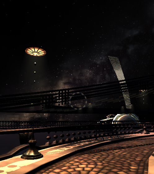
Overall, it seemed like people liked where I was headed. Many people complimented me on the graphics — especially the starry background — and one person’s eyes lit up when I started talking about how there would eventually be this story about this woman trying to get into the Navy.

I got some really good feedback about my mechanics, which I’ll be thinking about a lot in the next few weeks.

Plus, I had a really good time at the faire. It was great to hang out with the other game developers and see how people reacted to this. I’m looking forward to demoing this again at the Science Center in June.

Meeting my ideals may be beyond the scope of this project.

I’ve decided to change Operetta (or Spindle Sun, if you remember that) from 2D to 3D. Mostly because, if there aren’t, like, human characters involved, I’m much more comfortable making 3D models than 2D illustrations. And many of the troubles I’ve had getting this project off the ground have been related to the 2D graphics and interface.

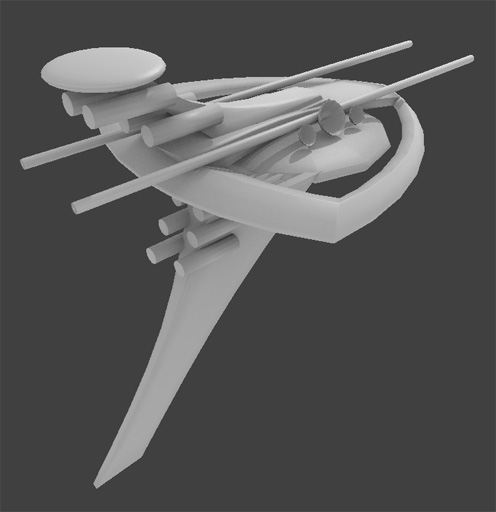
So I started making a model for the spaceship you’ll be flying around. I really don’t like it.

Ship-14-January-2014

Every time I try to design a spaceship, it seems it ends up looking like a Star Trek wannabe or a collection of random shapes.

And I think a big part of that is how small my toolbox is here. Tools are just development environments or new hardware. Tools can also be ideas.

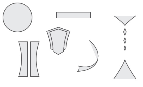
When designing things, I have a toolbox of shapes: saucers, cylinders, Art Deco fans.

toolbox

I’m comfortable with these shapes. I can get them to fit together in harmonious ways. And when I do, I get Star Trek or my usual Art Deco sort of aesthetic, which, honestly, I’m tired of.

But if I don’t use the tools I’m comfortable with, I get a mess, and that’s to be expected, I suppose. Getting comfortable with new shapes, learning how to use them in designs, will take time.

Having new tools is not enough. You need experience using them.

* * *

I’d like to make fun, exciting video games that don’t rely on combat to provide tension.

Combat in games is a known quantity. I have various tools with which to build a combat based game: levels designs and goals based on clearing areas of enemies. Randomly scattered ammo and health kits to keep the player moving. Life and magic bars that keep the player informed of their status.

Some of these tools will work for non-combat situations. Some will not. In any case, I need some new tools here.

* * *

Right now, all this is a bit paralyzing. The tools I’m most comfortable with to build Tinselfly are tools I’m unwilling to use. Even so, it can be much easier to use tools I don’t like than it is to force myself to abandon them and try new things.

With that in mind, I’d like to revisit Gemslinger, my gem-collection as arcade-shooter thing and see if I can get a minimal, workable product that’s fun and not based so much on killing monsters. I’d like to use this as an opportunity to expand my toolbox. Doing so here, with a small project, will hopefully make it easy to explore ideas that I can then apply to larger projects like Tinselfly.

My first few attempts to do this will undoubtedly fail. And by fail, I mean I may end up with something fun and polished… but which is more combat-based than I would like. And that’s ok. I need to fail before I can get better — I can’t just refuse to make anything with combat mechanics on the hopes that I’ll replace my entire toolset, all at once. I need to explore new ideas a little bit at a time so it’s not overwhelming and paralyzing, and that means a couple new, interesting ideas in products with mostly old, blow-up-monsters type ideas.

And maybe, just maybe, whatever I do after Tinselfly and Gemslinger and Operetta will have a higher proportion of new things made with my new tools, and a little less blowing up monsters.

And eventually I’ll get where I want to be. Eventually.

In Period

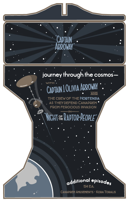
Been working on this texture for an old-fashioned stereoscope. It’s the first object you’ll see in Tinselfly.

Like everything else lately, this has been going slower than I’d like. And part of the problem is defining the problem I’m trying to solve.

The obvious problem is this:

Make something that looks like it was made in the 1920s.

Before I get into what’s wrong with that statement, let me talk a little about where I’m coming from here: Bioshock and Bioshock Infinite. They’re beautiful games with fun, period settings. But all the posters and signs you see in those games look maddeningly inauthentic to someone like me who’s studied the history of graphic design. In short, almost all the type you see should be hand-lettered; hand lettering takes a lot of work, but it’s something I have the skills to do, so I’d like to do it to make my stuff feel more authentic.

So back to making 1920s-style designs: That statement could mean a lot of things. The real question is, who’s looking? And when I asked myself that, I realized I was really asking myself to solve a different problem:

Make something that looks modern, to someone living in the 1920s.

And making something that authentic is way beyond the scope of this project. Like I said, hand lettering is hard. It’s adequate to say:

Make something that looks to a modern audience like it came from the 1920s.

This is not about being authentic for its own sake: this is about communicating something to a modern audience.

But this is, again, a loaded statement — what modern people am I talking about? Without really thinking about it, I realize I’ve taken the problem to mean:

Make something that a modern expert on 1920s illustration would identify as coming from the 1920s.

When it really should be:

Make something that a casual, modern observer would identify as coming from the 1920s.

This is close. Really, really close. Phrasing the problem this way frees me up to take a lot of shortcuts:

A casual observer may not notice how I’ve added procedural jiggling to my letters rather than doing real hand lettering.

A casual observer will not care too much if I use more ink colors than a real 1920s print might have contained. (And using more colors, in this case, actually makes my job easier).

A casual observer may not find the cel-shaded spaceship above too jarring (drawing that by hand would have taken lots more time).

In short, a casual observer will be much more forgiving of the errors I’m making than I will be. There’s a lot that’s inauthentic about the image above. And that’s ok.

If I want to keep things moving, that has to be ok.

So the problem, finally, is this:

Make something that a casual, modern observer would identify as coming from the 1920s and that does not annoy me too much with its anachronisms.

And here’s what it all comes down to: I am not my target audience. I don’t need to spend hours and hours making truly authentic illustrations here. I just need my stuff to pass a quick sniff test.

Despite my complaints, you could argue that the posters in Bioshock already pass said sniff test, and you’d be right. So what I’m going for here is not perfect authenticity — it’s just a slightly more strict sniff test.

And that’s a little more surmountable than the problem I was trying to solve last week.

Copyright © 2017 Brian Crick.