Brian Crick

The Faintest Ink

A while ago, Marie told me an old proverb: the faintest ink is better than the best memory.

I’m usually not much for proverbs. Most quotes that stick with me are from mediocre movies. But this one really stuck with me, and I’ve trying to integrate this thought into my life more, whether it’s taking notes at meetings or making maps of video games.

With that in mind, I’ve started a little wiki of sorts for Tinselfly (massive spoilers will eventually make their way there, if anyone cares). I’ve still got a long way to go, but the idea is to write down every decision I’ve made about the characters and story and whatnot, because there’s really a lot just sitting in my head that’s never been written down, anywhere.

I probably have more discarded, forgotten ideas related to this project than I could possibly write down. And while it’s important to cut and change things, I would like a record of what’s been changed and why. Might be good to have.

* * *

One of my biggest concerns with anything project like this is being precious about it. While this project is, of course, important to me, I don’t ever want to find myself in a situation where I’m so enamored of a particular idea that I’m unwilling to step back and evaluate its fitness for inclusion in my final product.

You’d think that getting all this stuff out of my head and into a more permanent, public location would cement these ideas in my head, and it would become harder to fight that preciousness, but the reverse has happened. Seeing these ideas written down, and re-reading them helps me with that evaluation process.

Like my approach to my journal in general, sometimes you have to write something down so you can realize how stupid it is. It’s so much easier to be precious about an idea when you haven’t actually had to explain it to anybody.

Myssing Links

Yesterday, for no particular reason, I started playing Myst again. My one video game of choice lately (La Mulana) causes my computer to randomly shut down without warning, I had a hankering for a video game to play, and I wanted to reacquaint myself with adventure game tropes (and to that end, I’ve also started Syberia II).

So since I was thinking about Myst, I went looking to see what one of the developers, Robyn Miller was up to.

And I was reminded that he has a web site named Tinselman.

* * *

My stupidly-long-in-development game project Tinselfly is the combination of two different things I was working on a couple years ago.

The name Tinselfly and the game mechanics come from a fairy-tale-themed follow-up I was doing to a game I made for a contest put on every year by Jennifer Ann’s Group. There was a damsel in not-so-much distress, and flying insects that emitted razor-wire-like strings from their bodies, like spiders emit spiderwebs. Hence the name Tinselfly; an earlier potential title was Damselfly.

The other project was Basil Street Bridge, an outer-space adventure starring a girl named Robin, who may have been consciously named after Robyn Miller.

Mash these two projects together, and you get an outer-space adventure named Tinselfly with a lead named Robin.

* * *

Am I getting into creepy copycatting territory here? Probably not.

Is this just a massive coincidence? Probably not that, either.

When an idea ‘just pops’ into my head, I like to trace it to its source. To the extent that I’m going to put a lot of effort into tracking this stuff down, I’m more likely than others to look at my work and find it depressingly derivative.

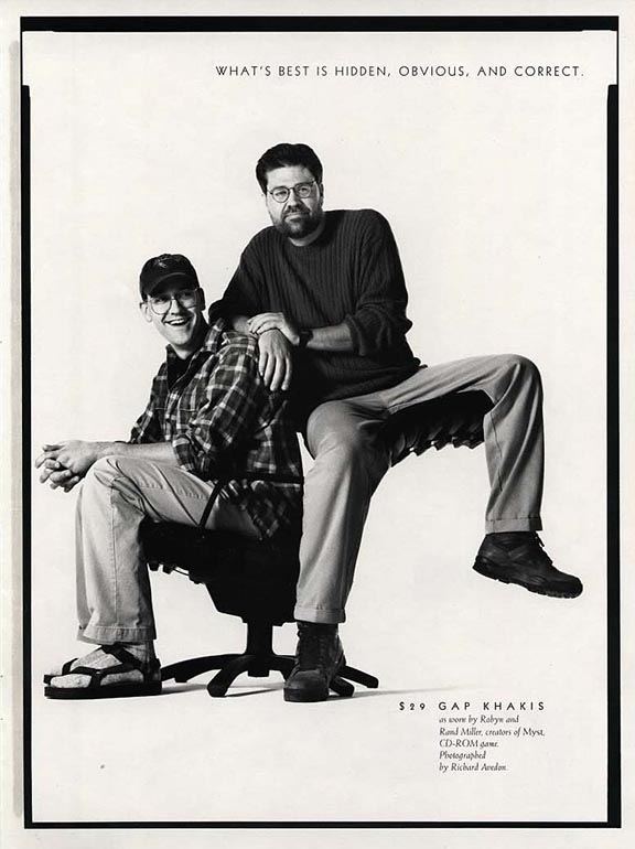
When I first played Myst, I really wanted to be the next Robyn Miller when I grew up. Which would make my brother Rand Miller, the other lead developer of Myst. I thought, in my own naive highschooler way, we might be the next Millers and make the next Myst or something. You know, and do a Gap ad.

The Robin character in Tinselfly is sort of an exaggerated version of myself. Her homeworld is based on my home town.

So in its own way, there’s this weird convoluted logic behind why Robin is named Robin, since I’ll conflate Robin and Robyn and myself.

* * *

I’ll probably stick with the name Robin and the title Tinselfly, but it’s something to think about I guess.

Test Driven Storytelling

At work-work, we’ve started experimenting with something called Test Driven Development.   It’s where you start a new program by writing some tests for it. Since your program proper hasn’t been written yet, your tests will fail.

After failing, you then write your program, and run your tests again. And hopefully some or all or the tests will pass. And you keep working on your program until all your tests pass.

It sounds a little backwards, and I wasn’t really sold on the whole idea at first, but it’s growing on me.

* * *

So I was gonna enter this co-op board game contest.

And then I didn’t.

I could write up a whole postmortem, but mostly what it comes down to is, I chose not to devote a lot of time to this project.  I’m still going to work on the game design. It’s deeply flawed, but I think there’s potential here. In many ways, failing this first test has been a good way to start.

* * *

Video games are filled with tests. Boss battles especially are very test-like. After grinding for hours and hours, you’ll suddenly find yourself in a situation where you have to use all the new equipment you’ve gained and defeat a screen-filling monster in an intensely concentrated test of your skills as a player.

For Tinselfly, I want tests, but more character driven. You can’t progress if you don’t get the characters you’re playing. Their assorted emotional baggage, their strengths, what things make them totally freak out for no rational reason. The story won’t continue if it thinks you’ve missed some of it.

* * *

It’s getting harder and harder to avoid working on actual playable levels for Tinselfly. I’ve done lots of setup, written lots of outlines; the visuals so far are nice… but a decade into this, I still haven’t figured out the details of where to begin, with this whole character-and-story-through-game-mechanics thing.

But it occurs to me that the answer lies in Test Driven Development. In an odd sort of way, a great many conventional stories are test driven.

You start with a hero. The hero is presented with a test in one of the first scenes of the story, and they fail the test. The exact way the hero fails should tell you a lot about them as a person. And then the hero gains new skills, has various emotional epiphanies, improves as a person, and finally passes the test they were originally confronted with. Roll credits.

Lots and lots of action movies follow this sort of template.

So without knowing the details of my first level, I can write the test for it, and just make it up as I go along, which is nice because I hate planning this sort of stuff.  And then I can build the rest of the level around that test, making sure the player has ways to gain the items and area unlocks they need to complete the test, and I can keep iterating until the test is actually completable.

Orders of Magnitude

New Tinselfly build up.

Been doing a lot of math lately. While I consider Tinselfly to be fantasy, it has sci-fi elements like spaceships and living on other planets and whatnot.

I would never call this hard sci-fi. I don’t even like hard sci fi. However, I don’t want people who are particular about scientific accuracy to check out of my story because I didn’t do my homework… and I also think it’s reasonable to say I have a responsibility to avoid spreading misinformation about science or astronomy or whatever, even though this is a work of fiction.

So while I’m still going to have artificial gravity here and there, and invisible force fields keeping the air in fantastic low-orbit cities, I’ve nixed faster-than-light travel, have constrained my setting to a single solar system, and am trying to make sure the sizes of planets and distances and travel times involved are reasonable.
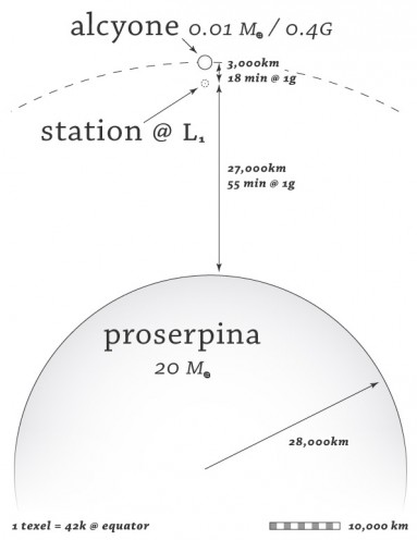
So we’ve got this small but reasonably-sized gas giant Proserpina here, and a moon orbiting it, and a station between the two.

Say you were living on the station but commuting the moon — I now know that it would take 18 minutes to get there, at a 1-gee burn accelerating halfway there and decelerating halfway back, because I know the the mass of Proserpina and a reasonable spot where that station would have to be.

Of course, if you were doing the commute in game, I wouldn’t make you sit on a shuttle for 18 real-world minutes; time is always compressed in games. But the important part is, I know that the commute is reasonable, and that this is something people might actually do, assuming that space travel over short hops like that is cheap enough in this universe. My own commute to an office a couple miles away takes longer than that.
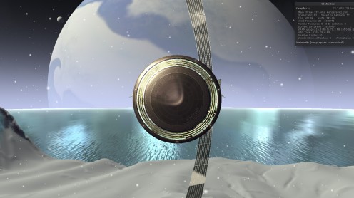
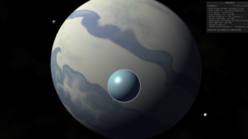
Part of this endeavor also revolves around making sure the size of things you see on screen makes sense. So above, you’re a couple hundred meters off the surface of that little moon, looking back at Proserpina, and that’s really how big a smallish gas giant would look through a typically wide camera lens.
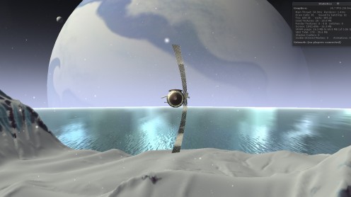
I want to make sure the player understands these scales, or at least, understands that the scales involved in astronomy are so big that they’re beyond comprehension. A big theme of the story is how the characters feel very small, very insignificant.
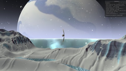
If you run my latest build, you can zoom out (with the right mouse button or mouse wheel) all the way to outer space, with smooth transitions during every step of the process.
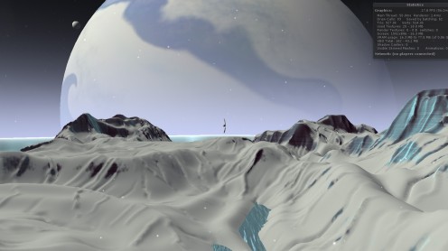
It’s not quite done yet, but I think most of this is more than sufficient, given the challenges involved. The numbers here are so big that my game engine can’t adequately deal with them at face value — I can’t just add a 56,000 km wide sphere to my scene and expect it to render properly in the background .

So what you’re seeing here is a composite image, where the landscape and the spaceship and some of the water is being filmed with one camera, and miniature versions of the stars and Proserpina and its moons are being filmed with another camera.
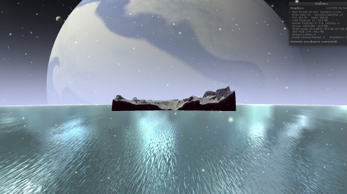
There’s a little bit of code sort of linking the cameras together. When the main camera turns, the miniatures camera turns the same amount. The scale is something like 100,000:1, so if the main camera moves back 1 meter, the miniatures camera moves back a hundredth of a millimeter so things stay lined up right.
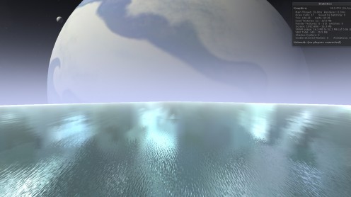
If you look closely, you can see a seam in the image above, where you’re seeing two different versions of the water. Maybe I can fix that, maybe not; I won’t be terribly sad if that stays.
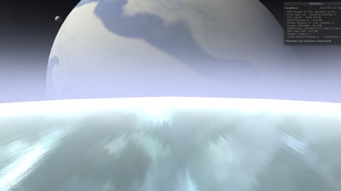
The hardest part was the atmosphere — it had to look right both from the ground and orbit. The way everything gets super bright as you’re exiting is totally accidental, but I kinda like it.
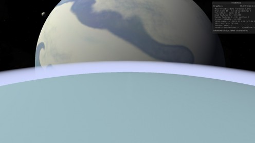
Mostly, I’m really happy with the effect. But it doesn’t interact with the light at all right now, so it glows a bit too much.
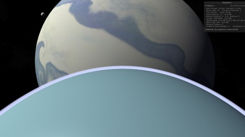
Also, my planet needs much more texture — that should be easy to fix.
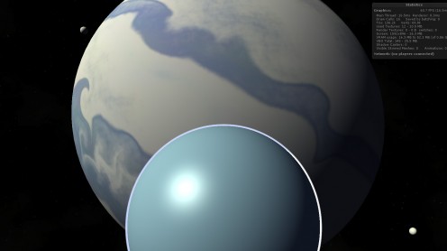
I actually think a straight zoom like this is a terrible way to communicate scale, but I’m glad I’ve implemented this in a generalized sort of way where I can do whatever I want with the camera and have things show up properly.
 

Adequately Gorgeous

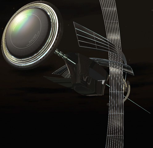
I’ve been obsessing over one particular spaceship model for Tinselfly lately. Mostly, I’m trying to prove to myself that I can make this product look as good as I want it to be.

You can view this in 3d here. (It’s updated from yesterday’s model, if you happened to see that.)

This is rather uneven, sort of by design. That main body is pretty funky looking, because I’ve been ignoring it.

I slip into a bit of a weird workflow, when I really don’t have any faith in my skills. Sure, a decade ago I made this design, ostensibly for this project, and it still looks pretty nice… but since I made that, I decided to make the switch from pre-rendered scenes to realtime 3d, and  I have a long way to go before I can say I’m good at making models for realtime 3d projects.

So I’m shooting for adequate here.

Trouble is, my standards for ‘adequate’ are pretty high. And what I’ll do, when I’m not sure I can make something that meets my standards, is just focus on one small piece of my model or illustration or whatever, and see if I can get it looking ok. Here, I’ve been concentrating on the big disc in front and those shiny lattice-like sails curving around everything. And I hereby declare those things adequate. I’m pretty sure now that I can give everything else — the main body of the ship, the rings in back — a similar level of detail and visual interest.

I sort of wonder, if I’d gone into this confident that I’d eventually get something I liked, if I might have picked a more efficient workflow. I wouldn’t say I’ve done a lot of second-guessing my decisions, but jumping into a challenge expecting to fail probably isn’t a great mindset to have.  That’s how I went into another recent illustration project, and I’m pretty sure that killed my efficiency.

Generally I tend to be pretty optimistic, and that’s been waning a bit, much to my surprise. I think it’s time to reclaim some of that. Being stupidly optimistic can be helpful sometimes.

Larger Than Life

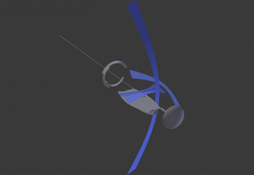
I’ve been working on my Hortensia model (a spaceship for Tinselfly), just roughing out the basic shapes for it. Here’s what it looks like from the front right now:

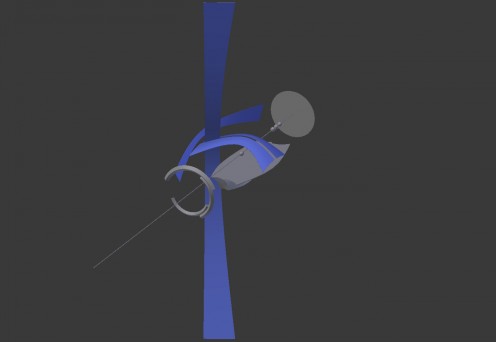
And from the back:

My main goals were to have it look absurdly fragile and have a sort of nautical feel, what with these sail-like structures and all, and I think this is finally getting there.

It’s a bit Tron-ish, but I’m ok with that; whatever I make, it’s going to be something-ish, and Tron-ish feels like a better fit for this story than Star Trek-ish, Star Wars-ish, or a realistic NASA-ish.

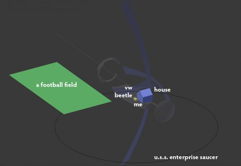
Besides nailing down the silhouette, I’ve also been trying to decide how big this thing is, and I’ve finally settled on that, too.

To give you a sense of the scale I picked, here’s an overlay of random things in comparison:

(The ‘me’ bit seems to have been completely obliterated by compression artifacts… you can click on the image to see a larger version.)

By any absolute measure, this is not a big ship. The distance from the front disc to the back of the rings is less than 100 meters. The main body isn’t so much bigger than the Mayflower.

I like that smallness. I like the idea that you could have the whole thing in frame, and see a character on deck or behind a window, and maybe even know which character you were looking at.

* * *

My lead character Robin is supposed to be in awe of the beauty and power of this thing. I could just scale it up; I could make it look big and massive and have it dwarf everything around it; I could make it comparable in size to popular fictional spaceships… but that sort of feels like a cheat. No matter what this ship looks like, Robin has to react to it in a way that expresses her feelings about it. And if I’m not communicating that in some sort of memorable, gameplay-driven way it’s sort of a lost cause anyway.

Here are some random ideas for doing that:

  • Robin occasionally glances back at the ship if it’s in view. (On its own, this isn’t really based on game mechanics, but imagine a scene where you’re talking to someone and keep glancing back at the ship and you fail to hear important information they’re trying to convey; the solution would be to talk to the character in a different location where the ship isn’t in view and distracting Robin.)
  • Robin can run a little faster towards the ship and a little slower when running away from it. (This could also be used to solve a puzzle of some sort.)
  • While near the ship, the camera rises really high, showing Robin dwarfed by the ship. Robin looks up constantly. From this point of view, Robin cannot interact with anything near her, that she needs to interact with; you need to literally get Robin back down to earth to continue.

That’s just a few ideas I thought of while writing this post. Hopefully you can have all sorts of little things that the player experiences, without words, without cutscenes, that tell you about this and other playable characters that don’t have anything to do with giving the player loads of verbal exposition.

Extra! Extra!

Been working on a randomly-generated-extras system for Tinselfly.

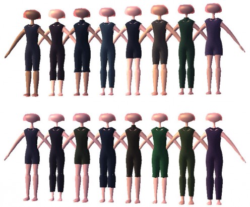
It doesn’t look like much yet, but I’m pretty excited. The idea is that if I have background characters in any given scene, they’re all going to be dressed in a similar fashion or they’ll be easily divisible into two or three classes of extras who are all dressed similarly. So for example, one ‘class’ might be people in navy uniforms. The uniforms will all look mostly the same, but there might be a little variation in the details: most people will have their shirts tucked in, but some will have their shirts untucked. Some people might be in short sleeves, and some in long. And of course, there would be variation in the people themselves: skin color, weight, height, hair style.

So here I’ve got a simple sample class that defines a character with some variation in weight and skin tone, and a plain garment with variable thickness, color, collar size and leg length.

Eventually, I want more detail and more variation or course; in one particular scene, I even need people in nice white dress uniforms with randomly placed blood stains that vary from shiny and red to matte and brown.

It’s going to take a while to get there. Besides procedurally generating character meshes, I need procedural textures with patterns, trims, lapels, and details like pockets or randomly generated fruit salad on people’s chests, if I want to get really detailed about it. All of which I’m pretty sure I can do, and it’s tempting to dive into all that, but my first priority is to make sure my procedurally generated characters can be animated.

In addition to extras, I’m going to be using the same system to define the look of my leads. And I’d like an animated, working, playable character as soon as I can get one so I can start on gameplay and level design stuff while keeping all this character generation stuff at a trickle.

Because I’m probably going to be making improvements to the character generation throughout the entire project.

Mass Appeal

A while ago, I downloaded this app that lets me see how much time I’m spending playing games. I seem to get about an hour or two a week in. The most I’ve spent with any one game is Star Trek Online; I’ve played it for a total of 25 hours over the last 2 years.

Those felt like pretty big numbers to me. I showed the stats to my wife, and she was appalled that I’d given a full day of my life to this one game.

I showed those numbers to some people in the local game dev group, and later on to some other friends, and they were appalled at how low those numbers were.

It’s becoming quite clear that I don’t really have a grasp of how people who are really into this stuff engage with it.

* * *

So I started playing Mass Effect. As with most big, popular video games, I wouldn’t necessarily say I like it. But the act of playing and trying to figure out what it’s trying to do, who it’s trying to appeal to… that, I find fascinating.

It seems a lot of it is about world building. I’m really, really not at all into world building normally. Whenever people start gushing about the richness of this or that built world, it actually makes me angry. I feel like it’s a waste of time, concentrating on emotionally inert minutiae that has no real value outside the context of a narrative.

But if I’m playing this game to figure out the mindset of its target audience, a big part of that is figuring out the appeal of world building, really figuring it out without being dismissive of it.

* * *

So what is this whole world building thing about, anyway? Here are some guesses:

  • Historical context. Can add more layers of meaning to dialogue and events.
  • Suggesting unwritten scenes. I’m a big fan of this in general. Suggesting an unwritten scene can be used to gloss over something that would be boring if you actually saw it; it can create comedic how-did-they-get-here moments, or efficiently hint at where a relationship has been going. I can see something here where the more world you’ve got, the more you can suggest using the costume, iconography, etc of your world.
  • Sandbox. Fantasy/sci-fi worlds frequently exist just so the author can explore a what-if sort of scenario, and I suppose a good, robust world will also invite the audience to pose what-ifs of their own. At its worst, this can descend into self-indulgent wallowing in one’s favorite bits of a fantasy world, but I’ll admit there is real value in encouraging people to explore these kinds of things.
  • Suspension of disbelief. Some people will just get annoyed if you present them with an artificial feeling world. I don’t want to pander to those people just to get them to buy my stuff… but to look at it another way: while I’m not going to be taken out of a mass-market period movie because the costuming is inaccurate, many people will, and saying that it’s ok to be lazy about costume research because the masses as a whole aren’t that picky is making your work more insular, not less.

* * *

It has always been my intention to make Tinselfly appealing to people who didn’t normally play games, or only played casual stuff. But it occurred to me the other day that the last thing I want to do is be too opinionated about what sort of audience I want to reach.

It’s about depth. Being appealing to a casual audience shouldn’t be about finding that lowest-common-denominator, simplistic presentation of Stuff That Common People Like.

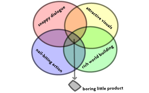
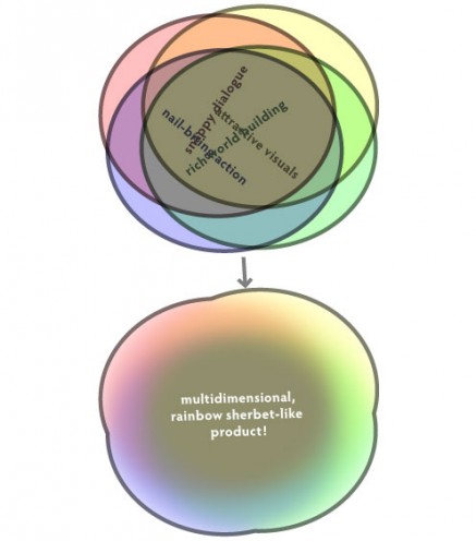
I think it should be more about the union, rather than the intersection, of appealing things. It’s about having most everything that’s appealing about your product in most every scene, but also letting those things stand on their own and shine once in a while.

So if you’ve got one person who’s just into the visuals (say, me 😉 ) and one person who’s just into the snappy dialogue (totally not me), you’ve got a good chance of getting both of those people. But that’s not the important part. The important thing is that any audience member has a variety of things to latch onto at any given moment, and can experience the work on multiple levels simultaneously, if they so desire.

* * *

This new, vignette-filled structure I’ve hit upon for Tinselfly opens up some opportunities for world-building. I was gonna pepper my main plot with these little, tangential, fairy-tale style stories set in little fairy-tale style universes, but I could just as easily package these up as little bits of history, set a hundred or a thousand years before the story proper.

If there’s an organic opportunity to give world-building fans something to play with, I should probably do it.  I would do well to go ahead and put real effort into those dimensions  of my product that I’m not the biggest fan of, like the dialogue and the world building; as long as it doesn’t interfere with the visuals and the story structure that I want, it can only make this better.

Formality

While I haven’t worked on it much lately, I’ve been feeling really confident and excited about Tinselfly. I’ve now got a page and a half of bullet points describing scenes I want to have and how they fit into my overall story. Structurally, this is really coming together.

* * *

I’m hesitant to talk about story too much; I don’t want to give away any spoilers. That’s been making me uncomfortable for a while. I want very much to share my thoughts on how to tell a story here and post playable demos; that’s an important part of this process to me. However, one thing I’m really exited about is this series of short vignettes I’ve decided to put in near the beginning of the story proper. Not just because they fit in an interesting way with the story proper, but also because I’d feel comfortable talking about them in detail and posting playable demos of them, without talking about their overall context.

* * *

Given the egalitarian nature of my universe, I’ve been stressing about designing androgynous formal wear that is still recognizable as formal wear, and that isn’t just having one set absorb the other (i.e. putting all the women in tuxedos).

My initial idea was to try mashing up the visual details of men’s & women’s formal wear — a gown with a formal jacket over it; a tuxedo with semitransparent/floral/embroidered details. But that’s kind of a shallow approach.

What I should do instead is get at the logic of formal wear, the different things it’s trying to accomplish for each gender, and mash up the logic. Once the logic is worked out, a costume should become self-evident.

Not that that approach is working to well right now. It’s very abstract, and I’m much more comfortable just doing visual mashups.

Tried to draw up a sketch in Illustrator (left), which isn’t really helping me sort out my thoughts that much.

I think what I need to do is just keep working on my character customization stuff; eventually, I should have a system where I can make an XML file or something that defines not just one costume, but a set of options for a given gaggle of extras. So like, the formal wear XML file might say something like, there’s a 75% chance the character will wear slacks and a 25% chance the character will be wearing a floor-length skirt, and maybe the shirt’s tucked in and maybe it’s not, and I can work with a whole look and (hopefully) see multiple extras generated from my script all at once in a neat little table in my editor.

(That will probably make more sense once the tool is up and running, and I’m sure I’ll babble about it more then.)

Saving the Day

This is going to be a sort of grand finale type cue to go along with a scene near the end of Tinselfly.

My computer’s hard drive died last week, and life has been one giant install party lately. Everything was backed up, and the backups were backed up, so thankfully, this is just a minor annoyance and not the crisis it could have been.

The first application I reinstalled was Flash Builder (which I use for work-work). I’ve been trying to squeeze in as much real work in as possible between reboots and progress bars, trying to catch up. But in the interests of keeping my creative side happily fed, the second app I installed was Mixcraft, my music composition software. And the only creative, pet project type thing I’ve done in the last few days is work on this new piece of music, since I didn’t get my personal files restored until yesterday.

It’s not done of course, but considering the relatively small amount of time I’ve spent on this, I’m pretty happy.

what went right

  • Getting ideas. It would seem that nothing helps me flesh out a level design or story beat like composing music for it. While working on this, I figured out a pretty satisfying through-line for my protagonist that is sort of an anti-power-fantasy, but still feels heroic in its own right. That’s been the goal of the project since its inception, but I wasn’t sure how to end it in anything other than a bleak, nihilistic, deconstructive sort of way.
  • Short bursts. I work best in short bursts. I can engineer short bursts, but it’s difficult to fake the sort of burning need to work on something that you get when you’re desperately trying to squeeze it in with more important tasks.
  • The rhythm. I’ve always wanted to do something in 5/4 time. So what I did here was, I created a single-measure, blank drum track and had it loop incessantly while editing it. I could move the beats around in realtime until I got something I liked, and didn’t think about chords or melody at all. I’m pretty happy with the results. This should probably be a standard part of my process; usually, I don’t give much thought to rhythm.
  • Structure. There’s a bridge, and an ending — two things I’ve never done before. They need some work still, but I’m glad I forced myself to add those things in, so at least I have something to work with now.
  • Changing time signatures. The piece changes to 6/4 time just for the bridge. I originally had the bridge in 5/4 like everything else, and it just felt wrong. I think that was a good choice; it adds variety but doesn’t feel jarring at all to me. Also, when I use the main melody elsewhere in-game, I’d like to have it be 6/4, so it just goes to 5/4 for the finale.

what’s going wrong

  • Length. This is just over three minutes long, and is the longest piece I’ve ever made. If this were part of a movie or something, I suspect that would be fine. But as something you play through… my gut feeling is that anything you’re imagining as a movie scene is going to take at least 3 or 4 times as long if you want to express the same concepts as a level in a video game. While I get bored easily with repetitive action in movies, action is the supposed to be meat of the storytelling here, and repetition becomes more important.
  • Totally 80’s. This is supposed to feel more modern, more synthy than the other pieces of music in Tinselfly. I know it’s not everybody’s favorite thing, but I like it when movies do that during important moments. It’s a reminder that you’re being told a story; that this is, after all, about real world issues and not the issues in this made-up one. But unfortunately, I don’t think this is synthy enough to feel different from my other pieces.
  • Cryptomnesia. I am, as always, worried that I’m just dutifully copying something I heard before, and don’t realize it. Like, I dunno, some 80s sci-fi like Solarbabies. The beat reminds me of Mars, Bringer of War and We Belong; the introduction of the chimes make me think of Curtains, used in Myst IV; the first couple measures of the bridge, I have just realized, are just a single note off from the intro to I Dreamed a Dream. And the image I have in my head, of the visuals that go with this — a circular panning shot of a bunch of random people rushing to the edge of a sort of open-air space platform perched above a stormy gas giant — just feels like it’s been done to death. I don’t know why. Maybe I’ve just forgotten that this is all only a few days old, which I am wont to do. But, the more specific things I can think of that this is like, the more comfortable I am; the more likely I am to question what I’ve done and make this my own.
  • Transitions. I’ve got a main section and a bridge and an end, and that’s good… but for the most part, I think the transitions from one section to another need to be smoothed out.
  • Muddiness. Some of the instrument clusters just sound messy. Need to clean those up too.
  • Adding more themes. I really want each theme to have a clear connection to a specific character or place, and I want to make sure I don’t have so many that the whole score for this just feels like a bunch of random things I threw up there with no relationship to each other. But… I’m not sure what this theme is… maybe it will be my protagonist’s theme. Strangely, I don’t think I have one yet.

Copyright © 2017 Brian Crick.