Brian Crick

Silly Photoshop Tricks: Backlit Clouds

I was trying to make a nebula texture for Tinselfly, and discovered a neat trick for doing that in Photoshop.

I used to do this sort of stuff all the time, making textures with nothing but builtin filters and effects and whatnot. I’m a little rusty now, but I thought this was worth sharing.

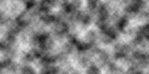
Step 1: Start with some difference clouds. Those are always great for making textures.

(Random tip: if you make your image width a power of 2 like 256, 512, 1024 or 2048, the texture you end up with will be tileable.)

Step 2: Make a new layer and just slap a black & white vertical gradient on it.

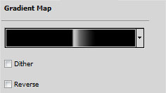
Step 3: On top the regular gradient layer, make a Gradient Map adjustment layer. My gradient map looks like this:

You want something that slowly ramps up from black to white, and then abruptly goes to black again. That abrupt change is going to define the edge of our cloud.

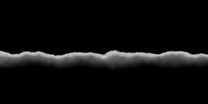
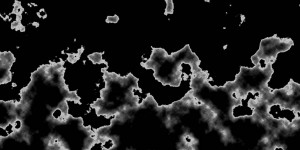
The effect it has on the layers underneath is like this:

Step 4: Now, here’s where it gets fun. Go back to your regular gradient layer you made in Step 2. Slowly lower the opacity to 0 and watch what happens.

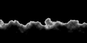
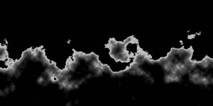
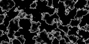
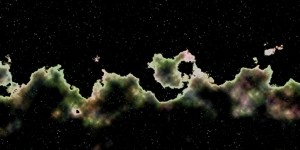
What you’re doing is changing how straight your clouds are going to be. If the gradient is too opaque, you just end up with a boring wavy line. If the gradient is too transparent, you end up with these funny blobs with no real structure. But somewhere in the middle, you’ll find something that looks kinda like the top of a large cloud, with light shining through it.

And once you’ve got that, you can add more effects to bring it to life.

I’m not done with this yet; it looks strangely flat still. But I think it’s an interesting start. And it took less time to do that than writing this post. 😉

Hole in the World

I wasn’t planning on posting a Tinselfly update today, but I thought this was too nifty not to share.

(click to enlarge.)

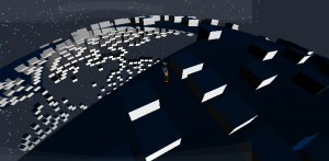
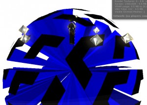
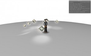
There’s a bug right now where one—just one—face of my 20-sided world is displaying incorrectly. I thought this looked kinda eerie and beautiful.

I may have to make a level in my story mode of the game that looks like this. 🙂

Anyway, I also added a randomly generated starfield, moonlight, and blue sky when you’re on the day side of the planet.

Fun with Symbols

Lately, I’ve been amused by certain similarities in two recent movies, Super 8 and X-Men First Class—and how this relates to what I want to get done with Tinselfly.

Warning: spoilers ahead.

Both Super 8 and X-Men have leads who carry around small, inanimate objects of great personal significance to them. Both movies have wordless scenes in their climaxes where said inanimate objects abruptly take on a life of their own, and the audience is presented with a simple, clear, visual metaphor for the resolution of the leads’ internal struggles.

I love it when movies do this sort of stuff. I wish more movies spoke their own language like this, and get frustrated when I think a movie is missing an opportunity to tell stories through objects. I saw Midnight in Paris recently too, and I thought they could have gone in this direction with a pair of earrings a character possessed, and I was sad they did not.

Of course this is just one specific way of having a movie communicate things visually. The Tree of Life, another new release, is overflowing with visual symbolism, and those visuals did absolutely nothing for me.

So I’m trying to relate this to storytelling in games, this sort of formula. And yeah, you could argue that it can go into visual cliché territory, but storytelling in games isn’t really there yet, and we need formulas that work.

The nice thing here is, this isn’t so much different than the way I’d envision storytelling through game mechanics working. These objects already have mechanics. They’re made of metal; they’re affected by magnetism. This doesn’t matter most of the time for most metal objects you’ll run across, but in one case there was a giant electromagnet being constructed by an alien, and in the other we had a character with superpowers revolving around magnetism. The big difference I’d see for games is that, for this sort of symbolism to work, it has to kind of catch you off guard let you see it as just another thing to plan strategy around.

I don’t have any concrete ideas for translating this to Tinselfly or whatever, but it’s not too far of a stretch to imagine a video game starring X-Men‘s Magneto, and you’re having fun using your toss-metal-around powers when suddenly you find yourself using new powers in an old location for the first time, and previously non-reactive bits of character-significant scenery come to life for the first time…

Jump Down Spin Around

Set some very small, but concrete goals for Tinselfly this weekend, and hit them all, and still took time out to see friends and stuff. Feels good.

[fergcorp_cdt]

Most of what I’ve been working on has been getting all my math to work now that you have the ability to run around and have ‘up’ mean something different for different parts of the spherical world you’re traveling on. Specifically:

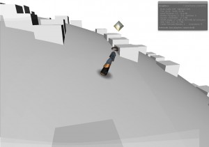
  • Made the camera correctly follow your character around the world.
  • Made your character point in the right direction while moving.
  • Made gems spawn in a plane around you, regardless of your position on the world.
  • Abstracted everything away so that things like gem producing and movement have no knowledge of the shape of the world. You could be walking on the surface of a donut, and the code for these sorts of mechanics wouldn’t care. Used some stuff from the design patterns book I’ve been reading there, and I’m glad I had a chance to apply some of these strategies.
  • Made a system to randomly generate mazes of placeholder obstacles all around the world. Re-used my Gemslinger code for that.

I guess there’s not anything cool I’ve learned lately, but I’m getting better at breaking this sort of stuff into manageable parts and working efficiently in Unity.

Keep Your Head Up

Just a quick Tinselfly thought today.

[fergcorp_cdt]

Been working on getting my character to stick to this round world I’ve created, and made some good progress last night.

I was flailing for a while though. When you moved, the character would kind of do cartwheels and eventually settle on the right orientation. It was kind of amusing, but I was all like, omg! I’ll never get quaternions! And I kept changing my math around and reading Wikipedia stuff on quaternions and watching Youtube videos about quaternions, and none of it helped.

But it turns out my understanding of this was fine. The issue was that I was writing a script to make sure the character’s feet were always pointing towards the center of the world, and I had a separate script made a long time ago that was trying to make sure that she was always pointed in the direction she was moving, with her feet pointed down in absolute coordinates. So the scripts were fighting with each other.

So it’s just a reminder of how important it is to know what you know, and know what you don’t. It’s sort of the opposite of the whole if your only tool is a hammer, all your problems will look like nails thing. I convinced myself my problem was a nail, and refused to use any tools on it that weren’t hammers.

I don’t know, mathematically, how quaternions work, but I do know how to use them in Unity. I should have realized that and looked for other sources of my cartwheeling problem sooner.

This week, I’ll work on refining my maze generation and high-level world building system.

It’s a Small World

Before I dive into my Tinselfly update, I just have to say, this was a spectacular weekend. Got to go to a drive-in for the first time in fifteen years, played whirlyball for the first time ever, saw fireworks, got almost 6 miles of walking & jogging in with Marie and hung out with some really cool friends.

* * *

[fergcorp_cdt]

On to the update.

I’ll start with a mistake.

Sometimes, it’s really cool what happens when you’ve coded something wrong. This particular mistake had a lovely Tron-like quality, what with its strangely geometric, sorta-backlit floating Tetris pieces there.

So what I was trying to do was make a sphere. Took all weekend.

Tinselfly is supposed to have different modes: a story mode, which will be only as long as it needs to be to tell the story I want; some multiplayer stuff, and an ‘adventure’ mode, where you can go off on any number of randomly-generated quests that will take a lunchbreak or a couple hours to finish.

So for these adventures, I figured they could all take place on little round planets. It’s much harder to do than a flat map, but Marie and I talked about it a bit and thought the extra effort would be worth it, making it feel more like you’re exploring a vast and interesting universe.

This is going to be tile-based, so first I had to decide how the tiles were going to work. I could go with a square grid, which would make the math easy but result in some really not-square squares here and there, or I could go with a hexagonal grid which would result in a more consistent grid but be harder to implement.

I decided to go with the harder, but better looking solution.

So each world needs to be divided up into a zillion little hexagons, and each hexagon can hold a tree or a rock or some water or whatever.

Much of the work I did this weekend was figuring out where all those hexagons go. Unlike a flat, square grid, you can’t just express everything in simple integer x,y coordinates where the position of each square is just some multiple of x and y.

Thankfully, I had help.

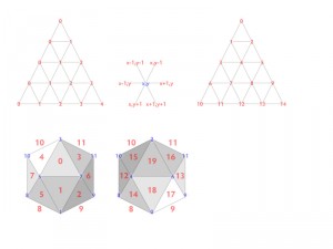
Without going into too much technical detail, what you’re looking at here are some notes I whipped up for starting with an icosahedron, dividing each triangle on the icosahedron into a triangular grid (to be converted into a hexagonal grid later), and figuring out what’s adjacent to what in the finished product. But anyway, the point I’m getting at here is that drawing this in Illustrator and having it visible all the time on my second monitor really sped up my coding. I should do this sort of thing more.

Also, I had some help from Wikipedia, which told me the exact coordinates of all the points on an icosahedron.

So here’s what I’ve got now:

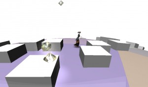
It may not look like much, but what you’re seeing is a smooth shaded sphere made of 18000 triangles that represent around 9000 hexagons. The locations of each triangle were all generated through custom code.

At 9000 hexagons, that’s about half the number of square tiles you get on the original Legend of Zelda outdoor map, which seems like a good baseline to me. It’s adjustable, so the player can have longer or shorter games on bigger or smaller worlds if they want.

I’m sorta surprised the curvature of the world is so distinct. I wasn’t sure if it would be or not. But I kinda like that. Can’t wait to have moons and stars and suns in the background that will rise and set as you move around. I think that could look pretty awesome.

Next, I need to figure out how to get the player and the camera to hug the world here. That’s already making my head hurt. It’s likely going to involve things called Quaternions, which I don’t understand real well.
Countdown to the IGF

Submissions are now open for the 2012 Independent Games Festival. If I want to submit Tinselfly, I need something ready by October 17th…

…so have a nifty automatic timer thingie!

[fergcorp_cdt]

That’s a little over 100 days away, and given how busy work has been and how slow Tinselfly has been lately, that’s really not a lot of time. Still, I like working under concrete external deadlines, and many IGF submissions are far from done. This isn’t a drop-dead release date.

Given the choice between submitting something that’s not quite there yet and waiting another year… I’d rather just submit something and get on with my life. Or, at least, act as if I’m going to submit something sooner rather than later, and make the call when October comes around.

We’ll see.

With any luck, expect more frequent updates here. 🙂

Copyright © 2017 Brian Crick.