Brian Crick

Level of Detail

Been working a little harder lately on that whole relaxing thing, which frequently takes the form of playing video games. And part of that is working harder to find games I’ll like. Historically, this has been a difficult task for me, but I think I’m getting better at it. The trick here has been realizing that my stated preferences don’t really line up with my actual preferences.

Take, for example, graphics.

If you ask me what I’m looking for in terms of graphics, I’m likely to say I want state-of-the-art, lavishly produced 3D worlds.

But… that’s not really accurate, now that I’m thinking about it.

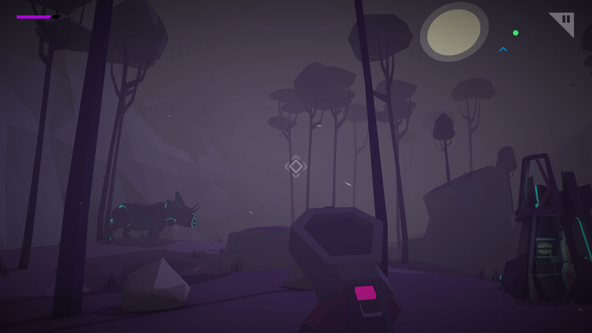
Right now, I’m playing Morphite, which features simple, flatly colored polygonal landscapes. And I love it.

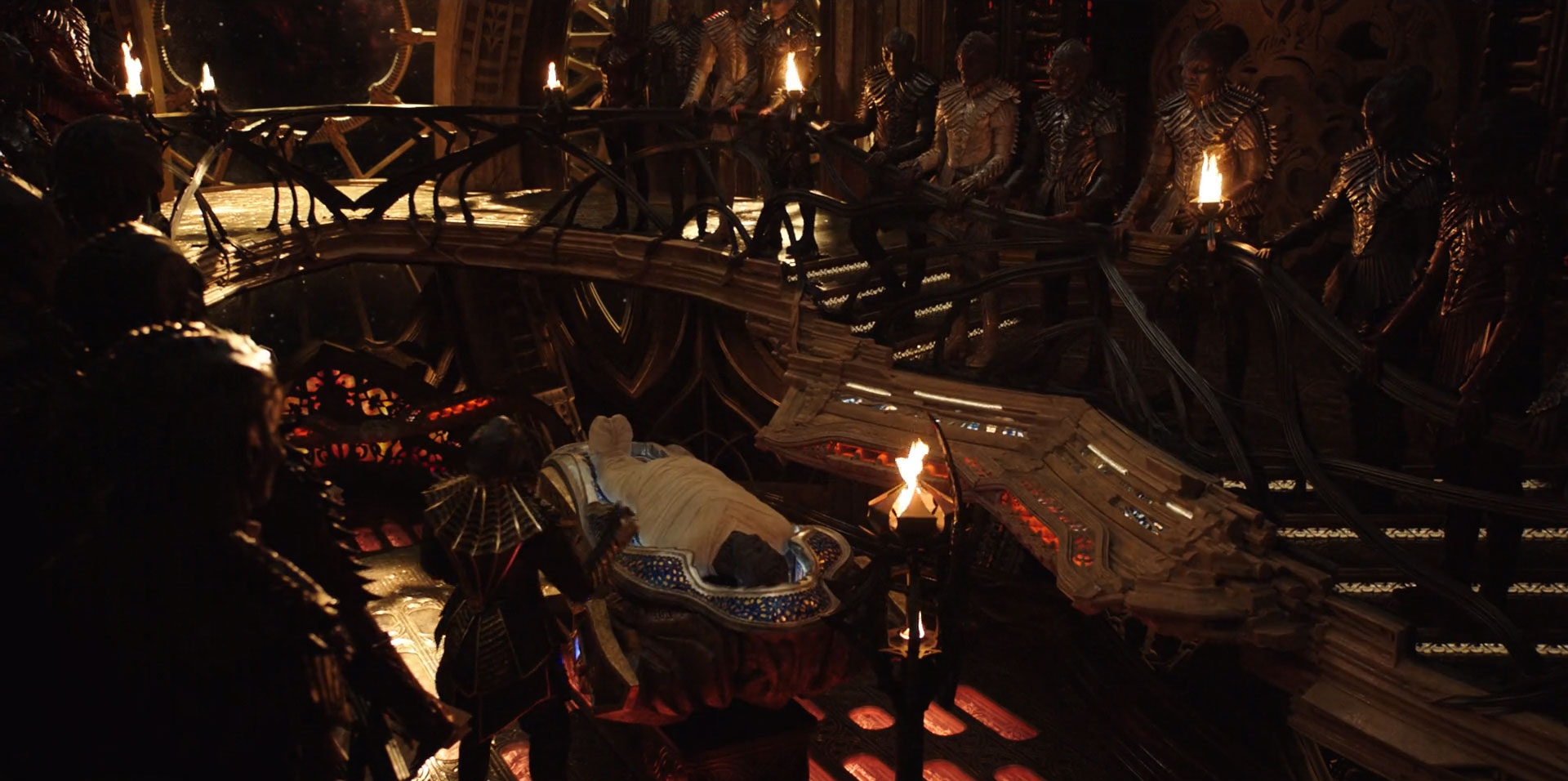
Compare that, as an extreme example, to this still from the new Star Trek show.

The level of detail in this set is staggering. Everything is alien, custom designed for this alien race on this spaceship in this Star Trek show. It’s a wonder to behold.

And it’s exhausting to behold.

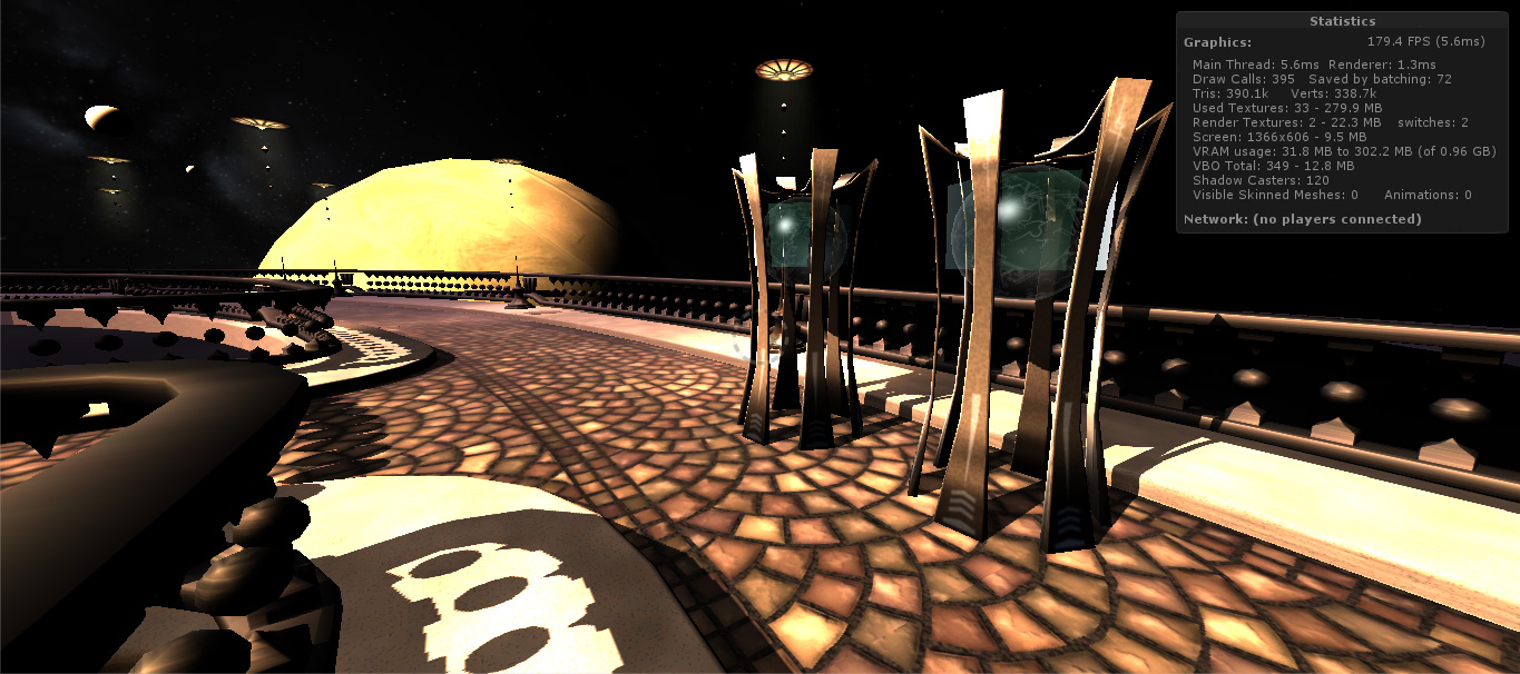
As I watch this, I’m not watching the characters, or perhaps more importantly, the subtitles of the alien language they speak; I’m watching the set. It’s so meticulously crafted as to be distracting. If that set were a video game environment, I would feel compelled to stop for several minutes to look at all the details close-up, like was admiring a work of art in a museum, forgetting all about the gameplay and the story. And I would like the game less because I did that.

So yes, I want lovely graphics, but more importantly, I want graphics whose level of detail harmonizes well with the pacing of the game I’m playing. Intricate detail is great for slow-paced, contemplative Myst-like puzzlers, for an action game I’d want something painted in broader strokes. There’s no one-size-fits-all approach to visual design here, and I’m certainly not advocating for all games to have minimalist or thoughtless designs. The designs still have to be really, really well-crafted–in terms of things like composition and balance and color selection–to hold my interest.

If you ask me whether I prefer live-action entertainment to animated, I’ll say live-action because everything is more real. And again, I’d be wrong about my own preferences. My favorite movies are animated, even though I find myself wishing I’d gotten to see more ‘well-realized’ versions of the fantastic environs you frequently get in animated features. Yes, the things in live action entertainment look more real. But, with animation or low-poly or pixelly styles, I have more mental bandwidth to engage with the story and characters, and then everything has the potential to feel more real.

And that feeling is really what’s important here.
Hiking

Been feeling pretty fried lately. In less than a week, I’ll be demoing Tinselfly–or maybe Gemslinger, insteadat GDEX, a video game expo in Columbus.

I’ve very deliberately not been rushing to get a demo of either project out. I’ve kind of learned the hard way that working too much on demos always ends up complicating real work that will move me closer toward finishing these projects.

So I’m focusing on doing exactly what I’d do if the expo weren’t coming up: solidifying my project plans, figuring out what exactly I need to be working on next.

I’m just doing all this… a little faster than usual. I’m still rushing.

* * *

Been having trouble the last few years finding a game I find really interesting and memorable. Sure, I love playing well-produced arcadey titles like Tron Run/R and Pac-Man Championship Edition, but they’re sort of like junk food. Delicious, wonderful, quick hits of junk food… but I’m yearning for a nice multi-course meal.

I don’t do a whole lot of things you’d call relaxing. I stress out about having fun, so frequently I don’t try.

I’m impatient to get to the fun part in any game. So I’d been going through some old games I bought and could never really got into: Arkham City, Mass Effect 3… wondering if I just bailed, in my impatience, before I’d gotten to the fun part.

Maybe I’m looking at this all wrong.

* * *

The first game I really loved was the original Myst. I couldn’t tell you why; with my memory as spotty as it is, whys always elude me. But I can tell you whats. What I loved was Myst.

My own work frequently gets comparisons to Myst games: and visually, I can certainly see that. But there’s certainly more to it than that, more than I consciously know. Myst is undeniably a core part of how I think of game design, but it’s maddening sometimes because I couldn’t tell you what that means.

* * *

I’ve done a couple 5k runs and one 5-miler, but I’m not really a trained runner. I’m not particularly fit (despite being rather thin).

Still, most of us can just decide to run and we run. We can decide to sprint and we sprint. After a little bit of practice, we get a feel for what speed we need to go at if we want to maintain that speed for such-and-such a distance. I’m confident I can walk several miles without issue; I can jog two or three miles; I can run one; I can sprint for about fifty feet before having to stop and rest.

Obviously, we don’t go everywhere at top speed; that would be absurd. But there are times when it’s fun, and times when it’s useful.

* * *

Been playing Obduction lately. I played it when it first came out, got frustrated, and now I’m back.

If you haven’t heard of it, Obduction is the latest game from the creators of the Myst series. You wander around vast, alien, beautiful, largely unpopulated environments, fixing broken machines and just soaking in the ambience everywhere.

And when I say these environments are vast, I really mean it. There’s a lot of just walking from place to place. My wife saw me playing as said the game looked like a hiking simulation.

That seems pretty accurate. I have no patience for hiking.

Sometimes I drop games and come back to them with a burning desire to just get them done, to tie up that loose end and move on. That’s not what I’m doing here.

I’m trying to play Obduction in the spirit in which it was, I think, intended. I’m making maps and taking notes. I’m reading all the way through lots of journals and meditating over little visual storytelling details here and there. I’m walking from place to place and trying not to be annoyed at how long it takes to get from place to place.

I’m taking it slow. And you know what? I’m enjoying it a lot more now. I think it’s supposed to be a little slow. This is, in many ways, the fun I have been looking for, for so long. It’s not a longer version of the quick-hit arcade games I’m used to playing; my definition of fun evidently doesn’t scale that way. It’s meditative and relaxing and fun, if I’ll let it be that way.

* * *

Lately, I’ve been working on Tinselfly at a rate I can only describe as a run. I decide to think faster and I think faster.

This pace is not sustainable indefinitely… but I’m confident it’s sustainable until GDEX.

I’ll probably jump into a sprint the day before GDEX starts. That’s the way these things typically go. And that’s fine.

But once GDEX is over, I need to slow down my thoughts again. This is not a sprint. This isn’t even a marathon.

This is hiking.

What is focus, anyway?

I think it’s safe to say that progress on Tinselfly is going faster now than it ever has before. It’s a great feeling. I’m working hard to get things ready for IndieCade east at the end of the month, and while I’m enjoying this burst of energy, I find myself wondering how to keep up this level of productivity after IndieCade has passed.

IndieCade is not making me more efficient, and there’s no reason my energy has to drop once it’s over. I’m changing my habits in response to this looming deadline and that’s making me more efficient. So… what are those habits? How do I hold on to this?

* * *

A big part of this, or course, is time. I’m canceling obligations wherever I can to make more room for this project. And that’s definitely something I’m not willing to do for long periods of time. But there are certainly things I’m dropping — tv shows, finishing this or that video game — that I simply don’t miss. I’m kind of getting a clearer picture of what I want to be doing with my time in general.

Navy-Booth-10-April-2016

* * *

Another big part of this effort is getting rid of unnecessary work.

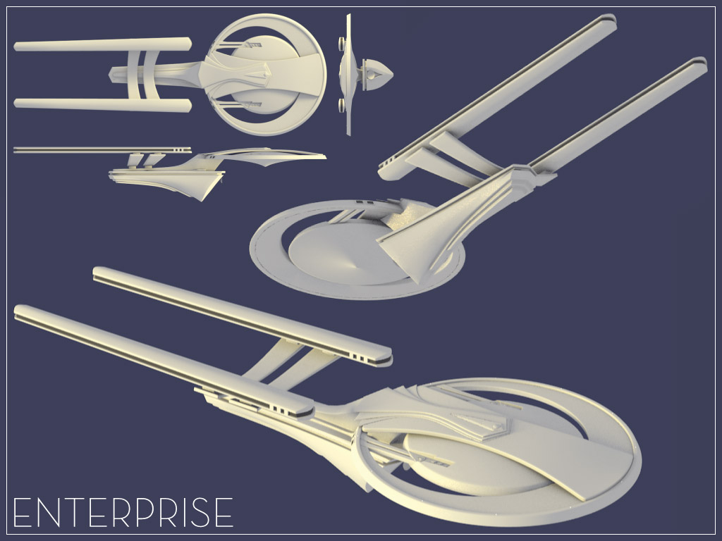
A few years ago, I entered this contest to design a new starship Enterprise for Star Trek Online.

composite-15-january-2011

It was going kind of slow, until I realized I was looking at my deliverables wrong. I was not here to make a spaceship. I was here to make an image of a spaceship, and more precisely, a bitmap image with fixed maximum dimensions. Sure, I could zoom in my 3d modeling program and see glaring imperfections in my design, but anything I did that did not make that final image look better was a waste of my time. The contest judges were not going to see my model.

So similarly, when there’s a deadline looming, I’m more likely to judge my game textures and models based on how they look in-game, not how they look in my editing software. This is not me reigning in being a perfectionist so much as defining perfection in more practical terms. I am trying to make my game perfect — not my models or textures.

* * *

Which is not to say that I’m getting everything looking and feeling perfect in-game, either. With a deadline approaching, I’m more likely to stop work on a particular task once the results are merely good.

And you know what? I hardly every find myself wanting to go back and change one of those ‘merely good’ assets. Declaring an asset or scripted event adequate isn’t just about accepting incomplete work — it’s about putting some distance between myself and the work. And once I’ve got some distance, I’m less critical of it.

* * *

I’ve been automating my process a bit lately, and I should do more of that.

Last week, it took me about half an hour to import a new character into my game. It was tedious, error-prone work. So I wrote a script to do a lot of the setup for me, and can drop a character in the game in about five minutes now.

* * *

Lastly, when I’m pressed for time I find myself more willing to find unique solutions to problems.

Fighters-4-April-2016

A while ago, I was working on some animated planes that flew by as you started the game. And I wasn’t really happy with how fast and dramatic they looked.

So I fixed the look of the planes… by adding sound. Once the planes made sound passing by — with some exaggerated Doppler effect added in — they felt impressive and fast and, yes, they looked better.

I’m more willing, when pressed for time, to start looking at new ways to solve problems instead of beating my had against my whatever solution I chose first. I was focusing too much on visuals here, and had to remember I’m creating an experience — which involves sight, sound, the game reacting to the player and the player interacting with the game. If the experience feels incomplete, chances are, I’ve been neglecting one of those four parts of my presentation.


Failure is not an Option

So I’m playing Republique, a stealth game where you’re trying to evade various guards and escape from this compound… and one of the guards sees me, and catches me, and I’m like, crap, I gotta do the level again– –except, I’m still, much to my surprise, in control. The game hasn’t restarted.

So I pepper spray one, but another guard grabs on to me soon enough and starts to escort me back to my cell. And I’m still in control. I manage to play along with being escorted long enough to get to a doorway, and close the door between me and the guard and lock it, and run away to safety. I got out of a tricky bind, and it was a weirdly satisfying experience. I never failed. The game never said

YOU LOSE

in horrifyingly large-point text; it never showed my gruesome impaled-on-whatever-pointy-thing’s-nearby death, it never faded to black and made me start over. And I really loved that. It let me see that I was about to fail, and gave me a chance to correct it.

* * *

Repeated failure is one way to teach a player the skills needed to get through your game. I tend not to like games where the player is expected to die over and over. I just find them, well, annoyingly repetitive. It’s like trying to have  conversation with a teacher who has a two-word vocabulary: try again.

Other games teach through explicit written or verbal prompts. They can be integrated to the game environment in fun ways, but there’s something kind of sterile about that approach.

Usually, my favorite approach is education through level design: you get a new item, and you’re immediately presented with an escape-the-room type puzzle where you have to use your new item in a specific way to progress.

I don’t think I want any of these for Tinselfly.

* * *

So I’m trying out Guild Wars 2 and I get totally clobbered by a monster. And I don’t respawn. I fall to the ground, and, for a short time, I can try to delay my inevitable defeat by throwing rocks at my opponent and flailing a bit.

I am dying.

It’s a fairly protracted death, and there’s something really interesting about that. Most games, you live; you die; you restart; you are never dying. You never dwell on it.

* * *

If you die over and over in Tinselfly, I guess that’s ok. Your character has an overactive imagination, and a maybe little bit of survivor’s guilt. I could have her die over and over, because she could be, in some ways, obsessed with death. I’ve been exploring the idea of having my climax be a puzzle where you’re trying your hardest to get your character to not gleefully sacrifice her life for her country. It’s a little bleak.

That’s a direction I could take the character. But I’m not sure if that’s really what I want for the character or if I’m just trying to shoehorn the character into that dying-a-zillion times video game trope. Like I said, I tend not to like games where you die a lot.

I’d prefer my character to be fairly ordinary, with ordinary dreams and ordinary roadblocks. Few moments of the game should be life-or-death situations for her, and I don’t want anything overly melodramatic in her past: no dead parents; no traumatic childhood. I would actually like her to exist in a reasonably nice, supportive environment. I want her problems to be relatable.

If you mess up, I’d like it to be like Republique, where you have an opportunity to make things right before the game says, nope, it didn’t happen. Try again.

* * *

Tinselfly is supposed to be my attempt at a character-centric, but still fundamentally action-based game. To that end, my plan to solve the problem of teaching the player game mechanics was to have the lead playable character teach you the mechanics–she will talk to you sometimes–through a game-within-the-game with identical mechanics as the game proper. She well tell you the basic controls within the context of this sci-fi video game she likes, while at the same time giving you a sense of her character and how she engages with this game universe, which is pretty plot significant. It occurred to me, however, that there were also other techniques I could use. I’m not sure I’ve seen it done, but I’d like to have non-playable characters teach you some mechanics by example. Your character is not supposed to be a lone warrior. She’s part of a small ship crew, with some experienced members and some new people. Thematically, the NPCs-as-teachers thing would be really great if I can pull it off, if I can have your mentors in the game function as mentors. Having said that… I need concrete examples of how this might work. So here are a few thoughts:

  • NPCs can show you where it is safe to go by, well, going there.
  • NPCs can communicate places that are unsafe by stopping abruptly before hitting dangerous spots, or hitting dangerous spots before you do and visibly reacting.
  • NPCs do routine tasks you also have to do: using consoles, applying combat dressings.
  • You can watch other engineers fixing things.
    • Maybe you could tell who fixed something by the neatness of wiring in various places.
  • You can watch other people swordfighting.
    • Your character could comment on specific techniques they’re using. Yes, it’s explicit verbal instruction, but it could be done in a way that is both instructive and revealing about your character.

All of this depends, of course, on my ability to animate NPC interacting with things in meaningful ways, which I’m not sure I’ll be able to do. But hopefully, if I approach NPCs with this sort of mind set, both they and the playable character will feel more real and interesting.

Global Game Jam 2015 Postmortem, Part 3: Words and Music

(Part of a series. Check out Part 1 and Part2 if you haven’t already.)

And now I’m gonna start talking about some things that went wrong.  🙂

Music!

There, uhm, is none.

I figured I could, pretty quickly, crank out something kind of like what I did for the last Global Game Jam: something kind of mysterious and atmospheric. I got a decent beginning… and my music software crashed.

I opened the last auto-save, and it crashed again. And then I started to panic. I’d installed a new version — not a point release; a whole new version of my music composition software months ago, and this was the first time I’d used it. And it wasn’t working.

So I decided to move on, and not do any music. Any at all.

After the jam I installed the latest patch, which had been out for some time, and that solved everything. And I felt rather silly.

So, lessons learned:

  • Test new software once you get it, even if it’s just a quick smoke test.
  • Keep your software up to date, even if you haven’t used it in a while.
  • Don’t panic. Crashes happen. And so do software updates.

The Book

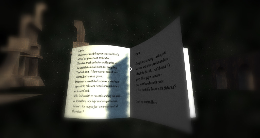
So as I mentioned in Part 1, before the jam even started, Marie and I decided that making a Myst-like game with a journal or journals to read was a possibility.

And before the jam started, I was thinking about how I would implement a book with animated, turning pages. Not testing anything, mind you… just thinking. Leisurely thinking.

I implemented by book animation system as I planned it out, but it took most of forever to do it.

book1

There are times when planning can actually hurt. I had a system in mind, that I knew in advance would work, and that seemed good enough. By the time I started implementing the system, I didn’t bother to ask myself if it was the right system.

This was a system planned in a vacuum. I wasn’t thinking about the time it would take to implement it, because I wasn’t under any time constraints when I planned it. I was in the completely wrong mindset for a game jam.

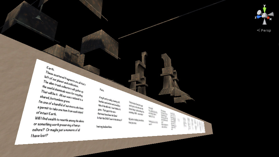
Furthermore, while the system worked, it was overly complicated to use. If I was thinking about Marie’s time using what I’d written, I would have realized very quickly that what I had in mind was overly fussy and error-prone; the act of adding pages to the book involved adding real objects to the scene at precise locations on specific layers in the real game scene, with multiple cameras filming them.

book2

I could have just done something where you plopped textures into an array in the book’s properties pane, without any extra cameras and pages sitting in the scene. And it would have been easier to make books.

Marie found the system annoyingly cumbersome, though she tells me it made her feel more valuable as a member of the team, relieving me of the need to do all that tedious layout myself.

Guess that’s it for Part 3. In Part 4, I’ll talk about scaling issues we ran into.

Mechanics, Mechanics, Mechanics

At last week’s game developer meetup, I got to talking about Tinselfly, and once again had to say that I just had an environment right now; there was no gameplay.

So I set myself the goal of having some gameplay by the next meetup, which is in two and a half weeks.

So far, there are these alien robot things, which are supposed to look, like, otherworldly and menacing and stuff. And I’d like you to be able to swing your sword at them, and I’d like them to fight back.

Robot-27-February-2014

I can probably get the basic swordfighting mechanic ported over from my sandbox game tonight or this weekend. And then I just want to keep revising it and iterating over it, the same way I’d obsess over a model. Thing is, I’ve hardly ever done this before. And when I’ve done it, it’s been within the context of a game jam, so I’ve spent no more than a day trying to fix mechanics once dropped into a project.

Two weeks just working on mechanics is unheard of for me.

Hopefully, if I can get myself to give this the same attention to tiny detail that I give my models, I’ll have gameplay that’s on its way to being as fun as my environment is pretty. 😉

* * *

I am, of course, trying new things to keep Tinselfly on track. But it’s also more than that. At game dev meetups, I am frequently motivated by seeing other people’s stuff; or even just knowing that other people are making progress. I want to return the favor, and make sure I’m not inadvertently making people lose faith in this whole going indie thing. I don’t want people to look at my stuff and think oh, there’s no gameplay here; you’re either a graphics person or a programmer or a game designer.

I’m frequently hesitant to break out my laptop at meetups, but It’s not so much about showing off what I can do. It’s about showing myself what I can do, and showing other people what they can do, too.


Little, Big, Solar System

The trouble with the solar system is, it’s big.

Really big.

Lighting-28-September-2013-496-440

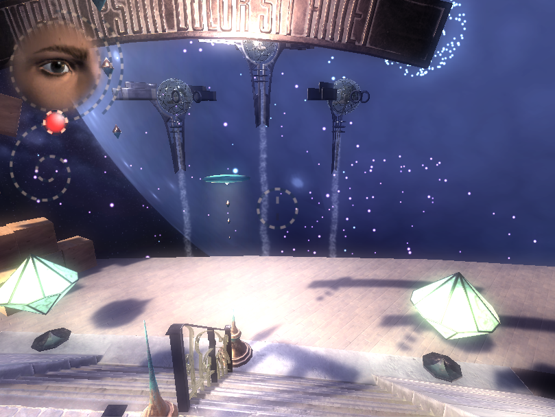
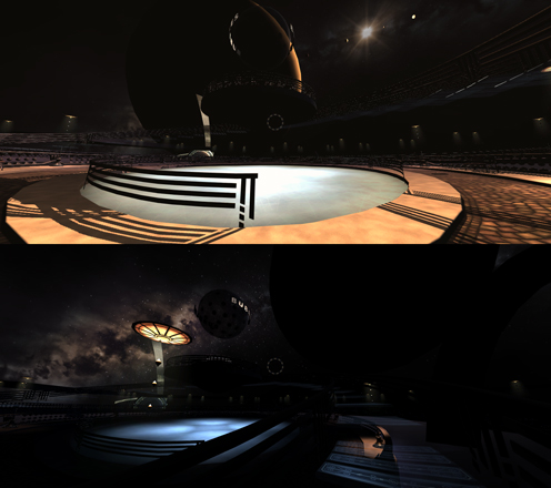
So I was working on getting Tinselfly to understand the concept of interplanetary travel. I want it to be smooth and seamless; I want the player to really feel the distances involved here. I want the player to feel small. This is sort of an extension of some stuff I was doing last year.

In short: you can’t just model this stuff and have it work. You have to use some camera tricks. So I came up with a plan. It was a clever, workable plan inspired by the effects in The Lord of the Rings, and I was halfway through it when I realized the other half might not be worth doing.

Here are the parts I finished:

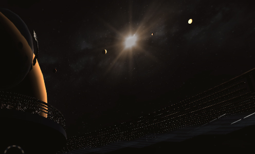
  • You are orbiting a small moon, the big screen-filling, sun-blotting sphere in the images above. Its size is realistic.
  • The moon is orbiting a gas giant, which in turn has other moons, all of which are realistically sized.
  • You can see four small planets orbiting the sun in the top image; their positions are realistic.

But here’s a problem that I’m choosing to leave in:

  • The sizes of the four small planets you can see near the sun are not remotely realistic.

You’re viewing the bodies in this solar system as if the planets are reasonably sized, but the planets (including yours) are all 1000 times closer to the sun than they should be.

The four little planets above? Are shown 1000 times bigger than they would be in real life. It was part of my plan, to store everything using a compressed scale in my scene, and kind of inflate it all when the game was actually running. And I stopped just short of implementing that inflation part.

Lighting-Closeup-28-September-2013

Looking at this detail image here, you can see that each planet has a different phase, like the real Moon does. The planet on the left is reddish and a crescent. The planets in the middle are half moons. The one on the right is almost full. You can tell these are spheres, being lit by the sun, with different sizes and colors.

In short, you can tell they’re planets. Which, realistically, you could not do. Realistically, they should look kinda like particularly bright, untwinkling stars.

Looking up at the night sky never, ever, made me feel small and insignificant, because reality does a terrible job of communicating to the viewer what they’re actually looking at. And I don’t see it as my job to have space be big. It’s my job to communicate that space is big.

Rather by accident, looking up at these planets in-game makes me feel small in a way that reality does not, because it’s all on a scale I can start to comprehend — and I start to comprehend just how far I am from really being able to grasp how big that scale is. So I think I’ll leave this mistake, this unfinished camera trick, in.

For the same reason, I have made the plane of the solar system here line up exactly with the plane of the galaxy, with lines up exactly with the plane of the planetary system you’re in. Again, not entirely realistic, but seeing everything lined up like that — and seeing it all move unrealistically fast — cements this idea that you’re part of this system of spheres spinning around other, larger spheres, spinning around ever larger objects.

And watching all this makes me feel really, really, tiny. Which is what I’m going for here.

The Butterfly and the Beanstalk Postmortem: What Went Right

(This got a bit long, so I’m splitting it up into parts.)

This last weekend, I attended my third game jam. It’s a thing where you have a couple of days to make a complete video game, based on a theme that’s not known until the start of the jam.

This jam’s theme was The Butterfly Effect. I ended up with a racer type of thing, without the racing. You can play the version I completed for the jam here… though it’s nearly impossible to win. In my next post I’ll put up a new, more playable version and talk about what went wrong and what I was focusing on fixing post-jam.

what went right

the theme

I was really, really unenthusiastic about the theme when it was announced Friday night. So at first I decided to just do something pretty, where you were a pretty butterfly racing along this pretty, convoluted pipe with pretty, perfectly round trees in your way. Like this Unity contest winner. And… going with the theme of the butterfly effect, your small movements should affect the shape of the level globally… somehow.

Which is what I did for my other two jams. Nothing terribly original or exciting here.

But that — that not caring about the theme, or even my own mechanics — led me to what I think is an interesting mechanic that fit with the theme.

By the time Saturday was halfway over, I had sort of numbly forced myself to implement an unchanging pipe, and you could move along the pipe, and there were trees in the way. And I played several times through this empty, endless experience, each time imagining a different goal for the player, and different complications, and that helped me find an approach to the theme I could get excited about.

I kind of liked not starting with a concrete approach in mind. Instead, I started with a stock mechanic, the pipe racer thing, and that helped me think. And that’s the exact opposite of what I’ve done in my other jams.

the pipe

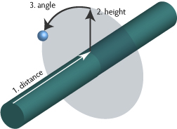
The game has only the vaguest concept of your position in three dimensional space, or even the fact that you’re traveling on the outside of a convoluted pipe.  As far as the game mechanics are concerned, you’re traveling in a straight line along a straight, two-dimensional track. What I’m doing is storing everything — the player location, the position of the trees, even the points that make up the surface of the pipe — in a simplified coordinate system with the following components:

coordinates

  1. Distance along the pipe.
  2. Height above the pipe.
  3. An angle representing your point’s orientation around the pipe.

I then wrote a single positioning function to translate this coordinate system to the world system, bending everything around an array of points I had that defined the curvature of the pipe in world space. Everything went through this function, so once that was nailed down, it became very easy to place things where they needed to be, relative to the pipe. To create the pipe, I call my function on different combinations of distance and angle, all with a fixed height (the radius of the pipe) and those are the vertices on the final pipe mesh. Every frame, the player’s distance goes up a fixed amount and the angle changes if keys are pressed, and then I call my positioning function to place the player model in the scene. As the player moves through the scene, trees are created with 0 height, a random angle and a random distance and positioned with my function. When trees spin, I change their angle slightly and call the function again.

Nothing here cares that the pipe is twisty. Nothing at all.

the music (sort of)

I’m not thrilled with the music. I spent all of half an hour composing it, and it has more than a little in common with this bit of Doctor Who (at the 1:55 mark ). I consider this a win, because I had the presence of mind to just throw some music up there, and move on. There were more important things to work on.

the graphics

My initial goal was just to make something pretty. I think it’s fair to say I got that. 🙂

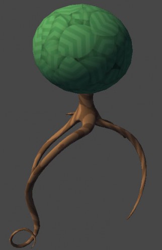
I’m especially proud of this tree.

tree

More on how I made that in another post.

the revision

I’m considering the post-jam revision an essential part of this process, which is something I’ve never done before. Rather than simply think and blog about what went wrong, I decided to go ahead and try to make fixes for the most glaring problems, and that has helped me learn more about what I need to work on here.

So that’s it for now. Stay tuned for What Went Wrong, which may be even longer! 😉

Terribly Overdue Scopa Updates

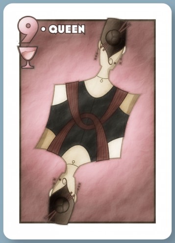
Got a new Scopa card (mostly; just noticed the missing icons, number & title on the bottom). I thought I’d try doing this character from the back just because I thought the bun & chopsticks would look neat that way.

There’s a back-view baseball pitcher coming up too, hopefully.

So actually the top image has been sitting on my computer for like months now. Didn’t add it to my gallery, didn’t send it to the client, didn’t have any motivation whatsoever to move this project along.

I’m not sure what the deal is. I want this project out of the way so I can concentrate on other things. This is, as far as I can tell, a fun, interesting project. I’m happy with my output. It’s for free of course, but the client has reacted positively to the drawings I’ve sent.

I should, all things considered, be highly motivated to get this done.

So in an effort to get back on track, here’s a guess about my lack of motivation: it’s surprisingly tedious.

My first image for this project took like forty five minutes to an hour to complete. Each image thereafter has taken two or three hours.

You’d think it would go faster, the more images I produced, but in many ways, trying to get new images to match the existing ones is harder than coming up with things from scratch. I suppose that’s a skill I need to work on. My workflow could clearly be more efficient, for this and any other project that involves hand-drawn illustrations. Which is most of them.

What I’m doing right now is, I’ve got a basic character template printed out. I’ll trace that with real pencil and paper for new characters, take a picture of my new drawing, then trace that in Illustrator.

There are many parts of this process that are a bit janky, most notably the duplication of effort with the traditional drawing and the Illustrator tracing. But I think the big issue right now is just getting my pencil & paper drawing into the computer. Right now the process looks like this:

  • Find a nice bright spot to place my drawing.
  • Take a picture with my phone.
  • Realize that the light wasn’t bright enough for the picture to come out.
  • Futz with camera settings, relocate random lamps from around the house and try again.
  • Email the picture to myself.
  • Download the email attachment on my laptop.

This is, of course, less than ideal. My scanner broke years ago,  and my new phone blows up if you try using it as a USB drive, hence the icky multi-step process.

Ideally, I’d hold up my drawing in front of my web camera and just skip the external scanning/photo taking devices entirely. I have no idea if that would work, but it’s a thought. 😉

In the absence of that though, some sort of photo-taking setup with a bright light right in my office might be helpful. A desk lamp pointing at a clipboard on the wall (desk space is really tight), or maybe an improvised light box taking advantage of the fact that my desk is made of glass. Something like that. Anything to make this more frictionless.

I should see if I can cobble something together from random stuff in the house.

This is how you click a button.

I spent much of Saturday night teaching an unmedicated schizophrenic how to use a new computer she’d just bought.

This was, in many ways, the high point of my day. I like teaching. Teaching is especially nice if you have every reason not to like the person you’re dealing with, or just can’t connect with them on any kind of personal level. All of that fades away into a comfortingly neutral set of canned interactions.

I also like teaching because the less your student knows, the more open you are to looking at a skill or an experience from a fresh point of view.

And this was a person who didn’t know how to click, or what a blinking text caret was, so my mind was pretty empty just a few minutes into this. It was a unique opportunity to look at the typical conventions of computer UIs — scrolling, push buttons, tabs, file trees — and ask yourself how much sense these things really make.

We had no common experience of computers at all. In fact, it’s probably safe to say our experiences of reality don’t overlap that much either. And while it can be immensely frustrating talking to a person with problems like that, it kinda gets you thinking, about the way you think about things.

* * *

Earlier in that day, we went shopping for said computer, and the first question we had was, tablet or laptop?

The computer was going to be used mostly for email, web browsing, music and movie watching. The obvious choice was a tablet.

I’ll admit, I’m a bit biased. I do not like tablets. Or more precisely, I do not like the idea of tablets. From what I’ve seen, they’re mostly geared at consuming things… and, if that’s true, I’d rather see people get a machine that at least has the potential to allow them to create interesting things.

I don’t want everyone on earth to be a computer nerd. We all have different skills, different interests. However, the cheapest laptops at the store we went to cost the same as the tablets. So I figured, why not go with the laptop? I’d like to believe that anybody could get a lot out of this, if they so desired. Even an unmedicated shizophrenic.

I don’t want to underestimate anyone. It doesn’t matter whether I like or dislike them; it doesn’t matter how functional I think they’ll ever be; I don’t want to start off by thinking of someone as beneath me.

I’m not convinced the tablet would have been easier to user for someone totally new to computers anyway, and it all comes down to one thing: affordances. Affordances are visual cues that tell you how you can interact with an object or user interface. Most tablet user interfaces I’ve seen are utterly lacking in these. If you want to scroll, you can flick along the screen, but there are no scrollbars telling you you can do this. There are no hover states on buttons because the tablet can’t detect a hover.

Don’t get me wrong, some tablet interfaces are beautiful and elegant and there’s certainly potential here. But I would hesitate to throw a technology so young at a new user.

* * *

Several days later, I’m still repeating many basic computer concepts. That’s ok. It will take a while for everything to sink in. Overall, I’m surprised by how much actually is sticking.

Being around the mentally ill is s funny thing. You could just think to yourself, gosh, I’m glad I’m sane.

But I prefer to look at it this way: if I weren’t sane, I wouldn’t know. We could all have an over-developed sense of how rational we are, and we wouldn’t know.

I’m just lucky that I can make the choice to try to improve how rational a being I am.

Copyright © 2017 Brian Crick.